 |
|||||||||||
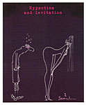
Opus 319 (December 12, 2013—Christmas). As is our custom here at the Rancid Raves Intergalactic Wurlitzer, we admit (and often correct) our mistakes ’way up front, before we open our motor mouths about anything else. This time, the error, the drastic fubar (as Don Rosa used to call ’em), took place just an opus away at Opus 318. Among the vaguely relevant squibs of information imparted therein was a report on James Reston Jr.'s authoritative contention in USA Today that Lee Harvey Oswald was shooting at Texas governor John Connally, not JFK, and accidentally hit the latter, killing him. This notion explains a lot, seems to me—and it also destroys every conspiracy theory still afloat. But it turns out that Reston was dead wrong. He asserted that the Warren Commission concluded that Connally was the target, but, after posting the piece, I looked up the Warren report online, and it concludes no such thing. In fact, it shoots down the Connally theory out of hand. Nuts. That'll teach me to do my research and vetting before shooting off my mouth. Or so you’d think. Now
on to important stuff—namely, the Anyule Season’s Greetings, which we perform
herewith, posting this relic from my magazine freelance days in 1959, when, in
a frenzy of experimentation, I drew some pictures on scratchboard. Like the one
at hand. For
the rest of the season’s salutations, I invoke a 2011 cartoon by Hilary Price,
whose Karaoke Favorite makes me sing aloud, always a good thing at this time of
year. Then on a somewhat more serious note, we Incidentally, fubar is greek for “Fouled up Beyond All Recognition”—in case you forgot. Otherwise—:
WE FLOOD THE DIGITAL ETHER WITH BOOK REVIEWS this time in our anyule effort to give you a list of possible Christmas gifts that you can pass along to your spouse. (Or, if you’re reading this too late for that, use the list to spend the money Aunt Sylvia gave you under the tree on Christmas morn). The list begins immediately below; it includes eleven sterling tomes and a generous dollop of history. Plus a short roundup of recent editoons and a look at comic strip potty humor and other signs that the taboos of yore are no longer active in the funnies. And Playboy’s 60th and Garrincha’s new strip at GoComics, and Al Plastino obit. Here’s what’s here, in order, by department—:
NOUS R US Al Jaffee Art and Papers to Rare Books at Columbia Another Watterson Movie? Thompson Pedigree Collection Starts Selling DC in Burbank for Movies Not Comic Books Spiegelman’s Co-Mix Criticized Signs of 60 at Playboy
EDITOONERY Mendela Farewells Obamacare Grandstanding Obstructionist Pachyderm
THE FROTH ESTATE On Obama’s Broken Promise Cable News Audience—Small
RANCID RAVES GALLERY Moses and Cahoots (er, Harvey)
NEWSPAPER COMICS PAGE VIGIL Erstwhile Taboos Violated Bathroom Comedy and Sex Wisdom in Dialogue Profanity in Harv’s Navy Strip Understanding Chaos—A Newcomer at GoComics
REVIEWS OF REPRINT TOMES And the Saga of the Gumps and Mary Gold Polly and Her Pals: A Complete Year of Surrealist Hilarity
BOOK MARQUEE (Short Reviews) The Blue Boy Chronicles (new fanzine) John K Presents Spumco Comic Book Frank Frazetta: Art and Remembrances The Secret History of Marvel Comics Adventures into the Unknown: Pre-code Horror Anthology, Nos. 9-12
BOOK REVIEW In Love with Art: Francoise Mouly’s Adventures in Comics with Art Spiegelman
LONG FORM PAGINATED CARTOON STRIPS (Graphic Novels) Zombillenium Madison Square Tragedy: The Murder of Standford White Century West
FUNNYBOOK FAN FARE The Sandman Overture Afterlife with Archie Velvet
PASSIN’ THROUGH Al Plastino, 1921 - 2013
Our Motto: It takes all kinds. Live and let live. Wear glasses if you need ’em. But it’s hard to live by this axiom in the Age of Tea Baggers, so we’ve added another motto:.
Seven days without comics makes one weak. (You can’t have too many mottos.)
And our customary reminder: don’t forget to activate the “Bathroom Button” by clicking on the “print friendly version” so you can print off a copy of just this installment for reading later, at your leisure while enthroned. Without further adieu, then, here we go—:
NOUS R US Some of All the News That Gives Us Fits
Fox has renewed “The Simpsons” for a 26th season, which will keep fresh episodes on tv through 2015 {New York Times}. ... Three of J.D. Salinger’s unpublished short stories, which he specified should not be printed until 2060, have been leaked online {Time}. ... A new book entitled Tequila Mockingbird offers 65 drink recipes for English major imbibers (The Last of the Mojitos, f’instance); an older book called Tequila Mockingbird is a book of animal cartoons by The New Yorker’s Leo Cullum. And there are at least three other books with the same title. ■ Al Jaffee, 92, famed for his “fold-ins” at Mad, is giving some of the original art and other material from his 70-year career to the rare book and manuscript library at Columbia University. Said Jaffee: “It will keep my stuff in New York City, which has been very good to me.”Among the treasures—some fold-ins in all stages of development, from the first “thumbnail squiggle” (as Jaffee described it) to the large sheets of tracing paper with sketches in colored pencil to the final painted board. Columbia has the papers and artwork from several cartoonists—comic book writer Chris Claremont, Wendy and Richard Pini (Elfquest comics), and alum Jerry Robinson. ■ Nikki Schwab at WashingtonWhispers blog reports that Rep. John Lewis, D-Ga., is bringing comics to Congress for Christmas. Top Shelf Productions, publisher of Lewis’ autobiographical graphic novel. March: Book One, is donating a digital copy to every single one of his Capitol Hill colleagues. Said Lewis: “It doesn't matter if you were part of the movement, if you knew anything about it, but you can learn something.” ■ From DailyCartoonist.com: TrackingBoard.com is reporting that Warner Bros has picked up a biopic script by Dan Dollar about Bill Watterson. Called “A Boy and His Tiger,” it chronicles Watterson’s early efforts to become a cartoonist, dealing with the popularity of the strip, and then his struggles with the syndicate to keep Calvin and Hobbes exclusively in the strip rather than to branch out to merchandising, which Watterson has always said would destroy the “life” of the characters who, for him, lived only in the strip. Alan Gardner notes that studios option scripts all the time and nothing comes of the options. Although Watterson has given an interview recently (see Opus 317), I doubt that he would be any kind of participant in the proposed movie. So how good could it be? ■ Heritage is auctioning off the Don/Maggie Thompson Pedigree Collection of comic books, a trove not so much of rare comics as of cunningly assembled ones, and the first installment of the auction brought Maggie, editor emeritus of the defunct Comics Buyer’s Guide, $835,384. The Thompsons were among the founders of modern comics fandom (with a mimeographed one-sheet newsletter called Harbringer in1960), and they collected quality comics astutely and passionately. Maggie, I hear, intends to use the proceeds to replace the collectible comics with readable ones.
DC More Committed to Film and Ancillary Products than to Comic Books From ICv2 on the Web: Time Warner plans to spin off Time Inc., its magazine division, into a new public company in 2014. The move will complete the divestiture of substantially all the print assets of Time Warner except for DC Comics, which came into Time Warner through Warner Bros., which was acquired by then DC parent Kinney National Company in the 1960s, and has been part of the film studio, and the studio’s culture, ever since. Time Warner CEO Jeff Bewkes’ statement that Time Warner will now be able to focus entirely on its film and TV businesses indicates how DC is viewed: as a development house for media properties. The plan to move DC to Burbank by 2015 completes DC’s connection with the film and TV business and severs DC’s old connections to the publishing industry in New York. That’s not inherently a bad thing, but a sign of the focus that Time Warner is bringing to the task of exploiting the stories that are still published in 32 page comics each month. DC’s executive team, movie, TV, and videogame operations, toys, licensing, and digital are already headquartered in Burbank, with print publishing the last outpost in New York. DC Entertainment CEO Diane Nelson doesn't think DC will miss anything by not being in New York.. She acknowledges that the city provides access to talent and other resources, but not as much as historically. “Fewer and fewer are there,” she said. “So it’s not a compelling reason." While emphasizing that she sees no practical benefits to being in New York, Nelson did acknowledge the intangibles. "There is an emotional aspect and a legacy to the publishing industry in New York and for DC specifically that we will miss out on," she said. "We need to acknowledge that is real." But she has repeatedly emphasized that having the entire staff in one place would have collaborative benefits. "When you have a creative business and ideas generated from people working together, I think you can work happier together," she said.
Spiegelman’s Co-mix Show at the Jewish Museum in New York From The Week: The very idea of a museum mounting an Art Spiegelman retrospective is an embarrassment, said Jed Perl in The New Republic. ... Far from being innovative, “his work is about giving comic books some high-culture airs,” so it’s a bit ironic that the curators of this show, which has already traveled from Paris to Cologne, Germany, claim that this venerated 65-year-old has helped tear down the wall between high and low. Pretentiouisness is “pretty much Spiegelman’s M.O.” ... To be fair, said Ariella Budick in the Financial Times, Spiegelman has had fine moments. Some of the many coves he drew for The New Yorker had a “merciless, gloomy wit,” like the 1998 image in which reporters crowd President Bill Clinton and hold their microphones to his crotch. ... To my eyes, “there’s rarely a dull moment” in Spiegelman, said Holland Cotter in the New York Times. “He has always been a restless experimenter.” ... And seeing his art “in its original preprint state” adds “an invaluable dimension” because in the erasures and revisions, we get to watch him making decisions. The resulting work “is in every way the equivalent of art we see in museums all the time.” ... But Spiegelman’s career requires tighter editing, said Budick; the high points in the show have been “swamped by juvenilia, outtakes, and mountainous evidence of his obsessive self-regard.” I can understand how Spiegelman’s juggernaut of a well-publicized cartooning career has bumped some of us off the road, but I don’t think he goes much out of his way to seek publicity. He doesn’t by any means eschew it: when the spotlight falls upon him, he knows how to enhance the occasion. (And that doubtless irritates some of us less famous drudges.) But mostly, I think he is the beneficiary of fame he didn’t set out to acquire for its own sake.
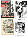
SIGNS OF 60 AT PLAYBOY Playboy and Hef are celebrating their 60th anniversary together with the January/February issue of the magazine, a double issue that is short the 300 pages that would make it truly twice the size of a normal issue, but 272 is close enough for government work, as we were wont to say (one of my many wonts, as Porkypine says, right there—on my wall in the Sunday page for August 25, 1968). To make up for the shortfall, Hef gives us two Playmates to gaze at. And to help celebrate the anniversary, he picked 16 cartoons from the 60-year archive of the magazine—“the wittiest and funniest,” it sez here. The cartoonists are Al Stine, Jack Cole, Eldon Dedini, Raymonde, Smilby, Sokol, Sneyd, Buck Brown (with two), Erickson, John Dempsey, B. Kliban, Gahan Wilson, Kiraz, and one other whose signature I can’t read (and I’m too lazy to look him up). There’s also the usual year-end tease-and-A Playmate Review—and, wonderful, a 6-page comic strip by Joe Casey (writer) and Nathan Fox (artist). Called “Modern Romance,” the strip stars Stan Treemont, who, having just secured a fiancee, is mysteriously transported from the 1950s to present-day New York, where he meets Madison, a lay-about tattooed slut of a broad (like all present-day bimbos) who tries to seduce him. Terrified, he runs away and, at the last minute, finds himself once again in the 1950s arms of his betrothed, Violet. And as we see them embrace with Stan extolling old-fashioned love, we also see that Violet has a tattoo on her butt. So
exactly how much does Hef miss the old days of the decade of his magazine’s launch?
The cover seems a trifle misty-eyed, too: staid, even a little repressed
compared to the usual Playboy cover, it’s about as sexy as vintage
fifties magazines were permitted to be. And next to Kate, a couple of LeRoy Neiman femlins. Neiman’s gone but the femlin continues to purr on the jokes page. I suspect that Hef’s just recycling old art, and the similarity of the two femlins here (one from October last, the other from December) seems to confirm my suspicion. Old Neiman art, modified ever so slightly: the facial expressions are different, and so are the props, but the basic pose is almost identical.
Fascinating Footnit. For even more comics news, consult these four other sites: Mark Evanier’s povonline.com, Alan Gardner’s DailyCartoonist.com, Tom Spurgeon’s comicsreporter.com, and Michael Cavna at voices.washingtonpost.com/comic-riffs . For delving into the history of our beloved medium, you can’t go wrong by visiting Allan Holtz’s strippersguide.blogspot.com, where Allan regularly posts rare findings from his forays into the vast reaches of newspaper microfilm files hither and yon.
QUOTES AND MOTS “The Supreme Court has ruled that they cannot have a nativity scene in Washington, D.C. this wasn’t for any religious reasons. They simply couldn’t find three wise men and a virgin.”—Jay Leno “Santa is very jolly because he knows where all the bad girls live.”—Dennis Miller
EDITOONERY The Mock in Democracy THE BIG NEWS in the past week or so is the death of Nelson Mandela, who became South Africa’s savior by fighting apartheid and winning. At the time that he was performing his nation’s salvation as its first black democratically elected president, I was impressed that instead of seeking revenge upon the white oppressors who took 27 years of his life away, he promoted forgiveness and sought “reconciliation” nationwide. Many of those speaking about him at his death talked instead of how he voluntarily served only one term as president. On a continent whose countries are usually ruled by whoever takes power for as long as they live (or can avoid a coup), Mandela’s leaving office at his own volition was more remarkable than his concentrated and wholly unprecedented effort to heal his country by formal, institutional, means—the reconciliation courts. Mandela
has been likened to a saint, and, indeed, most of the editorial cartoons
commemorating his life at his death were highly reverential. Jonathan
Shapiro, who signs his work Zapiro, is South Africa’s premier political
cartoonist, and we begin our short review of Mendela farewell cartoons with his,
a superb example of how good editorial cartoons work—with a visual metaphor
that is both evocative and memorable. His valuation of Mendela as the light of
his country is explicit in his depicting him at his death as a setting sun. Leaving
aside the numerous pictures of Mendela standing at the pearly gates being
admitted to Heaven, here are two that capture the largeness of the man’s spirit
in our next exhibit. Below Jones’ cartoon is Rick McKee’s, rich in somber symbolism. It evokes Mandela’s long prison term by showing him leaving prison—and leaving behind his footprints of “forgiveness” as marking perhaps the way of escape from the prison of apartheid. And the prison of the vengeful mind. A departure from prison can also suggest a departure from this life. A
couple of editoonists who teach cartooning reported sadly that most of their
students don’t know who Mandela was. “Even more stunning,” said one, “was their
ignorance of the history of apartheid. According to these particular eighth
graders, Paul Walker's death was a more devastating tragedy of note than the
passing of Nelson Mandela.” And
we continue passing in review of the contentious political situation in
Washington in our next visual aid. Going clockwise, we come first to Pat Bagley’s assessment of the Presidential Lie (“If you like your health care, you can keep your health care”): there’s more than one Pinocchio with a growing nose in Washington, and most of the other ones—all of them in Bagley’s cartoon—are Republicons, not Democrats. Next on the clock is Nick Anderson, whose imagery points out that the GOP is as guilty of “class warfare” as they accuse the Democrats of being. And finally, we have Steve Sack commemorating on the record of the 113th Congress, which has passed fewer laws than any Congress in recent history. And yet the GOP spokespersons (mostly in the person of John Boehner, pronounced “craven panderer”) seem proud of their achievement. To properly appreciate this seemingly obtuse evaluation, we must remember that a significant fringe of the GOP—mostly identified by the tea bags dangling from their three-cornered hats—came into Congress not to pass laws but to stop laws from being passed. They want to get government out of our lives, and they believe one way to do that is to prevent government from enacting any more laws. From their perspective, this Congress has been a roaring success. I just wish we weren’t paying them salaries for such non-accomplishments.
PERSIFLAGE AND BADINAGE From Charlie Reese (via the Web)—: One hundred senators, 435 congressmen, one President, and nine supreme Court justices equates to 545 human beings (out of the 300 million population of the U.S.) who are directly, legally, morally, and individually responsible for the domestic problems that plague this country. Politicians are the only people in the world who create problems and then campaign against them. Have you ever wondered, if both the Democrats and the Republicans are against deficits, why do we have deficits? Have you ever wondered, if all the politicians are against inflation and high taxes, why do we have inflation and high taxes? It seems inconceivable to me that a nation of 300 million cannot replace 545 people who stand convicted—by present facts—of incompetence and irresponsibility. I can’t think of a single domestic problem that is not traceable directly to those 545 people. When you fully grasp the plain truth that 545 people exercise the power of the federal government, then it must follow that what exists is what they want to exist. They, and they alone, should be held accountable by the people who are their bosses. Provided the voters have the gumption to manage their own employees. We should vote all of them out of office and [thereby] clean up their mess. Charlie Reese is a former columnist of the Orlando Sentinel.
THE FROTH ESTATE The Alleged News Institution THE COVER OF the December 2 issue of Time depicts a giant aspirin tablet, broken, with the caption “Broken Promise.” The cover story by Nancy Gibbs begins by predicting the utter collapse of the Obama Presidency because the Prez has apologized. Heaven forfend that the nation’s top elected politician should apologize! He said he was sorry that the Obamacare insurance exchange roll-out was so badly managed, that he didn’t know what was going on in his administration, and that he didn’t tell the whole truth when he said: “If you like your health care plan, you can keep your health care plan.” He gets no credit in this write-up for candor, for unabashed honesty—which is the other thing that his apologies represent. No politician has ever apologized. But Bronco Bama did, trying to be honest with the citizenry. Nor does the article—or, for that matter, almost any other report on Obama’s ill-informed assertion that we could keep our insurance if we liked it, “period”—recognize that he wasn’t the only one making this assertion. Nancy Pelosi did it. And so did several other leading donkeys in government. So why isn’t the ever-vigilant press crucifying them? Because the so-called news media have seized upon Obama’s gaff as a way to prove that they are not, as Republicons have asserted with the predictable regularity of a roundelay, biased in favor of liberuls. Obama’s misstep gives the press a chance to demonstrate that they do not carry water for the liberals. Or, as I might put it, that they are as incompetent about liberal issues as they are about conservative ones.
■ Keleta Sanneh at The New Yorker: “Compared with the major networks’ nightly news broadcasts, which routinely reach six or seven million viewers each, the cable-news audience is laughably small. O’Reilly generally draws about half as many viewers as the lowest-rated network newscast, and MSNBC’s ratings lag well behind those of, say, the Food Network or Syfy.” But if you ask O’Reilly, he’s the king of the hill.
RANCID RAVES GALLERY Pictures Without Too Many Words HERE’S AN
EXCELLENT CARICATURE of Franklin D. Roosevelt done by Fred O. Seibel of
the Richmond Times-Dispatch ‘way back when. Seibel always affixed a
dingbat to his signature—a crow originally named Jim but later, in a
commendable fit of revisionist thinking, re-christened Moses. Later, as you doubtless know, I invented a dingbat of my own, a bespectacled rabbit (evoking Harvey the rabbit, the eponymous but invisible six-foot pal of Elwood P. Dowd in a famous Jimmy Stewart movie; I’m only five-foot-eleven but I have aspirations). At the time of my rabbit’s invention, I don’t think I was remembering my sixth-grade infatuation with Moses. Not consciously in any case. But that didn’t prevent me from creating several years ago the homage you see here to the right of FDR.
A FEW STATISTICS Cost of a U.S. command center completed last November in Afghanistan’s Helmand province: $34,000,000. Number of days it has been used: 9 Average length of time, in years, a prisoner placed in solitary confinement in California spends there: 7 Cost of 50 pork-coated 9mm rounds designed by an Idaho company as a “natural deterrent” to radical Islam: $24.75.
NEWSPAPER COMICS PAGE VIGIL The Bump and Grind of Daily Stripping REVISITING
AGAIN one of our favorite topics—evidence that the taboos of yesteryear have
fallen away like pinecones in autumn—we start, this time, with bathroom comedy
and outright blasphemy. Farting
gets a workout in our next display. Jack Frost visits the population in Over
the Hedge, and demonstrates his superpower—an ability to create something
out of nothing but, er, hot air. Our
next exhibit is all about sex. But, then, what isn’t? In Greg Evans’ Luann,
Brad clearly has designs on his fiancee’s body, and she’s certainly willing. Finally, we have Amos and Edda in bed together in 9 Chickweed Lane. Unless they got married during one of the weeks I was gallivanting somewhere, their cohabitation is illicit. Or it was in a previous age. Not in this one. But there’s nothing alarming about this sequence: the couple’s first coupling took place on a concert grand piano in full view of a passing hot air balloon, so we can hardly be shocked. Brooke
McEldowney, who controls Edda and Amos and the rest of the strip’s
population, is always tempting fate with risque sequences about which we are
entitled (nay, encouraged) to be suspicious. Like the aforementioned coitus on
the grand that I just mentioned, f’instance. Are those people having sex? What?
In a daily newspaper?!! And McEldowney always commits these hilarious
indiscretions with exquisite taste and discretion and a finely honed sense of
comedy. Take the sequence on display at your elbow. As you doubtless noted in our previous exhibit, Edda and Amos are experiencing government surveillance of the intrusive sort. And in the sequence at hand, it seems the bottom of Edda’s bikini has been, er, bugged. And the wire with which it has been wired evidently snagged on the diving board. Unlikely, I know, but the situation permits McEldowney to produce a number of tantalizing pictures of the shapely Edda whose derriere hovers on the edge of exposure. Hovers but does not descend. (Or arise.) Ingenious. (And risible.) But that’s only one of the reasons I love the strip. The others include McEldowney’s taste and never faltering sense of comedy and persistent compassionate humanity. Sex
can, and often does, lead to pregnancy and childbirth, neither subject
frequented in the daily newspaper’s comics section. But that, as our next
visual aid demonstrates, is changing. Our
next display uncovers no revolutionary, taboo-breaking advances in Western
civilization. Just some nifty comic strips, beginning with Betty, named
for the housewife and mother protagonist of a friendly old fashioned looking
but otherwise entirely hip strip by Gary Delainey and Gerry Rasmussen. In Blondie, the pause between the first and third panels is the dynamic of the joke. Without the pause, the joke loses much of its impact. And in the last example of this exhibit, Mort Walker and Beetle Bailey toy with the mechanics of the medium, the joke arising entirely out of the visual conventions of the daily comic strip. Incidentally,
I once played with exactly the same convention. While in the Navy aboard the
USS Saratoga (one of those giant aircraft carriers), I produced a full-page
Sunday-style comic strip for the ship’s monthly magazine. Its eponymous title, Cumshaw, referred to a widely accepted but officially forbidden practice of
obtaining goods or services through unofficial channels (without sufficient
paperwork, for instance, one could still cumshaw something; and
the something was then termed “cumshaw”), a practice perfected by my strip’s
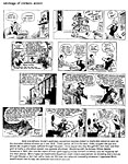
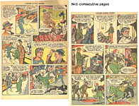
protagonist, who bore the telling name Cumshaw. In one episode, Cumshaw encounters the equivalent of Beetle’s Sarge, Chief Petty Officer Bucket, who is, as you can see, as picturesquely profane as Sarge ever hoped to be. With unexpected consequences—all safely within the realm of the graphic conventions of comic strips. As is the appearance of the mermaid, Compass Rose, the view of whose naked upper body could be conveniently obscured with a variety of visual maneuvers. As you can see. Returning
to the pages of today’s newspapers, we arrive next at a recent installment of Dick
Tracy, a legendary strip being carried on these days by Mike Curtis,
who writes it for Joe Staton to draw. Curtis, aided and abetted, no doubt, by Staton, indulges a penchant for bringing into nearly every adventure a host of Chester Gould’s villains of yore, and the result is a parade of peculiar personages long enough that we forget their names by the time they re-appear a few days after their introductions. This is all fun stuff, but there’s a bit too much of it crammed into the limited scope of each day’s comic strip. In Blondie, I admire the rendering of the automobile. It’s small enough to get into one standard-sized Blondie panel, and while the car is actually too small to hold Dagwood and Herb, the oversized window permits John Marshall (the artist of record) and his assistant Frank Cummings (who does a lot of drawing without credit in print) to draw the characters’s faces large enough to be recognizable. Seeing them, we believe the rest of their bodies are actually inside the car; seeing is believing, right? Below that, is a Mother Goose and Grimm with a nifty rendering of a dog in the second panel. Just in case you thought Mike Peters and Jeff Parker couldn’t draw anything that looks like an actual canine. And finally, in Pearls, I admire Stephan Pastis for including such storytelling bits as the puddles of water the goldfish leaves trailing behind. Our
penultimate exhibit for today is here purely for the sake of the fun it
affords—and/or the wisdom, as in Zits at the top of the display. In Baldo, Hecto Cantu and Carlos Castellanos generate a gag with a surpassing blend of pictures and words. It is to weep for joy. I love the way Brad Anderson draws his giant dog; so here are two recent renderings. And Dan Piraro’s joke is here for all of us who wonder how it is that Superman, who is presumably a brilliant guy, thinks that putting on a pair of eyeglasses is going to “disguise” his well-known Super visage. It is to laugh. And I have.
FINALLY, HERE
ARE A FEW EXCERPTS from one of GoComics’ newest strips, Gus Rodriguez’s Understanding
Chaos. Set in a multicultural South Florida beach town (GoComics’ blurb tells us), Understanding Chaos features Ordelia and Medore, a couple who remain coupled despite their numerous (and usually outlandish) differences, often of a purely cranky nature. Gus,
whose pen name is Garrincha (which he attaches to a host of drawing projects
from editorial cartoons to advertising art to book illustration), says his
cartooning career started in1986 when one of his comic strips was printed in a
monthly magazine in the cartoonist’s native Cuba. Thereafter, his cartoons
began appearing everywhere. In 2005, they started appearing in the United
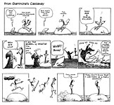
States after he came to this country. One of my favorites is nearby. Gus also has a new book of comic strips out. Called Castaway, it features 211 desert island jokes, each more inventive than the last—as if to prove that desert island jokes are forever. The Castaway’s barren rock of an island is not entirely deserted. He is visited regularly by talking fish and birds. Even classical children’s folktales show up. “Hi,” says the little girl in the hoodie, “I’m the Little Red Riding Hood. Why are you half naked? What’s your grandma’s name? Where is the bathroom? Are you married? What kind of sun blocker do you use?” Says the Castaway: “I didn’t know literary licenses could ask so many dumb questions.” Says Red: “Journalism has always been one of my passions.” Comedy and social criticism at one swell foop. Delightful. Order your copy of Castaway (211 8.5x8.5-inch pages, b/w) from CognitioBooks.com, where it’s available in both paperback and ebook; both English and Spanish.
JIVEY PUZZLE From Jim Ivey, here’s a word game for all you comic strip addicts. Solution next opus.
CLIPS & QUIPS ■ A man goes to a psychiatrist. The doctor says, “You’re crazy.” The man says, “I want a second opinion!” “Okay,” says the psychiatrist, “—you’re ugly too.”
■ When I took the entrance exam for medical school, I was perplexed by this question: Rearrange the letters P-N-E-S-I to spell out the part of the human body that is most useful when erect.” Those who spelled SPINE become doctors. The rest are in Congress.
■ A smattering of lexophilia: A bicycle can’t stand alone; it is two tired. A will is a dead giveaway. Time flies like an arrow; fruit flies like bananas. A backward poet writes inverse. A chicken crossing the road: poultry in motion. ■ I’d just come out of the shop with a roast beef sandwich, large chips, ear of corn and a jumbo sausage. A poor homeless guy sitting on the curb said: “I’ve not eaten for two days.” I said: “I wish I had your will power.”
CIVILIZATION’S LAST OUTPOST One of a kind beats everything. —Dennis Miller adv. ROLAIDS’RE BACK. After a hiatus of three years, the “fast fast fast relief” tablet is back on America’s shelves in drugstores and supermarkets everywhere. In December 2010, Johnson & Johnson recalled the speedy pills after irate customers complained that they’d found particles of wood and metal among the antacids. An earlier recall that year had been initiated following an investigation of consumer reports of “an unusual moldy, musty, or mildew-like odor that, in a small number of cases, was associated with temporary and nonserious gastrointestinal events,”saith Wikipedia. “These events included nausea, stomach pain, vomiting, and diarrhea.” I like that terminology—“events.” Nausea, stomach pain, vomiting and diarrhea are “events.” The event-causing problem was attributed to practices at “outside manufacturers.” At the time of the December recall, the Rolaids website carried the following statement regarding product availability: "You may have noticed that Rolaids products are not available at your local retailers. We are changing some of our manufacturing facilities where our products are made, a process that will take time to complete. We apologize for the inconvenience this may be causing you. Your health and comfort are important to us, and we assure you we are working hard to get Rolaids product back on store shelves." But the events in our stomachs were evidently not urgent enough to result in rapid corrective action. In fact, apparently not much progress was made until last January, when Chattem, a subsidiary of Sanofi, acquired full rights to the brand from McNeil Consumer Healthcare, a subsidiary of J&J. In any case, all our stomachs can now look forward to a less eventful life. And a good thing, too. Who needs Obamacare when we have Rolaids in plentiful supply?
REVIEWS OF REPRINT TOMES With a Generous Dose of Comics History and Lore WE’LL BEGIN with the history and lore section, to wit—:
The Death of Mary Gold Mary Gold died on April 30, 1929. The public outcry when her death became known was gratifying in both its precipitousness and its volume. Switchboards at major metropolitan newspapers were clogged for hours. Mail rooms quickly overflowed with letters expressing sympathy and outrage. Her doctors would offer no medical explanation for her death. They merely muttered shame-faced speculations about the vagaries of the human mechanism, and many of her friends consequently concluded that the cause of death was a broken heart— the tragic and tattered end of a labyrinthine love story that should have ended happily. The body politic had been following the ups and downs of Mary Gold's love life for months. She'd been courted by a young inventor, Tom Carr, but on the eve of their wedding, he'd been arrested for absconding with his backers' money. After a long trial, he was found guilty and sentenced to ten years in prison. Mary Gold came to public attention in the sensational aftermath of the trial. Grief stricken, she nonetheless consented to marry a friend of her family's, a wealthy banker named Henry J. Ausstinn. On the day of the lavish wedding, the ceremony was spectacularly interrupted by Tom Carr's brother, who produced evidence that not only established his brother's innocence but fingered Ausstinn as the man who'd stolen the money and framed Tom. The strain of these events was too much for poor Mary. Her health broken, she took to bed with a high fever, and in a week or so, she was dead. The outburst of public sentiment promptly exploded all across the country. Public preoccupation with the affairs of private citizens was scarcely novel in the twenties (or in any other period, for that matter). But during that decade, the mass media were coming of age, and newspapers learned to play upon the nation's curiosity with all the skill of a pied piper fingering his flute. Editors seized upon every scandal or sensation that seemed to capture the public fancy and kept it on the front page for weeks. In addition to the daily doings of such luminaries as Waxey Gordon, Al Capone, Legs Diamond, and Dutch Schultz, there was the Fifi Stillman divorce case (in which her husband maintained that their fifth child was illegitimate), the Fatty Arbuckle scandal (featuring the trial of the popular film comedian for accidentally killing a starlet during one of his typical Hollywood orgies), the Hall-Mills murder mystery (the unsolved killing of a pastor and a female member of his choir), and the Sydney-Gray sex-and-homicide epic (in which Ruth Snyder and her lover, a corset salesman, were brought to book for the murder of her husband). Still, Mary Gold was different. The Mary Gold who died had never lived. She was only a paper doll. A character in a comic strip. Her sole distinction was in being the first major comic strip character to die. And the overwhelming public reaction to her death testified to the popularity of the comics with an authority difficult (if not impossible) to dispute. Not that there was any dispute. The comic strip in which Mary Gold lived and died was The Gumps, written and drawn for the Chicago Tribune by Sidney Smith. The strip dwelt with melodramatic excess on the opportunistic yearnings of Andy Gump, a creature whose bizarre, chinless physiognomy set him apart from every other comic strip character in the popular mind (which conveniently overlooked, apparently, that Augustus Mutt was identically endowed). Andy's avaricious middle class aspirations struck a chord— whether sympathetic or antithetic—among newspaper readers. The strip was a resounding success, inspiring the kind of fanatical following that grieves over fictional death. The Gumps began in the Tribune in 1917, and within a few years, the strip had created such a stir that it was syndicated for distribution in every major city in which there was a newspaper with any pretensions to greatness. The combined circulation of the newspapers in which The Gumps appeared eventually reached twelve million. That alone justifies your running right out and buying—:
The Gumps: The Saga of Mary Gold By Sidney Smith with an introductory essay by editor Jared Gardner 342 4.5x11.5-inch landscape pages, b/w; IDW Library of American Comics Essentials, hardcover, $19.99 THIS IS THE SECOND VOLUME in the new division of IDW’s Library of American Comics—the Essentials. “An important series,” saith the back cover blurb, “that reprints, in yearly volumes, the rare early daily newspaper strips that are essential to comics history, seminal strips that are unique creations in their own right while also significantly contributing to the advancement of the medium.” This oddly oblong book reprints all of The Gumps from May 1,1928 through May 3, 1929, one daily strip per page—including the title line that ran atop every daily installment—a contrivance, it sez here on the back cover, “allowing us to have an experience similar to what newspaper buyers had many decades ago—reading the comics one day at a time.” Here, however, we read the strips one page at a time. Similar experience. To enhance the similarity, the strips are printed on newsprint, not glossy, paper. But the quality of reproduction is superior—bafflingly so: it is surprising that IDW found such high quality source material for a strip so primitively drawn. During the year’s strips reprint here, Smith ran the story we’ve just read about—the story that, as the cover proclaims, “changed comics forever.” A little extravagant, but not too. As Gardner puts it: “The story collected here is most famous for being the first time a beloved comics character would die.” Perhaps the next most famous comic strip death was Raven Sherman’s in Milton Caniff’s Terry and the Pirates. But the palm goes to Smith and his Mary Gold for being the spectacular first. By the time of Mary Gold’s death and the prolonged year’s continuity that preceded it, Smith had perfected the cliffhanger as a device for sustaining reader interest (and newsstand sales of the paper). Gardner’s introduction provides a brief biography of Smith and an account of how he achieved yet another unprecedented event in comic strip history: he launched The Gumps by having the voluble Andy Gump and his family move into and occupy the strip Smith was doing before starting The Gumps, a strip about an anthromomorphic goat named Yak and his son Yutch.. He’d started Old Doc Yak in 1912 when he’d moved to the Chicago Tribune from the Chicago Examiner, where he’d invented a goat character as a dingbat commenting in the corner of his editorial cartoons on the issue being cartooned.
AT THE TIME OF MARY GOLD'S DEATH, the Chicago Tribune was joined at the hip to the largest circulation daily newspaper in America, the New York Daily News, which had been started in 1919 by Captain Joseph Patterson, who was a hands-on publisher even while at the Tribune before transferring his attentions entirely to the Daily News. The Daily News started at the bottom of the heap with the lowest circulation of New York's 18 daily newspapers. In less than five years, it surpassed William Randolph Hearst's champion, the New York Journal. Patterson had beaten the king of the hill at his own game, and he had done it by giving the public what he knew it wanted—sex and scandal, games and contests. And comic strips. Patterson displayed an inordinate affection for comic strips, which, by this time, had amply demonstrated that they were a magnet drawing readers (and therefore purchasers) to the paper. One of Patterson’s first acts upon assuming control of the Sunday Tribune in 1910 was to add to the comics section his favorite strip, Rudolph Dirks’ Hans and Fritz (which would be retitled The Captain and the Kids in the national fit of anti-German feeling during World War I). Patterson invented the Gumps, and if he didn’t invent the suspense-driven continuity formula for daily comic strips, he surely mid-wifed the genre’s birth with The Gumps. Comic strips that told continuing stories had been around long before Captain Patterson took an interest in the idea. Winsor McCay in his Little Nemo frequently continued a narrative from Sunday to Sunday. And Bud Fisher had done it from day to day at various times in the early days of Mutt and Jeff. And these two strips were not alone. C.W. Kahles introduced Hairbreadth Harry in 1906, a Sunday strip that carried its story forward from week to week. And Harry Hershfield used daily continuity in his Desperate Desmond (1910) and its sequel, Dauntless Durham (1913). Patterson can scarcely be said to have invented the concept. But he (and Smith) refined it in a way that opened the door to the future, to continuity strips of exotic adventure: The Gumps made gut-wrenching suspense the driving mechanism of the continuing story strip. And because The Gumps was syndicated and distributed to many papers around the nation, it had a greater impact upon the medium than any of the earlier attempts at continuity strips. When Patterson began thinking about a new comic strip in early 1917, he envisioned something considerably more in touch with reality than either Kahles or Hershfield had achieved. And that's what the Captain got—and then some. Once Smith warmed to his task, he soaped his stories with every sudsy bubble of melodrama he could lay his pen to, but the people in his stories were ordinary people and their predicaments were those of ordinary people, recognizably the fellow creatures of the strip's readers. "I wanted everyday things to happen to them," Smith once said. "I was not so much concerned about making them terribly funny, but I did want them to be true. I thought I'd get what I wanted if I could draw something which a wife would read and hand to her husband with the remark, ‘There, that's you!'" And that was precisely what Patterson desired—a strip about real people who would become involved in situations with which Tribune readers could identify. Doubtless in conceiving the strip, Patterson harkened back to the novels he had written in his youth when influenced by the social realism of Theodore Dreiser. The strip would achieve both comedy and catastrophe by focusing on an average lower middle class family—father, mother, and children (one young son at home, one in the Navy, and a daughter in college; the elder offspring were mentioned in the strip's introduction, but Smith never brought them into his stories). In its aspirations and adventures, the family would mirror the ambitions and appetites of the Tribune's readers as Patterson imagined them. Patterson christened his family "the Gumps," employing a slightly derisive term he and his sister Cissie had applied as children to loudmouth adults. In Andy Gump's case, the name was a self-fulfilling prophecy, as we saw last time in Opus 318, which explored Andy’s appearance in a novel. Having conceptualized his new strip, Patterson looked for someone to produce it. It was perhaps the shortest talent search on record.
IN THOSE EARLY, UNSOPHISTICATED DAYS of comic strips, Patterson probably thought anyone who could draw cartoons could draw The Gumps, so he simply turned to the Tribune's staff of cartoonists— which, at the time, was minuscule. The Sunday comics section printed only four strips: in addition to Hans and Fritz by Dirks, there was Mama's Angel Child by Perry Ross, Bobby Make Believe by Frank King, and Old Doc Yak, Smith's offering. Only Yak and a Clare Briggs' feature of rotating titles ("Ain't It a Grand and Glorious Feeling?," "They Can't Arrest You for That," "Days of Real Sport," and the like) ran in the daily paper. Why Patterson picked Smith to do The Gumps is something of a mystery. Old Doc Yak certainly bore no resemblance to the kind of strip Patterson was imagining: a silly slapstick romp about a goat and his son, Yutch, it was about as far from Dreiser's gritty realism as vaudeville is from Shakespearean tragedy. Maybe Patterson merely elected to discontinue the strip that he liked least— in effect, reassigning the cartoonist to The Gumps. Or maybe he saw in Smith's goat strip an almost imperceptible quality that he felt Smith could translate effectively into the realization of Patterson's idea. Whatever the case, Smith got The Gumps, and he turned out to be an inspired choice. Given Patterson's proprietary, almost paternal, feeling about The Gumps, it would be difficult to imagine Smith doing a continuing story without Patterson's approval—if not at his express direction. And while The Gumps eventually told a continuing story, with Smith, as I said, pitching suspense at fever levels, but continuity at the beginning was more thematic than narrative. Before Smith introduced the Gumps to his readers, he devised an exit for Old Doc Yak (the pertinent portions of which are reprinted in the book at hand). On Thursday, February 8, 1917, Smith announced to Yak readers that "Old Doc Yak has been served notice that if the rent for this space is not paid by Saturday, he and his son Yutch will have to leave this page and it will be rented to another party." Yak fails to come up with the rent, of course, and on Saturday, the landlord appears to confide: "Between you and me and the lamppost, I was going to put him out anyway—whether he paid his rent or not—there's a new family goin' to move into this space on Monday." And on Monday, the 12th, the Gumps are introduced. The slender continuity of these last Yak strips was prolonged through the following week, which featured jokes about the Gumps' moving in. And the strip was essentially a daily gag strip, its continuity derived entirely from the moving-in theme. In March, the daily gags perpetuated thematic continuity in Andy's on-going battle with a mouse in his new house. And so it went for the rest of this year and the next two. At first, Andy's adventures were the mundane preoccupations of the average American of the times, and Smith aimed to provoke laughter in his readership. Andy had mother-in-law troubles for days on end, went fishing on his vacation, and railed in endless monologue against the minor evils and irritations of the world, those that particularly festered in the middle class mind: taxes, waste in government, the rising cost of living, women's fashions, food, family life, etc. His diatribes were often so heated as to inflate speech balloons at the rate of eighty to a hundred words per balloon, a heroic accomplishment, leaving Andy lying on the bottom border of the panel, the speech balloon having consumed all the space over his head.. But
no storyline emerged until early 1921, when Andy’s fabulously wealthy Uncle Bim
starts to fall into the clutches of the Widow Zander, a gold-digging damsel
whose marital intentions for Bim threaten Andy's hopes for inheriting Bim’s
fortune. The laughter went out of the strip as the suspense heightened. The
Widow Zander affair continued into 1922, and that year, Andy ran for Congress.
The blow-hard had found his calling, and Patterson and Smith had captured their
audience. By this time, people were asking newsdealers for "the Gump paper," not the Tribune. While Andy Gump's pedestrian interests and his opinionated trumpeting probably contributed a large measure to the rapidly growing appeal of the strip during its earliest years, it was undoubtedly the continuity of the Widow Zander episodes that sent the strip soaring into the public consciousness and made The Gumps (and buying the Tribune every day) a habit if not an addiction among its readers. Suspenseful continuity as a device for building a successful comic strip had been established. Smith played upon his readers' addiction mercilessly. He began to pull out all the stops of melodrama, and The Gumps stepped back several paces from reality. (But not so far that readers could no longer see themselves in the dilemmas of Smith's characters.) The villains, at first merely grasping, became heartless and vicious. The predicaments of the good folks became more and more pitiful, and Smith ladled on the purple prose: "And so Zander escapes again—through his lies and deceit, he has made another innocent man victim to an unjust fate. How long can this fiend's amazing luck hold out?" And, two days later: "Oh, Townsend Zander, could you but see this brave, pathetic little figure trudging down toward the cold icy gray swamp, even your icy heart would be melted." Smith
milked the crises in the strip for every last dribble of suspense, slowing his
plots by postponing developments for days. To keep suspense at hysterical
heights during such interludes, Smith sometimes employed a maneuver unique for
a comic strip: he would turn a day or two's strips into editorial cartoons,
with the villain portrayed variously as a vulture preying on his victim, a
hungry cat eyeing a bird (the heroine) in a birdcage, a spider waiting for the
heroine-fly to wander into his web, and so on. No other cartoonist I know of so blatantly exploited the resources of his medium. But in no other strip I know of would the device of an editorial cartoon installment fail to be laughably incongruous. It is more than a bit too much. But The Gumps was so excessive in every way, that Smith's novel means of protracting the suspense seemed entirely appropriate. And you can see the whole enchilada on display in the Mary Gold volume at hand, a veritable daily lesson in how to create and prolong the suspense essential to the continuity comic strip.
***** Fitnoot: The first volume in IDW’s Essentials series is George Herriman’s Baron Bean, which I haven’t seen. Yet.
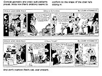
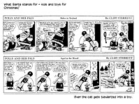
Polly and Her Pals: A Complete Year of Surrealist Hilarity By Cliff Sterrett with an introductory essay by Bruce Canwell 336 4.5x11.5-inch landscape pages, b/w; IDW Library of American Comics Essentials, hardcover, $24.99 THE THIRD OBLONG VOLUME in IDW’s Library of Comics Essentials, this tome reprints all of the 1933 Polly dailies. Most of the previous reprints of the famed “surrealist” comic strip are of Sunday strips, where color complements Sterrett’s wild designs. I’m aware of only two other projects that reprinted dailies: Arcadia Publications’ Comic Strip Showcase No.2 did 1931 strips in 1990; and the long-gone and lamented Hyperion Press reprinted the first year (1912-13) of Polly in 1977. So it’s nice to have this collection. All the more so because my favorite Sterrett period is the 1930s. His experimental work of the previous decade was by then well in the past, and he was now firmly in possession of a drawing style that echoed Fernand Leger’s futuristic, tubular mannerisms—producing abstractions of human anatomy and of whatever locale his characters were occupying. Wild patterns dominated his art, but we cannot overlook the geometric abstraction to which he reduced all figures in his work. Polly
and Her Pals may be the most misnamed comic strip in history. Polly, one of
the the century’s earliest manifestations of the “modern woman,” is almost
never on the strip’s premises. And who, exactly, her pals are you could spend a
long time looking for. Mostly, the strip was about Polly’s father, Paw, and how
he managed, somehow, to survive the modern age and his modern daughter. (Hint:
he did it with the help of a cat who was always at his ankle, imitating his
every move and mood.) IDW may have picked 1933 as the year to reprint because of the holiday sequence at the end of the year. Sterrett, as if poking fun at his drawing style, converts all of his cast to toys of an unmistakable tube-like construction, a sly exaggeration of his own mannerism. He was doing it, however, not to satirize himself but to make a point about Christmas being a big holiday for children—as you can see from the sequence we’ve posted here.
By New Year’s, everyone was back to their normal geometry—as was Paw, cavorting on the ice for joy. Canwell’s essay peers into a hitherto nearly unknown corner of American cartooning history, the artists’ colony, Ogunquit, on the coast of Maine where Sterrett spent many summers (April through December), starting in the early 1920s. But Sterrett, Canwell proves with impressive delving into this obscurity, was not, as Rick Marschall claims, a founder of the colony, which Canwell demonstrates by reciting the history of the enclave, started in the 1890s long before Sterrett started cartooning. Canwell notes that some of the 1933 strips are doubtless inspired by the bucolic life Sterrett enjoyed at Ogunquit, but where I expected Canwell to claim the artists of the colony influenced Sterrett’s alleged “surrealistic” cartooning, he is silent. I’ve had trouble over the years in seeing surrealism in Polly: I don’t think it’s there. Sterrett is obviously doing something different in rendering his strip, but the result is surrealism, I say, only in the broadest possible interpretation of the term. It’s surreal in the sense that it is bears only an incidental likeness to the reality we live in; it’s not surreal in the way that Salvadore Dali was surreal with dripping watches hanging off cliffs overlooking empty expanses of desert. I’ll expound further on this subject—while tracing Sterrett’s life and the history of his strip—in Harv’s Hindsight later this month. Don’t miss it if you can.
MORE T-SHIRT WISDOM It was me: I let the dogs out I’m not lazy: I’m cat-like Everything I say is fully substantiated by my opinion Scars are like tattooos but with better stories When the chips are down, yell Bingo! If only closed minds came with closed mouths You can’t spell “awesome”without “me”
BOOK MARQUEE Previews and Proclamations of Coming Attractions This department works like a visit to the bookstore. When you browse in a bookstore, you don’t critique books. You don’t even read books: you pick up one, riffle its pages, and stop here and there to look at whatever has momentarily attracted your eye. You may read the first page or glance through the table of contents. All of that is what we do here, starting with—:
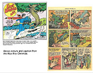
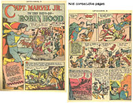
The Blue Boy Chronicles is editor/publisher Don Ensign’s (donensign @ mail.com) new fanzine that celebrates Fawcett’s Blue Cheese—namely, the crippled newsboy Freddie Freeman, who, by saying “Captain Marvel,” could transmorgrify himself into Captain Marvel Jr., attired in blue tights, not red. (Captain Marvel, Jr. is also the only comics character who could not introduce himself to anyone by name: the second he started saying his name, lightning would strike, and he’d be Freddie again.) The first (and so far, the only) issue of Blue Boy traces the “publishing history of Captain Marvel Jr.” and various other aspects of the character and his encounters. Captain Marvel Jr. was created by Ed “France” Herron; Mac Raboy designed the visuals. He debuted in Whiz Comics No. 25, December 1941, a scant two years after the Big Red Cheese (the Captain Marvel) bowed on stage. Raboy, who is usually shamelessly worshipped as the definitive CMJ. artist, lasted at the job only a little over two years, leaving sometime in 1944, Ensign tells us. His longest-termed successors included Al Carreno, Joe Certa, and Kurt Schaffenberger, but the one who drew the most CMJ stories was Bud Thompson, who started in late 1944 or early 1945 and produced “more CMJ story art than any other artist during the Golden Age,” says Ensign. I’m delighted to at last have encountered someone else who thinks Thompson’s art was superior to all others. But I’m astonished to learn that he produced so much CMJ art: I’ve tried for years to round up as many of the CMJ books he drew as I can find, and it turns out to be difficult to find them. If he produced so much, how come they’re so scarce? Here are some Thompson samples. He drew CMJ as a lithe youth (trying saying those two words together fast), but as much appeal as that rendering has, I admire his manner whatever he’s drawing—the languid flow of his liquid line, flexing only slightly; and he typically ticked parts of his pictures with delicate etching lines, imbuing his delineations with high contrast linework.
Thompson was assisted by Certa, who also did his own stories for the series, and his style is so close to Thompson’s that it’s sometimes nearly impossible to tell one from the other. (Thompson’s was a little looser, but that’s so subjective it’s scarcely a criterion.)
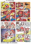
John K Presents Spumco Comic Book By John Kricfalus, Jim Smith, Vincent Waller, Mike Fontanelli, Shane Glines, Rich Pursel and Other Spumco Talents 162 9x12-inch pages, color; from IDW, a Yoe Books hardcover, $34.99 FROM THE CREATOR OF Ren & Stimpy comes this hilariously outlandish collection of stories presented in the frantic far-out exaggerative manner of the animated cartoons. Apart from the anatomical impossibilities rendered entirely believable by the visuals (seeing is believing, kimo sabe), the contents regale us with a few of the everyday adventures of Jimmy the Idiot and a short fat guy whose name is probably George—plus a few pages of a dog shitting on the front lawn. Mostly, what John K and his cohorts do herein is everything they can’t do in family-oriented animated cartoons—but would like to. Raucous forbidden comedy. Plus the usual antics of extreme animation. Pictures in this case, provide a much better review than these measley words; so here are a few—:
Frank Frazetta: Art and Remembrances By Frank Frazetta, Jr. 192 10x12-inch landscape pages, color; Hermes Press hardcover, $49.99 FAMOUS FRANK FRAZETTA’S SON, Frank Jr., 54, has written not so much a biography of his father as a fond and appreciative reminiscence, full of incident and memories but a little shaky on dates; he doesn’t mention his father’s birth date, f’instance. He tells of his father’s passion for baseball (he was offered a contract with the Giants in the fall of 1947 when he was just 19), his early struggles to get published after leaving Al Capp’s employ in 1961, and his encounters with Hal Foster, Clint Eastwood, George Lucas and other notables who came to Frazetta for artwork on movie posters. The
book is full of photos of Frazetta with his son and with his wife Ellie, who
has not appeared in photographs much, seems to me. Samples of the artist’s
early art (pages from the 1944 “Snowman” story published in Tally Ho Comics when Frazetta was about 16) and later masterpieces (all shot from original art)
abound; also reproductions of famous comic book and book covers, album covers
and movie posters, and a few Li’l Abner strips. Missing, however, are
very many pages of the comic book work Frazetta did before joining
Capp—notably, the White Indian and EC stories. But all of that stuff is
available in other tomes. This one compensates with a lot of never before
published sketches and half-finished art. I saw Frazetta in the flesh at the San Diego Comic Con years ago. Camera in hand, he was browsing in Bud Plant’s booth. Bud pointed him out to me, saying that the artist didn’t want to be recognized. So those of us who beheld him, stood off in simple awe. Frazetta was engaged in another act of awe: he was photographing the derriere of one of Bud’s female employees who was wearing a white, tight knit dress. She was thrilled at the attention from so celebrated a limner of the femme form.
The Secret History of Marvel Comics By Blake Bell and Dr. Michael J. Vassallo 310 7x10-inch pages, b/w with some color; Fantagraphics hardcover, $39.99 THE SECRET in the Secret History is that Martin Goodman, the ostensible founder of the company, was a scumbag pulp magazine pirate whose business was “selling paper”—not publishing stories and art in magazine format. What was on the pulp paper was of absolutely no concern to Goodman. “His core business,” Bell writes, was “selling magazines—quickly, cheaply, and in mass quantities. Quality was not part of that equation. Goodman didn’t think fans cared about quality. He certainly didn’t, nor was he about to allow any sense of artistry to interfere with the sale of paper.” As you can tell, Bell minces no words in this tale of Goodman’s rise in the pulp publishing business, a dubious eminence achieved, as Bell repeatedly demonstrates, by hook and crook. In his drive to make money by selling paper, Goodman did what any greedy unscrupulous capitalist bastard does: he kept cost as low as possible. He paid artists and writers as little and as infrequently as he could get away with. Like Harry Donenfeld, the equally sleazy “founder” of DC Comics, Goodman got into the comics business by way publishing pulps—westerns, crime, and science fiction magazines, plus a generous helping of “spicey” publications displaying as much of the female epidermis as the laws of the day allowed.. “The pulp pirates of the 1920s and 1930s became the comic book barons of the 1930s and 1940s,” Bell writes. “All of comic books’ founding fathers rose up from the fetid swamp of cheap magazines and pulp publishing. Most lived in new York, and the comic book business they created was just as nasty and incestuous as the pulp business that had spawned them. These men were in the business of moving paper to grow profits—not to grow talent.” Bell shows that Goodman was repeatedly in trouble with the Federal Trade Commission for deceptive practices. He bought novels and short fiction on the cheap, then retitled the works, changed the names of characters and authors, and passed them off as new original material—avoiding the expense of having to pay writers. In Pulp Fictioneers, editor John Locke explains: “The stakes for the publisher were simple: every old story reprinted at little or not cost was a savings over the cost of a brand-new story. The stakes were equally simple for the writer: every reprinted story was a lost opportunity to sell a new one.” Although Stan Lee, whose mother was the aunt of Goodman’s wife, is usually blamed for the departure from Marvel of Jack Kirby and Steve Ditko, Bell maintains that it was Goodman with his disdain for creative people and his compulsion to obtain as much from them for as little as possible that drove Kirby and Ditko from the company. He supplies scant evidence in support of this contention, but it rings true. Otherwise, deeply researched and copiously footnoted, the book’s bias against Goodman is clearly based upon fact not whim. Goodman’s signal achievement was in flooding the newsstands of America. His publishing strategy was to find a new publication that proved popular and then to imitate it in dozens of copycat periodicals. Says Bell: “Keeping a keen eye on his competitors, and quickly following their lead kept his costs and his risks low.” Like the rest of the pulp pirates, Goodman sustained himself in business and perpetuated his grasping business practices through a shell game of shifting corporate entities. He created several publishing companies, “and when [financial or legal] trouble arose, one company could be placed into bankruptcy and have its intellectual property bought out by one of the other companies. The purchaser company would then be legally shielded from responsibility for paying the debts of the bankrupt company (even though the editors stayed the same, as did the office addresses).” The unpaid debts included money owed to artists and writers, who were already suffering financially due to the industry’s practice of paying only “upon publication.” Publishers built up inventories of material but didn’t pay anyone until the material was published. Writers sometimes waited for months—even years—for payment when they might have been able to find another publisher for the material who would publish it sooner. Bell’s co-author, Michael Vassallo, has written extensively for the Marvel Masterworks series and is regarded as a “preeminent expert on Marvel Comics.” Bell, who has been published with several books on Bill Everett and Steve Ditko, makes no attempt to mute his scorn for Goodman. His formal indictment of the get-rich-quick bully, the history of the company and Goodman’s practices, takes about a third of the book—liberally illustrated (a photograph or artwork on nearly every page). The remaining 200 pages are devoted to sampling the artwork done for Goodman’s pulp magazines by artists who later became famous for their comic book work: Kirby, Everett, Joe Simon, Alex Schomburg, Syd Shores, Carl Burgos, Joe Maneely, Dave Berg, Matt Baker, Russ Heath, Roy Krenkel, and another dozen or so—all are represented with art and in short prose profiles. Short fiction by Stan Lee is included—and Hank Ketcham and Mort Walker are also represented. The book is a veritable treasure in information and illustration. We conclude with some of the latter.
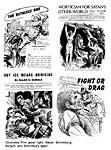
Adventures into the Unknown: The Pre-code Horror Anthology, Nos. 9-12 Edited by Philip R. Simon with a Foreword by Michael T. Gilbert 224 7x10-inch pages, color throughout; Dark Horse hardcover, $49.99 THE THIRD VOLUME in Dark Horse’s resurrection of this ACG title from 1950 is, like its predecessors, a complete reprinting of four issues, including letter pages and ads as well as stories. While the stories are as entertaining as they ever were, the advertisements provide insights into the history of the industry itself. Here’s an ad for seat covers that “add instant class to your car.” So ACG expected those who bought this title to be car owners as well as horror fans. There are also ads about body building and blackhead removal and hair care and Fleer’s bubblegum. ACG also expected adolescents to buy their books. The quality of reproduction is fair to good, depending, doubtless, upon the quality of the source material. Some fine lines are lost or blotchy, but much is surprisingly well done. Artists rarely signed their work in those days, so while we know from signatures which of the stories here Ogden Whitney and John Belfi drew, we have to take at face value the back cover’s assertion that other stories were drawn by Bob Lubbers, John Celardo, Lin Streeter, Edvard Moritz and Charlie Sultan, whose names otherwise appear nowhere. Gilbert’s Foreword is a nostalgic trip back through some ACG books he read as a youth, most of which are not represented in this volume.
TICS & TROPES Women and Men in the Age of Political Correctness: She is not a “babe” or a “chick”: she’s a Breasted American. She is not “easy”: she is Horizontally Accessible. She is not a “dumb blonde”: she is a Light-haired Detour off the Information Superhighway. He, meanwhile, does not have a “beer gut”: he has developed a Liquid Grain Storage Facility. He is not “balding”: he is in Follicle Regression. He does not act like a “total ass”: he develops a case of Rectal-Cranial Inversion. It’s not his “crack” that you see hanging out of his pants: it’s Trouser Cleavage.
BOOK REVIEWS Critiques & Crotchets
In Love with Art: Francoise Mouly’s Adventures in Comics with Art Spiegelman By Jeet Heer 136 4.5x7.5-inch pages, b/w with a 16-page color section; Coach House Books paperback, $13.95 JEET HEER HAS AN IMPRESSIVE command of the language, a good, solid basic understanding of the arts of cartooning, and a fundamental grasp of the history of the medium. And he needs all three in abundance to make his understanding of Francoise Mouly’s talent into a booklength publication. Heer undertook this project because he felt he had slighted Mouly in an article he wrote ten years ago about her husband, Art Spiegelman. To make up for it, he’s produced this “slender volume” with its embarrassingly personal pun for a title. Heer’s basic contention is that Mouly, apart from her own considerable ability as an artist, has achieved eminence as an art editor (of both RAW, the experimental comics magazine she produced with Spiegelman, and The New Yorker, where she has been responsible for the magazine’s covers since 1993) by reason of her artistic taste and political acumen and her ability to coax artists to improve their efforts. None of these qualities are readily exemplified by aspects of her work. So Heer is, by necessity, driven to making sweeping proclamations without much obvious evidence to support them: His book, he says, will “make the invisible visible to show how Mouly’s editorial fingerprints can be seen on every project she works on. She brings rigor and imagination to the craft of editing and in doing so proves that editing can be more than a craft—it is, at best, an art.” Nicely said, but are there any specific examples of her artistry as an editor? Or he draws far-fetched conclusions from whatever evidence is handy. The daughter of a surgeon, Mouly often watched her father operate and was fascinated by his hands, a fascination Heer claims was “a valuable lesson in creativity.” Later, he goes on extravagantly: “It’s not much of a metaphoric stretch to say that, as an editor and book designer she ultimately did become a kind of surgeon, nipping and folding pieces of paper rather than human skin. The tools she learned to use in the surgical theater are the same she uses at her drafting table: markers, knives, scissors. ... Prior to Mouly, this type of surgical, literary editing of comics simply didn’t exist.” And again: “Eventually, she would give that most esteemed of grand dames, The New Yorker, a face lift.” With the foregoing as testimony to Heer’s command of language both concrete and figurative, his gift for expressing the ineffable is perhaps a foregone conclusion: “Mouly’s training in the European Beaux-Arts tradition made her more responsive to physical beauty, to images that have an eye-pleasing surface or panache, a visual flamboyance or joie de vivre”—a quality evident, Heer says, in the European artists recruited for RAW. Or, again: “Other editors can function like obstetricians and midwives, helping the birthing process, but Mouly has to act more like a fertility doctor, intervening in the very moment of conception.” What happened to the surgery of her editing? Extravagant as his verbal conceptions sometimes are, they are nonetheless impressive, forceful, memorable. He is undeniably an adept stylist, but he sometimes leaps to conclusions he likes, ignoring contradictory evidence (or the absence altogether of any evidence). He believes that “part of the power of comics is that they enter our lives early, before we can form any biases against them.” Nice poetry but is there any actual evidence to support this contention? He sees that Spiegelman’s ability to ape the drawing styles of others was a “cameleon-like dexterity [that] would become Spigeleman’s hallmark as a cartoonist.” Most young, aspiring cartoonists imitate the work of those they admire—that’s their apprenticeship in the art—so Spiegleman is not particularly unusual in this ability. And I think his hallmark as a cartoonist is his playfulness with the forms of the medium rather than his ability as a copyist. . And Heer thinks Chris Ware’s “aesthetic” was formed by “absorbing and synthesizing the lessons” of RAW. (Heer thinks it a “cosmic fluke” that “the cartoonist’s name contains the mirror image of the magazine: WARe = RAW.” I suppose Heer would think it cosmic that RAW is the last three letters of dRAW.) I’m not convinced by his statement that Chester Gould’s “skill at diagrammatic clarity helped codify comics as a type of picture writing.” Comics as picture writing was well established long before Gould did Dick Tracy. And what, exactly, is “diagrammatic clarity”? Heer thinks Dave Sim’s Cerebus the aardvark was a “mashup of Howard the Duck and Conan the Barbarian.” Yes to the latter, but Howard came long after Cerebus. I’m not sure Spiegelman did cartoons for Playboy as well as Screw; the latter, yes, but the former? Heer’s sense of command sometimes leads him to statements that are flat wrong or highly debatable. He thinks Milton Caniff and Noel Sickles developed their famed chiaroscuro style in imitation of Hollywood B-movies. Sickles, who inspired Caniff, had something else in mind. He was disappointed in how badly his drawings appeared when reproduced on newsprint. In an article published in Cartoonist Profiles, Sickles said he remembered Monet and the other Impressionist painters he had studied as a youth. He had been impressed by their handling of light. And he sought to formulate an Impressionistic technique using only black and white. And Heer sees Charles Schulz as entering a “long creative decline in his late career.” Others hold the same view, but I disagree: I think Schulz was innovating all along, perhaps not as spectacularly as at first, but inventive still. Heer sometimes overlooks insightful sidelights. Spiegelman’s invention of Topps’ Garbage Pail Kids series was inspired by the insane popularity then of the Cabbage Patch Kids; hence, he was being satirical. Heer’s understanding of how comics work is often insightful if sometimes more pyrotechnical rhetoric than mental gymnastics.
HEER IS AN
ADHERENT of one of the more distracting theories about how comics work.
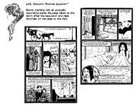
Discussing Spiegelman’s “Nervous Rex,” a lampoon of the newspaper strip Rex
Morgan, M.D. in which Spiegelman supplies contradictory or satirical visual
information beyond the picture that is within panel borders, Heer notes the
cartoonist’s belief that “the gutter between the panels is often where the real
action of a comic takes place.” This is akin to the theory of “closure” that McCloud expounded on before anyone else did in 1993 his brilliant deconstruction of the medium, Understanding Comics: The Invisible Art. Essentially, the idea is that when you have a succession of two panels, the second (which I’ll call B) depicting a continuation of the action initiated in the first (A) forces the reader to imagine what actions are taking place between A and B—in the space between panels, usually called the “gutter.” The notion of “closure” (the imaginative act that closes the distance between the two panels) as an ingredient in comic strip art stunned the comics scholar community, which, since it was unable to understand how comics worked, assumed “closure” was the “open sesame” that would fling ajar the door of cartooning behind which were all the secrets so far hidden from them because they were in plain sight. For McCloud, the space between the panels is the place where the reader participates in the story—imagining what was happening between the pictures. “Participation is a powerful force in any medium,” McCloud said. “Closure in comics fosters an intimacy surpassed only by the written word, a silent, secret contract between creator and audience.” Closure appeared to be a revolutionary concept. And the scholarly community adopted it with such enthusiasm that many theorists assumed that closure was where comics had their being. Comics were the “invisible art,” the space between the pictures, where there is more truth than in the pictures. It’s a persuasive notion for people who don’t otherwise understand comics. But a passionate commitment to closure as the key to all comics secret locked doors blinds students of the medium to the other ways comics work. It’s true that the reader imagines what happens in the space between panels A and B, but his/her imagination is severely restricted: the reader cannot imagine a different panel succeeding A. Panel B dictates what the reader can imagine. The notion of closure, while conceptually accurate, is of no value to criticism. It makes more active participants of us all in reading comics. But acknowledging our participation does not reveal much about the other ways that comics work. Heer, like many other comics theorists, contends here that “what is implied or imagined outside the drawings [in the panels] is as important as the marks the artist gives us [in the panels].” But without the marks in the panels, we would not be compelled to imagine anything. Caveats aside, Heer is otherwise often brilliant in his descriptions or understandings of comics art. His
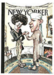
analysis (aided and abetted by Mouly) of how Barry Blitt’s nefarious
Obama fist-bump cover works extends the meaning of the “marks on the page” with
precision and understanding. The cover “parodied all the racist paranoia about then-presidential candidate Barack Obama. ... Mouly maintains that its power came from the fact that it invented no new calumny but rather gave visible form to widely circulated innuendo—which became absurd in the very act of being depicted. “What makes Blitt’s cover a meta-image,” Heer says, “is, interestingly enough, The New Yorker logo. The vilification of the Obamas that Blitt visually articulated already existed in the broader culture, but putting it on the cover of The New Yorker made it inescapably tangible, and the onus fell on the viewer to figure out that the lies were being presented as risible and not truthful.” (And the scandal that arose promptly upon publication of this cover art demonstrated how risky it is to depend upon the viewer to figure things out for himself.) We can put up with a lot of wrong-headed theories and a smattering of erroneous history for the sake of such insights as Heer offers in his fist-bump analysis. But the reader of this book must know when the insights are merely theoretical rather than inspired by misapprehended history. When Heer confines himself to facts (often picturesquely, memorably, recited), he is much more dependable. If you want to know Mouly’s upbringing in France, how she came to the U.S. and what she did upon arrival, how she met Spiegelman and fell in love with him, why she pushed Spiegelman to publish RAW, how she became art director of The New Yorker, and how they collaborated in creating the most memorable magazine cover in the wake of 9/11—black twin towers against a slightly different shade of black sky, a ghostly apparition of the disaster—this is the book to consult. And you won’t be disappointed. No feminist tract, Heer’s book is nonetheless a vivid demonstration of the equality at least of this woman in the realm of creative cartooning and illustration.
LONG FORM PAGINATED CARTOON STRIPS Called Graphic Novels for the Sake of Cultural Status
Zombillenium By Arthur de Pina 48 8.5x11-inch pages, full color; 2013 NRM hardcover, $14.99 ON THE OPENING PAGES of de Pina’s graphic novel, we meet Aton, a mummy, trying to hitch a ride along a highway. Cars stop, but when he approaches them, the drivers see his wrapped visage and speed off. And it doesn’t help when his thumbing hand falls off. Brief as this orientation is, you will quickly conclude that this book is not a serious attempt to climb onto the band wagon of the walking dead zeitgeist: it is, instead, an amusing mockery of the genre. The mummy’s friends, a skeleton and a vampire, drive by, coax him into their vehicle, and they all head out for Zombillenium, “The Family Amusement Park for Chills and Thrills,” where they all work, as does an impressive array of other ghoulish monsters who are the entire staff of the place. En route, our trio accidentally drives into and kills an ordinary civilian, Aurelian Zahner. Aghast, Sirius, the skeleton, and Francis, the vampire, revive the youth: Francis bites him, bringing him back to life—but as a vampire. Once he’s transformed, he has no choice but to apply for work in the Park. He is interviewed by a werewolf, Andrew, who, saying “we have enough vampires,” bites Aurelian, whereupon he becomes a werewolf. Francis, outraged, bites Aurelian again and he becomes a vampire again. Andrew bites him; Francis bites him. Werewolf, vampire. That’s more of the sort of comedy with which de Pina has, er, infected this book. And there’s ordinary comedy, too. In his previous life, Aurelian attempts to rob a local bar but is foiled by the witch Gretchen, who turns his pistol into a banana. Later, Aurelian becomes a demon capable of increasing his size to skyscraper when necessary, and I’m pretty sure he and Gretchen have a thing for each other. Whatever it is, it’ll doubtless be developed in the next of the volumes de Pina imagines for a six-book series. In those books, we’ll confront with the Park’s employees the crisis they face: that monsters are no longer scary and that the troupe of dancing zombies choreographing a recreation of Michael Jackson routines is no longer pulling in the crowds. De Pina, interviewed at comicbookresources.com, thinks the dilemma his monstrous characters face is based upon an evolving cultural truth: zombies and their ilk are no longer seen as creatures of evil. Says de Pina: “It's my opinion that, in pop culture, fear has ‘moved’ from horrible creatures to some expressions of sadism, cruelty, dehumanized behaviors, such as in films like ‘Saw,’ ‘Human Centipede,’ ‘Hostel.’ Zombies have just become old romantic figures and their purpose is not to be the face of evil anymore, but to mirror of the consumer society, like in the brilliant ‘Zombieland.’ They even fall in love in ‘Warm Bodies’! ‘The Walking Dead’ may look like the last exception, but in the comic, the biggest threat comes from the humans.” And so he takes the opportunity to have fun with the monster concept. Apart from the skewed perspective, the book is gorgeously rendered. “I draw exclusively on Adobe Illustrator 9.0,” de Pina said, “which is a very old version of the software, but to me, still the best one! I don't make sketches or roughs, but compose my page and place the dialogue. The artwork is drawn directly on screen, but each and every line or shape in Illustrator is always removable/redesignable/recolorizable/resizable, so you don't have to care about missing your first trace. Every object or character is a combination of shapes and lines, every line is a sequence of points, and every point is changeable at any time. I sometimes spend 20 minutes just to adjust Gretchen's chin.” Despite
his allusion to linework, there are no lines in Zombillenium: the
pictures are all made simply with flat but evocative colors, as you can tell
from the pages reproduced nearby. A Paris-based cartoonist, de Pina started his career in animation (short films, character design and TV series) but moved to illustration when he discovered “the great vector software [Adobe] Illustrator which is still the one and only tool I use nowadays. Even though I was pleased to give life to my stories, I felt a little bit frustrated when I realized how hard it was to make sequels. Making five minutes of animation can take two years of your life, which is not enough to me. Not enough to create a big story, develop the characters, create a whole universe. That's why I (and a lot of other European ex-animators) decided to switch for comic books. My first ones were talking about sex, and then I got interested in zombies and underseas animals. To me, comic book writing is the best way to share what's in my mind. Animation is sometimes too industrial, illustration doesn't allow much timeline to develop the characters, so I make books.” The second and third of the Zombillenium books are out in France. Says de Pina: “The second book talks about the relationship between monsters from the park and the humans (peasants, farmers, etc.) who live outside. It's the classic theme of, ‘Who are the real monsters?’ We also follow a very special family who come to the park as visitors. The question about the hiring in the park is a little bit answered. The third book starts the story of the park itself. We learn how it works, why it has been created. In this book, the danger does not come only from outside, but from within the park, with the appearance of a new character: a consultant who happens to be also a vampire with long, long teeth.”
Madison Square Tragedy: The Murder of Stanford White By Rick Geary 80 6x9-inch pages, b/w; NBM hardcover, $15.99 ANOTHER IN GEARY’S meticulously researched and elegantly rendered series, A Treasury of XXth Century Murders, this tidy volume rehearses the sensational murder of New York’s celebrity architect Stanford White on the evening of June 25, 1906. White’s murder was no mystery: scores of witnesses saw Harry K. Thaw shoot him while he was attending the open-air theater atop Madison Square Garden, a landmark building he had designed. The crime was followed by “the trial of the century” in which Thaw’s wife, the gorgeous showgirl Evelyn Nesbit, related (in lurid detail) how White seduced and despoiled her (albeit before she was married), a despicable act that drove her husband to kill White to avenge her honor. Geary begins his tale with short biographies of the three principals. White is revealed as a 50-something self-indulgent man-about-town with a taste for young women and a specially-designed boudoir in his apartment. Evelyn Nesbit is a young girl with no particular theatrical ambitions whose beauty nonetheless advances her career on the stage—initially, with the active encouragement of her mother. Harry Thaw is a spoiled rich boy whose use of drugs exacerbates the weaknesses in his personality. In his unique restrained, step-by-step manner, Geary traces the activities of the trio on the night of the murder; and with equal care, he briefly covers each of the three trails that finally resulted in Thaw being declared sane and acquitted of all charges. In the remainder of the book, Geary tells what happened to Thaw, whose violent life style continued to earn him headlines until he died in 1947, and to Evelyn, who survived a miserable existence largely by exploiting her fame. Evelyn, by the way, is the inspiration for Charles Dana Gibson’s famed “The Eternal Question,” a portrait in which Nesbit’s hair-do forms a question mark. She is also indirectly responsible for advancing the career of Nell Brinkley whose first assignment after her 1907 arrival in New York to take a job with the Hearst’s New York Evening Journal was to cover the trial and testimony of the beautiful young woman. And Brinkley was very good at drawing beautiful young women. See Opus 253 for all of the Brinkley story (or get Trina Robbins’ book on Brinkley, which is reviwed at Op.253). Geary’s careful drawings are the perfect accompaniment to his narrative style. In his pictures of the actors in the drama, he often depicts them as nearly emotionless automatons, their faces as deadpan as his narrative. His fastidious linear shading suggests tintype imaging, imparting to the tale a period aura. Just seeing how he models figures and faces with simple lines offers one of the great treats available in the study of the visual arts. As a concluding sample, here are some of his pages.
Century West By Howard Chaykin 64 7x10-inch pages, color; Image paperback, $7.99 THE THING YOU’RE LIKELY TO NOTICE FIRST about Howard Chaykin’s graphic novel Century West is the rapid shifting of camera angle and the breakneck pace of the dialogue. The thing you’ll notice next is the plethora of racial and ethnic slurs that litter the paginated landscape like maggots on a three-day-old corpse—nigger, hebe, sheenie, yid, kike, coon, dago. Perhaps the only sparkly scrap of prose in this connection is when one character says to another (both Jews): “The only thing we have in common is we’re both ashamed you’re Jewish.” Chaykin clearly thinks he can get away with this kind of verbal bigotry because he’s a Jew. But I’m not sure everyone reading this tripe realizes that—that and how simply, purely, even-handed he is in dishing out the scurrilous argot. Underlying whatever might be mistaken for a plot is the theme of identity. The book begins when a benighted gunslinger comes into town, gunning for Ranger Bob Ford in the mistaken conviction that the Ranger Ford is the Ford that shot Jesse James in the back. The call-outs of the would-be champion of Jesse James run through the first of the six-chapter book like a chorus until Ford blows him away with a Vickers machine gun. While this is happening, the town is invaded by the twentieth century in the shape of (a) a fast-moving automobile, (b) a motion-picture crew, ( c) the Grand Wizard of the KKK, (d) a Russian filmmaker, and (e) a passel of Pinkertons looking for the “nigger” who formerly played piano in a New Orleans whore house and a “gentleman of the Hebrew persuasion” who robbed someone in New York. These two fugitives just happen to be Ranger Ford’s deputies, and when they settle the hash of the bigoted Pinks, the camera-man gets it all on film so it can be used in the movie they’re making. Fake realism, the theme of the book. The tumbling confusion of the story with a tangle of subplots is compounded by an avalanche of names, flung heedlessly into the unfolding plot without hitching first names to last or vice versa—Ford’s deputies, Yael Tabackin and Pendergast Barron, Sergei Chernecko, Kincaid Munn, Sylvia T’ornhill (or maybe her first name is Melba?), Mignonette DeGallante, Wesley Sherwood McBride, Van Dyke Eckhardt, Puckett LaSalle, and a Mr. Pacifici, who shows up only on the first couple pages whereupon it appears that Chaykin is going to launch into a defense of women’s rights, beginning with the right of whores to birth control—a worthy cause that Chaykin abandons as soon as the Bob Ford hunter shows up. Throughout, Chaykin deploys what has now become a standard and predictable but once revolutionary page layout that carries the visual aspect of the story forward in short, single-page increments: beginning often with a scene-setting squint of a panel across the top, Chaykin goes next to a stack of close-up panels on the left inset against a medium range shot to the right; we read down the left, then over to the right, then drop to the bottom, which often consists of another page-wide panel.
The close-ups are so tight that we see little more than the pictured person’s eyes and nostrils, scarcely enough visual evidence to ascertain identity, and for the sake of visual variety, Chaykin embroiders each facial feature with enough quirky anatomical and fleshy detail to destroy distinction in a mesh of superfluous itty-bitty lines. Despite the pyrotechnics of Chaykin’s pictures, the story is carried more by dialogue than visuals. And the dialogue is typical Chaykin patter, crammed with verbal witticisms and sexual innuendo and ethnic slurs and thought fragments (typical of the way people speak in life but not very helpful in defining plot in fiction). The whole thing is a perfect storm of too many characters, too many names, too many people who look too much alike in tight close-up to be easily sorted out—which we must do based upon the scraps of evidence offered in a tale that is advanced at the lurching rate of one episode-to-a-page-then-shift-to-another-venue-for-the-next-page/episode. The book ends with the town’s citizens watching the movie made during the preceding pages of the book. The captions drone on as the pictures alternate between what’s on the screen and the horrified faces of those in the audience: “These pictures are so outsized, so otherworldly, they have no more connection to human scale than Michelangelo’s David—my mother won’t know her own son.” His identity has been evaporated. On the next, and final, two pages, a character who may be Bob Ford and maybe not (can’t tell from the close-up) says: “The world I knew is gone, and that photoplay is all that’s left of it. The West, the wilderness, the frontier I love, is fading away before our eyes. That world—what we called the Wild West—the world we tamed—all so these people can make a damned movie of it.” All of which may be true as a purely philosophical proposition. But this ending is laminated on the story at the end, and nothing in the story itself leads to this superimposed conclusion. None of the action shows us “the wilderness, the frontier” worthy of love. All we see is confusion—in many forms, including the confusion of reality with celluloid fiction. As I mentioned several opuses ago when I first came upon mention of this book, Chaykin originally created this tale for Disney Italia, but when the proposed tv series fell through, he reworked it all into this 64-page graphic novel—better drawn and colored than some of his other recent efforts (say, particularly the drawing, Satellite Sam). The story combines Chaykin’s affection for the old west with his passion for movies, focusing on the 20th Century arriving and “steamrolling over the 19th Century against the backdrop of the once-sleepy town of Century, Texas,” as reported TJ Dietsch at comicbookresources.com. Each of the Texas Rangers is an emigre—one from Saskatchewan, one from New Orleans and one from New York City. According to advance notices, each of the Rangers, in his own way, faces the 20th Century assault on their traditional way of life. But I couldn’t tell that from the action in these pages. The black guy’s “traditional way of life,” f’instance, would be, at the close of the 19th century, slavery; but Chaykin’s black guy is a wise-ass smart alec who takes no guff from anyone. Admirable, but not the “traditional way of life” for an African American at that time in our history. Including Hollywood in the mix reveals a typically quirky Chaykin belief that “the movies were the last great creation of the American West—ultimately, the West was tamed so that it could be filmed.” Much as I applaud the satirical implications of this remark, the truth of it is, as I say, superimposed upon Chaykin’s tale rather than being an organic conclusion of it.
***** CHAYKIN OBVIOUSLY THINKS he can get away with heaping up racial and ethnic slurs because one of the ethnicities being slurred is his own. Some others of the advanced thinking ilk believe that you remove the awful power of a slurring word by using it all the time. You blunt its effect until it no longer has a cutting edge. I’m reminded of the African American comedian Dick Gregory who entitled his autobiography Nigger, he said, so his mother would know every time she heard the word that they were talking about him and his book. In a recent biography of comedian Richard Pryor, Furious Cool: Richard Pryor and the World That Mad Him, authors David and Joe Henry conduct an “authoritative meditation on culture,” says reviewer Tom Chiarella at Esquire.com, when they reach the 1971 night when the 31-year-old star took a stage in Berkeley and referred to himself, again and again, as a “nigger.” Years later, reports The Week on Chiarella’s review, “he would excise the word from his act, but pop culture would never be the same. Pryor had taken a vicious slur and turned it into an emblem of black power: the power to say something that a white performer couldn’t.” True, I think. But Pryor himself eventually saw the word as more harmful than beneficial. Why else excise it from his act? Leonard Pitts, Jr., a syndicated African American columnist at the Miami Herald, recently took up the question of the “old context” argument: “It’s okay if we African Americans say nigger, but it’s not okay if you uncolored folks say it.” Phooey, says Pitts. “Some of us think there is cause for dismay when women, gay people or any put-upon people adopt the terminology of their oppressors as self-definition. ... [But] the N-word is not like the words used to denigrate” other groups—gays, Italians, Jews. “The experiences those peoples endured in this country do not compare with those of African Americans. “The N-word is unique. It was present at the act of mass kidnap that created ‘black America,’ it drove the ship to get here, signed the contracts at flesh auctions on Southern ports as mother was torn from child, love from love and self from self. It had a front-row center seat for the acts of blood, rape, castration, exclusion and psychological destruction by which the created people were kept down and in their place. “The whole weight of our history dictates that word cannot be used except as an expression of contempt for African Americans.” I think Pitts is right. Chaykin can argue that his use of the terms of denigration in his story is simply a gesture at realism: people talked like that then. Maybe so. But this kind of grab at realism is the sort that can get too real: it gives new life to old nastiness. And I submit that we’re better off without it. We can’t—and shouldn’t—deny the unpleasant parts of our history. But that doesn’t mean we should revive them and wallow in them at the slightest provocation. Or for the slightest reasons. In Century West, Chaykin makes anti-Semitism and racial bigotry active elements of one of the subplost: the Pinkertons go looking for a person “of Hebrew persuasion” and a “nigger.” And both of the characters of those despised groups triumph over their ignorant racist foes. Symbolically, those blighted miscreants end up shooting each other. So the “Pink” perpetrators of the slurring subplot get their just deserts. Neatly tied up. All well and good. But other characters who lace their everyday speech with slurs aren’t punished. Chaykin gives one anti-Semite a slap in the face when he arranges for another character to say Jesus was a Jew. That’s not enough. Despite the punishments he metes out, Chaykin has created a fiction in which these derogatory terms are used mostly with impunity—and without punishment. Besides, the larger story exists quite independently of this pejorative sideshow of alleged authenticity. And the larger story would not suffer in the least if Chaykin had left those words out. Moreover, even the sideshow of bigotry could be preserved without invoking the exact terms by which it is perpetuated. It wouldn’t be so easy, though, as the method Chaykin has chosen.
READ AND RELISH “Dammit I’m mad is dammit I’m mad” spelled backwards. And if that ain’t enough to make you mad, I dunno what is.—Anon, as far as I know ■ Given the biological differences that separate and unite the sexes of the human (sic) sapiens, if a woman shows up in a dress that displays her cleavage, we—the male population—are obliged to stare at it unabashed and for as long as possible. To do otherwise is to frustrate the purposes for which different genders were devised and insult the cleavage baring representative thereof. In other words, don’t be timid about looking at their tits: they want you to.—RCH
FUNNYBOOK FAN FARE Four-color Frolics An admirable first issue must, above all else, contain such matter as will compel a reader to buy the second issue. At the same time, while provoking curiosity through mysteriousness, a good first issue must avoid being so mysterious as to be cryptic or incomprehensible. And, thirdly, it should introduce the title’s principals, preferably in a way that makes us care about them. Fourth, a first issue should include a complete “episode”—that is, something should happen, a crisis of some kind, which is resolved by the end of the issue, without, at the same time, detracting from the cliffhanger aspect of the effort that will compel us to buy the next issue.
The Sandman Again THE
EXTRAVAGANTLY PINED FOR return of Neil Gaiman to the source of his
initial fame, the Sandman, has finally commenced, after months of ballyhoo. The
Sandman Overture is here and destined to go on for five more issues. My ignorance is even more profound: I read only The Kindly Ones of the original Sandman run so my knowledge of the Sandman Universe is severely restricted. In reading the current undertaking, then, I am apt to see it unencumbered by hard-breathing memories of past performances. It will not be, for me, a nostalgic experience, and things that Sandman fans will see in the work I will miss entirely. Hence, the failure or success of Overture will depend, for me, entirely upon what is on the pages before me and is readily recognizable or decipherable. Not a lot, as it turns out. The issue is divided into about six distinct episodes. In the opening sequence, following some profundities about “a small planet” with its diverse population, we enter a flower garden in which one of the flowers, a black-stemmed plant with an stark white blossom, is perplexed by having found nothing wrong but knowing there is something “very wrong.” On the next page, the flower burns up—dies—screaming, but the narrator for the nonce, a flower named Quorian, doesn’t know who has died. Next is a two-page episode in a 1915 London shop or office in which a young clerk attempts to help a newly arrived customer, who wears sunglasses (in 1915?) and a white suit and seems to know the young man’s name, Ian Stuart. They agree to meet when Stuart gets off work—at nine o’clock—at the Dirty Donkey, a pub across the street. (In Stratford, there’s a pub called the Black Swan that locals call “the Dirty Duck”; so is the Dirty Donkey just another name for Black Jackass?) After that, we witness an encounter between a cloaked and hooded personage (who, I eventually decide, is Destiny) reading The Book of Fate (or The Book of Destiny) when he is interrupted by the arrival of his sister, who is never named but who I have determined is Death, attired in Victorian raiment (perhaps the best picture in the book, all of which is drawn by J.H. Williams III). She tells Destiny that she’s worried about Dream, whom she has just “taken.” (He’s died? That’s obvious only if you know she’s Death. And since she’s never named, how are we to know? Only if we are dedicated Sandman readers.) The book’s central episode begins on the next page. It is inaugurated by our introduction to George Portcullis, a man with a portcullis for a face, who is minding the London office of the Master, who shows up in top hat and floor-length cloak (all black) and announces that he is expecting a visitor. The Master is doubtless the Sandman, although that’s not immediately clear. His visitor, when he shows up, is the man with the sunglasses we met earlier; his name (the only character formally named in this opus) is Corinthian, whom the Sandman says he created. But the Corinthian has disappointed the Sandman and so he says he is going to “uncreate” him. The Corinthian (whose eyes, behind the sunglasses, are a full set of teeth) begs for a trial by a jury of his peers (and while he talks, he helps himself to some knives that the Sandman has on the premises) whereupon the Sandman excuses himself, saying all that must wait until his return. The Corinthian then announces that he is going to kill a young man and eat his eyeballs (to replace the teeth in his eye sockets?). Perhaps the youth in question is Ian Stuart, with whom the Corinthian has that nine o’clock appointment. Or not. The
Corinthian’s arrival at the Master’s London office occurs just after we see him
either leaving the Dirty Donkey or arriving there. And if the latter, “there”
seems to be the Master’s London office. Deliberate mystification. Time is being
messed with. What is Past and what is Future? Meanwhile, the story follows the Sandman (who, we decide, can be identified by his black speech balloons with white lettering and quavering outlines) as he floats off towards a turreted neighborhood. Before he arrives there, we meet Lucien, the Sandman’s librarian, in conversation with a man whose head is a carved pumpkin. Pumpkinhead (who, Sandman fans will recognize, is Merv Pumpkinhead) is smoking a cigar and recalling his argument with Sigmund Freud about cigars sometimes being just cigars (and not phallic symbols, as Freud typically sees them). After which, the Sandman, donning some sort of uniform or mask or both, jumps into space, proclaiming himself “Dream” and falling into a spectacular but meaningless four-page foldout spread which is populated with an assortment of weird characters, most of whom wear around their necks or affixed to their chests the red amulet that the Sandman is shown wearing in his previous appearances herein. A couple of the characters (one of them, a cat) speak in black balloons with quavery outlines. In the midst of the ensemble is a pair of gigantic hands, the wrists of which are adorned by distinctive cuffs. Is this all we see of the Sandman? Or is it not he? After the four-page foldout, we are on the last page of the first issue, where the Sandman appears in the bottom circle of a stack of three circles, the top one depicting a frightening leather mask with a snout—the same mask as is worn by the creature on the cover of this issue (who looks like a nightmarish Big Bird). The Sandman says merely, “What?” And a concluding caption tells us that the next issue is “a concatenation of dreams.” The book’s central episode shows us that the Sandman is an admirable person: he is about to “uncreate” the Corinthian, who we learn is not admirable—he plans to kill someone and eat his eyeballs. In contrast, then, the Sandman is a good guy—and we admire his intention and his restraint and determination. Provocative cliffhanging elements abound. We would like to know if the Sandman, Dream (Morpheus), is, as Death asserts, dead. Who, exactly, is the Corinthian going to kill (Ian Stuart?); will the Sandman “uncreate” him before he can commit this ghastly deed? But there is no crisis that is resolved, nothing that displays the personality and character of the story’s protagonist in a way that lets us know him—and like him—better. The nearest we get to such a resolution is when the Sandman exits his London office, having promised to “uncreate” the Corinthian. But he doesn’t do it, and the Corinthian’s grisly grimace at that juncture suggests he’s going to use those knives he’s purloined to disembowel Ian Stuart and remove his eyeballs. While cliffhanging suspense is the mechanism for serial fiction of this kind, Gaiman has laminated into this first issue entirely too much mysteriousness—mostly in the form of unexplained relationships or characters. Still, we like the Sandman enough to want to see how it all turns out for him. And we need answers to the questions I asked a paragraph ago. It’s a passable first issue if not, quite, a good first issue. The book is more cryptic than captivating.
FOR THE UNINITIATED READER, that is. For Sandman fans, this tome is a trove of hidden or disguised delights. For instance, having learned the speech-balloon “tell” for Sandman, we know that the white-blossomed black-stemmed flower in the opening sequence is a stand-in for the Sandman because the flower speaks in black balloons with white lettering. Or maybe it’s just the Sandman himself in a difference guise. And he dies screaming? The climax of the issue—that ostentatious four-page gatefold—seems wholly meaningless to me, the consummate uninitiate. In fact, the gatefold seems to exist chiefly to stun us with its extravagance (blatant evidence of Gaiman’s literary rock star status: only a writer of his stature could demand—and get—such an expensive layout). But knowledgeable Sandman fans—like Oliver Sava at avclub.com—see reason where I see nothing. Sava sees all of the characters in the spread as “variations of Dream drawn in the styles of Pablo Picasso, Gustav Klimt, Jack Kirby, Bruce Timm” and others, which makes the layout “a wonderful game of ‘spot the influence,’ and I can’t wait to see the next issue when we see these characters and their varied visuals in motion.” It is precisely this sort of in-group knowledge that festoons the book, baffling the uninitiate. How is the casual but interested reader (like me) supposed to know that all these characters are manifestations of Morpheus? Is that red amulet enough of a clue? Don’t think so. In conversation with Sava at avclub.com, Jason Heller thinks the four-pager “feels completely unearned and shoehorned into the story.” My opinion exactly. But whether or not the four-page splash is organic to the story or superimposed upon it, it is undeniably a fine flourish of virtuoso visuals by Williams. He varies his rendering manner occasionally to suit the moods of different episodes, and his style is often a little too prissy in pinched-face visages for my taste and overly fussy about tiny details. But he’s without question a past master at his craft. Gaiman is pleased with Williams’ work, and Gaiman is not, I suspect, easy to please. His writing method for comics he describes as giving “stage directions.” But it seems, from his description of it at onpoint.wbur.org, much more than mere stage direction. His comics script is “a 10,000 word letter to an artist.” He describes in exhaustive detail the visual content of every panel. His stage direction is apparently a prose essay of modest literary artistry. My guess is that he leaves very little to the independently functioning imagination of the artist. So when we see that the panels of the Corinthian’s office encounter with Ian Stuart are drawn as teeth in a mouth, we can be sure that Gaiman specified this treatment. And when the Sandman is getting accoutered for his trip to the four-pager and the panels are shaped like the letters M-O-R-P-H-E-U-S, that’s Gaiman, too. While Heller finds much to admire in the book, he also senses that Gaiman is simply “moving down a checklist of what Sandman fans want.” Even so, Heller looks forward to “wandering around with these characters, soaking up their atmosphere.” Indeed, this is a book for Gaiman’s Sandman fans. It is, after all, a prequel—the story of how the Sandman came to be captured at the start of the first Sandman book. And who would be interested in a prequel but fans of its sequel? Gaiman may hope to attract others, but the reader in his mind is a longtime Sandman fan. And so the pictures are accompanied throughout by a steady drone of Gaiman’s pretentiously puzzling prose—from the small planet’s “race of huge carnivorous plants with limited mobility but beautiful minds” to “something is hurting ... something is waking up ... something is damaged” to “silent screams of the burning plant that go through Quorian like a gnawing worm” (screams that are silent?) to the Book of Destiny “bound in leather made from the hide of a beast that has never existed” to other self-contradictory mystifying impossibilities like “the only eyes that read the book are blind: they see only darkness and the contents of the book.” This is the sort of prose that has made Gaiman famous and rich. Lugubrious and meaningless. But poetic. And that, at last, is the clue to how to read, understand and, even, to appreciate Gaiman. The Sandman books are poetic in both picture and words. They stand as an extended reverie on death and the dream-like quality of life that ends in death. If I may be permitted a little affected prose of my own. And why not? If Gaiman can make up stuff, why shouldn’t I?
Zombie Archie ONCE YOU HAVE
a series of Archie Comics based upon Archie’s marriages called Life with
Archie, it seems only logical that there be another series echoing the
title and connecting to a current fad. And so we have Afterlife with Archie. About zombies. Nothing bizarre about that evolution—except that the title is
intended to be bizarre. In the first issue written by Roberto Aguirre-Sacasa, Jughead’s beloved dog is a hit-and-run victim, and Jug takes the animal to
Sabrina, hoping the delectable witch will be able to revive the creature. At
first Sabrina declines to try—saying such activities violate the witches’ code.
But she soon relents, and Jughead’s dog is up and running again, but this time,
he’s a zombie. And he bites Jughead, who shows up at the school Hallowe’en
dance as one of the walking dead—as we see here, just to the right of a
reproduction of the book’s cover. Drawing in the realistic pulp-retro style he deployed in his creator-owned Black Beetle, Francavilla drenches the tale in his patented blacks and stark reds and oranges and wild page layouts. Spooky stuff. And fun, too. In short, Afterlife with Archie is another triumph of deviation at Archie Comics. And I’ll buy the next issue (which is, of course, already out at your neighborhood comics store).
Velvet Ain’t Just Cloth ED BRUBAKER and his drawing partner Steve Epting are perpetuating the female spy/agent genre with Velvet in which a female undercover operative named Templeton (perhaps Velvet Templeton), whose daytime job is secretary in the spy agency, dons skin-tight leotards at night and takes on the bad guys with physical derring-do. She also sleeps around at whim and smokes pot. The story is told in the first person, Templeton’s, so we get a good insight into how she thinks—and she’s good at it. She’s also good at acrobatic combat. And Epting’s smooth and elegantly shadowed renderings make her both attractive and sexy (the latter without any of the lurid body shots that so often typify this genre; Epting concentrates on her face). Velvet also entertains a good opinion of herself, her only unattractive trait—egotism. One of the two completed episodes in the book shows how successfully Velvet can flirt and toke; the other shows her effectiveness at fighting her foes as she begins to solve the mystery that this first issue starts with—who killed agent Jefferson? While both justify her high opinion of herself, she emerges as a little too smug to be altogether likeable. And she must be likeable before we’ll come back for No.2. Jess Nevine, who writes prose essays on pertinent subjects for the Fatale books by Brubaker and Sean Phillips, contributes an article on the “history of spy fiction through the Cold War.” He begins with a 1684 novel and continues through Tom Clancy’s “techno-thriller” The Hunt for Red October, pausing en route for Somerset Maugham, John LeCarre, Graham Greene and Ian Fleming’s James Bond but conspicuously overlooking Peter O’Donnell’s Modesty Blaise, undoubtedly Velvet’s precursor in every respect. The idea of including such essays is, nonetheless, a good one. And so we turn over a Festive Glass for the season and for Good Ideas—Colorado Cola galore, the brand with the state flag on it.
WE’RE ALL BROTHERS, AND WE’RE ONLY PASSIN’ THROUGH Sometimes happy, sometimes blue, But I’m so glad I ran into you--- Tell the people that you saw me, passin’ through
Al Plastino, 1921 - 2013 By WILLIAM YARDLEY, New York Times In the heyday of Superman comic books — the late 1940s through the 1960s — Al Plastino drew scores of issues, earning $50 per page as a freelancer for the publisher that became known as DC Comics. In the late ’50s he helped create new characters, including Supergirl, and the Legion of Super-Heroes, and he drew the syndicated Superman and Batman newspaper strips. But in his telling, Plastino, who died on November 25 at 91 in Patchogue, N.Y., took his greatest pride in a single special issue, “Superman’s Mission for President Kennedy,” which he began drawing in 1963, before Kennedy’s assassination. The story, conceived with the Kennedy White House, paired Superman and Kennedy as allies in promoting the president’s new physical fitness program. The issue was not yet finished when the president was killed in Dallas that November, and DC initially decided to call it off. But after getting encouragement from the new administration of President Lyndon B. Johnson, the project went forward in revised fashion. For the issue’s cover, Plastino drew a flying Superman looking toward a ghostly, larger-than-life image of the president looming over the Capitol dome, where a flag is at half-staff. Also on the cover was a note explaining the story behind its publication. The last page included another note: “The original art for this story will be donated to the John F. Kennedy Memorial Library, at Harvard University.” For the next half-century, Plastino proudly told people that his drawings were in the library’s care. Then, in October, while attending Comic Con in New York, he was approached by a representative of Heritage Auctions who was excited to show him that Heritage had the original art and was preparing to sell it. The asking price was $20,000. Plastino was confused. Was the auction house selling it to make money for the library? No, it turned out; Heritage said it was representing a private owner who had bought it at auction at Sotheby’s in 1993 for $5,000. A few phone calls established that the Kennedy Library had no record of the art’s ever having been in the collection. It remains unclear how it ended up in private hands. “Al was just devastated,” said Dale Cendali, a lawyer who has worked with comic book artists and happened to be at the show. Ms. Cendali, working pro bono, sued to get Heritage to disclose the identity of the seller. The company withdrew the art from sale and returned it to the consignor, but it has not disclosed the seller. Ms. Cendali said in an interview that Plastino and his family had wanted the art to be available to the public through a museum or another organization, and that the family would consider dropping the case if the owner agreed to turn over the art. “We’re hoping the consignor will do the right thing under the circumstances,” she said. Alfred John Plastino was born on December 15, 1921, in Manhattan and grew up in the Bronx. His mother died when he was 6. His father, who made hats and sold them from a store on Fifth Avenue, often dropped his son off at the Metropolitan Museum of Art, where young Al would sketch Monets and Michaelangelos. And from there, Plastino went on to become one of the three classic illustrators of Superman, joining Wayne Boring and Curt Swan on the pedestal.
To find out about Harv's books, click here. |
|||||||||||
send e-mail to R.C. Harvey Art of the Comic Book - Art of the Funnies - Accidental Ambassador Gordo - reviews - order form - Harv's Hindsights - main page |

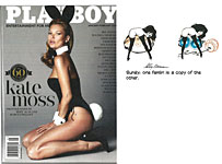
1.jpg)
2.jpg)
3.jpg)
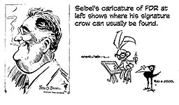
1.jpg)
2.jpg)
3.jpg)
4.jpg)
5.jpg)
6.jpg)
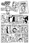
7.jpg)
8.jpg)
9.jpg)
