|
Noel Sickles is actually not unsung. In comics history,
he is widely celebrated for developing the chiaroscuro technique of
illustration that Milton Caniff
adopted and made famous in
Terry and the Pirates. But how and why Sickles developed this
way of drawing has not been the subject of much singing. Until now.
Now and here, where, snatched from the pages of my unpublished biography
of Milton Caniff, we have a few paragraphs that describe Sickles'
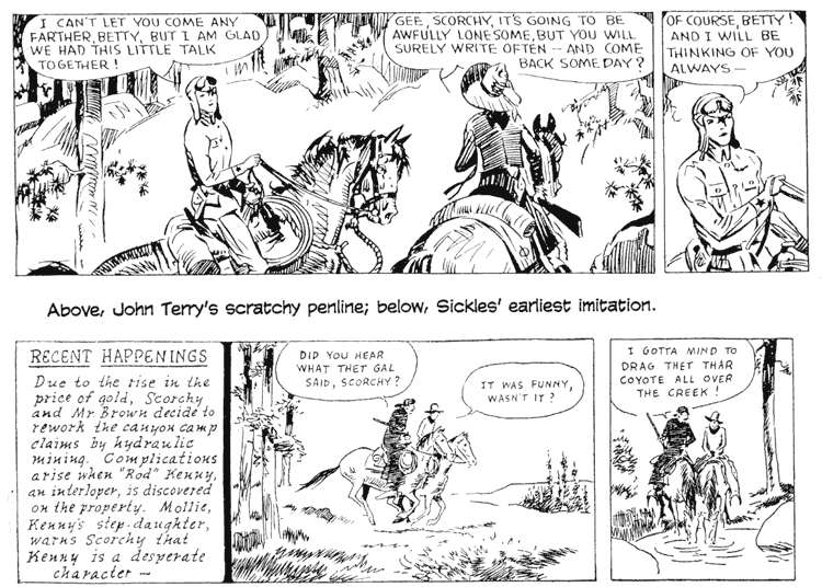
invention of his famed light-and-shadow technique. Scorchy Smith was
created in 1930 by John Terry
for the infant comics line-up in the Associated Press's Feature
Service. Debuting September 19, Scorchy was intended to invoke the
popular memory of Charles Lindbergh, the Lone Eagle who, just a few
years before, had flown the Atlantic solo and ignited the adulation
of millions. Terry contracted tuberculosis in 1933, and by the late
fall, he was too ill to work. Sickles, who had joined the AP art department
the previous spring, was tapped to substitute for the ailing artist.
It was, for Sickles, the consummate artist, something of an onerous
duty: Terry's drawing ability was primitive, and Sickles was instructed
to imitate it, which he did, smoothing off some of the rougher edges
as he labored over it. In place of Terry's scratchy, sometimes blotchy
line, Sickles introduced a simple line of unvarying thinness and enhanced
it with extensive diagonal linear shading. Sickles studied tearsheets from the AP member papers that
used Scorchy. He was appalled
at how badly many of the smaller newspapers were printed. His fine-line
shading was lost in reproduction, lines were broken or run together
in a muddy blotch. Whatever style he finally adopted would have to
be capable of surviving on the worst presses imaginable. But he had
other objectives in mind, too. He wanted a style that would make the
strip's drawings seem realistic. And he wanted to bring it out on
a page of comics. He knew that starkly contrasted black and white
would do that: heavy black areas always draw attention to themselves,
and the contrast with brilliant white areas would make the strip visually
irresistible. "The reason so many comic strips of that era looked
weak was that they lacked color," Sickles said years later as
he reconstructed the train of thought he had followed then. "Now,
color can be black and white. I felt they needed a greater contrast
of light and dark in the comics. Roy Crane, for example, was using
a lot of blacks but not in terms of light and shadows. What I saw
all around me were outline and solid blacks [used as color]."
In searching for a new style, Sickles remembered Monet and
the other Impressionist painters he had studied as a youth. He had
been impressed by their handling of light. And he began deliberately
to formulate a style based upon his understanding of the Impressionist
technique. Impressionist painters suggested, they did not delineate,
the appearance of things. The principle of the technique was simple.
In nature, there are no lines: the shapes, the edges, of things are
determined by contrasting colors, textures, and—most important to
Sickles—shadows. Everything casts a shadow, and parts of most things
are in shadows in varying degrees of darkness. In a daily comic strip,
there are only two "colors"—black and white. Sickles decided
to use black for shadows, a seemingly commonsensical decision. But
until Sickles began splashing black ink liberally into his drawings,
black was treated by most comic strip artists strictly as a "color":
a character would have black trousers or a black sweater. In Sickles's
strips, once he was fairly immersed in his new style, black was sometimes
a "color"; but more often, his strips seemed to contain
no such "colors"—only light and shadow. Imagine a character
standing in a room with a single source of light: half the character's
form would be in shadow. A man's face: the features on the light-source
side are drawn in fine lines with a pen, but the features on the side
away from the light are lost in black shadow. Only the high points—a
cheekbone, the top of an ear—catch the light, and thus they remain
tiny flecks of white in a liquid sheen of black. That's the principle. In practice, most of the faces of
Scorchy's cast were "in the light," but their figures were
half bathed in shadow. Everything had a side away from the light source—furniture,
appliances, automobiles, houses, people—so part of the shape of everything
was suggested with deft strokes of a brush dipped deep into black
ink, and unimportant props were all but lost in shadow. Sickles sculpted
shapes with nicks of black, the shadows etching the forms. Shadowy
folds on a figure's clothing, well done, define the figure; badly
done, everything is reduced to blots of black. Doing it well, Sickles
knew, required knowledge as well as drawing skill. "Once you understand structure," he said, "you
can draw anything, no matter what the angle. But a complete rendering
of every detail can be boring, and in some cases, it is less lifelike
than just presenting an impression of the object. The eyes don't see
a diagram. They see the shapes of the shadows left by the light source.
With just a suggestion of the shape, the object becomes more real.
That's what I was trying to bring to Scorchy." "The key to the style is eliminating unnecessary lines,"
Sickles explained. "Look at a Sisley painting. He's an artist
I think grossly underrated. You can't imagine how he could have achieved
the effects he did any more simply." As he began to bathe Scorchy
more and more in shadow, Sickles disciplined himself to draw as
simply as possible. To foreclose on the temptation to add more lines
than were necessary, he started using his brush first (a Windsor Newton
No. 3 watercolor, series 7), then his crowquill pen (170 or 303 point).
"After penciling in the figures and the backgrounds," he
once related, "I would work with the brush. With it, I would
fill in the shadows, the ones under the nose, the backgrounds, everywhere.
But I never used a brush on the outline of a figure or an object.
What fascinated me about Hal
Foster's work was his dry brush. But I never wanted to use dry
brush in a newspaper because it doesn't have the life of the pen line.
The pen has a mysterious quality of an outline and has a directness
lacking in brush line. Using the brush prior to the pen helps you
simplify your drawing. The style itself never seems to get old hat." But black and white alone, Sickles felt, was too startling
for the realistic feel he wanted. "I learned from photo retouching
when I was a staff artist in Sickles did not initiate his chiaroscuro technique overnight:
he eased it into the strip over a period of three or four months.
Although the fineline shading he'd been using disappeared suddenly
the week of Drawing was Sickles' passion, and the only part about doing
Scorchy Smith he liked was
drawing it. "Sickles was more concerned with method and technique
than with setting up a cartoon character whose name could become a
household word and provide a lifetime income," observed Caniff,
his studio mate at the time. And as long as Sickles felt challenged
by the graphic demands of the strip, he was happy. To keep himself
interested, he experimented with a variety of ways of rendering Scorchy.
Once he mastered the chiaroscuro technique he developed, he began
playing with other techniques. When he took Scorchy to the Canadian
north woods, he used the new chemically treated drawing paper, Craftint Duotone. Sickles created marvelously
photographic effects while he drew on this paper. Then he stopped
using it. He took Scorchy and his friends to the Meanwhile, Caniff's income grew as Terry's circulation increased. The AP's policy did not allow for its
cartoonists to share in whatever profits were generated when a feature
became popular. In fact, Sickles once said, the association resorted
to "corporate chicanery" to keep circulation figures secret
from its cartoonists. But Sickles was curious. He went to the AP's
exchange files and thumbed through all the newspapers to see which
of them ran Scorchy. He made a list. Counting more
than 200 papers on his list (many, small town dailies), he figured
that the AP was making at least $1,500 a week on the strip--of which
he was getting $70. Armed with this evidence, he demanded and received
a raise. To $125 a week. But even at that, his income was only slightly
more than half of Caniff's earnings. And Terry
appeared in only about 80 papers at the time (most of them, in contrast
to Scorchy's AP clients, big city dailies that paid high user fees).
Despite the irritation of this inequity, Sickles kept drawing Scorchy until the graphic challenge waned.
By the fall of 1936, it was waning fast. Sickles hated writing his strip's story, and he had mastered
all the rendering techniques he could think of for a newspaper strip.
He was bored and he seized every chance he had to avoid working on
the strip. "One of the reasons there are so many caricatures
of me by him," Caniff said, "is that whenever he'd get bored
or tired, he'd draw a picture of me. I never had time to draw any
of him. Dunno if I could have done it anyway. He was so good at it." Sickles got bored or tired with increasing frequency. He
often left his drawing board in the middle of a week's batch of strips
to take a break. Since he habitually put off doing the strip until
the last possible minute, his desertion of the drawing board at moments
like this raised blood pressures among his editors at the Associated
Press. "He'd just stop and go to the movies," Caniff
said. "And the poor Associated Press'd go out of its skull. They'd
call on the phone—Where is he? I'd say, I think he went to the dentist.
After awhile they'd say, Some dental work. Bud didn't care. He'd come
back and work all night to finish the stuff." In December 1936, Sickles and Caniff moved their studio
to the nineteenth floor of For awhile, Sickles continued to work for the Associated
Press, doing the daily "news" (editorial) cartoon for the
comics budget. But there was little in the assignment to challenge
him. The point of view in these cartoons, as always, had to be safely
anemic. And the drawing task alone was not enough to keep Sickles
interested. Finally, he quit altogether. "He did a lay-back for a whole year," Caniff reported.
Sickles felt he was missing an education, so he spent the time reading—economics,
philosophy, and history. He did a few freelance jobs to earn spending
money, and Caniff loaned him money, too, from time to time. When Sickles
decided to go back to work on a regular basis, it would be in illustration.
He made a profitable connection with a studio and was soon handling
several big accounts, Ford Motor Company among them. Sickles and Caniff
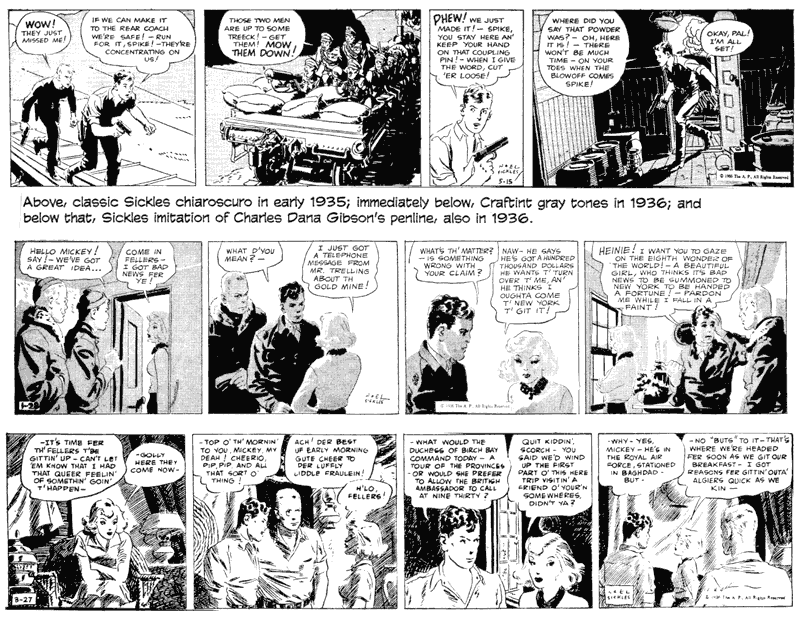
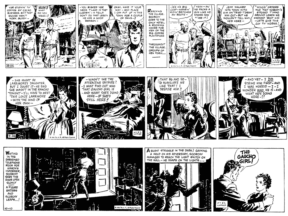
continued to share the Here, from Sickles' last months on Scorchy, are sample strips showing the virtuoso taking his final bows
in comics. In August 1936, he stopped using Ben Day, and the drawings
got more complex, more realistic, as Sickles achieved his effects
with linear qualities and minimal solid blacks. Then he began laying
in shadowy black again, heavy layers of it over drawings that are
now delicately etched rather than simply outlined as he'd been doing
while introducing the chiaroscuro mannerisms two years before. From
week to week, Sickles seems to be performing all the turns he'd perfected
over those last two years—Gibson pen-craft, chiaroscuro—all of it,
thrown into the mix for the finale. The strips reproduced here, not
consecutive but separated by several days, show him running through
the gamut of his illustrative repertoire, employing not only the penmanship
of a Gibson but the chiaroscuro of his own invention.
|
||