Seldom do we see a
signature that tells us more about the artist, his work and his vision than
Arnold Roth’s. The last name’s initial letter stands on one spikey leg while
the other, giving a chorus line kick, swoops down and around and curlicues into
the letter “o”—a corkscrewing, screwball “o” pinwheeling in on itself with the
fizzing frenzy of a July Fourth firework. The concluding “th” hangs there on
the end, lopeared and languid, the very soul of patience in a mildly insane
world. The “A” that launches the performance stands slightly askew while the following
“r” tilts askance in a looney opposing angle, joining the “A” at the top to
bridge an invisible inquisitive nose, and the other letters ravel down like the
ribbon on the lorgnette through which the artist peers at the world. This
happily jumbled calligraphy is affixed to a Roth drawing like an observant fly
on the wall, rubbing its legs together in satiric satisfaction over the lunacy
being committed before us. The fingerprint of the artist. An indelicate albeit decorative smudge at
the corner of the portrait.
Roth’s signature didn’t always
betray so vividly its owner’s antic attitude toward the world at large. As
revealed in Fantagraphics’ 2001 retrospective volume, Arnold Roth: Free Lance (still available at $22.95 at www.fantagraphics.com),
Roth once signed his name in an entirely normal manner. No curlicues, no
maniacal pinwheels. Just “R-o-t-h,” fini. The “A” in Arnold stood a trifle
akimbo, true. But for the most part, the letters in his name, strung together
in a nearly cursive line, marched along in orderly cadence. It is as if, with
maturity, the artist saw the world more clearly, and with clarity of vision
came comprehension: we had all gone a trifle mad in the mid-day sun, and our
foolishnesses deserved to be examined. Minutely. And the more Roth looked, the
more acrobatic his signature become, the more its letters danced crazily to the
music of the spheres that was, perforce, not so much musical as discordant. Or
so it would seem here in this fanciful prelude.
A prelude of extravagant metaphor,
no question; but there is something about Arnold Roth’s work that brings out
the extravagant in us all. And if it seems from what I’ve said that Roth has
changed as the years rolled by—that he became more sheerly perceptive and satirical—that
is but the trick of the metaphor. In actual fact, probably the world around him
has never seemed entirely sane to Roth. Throughout his work, we have his
risible gloss on civilization as we know it—or, more accurately, as we’ve tried
to ignore it, an enterprise Roth seems dedicated to undermine by making us face
ourselves. What he makes us see is not so much any congenital ugliness or evil
as it is a somewhat bent reality oddly inconsistent with our more exalted
aspirations. Roth’s satiric vision seems more attuned to highlighting the
nature of the human condition than to reforming it. He doesn’t want to change
us to much as he wants us to take some sort of perversely comical delight in
our own idiosyncracies as a species.
On the most straight-forward
unabashed level, Roth shows us exactly how a perfect lemon pie affects the
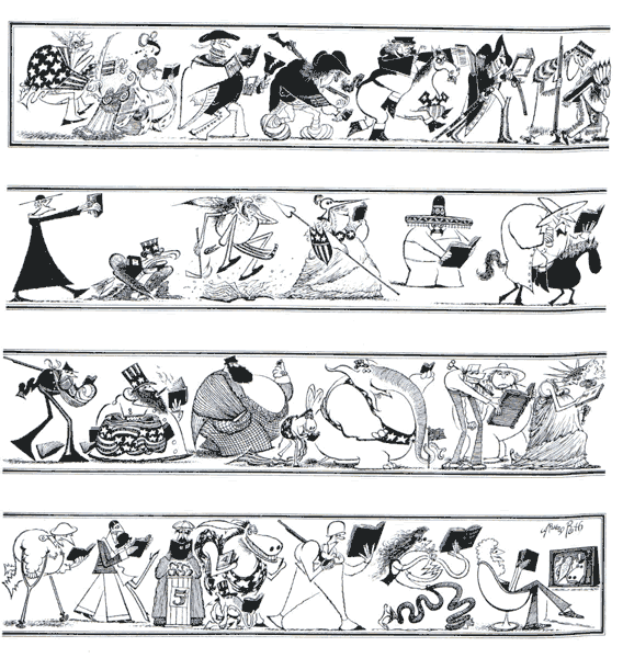
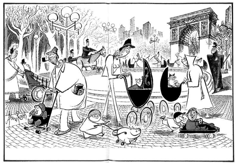
consumer in “Seasoned Cook: Lemon Pie.” Perhaps the best bird’s-eye view of
Roth’s sportive sense of anatomy is on display in the whimsical frieze of
readers he produced for The New York
Times Book Review as a “History of Reading.” In “The Original Pushers Return to
Washington Square,” anatomy is again shaped by the personalities Roth is
portraying—Greenwich Village types—and vice versa.
Pure cartooning. Funny pictures that complete the meaning of the
words and vice versa.
As revealed in his work, Roth is
clearly what many of us mean when we say “cartoonist.” He is a maker of funny
pictures—funny pictures often yoked to accompanying words. And vice versa. He
has been a cartoonist all his life, and for most of that time, he has
freelanced, snatching a living by hustling one assignment after another in a
highly competitive market, the wolf kept at bay by ingenuity and energy. And
talent. And luck, lots of luck.
“It’s great to try to be good at
what you do,” Roth told me when we talked in the fall of 2000, “but you can’t
try to be lucky. It sure helps, though. Of course, if you count only on luck,
you might be caught short if you have to back it up sometime.”
Roth had the luck to be born in 1929
on the cusp of the dawning Great Depression, and so he learned the survival
value of scrambling for gainful employment as he grew up. And Philadelphia was
a good place for a kid of artistic bent to grow up in. Roth and his older
brother (by four years) shared the same interests and frequented the cultural
environs of the Philadelphia Art Museum and the Philadelphia Library.
“From age seven or eight, we were
allowed to go anywhere in the city,” Roth said. “I think because there were no
neighborhoods worse than ours so our parents figured if we went someplace else,
we were safer.”
They went to exhibitions and shows.
They borrowed books from the Library. They attended events at the University of
Pennsylvania. For the rest of his life, whenever Roth did work for these
institutions, he did it as cheaply as he could by way of paying them back for
the free education he’d received. While a teenager, he worked in the Library,
first as a page and then as a repairer of books and bound volumes. As he
repaired torn pages in stacks of Harper’s
Weekly from the Civil War era, he studied the drawings that made the
magazine famous. He also saw cartoons in The
New Yorker and in Esquire (thanks
to an uncle who subscribed to the latter).
And he went to movies like any other
youth of the period. Unlike most, he fell in love with jazz and learned to play
the saxophone. “We always listened to music growing up,” he told Gary Groth in
an interview for The Comics Journal (June 1961, No. 142). “With six kids there was a different radio playing
different music everywhere in the house.” Although he took lessons briefly,
most of his learning about the saxophone was by observing other players and
talking with them.
Roth also drew pictures and sold a
few, and he worked in an “art factory”—a so-called studio that mass-produced
hand-painted works of art for sale in dime stores. And he worked in a toy
factory one summer: “I painted eyes on ducks,” he explained.
Upon graduation from high school in
1946, Roth was awarded a full scholarship to the Philadelphia Museum School of
Industrial Arts. But he finished only two years. “I was put on probation after
the first year,” he explained, “and expelled after the second.” But it wasn’t
for lack of talent; it was for lack of punctuality. He seldom arrived at class
on time.
“It was a strict school,” Roth said,
“and you had to be there at nine o’clock. And when I say I was late, I don’t
mean five after nine: I mean ten-thirty. That kind of thing.”
He was late because he had been up
until the wee hours of the morning playing in jazz bands around town.
Roth started freelancing artwork in
the summer of 1948, but music was his most dependable source of income: he
spent his nights playing in jazz bands around the city. By late fall, he had
been diagnosed with tuberculosis. “Somebody had to get it,” he quipped; “it’s a
whole disease.” In December, he entered a sanitarium, where he spent the next
fourteen months. While there, he read voraciously. And he drew a lot, sending
postcards to friends by the hundreds. He left the sanitarium in late January
1950 and re-enrolled in art school but left a month or so later to take care of
his mother, who was dying of cancer.
Upon her death in November, he and
his five siblings inherited $719 each, and he staked himself to a career as a
freelance cartoonist. He and ten other creative entrepreneurs set up a studio
in a 20x15-foot room in a historic building near Independence Hall. Many of his
studio-mates used the address as a mail-drop and never spent any time on the
premises. But Roth did. All week long, he prepared a portfolio of drawings to
sell. He hustled them around Philadelphia, and once a week, he took the train
to New York, a recognized Mecca for commercial artists, where he peddled his
wares.
Looking for any sort of work that
would yield an income, Roth did all kinds of menial artistic tasks for a time.
He did silk screen designs for Pennsylvania Dutch lampshades for Levittown. He
did cocktail napkins that were designed to be sold to habitues of nudist
camps. Once he took an assignment
whiting-out the specs that blemished velox prints. His only steady work was
with Temple University medical school for which he did leroy lettering on
medical charts. He did anything thrown his way. None of the jobs paid much, but
they paid.
“Eventually, I learned the obvious,”
he said: “not to go to places where I didn’t want to work. Although I was
hungry for every buck I could get, it’s a waste of time to go somewhere just
because they need artwork but not the artwork you do. I didn’t want to start
doing realistic illustrations or even stylized illustration, which is what they
would buy readily. I wanted to draw the way I drew and sell my thinking, too. I
wanted to do humor. And I was frothing at the mouth to get in The New Yorker.”
Toward the end of 1951, one of the
editors at The New Yorker manifested
great interest in Roth’s work. He invited the young cartoonist into his office
where he proceeded to go through his cartoons, making suggestions. Roth
responded in his usual flip manner.
“You know,” said the editor, “you
keep making wise cracks. Are you sure you understand what I’m telling you?”
“Well, I think you’re telling me I
should draw more like Sam Cobean,” Roth said. Cobean had just died in an
automobile crash. He was celebrated for his “naked eye” cartoons in which
thought balloons over men’s heads revealed that they were usually mentally
undressing the women they were looking at.
The editor was somewhat ruffled.
“You have to make up your mind if you want more than anything in the world to
be a New Yorker cartoonist,” he said.
“No,” Roth said, “I want to screw
and drink and smoke and cock around.”
The editor stared at Roth. He
repeated his question with deadly seriousness. Roth told him no. The interview
was over. And Roth never went back. But forty years later, he would be asked to
contribute.
Impolitic as the youthful cartoonist
had been, he knew what he wanted. And he knew what he didn’t want. The New Yorker was notorious for editing
cartoons—suggesting changes, so-called improvements in the composition or the
drawings. And Roth didn’t want to spend his energies re-doing his drawings. He
still doesn’t.
“I don’t like to preliminary
sketches,” he said. “I don’t like to do things over and over. I don’t work well
under those circumstances. That doesn’t mean that I’m always right and they’re
always wrong. But it’s my work. I
have to make my mistakes my way, and when I make it good, make it good my way.
Other people can work the New Yorker system, and they do terrific work. I would have been miserable. I’d rather work
in a grocery store—but I’d like to say where the cans go.”
The
New Yorker was launched in 1925 on the champagne vapors of the Jazz Age (as
one wag put it), its founder a gap-toothed unkempt hobo newspaperman named
Harold Ross, who, despite his bucolic appearance, midwifed a sophisticated and
literate humor magazine aimed directly at New Yorkers. Although Ross famously
disavowed any interest in readership by the little old ladies in Dubuque, the
magazine nonetheless became a national phenomena as well as the country’s premiere market for
cartoonists. It was and is a cartoon showcase. “If you went looking for the
best American gag cartoonists,” Roth said, “they were for sure in The New Yorker. They didn’t have every
good cartoonist, but they didn’t have any bad ones.”
Had Roth been published in the
magazine, his career would have taken flight and soared as a result. But he
realized very early that if he drew cartoons based upon the “corrections” and
suggestions of others, he would sacrifice the very spontaneity and invention
that made his work uniquely his own. He learned to set ground rules early in a
relationship.
“I tell them, if you want my best
work, the work you’ve seen, this is how I do it,” he explained. “I won’t do
preliminary sketches for advance approval, and I won’t draw what they tell me
to draw. They can’t give me the idea. I won’t make piddling changes. They have
to trust me. I’m not going to do a cartoon about a rainstorm if the story is
about furniture. If it’s a new magazine or I don’t know the people very well,
I’ll ask them if there are any taboos, if there’s something that is a sin to draw.
I just don’t work well under any other circumstance. I tighten up. I get to be
too careful. I start considering too many ancillaries. It takes the mickey out
of the job.”
To do his best work, Roth must be
free to follow his maniac muse wherever it might lead him. Pursuing that muse
is the fun of the work. That’s why Roth is a cartoonist—for the fun of the
work, for the mickey in the job.
“I made mistakes in the beginning,”
Roth admits. “But I was working for people who weren’t paying me much. And I managed
to avoid people who wanted to do the drawing. It’s like a band leader telling a
guy what to play in his jazz chorus. If you have to tell him, he shouldn’t be
playing in a jazz chorus to begin with. If I’m not doing it right, I don’t
belong in the business. And if I am in the business, I’ll know more about it
than they do.”
In 1952, Roth started getting lucky.
He began finding better outlets for his work. It was a watershed year.
Charm magazine began buying spot drawings at ten dollars apiece, two a month. “It
kept me going,” Roth said. And by a “pure fluke,” he got in on the ground floor
with TV Guide.
Launched in 1948, TV Guide was initially directed at a
New York viewing audience. But by the middle of 1952, it was moving toward
national distribution, which it achieved when it was acquired by Walter
Annenberg’s Triangle Publications. A special dummy issue of the magazine was
being prepared as part of TV Guide’s conversion for a national audience, and Roth did a drawing for that issue.
Walking down a street in
Philadelphia one day, he ran into an ad agency friend who was working on the
dummy issue. “He was desperate because they were in a big hurry,” Roth said.
“And he said, ‘Could you do a pencil drawing—if we give you the information—of
where the tv cameras will be for Eisenhower’s inauguration?’”
Roth did the pencil drawing and,
later, the finished version for publication. His second drawing for the
magazine—a picture of a man on a roof sprouting tv antennas—was so well
received that he began getting regular assignments with TV Guide. It became a steady account, and his relationship with the
magazine continued until Rupert Murdock bought it decades later.
With increasingly regular
assignments, Roth felt financially confident enough to marry Caroline
Wingfield, an artist he’d met at art school. They were wed in October 1952.
About that time, Roth met Paul Desmond and the rest of the Dave Brubeck
Quartet.
He and Caroline frequented the jazz
clubs in Philadelphia, so Roth knew the Brubeck group was in town for five
weeks, but he didn’t expect them to show up at his studio. One of the
photographers sharing the room had advertised a camera for sale, and when
Brubeck and his cohorts saw the ad, they chipped in to buy the camera as a
birthday gift for Desmond, who had developed a passion for photography.
Although the Quartet wasn’t as famous as it would become, Roth recognized them
as soon as they walked into the studio, and this chance meeting led to a
life-long friendship with Desmond—and to numerous lucrative assignments doing
album covers for the Quartet and others.
It was the Quartet’s first swing
through the East, and they made Philadelphia their base. Desmond would often
dine at the Roths’ apartment. Afterwards, they’d go to the club where the Quartet
was playing, and Desmond would pick up the tab for the Roths. “Sometimes he’d
come over to the apartment with food,” Roth remembered; “we just didn’t have
any money. And my wife would cook it.”
Once Roth had done a few album
covers for the Fantasy Records releases of Brubeck music, he had proofs of his
work and could get similar assignments at other record companies, including,
eventually, Columbia Records. Then in 1954 came another lucky break.
Roth arrived at the offices of Glamour magazine late in the afternoon.
At first, the art director told the receptionist he wouldn’t see Roth, but then
he suddenly came out and wanted to look at Roth’s drawings. He browsed through
the portfolio and then said:
“Would you sell all of these
drawings?”
“Sure,” Roth said “—that’s what
they’re for.”
“I just had a double-page spread
killed,” the man explained, “and we have to go to press tomorrow.”
The drawings were all humorous, not
gag cartoons, and without any particularly unifying them. But Glamour printed them all and gave them a
theme, entitling the double-page spread, “New Talent of 1954.”
At about the same time, television
began to emerge as a vast new outlet for advertising. The new medium had a
voracious appetite for material, and animation found an enthusiastic welcome in
commercials. Roth was soon into it. In 1955-56, he started contributing ideas
and character designs to an outfit named Storyboard, Inc. Started by John
Hubley, one of the founders of the UPA animation enterprise and a creator of
Gerald McBoing-Boing and Mister Magoo, Storyboard manufactured material for ad
agencies to use in tv commercials. With steady sales there plus TV Guide, Charm magazine and a few sales
to Esquire and elsewhere, Roth was at
last earning enough money to say that he was making a living as a cartoonist.
Feeling fairly secure in his profession, he and Caroline started their family
with Charles Perino, born in 1956, and Adam Wingfield, in 1958. About the same
time, Roth made his big break-through.
Hubley had two cartoonists on staff
as art directors—R. O. “Bob” Blechman and Gene Deitch. Talking with Blechman,
Roth heard about Trump, which, at the
time, didn’t have a name. But it had an editor—or founder—and Roth knew the
reputation of the editor. Harvey Kurtzman did the kind of cartooning Roth did,
and Kurtzman was looking for people to help with his latest project.
Kurtzman was the comedic genius who
launched Mad comic book in the fall
of 1952 for Entertaining Comics (EC). Paul Desmond had introduced Roth to Mad. “He picked one up in an airport
when he was traveling around to gigs,” Roth said, “and he brought one to
Philadelphia to show me and said, ‘You gotta be reading this! This is great!’”
At the time, though—roughly
1953—Roth wasn’t thinking about comic books; he was aiming for magazines, the
“slicks” not four-color pulp. He didn’t pursue the matter then. But in 1956,
when Bleichman mentioned Kurtzman’s new project—and when Roth heard about it
again from New Yorker cartoonist Ed
Fisher—it seemed a promising venue.
By then, Kurtzman had moved beyond
comic books both physically and intellectually. During the first couple of
years with the Mad comic book,
Kurtzman had honed the device of parody into a weapon of sharply pointed
satire. Beginning with takeoffs of comic strips, movies, tv shows, and literary
classics, he expanded into the larger realm of popular culture generally. By
1955, Kurtzman had become increasingly impatient with the limitations of the
form. He converted the comic book to a magazine format, but he was soon lured
away by Hugh Hefner, publisher of Playboy, to produce a luxurious new satirical magazine that would deploy all the
resources of magazine publishing—color and photographs as well as cartoons and text—to achieve through elaborate
parody the ridicule of popular culture that Kurtzman aimed for. Hefner set him
up in his Playboy branch office, a
handsome row house on 38th Street across from the J. P. Morgan Library.
Roth went to see Kurtzman, and
Kurtzman immediately put him on retainer.
Kurtzman was sitting at a table in
an office, Roth remembered, and on the table was a sheet of paper with the
names of about fourteen young cartoonists on it. “And every one of those
names—which I could remember for years—belonged to cartoonists who would have great
careers in publishing or animation,” Roth said. “Harvey was great at spotting
people and giving them a chance.”
The first issue of Trump, cover-dated January 1957,
contained work by Mad alumni Wally
Wood, Jack Davis, and zany Will Elder as well as a host of others from
Kurtzman’s list—Al Jaffee, Ed Fisher, Russ Heath, Bob Blechman, Howard
Schneider, and Bill Ashman among others. Roth illustrated a Roger Price
article, “Why Christmas Is Nice.” The second issue (March) was more lavishly
produced with many more pages of color. Roth was now listed on the masthead as
“Staff Artist (Asst. Ed.),” and he contributed pieces mocking the Russian
tendency to claim epoch-making inventions as their own, the influence of ballet
on everyday life, and “Movie Scenes You Must Have Seen,” a send-up of celluloid
cliches.
Roth had continued freelancing to a
growing list of client magazines, but he produced a good deal more material for Trump, too—much of it put aside for
future issues of the magazine.
Alas, Trump was out of business before it hit
the stands in late 1956. The March issue was its last. The problem was a
nervous bank. Hefner’s success with Playboy had established him as the boy genius of Chicago, and that was good enough for
the bank for a while. But Playboy was
making an expensive move into new offices at the time, and a brief recession
resulted in a dip in the magazine’s advertising and sales revenues. Moreover,
it wasn’t a good time for magazines, and when the venerable Collier’s magazine folded in January 1957,
the bank refused to renew the Hefner’s line of credit. To absorb loses, Hefner
stopped drawing a salary for awhile. And he killed Trump, which by then had run its loses to $95,000.
But Kurtzman and his crew had almost
tasted success. Kurtzman told Roth that he expected Trump to be making money by the fourth or fifth issue. Kurtzman
wanted to continue the crusade, and he was able, without much effort, to
persuade five of his cohorts to join him in a partnership to publish another
national satirical magazine. Elder, Jaffee, Davis, Roth, and Kurtzman’s
lifelong production manager, Harry Chester, signed on. Hefner, feeling
contrite, gave them free office space in his new Manhattan headquarters at
Madison and 57th Street, and the partners put up cash as well as talent to
publish their brainchild, Humbug.
Humbug was a much more modest production than Trump: it was smaller in size and page count, and it was published on cheap newsprint
paper. But it, too, was a doomed effort. Just as it debuted, the biggest magazine
distributor in the country folded. American News Service owned newsstands in
hundreds of transportation centers and most of the best corner locations in big
cities. Kurtzman, Roth recalled, tried to see beyond the immediate tragedy:
“Look,” he said, “we’re not in the worst trouble: The New Yorker doesn’t have a distributor!”
Casting about for an alternative,
the partners found an operation in Derby, Connecticut, which, Roth suspects,
had a more than incidental relationship with unsavory underworld types. The
magazine struggled along for eleven issues from August 1957 until August 1958.
“We really went through hardship to
do it,” Roth remembered. “We were all young. We had young children. And I was
doubled-up like crazy because I had to make a living. But still, my heart was
in the magazine. I even borrowed money to help—from the Brubeck guys, their
record company. We had a lot of talent and a helluva nerve but we had no
brains. Everything really did conspire against us. But Harvey, being Harvey, when
we were getting it all together, he would say, ‘Gee, I just had a horrible
thought: if this makes a hit, we’ll have to keep doing it.’ I said, ‘Harvey:
don’t worry about that now.’”
Kurtzman would pursue his dream in
yet another low-budget production, Help!, which lasted for twenty-five issues, coming out irregularly until August 1965.
Roth contributed occasionally, as we’ll see anon. And when Kurtzman and Elder
teamed up to produce the world’s most lavish comic strip, the painted
full-color Little Annie Fanny, for Playboy, starting in October 1962, Roth
occasionally helped paint Elder’s pictures. But by this time, Roth was in
demand in numerous other publications and had less time to devote to lost
causes. Still, he regards his time with Kurtzman on Trump and Humbug as the
biggest break he had.
It was a signal if not salutary
experience not just because of the fellowship of the crew but because of their
focus. “I was doing purely humor,” Roth said. “And it wasn’t just piece-work:
it was filling up the magazine. Although I’ve always done funny ideas, this
wasn’t just one album cover for which you create an idea suitable to the
subject and then go on to the next, which would be something completely
different. And so that was one of the best things that ever happened.”
He enjoyed working with Kurtzman and
learned much from him. Kurtzman had a reputation for meticulousness, for a
fastidiousness in layout and rendering that carried perfectionism to an wholly
impractical extreme. When editing the adventure comic books and Mad for EC, he produced detailed layouts
for every story, and he demanded that the artists follow his layouts precisely.
But he didn’t do layouts for Roth; Roth did his own.
“Harvey and I used to argue and
fight all the time,” Roth said, “although we were in absolute philosophical
agreement, our ways of working were very different. I’ve always thought, Well,
if it’s not that hot, you do another one. But Harvey wanted to hone and re-do.
And I’ve never worked well in that way. I want to do it and then do another
one. So I’d say, ‘Harvey, I don’t want to have life where I’ve done one
terrific drawing. I want to do a lot of crumby ones,’” he said with a laugh.
“It’s just like the two Egyptian kids looking at the pyramids, and one saying,
‘Wow—you know how good we are at doing these now? Imagine how good we’ll be in
5,000 years.’” He laughed again.
His regard for Kurtzman was at least
as enduring as the Egyptian rock piles. And when he published A Comick Book of Pets with Scribner’s
in 1976, he dedicated it to Kurtzman—“the master.”
Another of the beneficial effects of
the Kurtzman adventure was that Roth started being published regularly in Playboy. Many of his efforts were
illustrations for articles executed in his usual maniacal manner. But perhaps
his most celebrated contribution to the magazine is a series that started in
the late 1970s, “The History of Sex,” a compendium of verbal-visual japes about
the most intimate of the relations between the sexes through the centuries.
In setting out on this project, Roth
made a deal with Hefner. He knew that Hefner had ambitions to be a cartoonist
himself when young and that he couldn’t refrain from making suggestions for
changes in cartoons submitted to Playboy.
(Jules Feiffer, among others, agrees that Hefner is a very perceptive editor of
cartoons. He often produces several pages of detailed critique with ideas for
“improvements” in a single cartoon with the sole intention of making the
cartoon work better, Feiffer said. “And often he would bring up things that he
was absolutely right about,” he added.) But Roth, as we’ve seen, doesn’t feel
comfortable working in that manner.
“I made a deal that if he didn’t
like something, I wouldn’t do it over, but I would replace it,” Roth explained.
“If you agree to changing things and doing them over, you’ll be doing it to
everything. I didn’t want to collaborate with Hefner. Although I admire and
value his editorial judgement, I think he can’t leave well enough alone. I only
had to replace a few things out of lots of cartoons I submitted. It was filthy
and fun--though I think with one or two exceptions, my favorite jokes were
clean ones: they had nothing to do with sex.”
But
when Hefner saw in the “Olympian Games” the picture of King Midas whose magic
touch had turned his penis to gold, he couldn’t stop himself.
“He sent a three-page single-spaced
letter,” Roth remembered, “about how he really didn’t want me to replace it, he
liked it a lot, but the only thing is, he didn’t like the way I drew the penis.
And Caroline opened it, I was working—and I was in a horrible rush on a job—and
she was reading this letter to me, and she’s dying laughing, and she says, ‘I
can’t believe this guy is heading a two-hundred million dollar a year business
and has time for this.’ She showed me the memo—with ‘From the desk of Hugh M.
Hefner’ at the top—and here was a sketch. It was three red lines—two parallel
with an inverted V on top. He’s showing me how to draw a penis! So I wrote back
and said, ‘You’re right. The way you indicated is the way to draw a penis, but
unfortunately that’s the way I draw noses, so for clarity sake—, he chuckled,
the conclusion of the sentence obvious. “And that was the end of that,” he
said.
He never cleared his ideas in advance. “At the magazine,” Roth
said, “they had no idea what was coming: every chapter, I would just do it. And
they’d ask me: ‘How long is this going to go on?’ And I’d say, ‘As long as I’m
paying tuition for my kids in school.’”
All of Roth’s “History of Sex” for Playboy has not yet not been published.
He has completed three or four installments that the magazine has yet to run.
The last chapter to be published appeared nearly fifteen years ago. Since the series began, Playboy’s attitude about frontal male
nudity has changed: Roth has had to change his art in some instances to
eliminate phallic offense.
Back in 1958 in the wake of Humbug’s collapse, Roth increased his
efforts to find more markets for his work. He sent three cartoons to Punch magazine in England. All three
were purchased. And he worked up an idea for a newspaper comic strip.
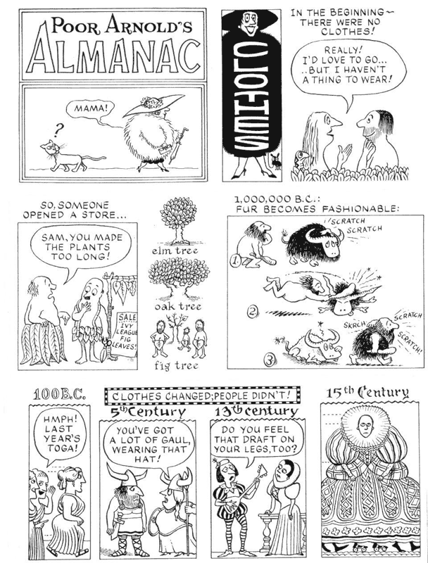
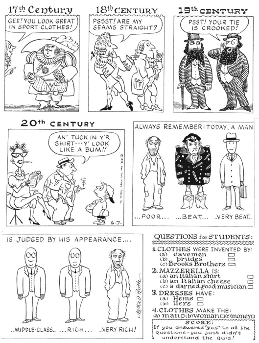
Called Poor Arnold’s Almanac, it was designed as a Sunday feature, and it proved to be the sort of cartooning Roth would be most adept at—and the kind he liked most to do. Like his later “History of Sex” series for Playboy, each installment of the Almanac picked out a single subject, and Roth played variations on the theme in the manner of a jazz musician. The opening panel announced the topic for the day, and in subsequent panels—sometimes one at a time, sometimes two or more in succession—Roth turned the subject this way and that, inspecting it from every angle and finding inconsistencies in human behavior and naked emperors everywhere he looked. Typically, his hilarities resulted from yoking pictures to words: the pictures revealed the comedy in the verbiage. But his format permitted him simply to play with words alone, punning and making lists and reciting with sportive abandon whatever drollery he discerned in some aspect of his subject. It was vintage Roth buffoonery. And he would eventually continue in the same mode for Punch and, as we’ve seen, for Playboy. It was the way Roth liked most to work.
He presented four completed strips
to Harry Welker, the comic editor at the New York Herald Tribune Syndicate, the
distribution operation of its namesake newspaper, the nation’s most literate
daily paper. Welker bought it immediately. The syndicate didn’t have many
comics, but what they had was quality—Johnny Hart’s B.C., Mell Lazarus’s Miss
Peach, Al Jaffee’s Tall Tales (which had just begun). Poor Arnold’s
Almanac started appearing on May 31, 1959. It was a regular gig, as Roth
put it—steady income. Living on what he earned with magazine work, Roth used
the Almanac money to pay off his dept
to the Brubeck record company. Within a year, he had discharged the debt, and
then he decided to go to England.
Roth had always wanted to go to
England, and now, with a regular check from his comic strip, he could afford to
risk the venture. Since he could live on the Almanac income, he didn’t need to hustle for work in the New York
magazine market. In London, he would supplement the syndicate income by doing
work for Punch, which had been buying
from him with some regularity. He packed up everything he owned, and he and his
wife and two kids moved to London in August 1960.
Punch was the English-speaking world’s most revered humor magazine—in legend, at
least, if not in fact as well. Allegedly launched from the back room of a
tavern in the summer of 1841, it was one of many British attempts of the day at
duplicating the satirical and comedic impact of La Charivari, a daily paper in Paris, founded in 1832 by Charles
Philipon, who had earlier (1830) achieved notoriety with a caricature of King
Louis Philippe in his weekly paper La
Caricature, the magazine that made caricature famous (due more to its chief
contributors, Honore Daumier and Gustave Dore, than to Philipon). At the time
of Roth’s initiation into Punch, its
editor was Bernard Hollowood, a sometime cartoonist himself who had served as
the magazine’s deputy literary editor and radio and television critic. The
soon-to-retire cartoon editor was Russell Brockbank (“a wonderful guy who was a
very good cartoonist himself,” Roth said), who had brought into the magazine
such personages as Ronald Searle, Francis Wilford-Smith (“Smilby”), Michael
Ffolkes, and Gerald Scrafe among others. A great many cartoonists were
connected to the magazine, but Punch needed
them: a weekly, it published about thirty cartoons in every issue.
Much of the planning for every issue
of the magazine occurred on Thursdays at a weekly meeting dubbed “the Punch lunch.” Like many things in
England, it had a long and mellow tradition. The meeting of editors, writers,
and cartoonists took place at a large table that could seat about twenty-four
persons. The table, sometimes called “the Mahogany tree” (because of a poem
William Makepeace Thackeray wrote about it in 1847), had been the possession of
the proprietors since about 1855. It is not a particularly ornate piece of
furniture; it is, rather, an inexpensive but sturdy piece of Victorian office
furniture in ordinary deal (not “mahogany” at all). Its distinction, however,
lays in the carved initials that adorn its surface. To symbolize the permanence
of the institution, “members of the Table” were invited to make their marks
thereon. The invitations were not lightly extended. By 1979—after over 120
years—only 79 sets of initials appeared, including those of such literary and
artistic lights as Thackeray, Searle, A.A. Milne, John Leech, George du
Maurier, Phil May, Malcolm Muggeridge, and John Tenniel. The only American by
then was James Thurber. Mark Twain had been invited to inscribe his initials
but declined, saying he would be quite satisfied to share the last two letters
in Thackeray’s beautifully executed monogram. (“Everyone assumed that he was simply too drunk to handle a penknife,”
Roth said with a chuckle.)
The meeting was an evening dinner
until 1925, when it became a mid-day meal. It began, without fail, in the
editor’s office with drinks, starting about noon. “There was about an hour of
boozing,” Roth said, “and then, you’d go into lunch, which was served by
liveried guys with white gloves on, one of whom looked like Mr. Punch. I always
thought they got him from central casting. The editor sat at one end of the
table, and the publisher at the other.”
The walls of the “banquet room” were
decorated with framed drawings from Punch and photographs of various dignitaries, including a painted portrait of
Mark Lemon, the first to edit the magazine single-handedly. (At the beginning,
the editorship was shared by Lemon and two others.)
The meal was a traditional
five-course Victorian feast, beginning with soup and including a hearty main
course like saddle of lamb and ending with desert and cheese, all lubricated by
bottles of claret. “You didn’t have to eat or drink for a couple of days
afterwards,” Roth said. “And by the end of the thing, everybody was pretty much
in the bag.”
In addition to staff members, the
company might include a special guest—a politician, entertainer, writer, or
other notable. During the meal, the conversation was general around the
table—general gossip, rude jokes, bad puns, obscene limericks, and other forms
of verbal horseplay. If there was a guest, that person might be queried about
an interest or activity. Eventually,
the talk would turn to current events, and staff members would comment on
aspects of the conversation.
“And so the editor would say, ‘Well,
good—why don’t you get me a hundred words on that for next week’s issue,’” Roth
said. “And then a cartoonist might mention something, and the editor would say,
‘Oh, yes—why don’t you do something on that?’ The meetings lasted most of the
afternoon. The editor told me that the next morning there were always all these
phone calls from people who’d been there: ‘Ah, I neglected to jot down the
subject you assigned to me.’” Roth laughed: “They were lucky they remembered
how to get home!”
Roth contributed exclusively to Punch for the next year. Although the
edgier Private Eye magazine invited
him to contribute, he didn’t. “I always
try not to draw for the competition if I’m doing a lot of work for somebody; I
don’t think it’s the right thing. It would just be egregious.”
Working for American magazines,
however, was not working for competitors. While in London, Roth received a
couple of assignments from Kurtzman, then producing Help! He went to Moscow and Berlin (“the pleasure domes of
Europe”) to do cartoon reportage. He also did a lot of color work for Esquire—illustrations as well as
cartoons. Then in the late spring of 1961, the syndicate rug was pulled from
under him.
Shortly after Roth renewed his contract
with the Herald Tribune Syndicate, he received another letter telling him that
his contract was terminated. Later, Roth found out that the newspaper and the
syndicate were quarreling, and the newspaper canceled Poor Arnold’s Almanac. Once the flagship newspaper no longer
carried a syndicated feature, it became difficult for the syndicate to sell the
feature. About forty newspapers carried the Almanac, but salesmen still had no way to counter the scathing comment they met with
many editors they visited: “If this strip is so good, why don’t you [the
syndicate’s home-base paper] carry it?”
Roth immediately wrote to another
syndicate to see if it would carry the strip. But by then, it was too late. “As
soon as a syndicate decides to kill you, they tell all the client papers that
the strip is ending,” Roth said. And all those papers promptly drop the strip
and put another in its place. Had he found out earlier about the impending
demise of the Almanac, he could have
negotiated a transfer of the feature to another syndicate that might have been
interested in acquiring a strip that came with a ready-made string of
subscribing papers. But since he was in England, Roth heard no rumors in
advance, inklings that might have prompted a salvage maneuver. The last strip
ran on May 14, 1961; it had completed two full years.
Roth continued producing material
for Punch and Esquire, but Punch didn’t pay well and Esquire wasn’t
regular enough. By summer, he was broke. In August, he packed up the family and
returned to Philadelphia (where he lived for the next two years, moving then to
Princeton, New Jersey, where he stayed until his 1983 move to Manhattan).
Within a couple months, Roth had hustled enough work to recoup an income and to
pay back the money he’d borrowed to finance the return trip from England.
He continued to do work for Punch by mail, occasionally making a
quick trip to London. Then in 1965, he inherited the magazine’s regular monthly
two-page feature, “Report from America,” which had been contributed for years
by P.G. Wodehouse, by then in his nineties. His report had slowly deteriorated
over the years until it consisted of little more than a miscellaneous
collection of clippings from U.S. magazines and newspapers. Bernard Hollowood
asked Roth to take it over.
“I wrote what I was sure were the
funniest two pages ever written in English and mailed them off,” Roth recalled.
“They came back and in red on top of the page in big letters it said, ‘You
fool, I meant draw two pages!’ My wife said, ‘Gee, they’re really angry at
you.’ I said, ‘No, if they don’t call you at least a swine, they’re not even
serious.’”
Roth did a monthly two-page spread
of cartoon reportage on American foibles for the next twenty-three years.
Deploying again the method he’d perfected in Poor Arnold’s Almanac, he examined such topics as the cutback in
funding of the National Endowment for the Arts, the struggle between smokers
and non-smokers, the jogging fad, hypocritical U.S. immigration policies, and
so on. As in the Almanac, he mustered
the entire arsenal of cartoon weaponry—single-panel cartoons, humorous
illustration, mini-strips of several sequential panels as well as a healthy
dose of verbal high jinks (like the delicious pun in the immigration report on
the “Open Dour Policy”). He loved doing it. The format was a perfect reflection
of his comedic sensibility; he was therefore stimulated to ever more prankish
flights of hilarity. And he enjoyed absolute editorial freedom.
“It was the perfect symbiotic
arrangement,” Roth said. “I knew I had to fill two pages every month, I did two
pages, I sent them in, they never said a word, they printed them, and then they
underpaid me. And everyone was happy!” He laughed.
Finally, in September 1986, the
ultimate accolade. Roth received a letter from Alan Coren, then the editor of Punch, inviting the cartoonist to sign
the Table next time he was in town. Next time? Roth turned to Caroline and
said, “Pack our bags—we’re going to London. Don’t want to miss this
opportunity.”
“What it meant was that I was
considered staff,” Roth told me. “And the staff is very small.” It was a signal
honor, and one that had been conferred upon almost no other Americans.
In the mid-1960s, Roth added Sports Illustrated to his list of major
outlets. The list would eventually number in the hundreds of publications,
including Time and Newsweek, Fortune and Forbes, Harpers, Gentleman’s Quarterly,
Holiday, Horizon, Life, American Health, Audubon, Modern Maturity, Mother
Jones, The Nation, Money, National Lampoon, New Woman, Parenting, People,
Premier, The Progressive, Psychology Today, Saturday Evening Post, Rolling
Stone, Smithsonian, Town and Country, and the Wall Street Journal and other newspapers, particularly in New York.
He became one of the most published cartoonists. Then in the late 1970s, Roth
had perhaps the most serious financial setback of his career.
He had concocted another cartoon
feature for syndication. Called Downtown, it was intended to reflect an emerging population shift. People were moving
back into city centers from the suburbs—single people. And Roth set his cartoon
locale in a downtown bar where all sorts of odd and engaging characters would
congregate. “The premise,” he said, “was much like the television show, Cheers” (which began in September 1982).
An agent placed the feature almost immediately with a syndicate, and Roth began
to cut back on his magazine work to give himself time to produce the cartoon on
a daily basis. He did about three months’ worth of cartoons, but the syndicate
kept stalling on releasing the feature, telling Roth all the time that it would
be launched “any day now.” Eventually, however, the enterprise collapsed
altogether. But by then, Roth had turned away scores of assignments. “And when
you turn away people too often,” he remarked, “they start to think you’re not
in the business anymore.”
Faced with near financial disaster,
Roth manufactured a flier and printed about a thousand to send to major
markets. He had sent out only about a hundred when he started getting assignments
again. In a few months, he was back on his feet, but Caroline had started
teaching art in public schools in the suburbs of Philadelphia to keep food on
the family board.
The 1980s was a good decade, Roth
said. Not only did he appear regularly in the pages of numerous national
magazines, but he was elected president of the National Cartoonists Society in
1983. The next year, the Society named
him Cartoonist of the Year and awarded him the Reuben. He had won NCS awards
previously for sports cartooning in Sports
Illustrated (1976 and 1977) and for cartoon illustration (1976 and 1979),
and he won the latter annually through the eighties (so regularly that he
withdrew himself from consideration after 1989). A member of the Society of
Illustrators as well as several city art directors clubs, he won many gold and
silver awards in the Society’s annual shows.
He appeared on the “Tonight Show”
with Johnny Carson several times and on the David Letterman’s “Late Show.” He
lectured at the Philadelphia College of Art, the School of Visual Arts, Pratt
Institute, Cooper Union, Parsons School, Princeton University, and Yale, among
others. He filled in for vacationing editorial cartoonists Bay Rigby at the New York Post and for his father Paul
at the New York Daily News, indulging
in a little political commentary as well as social satire.
Roth’s approach to editorial
cartooning is amiable rather than adversarial. He believes cartoons should
laugh the pompous off their perches rather than skewer them to the wall. The agenda
is to deflate not to destroy. For Roth, “liberal” is middle ground, not “left.”
“I’ve done a lot of political stuff
from the very left to—well, not the very right,” he told me. “Like today, I’m
working on a job for a magazine here which I’ve worked for steadily, City Journal, which is, I’d say, middle
conservative. Not a right wing. And they’re a pleasure to work for. I worked
for The Progressive for about a
year—that’s up in Wisconsin, the old Lafollette paper, and they’re pretty
far toward the left. And I’ve done work
for The Nation, too, which some say
is very left.”
By the end of the decade, his
regular assignment at Punch had
evaporated with the rapid turn-over of editors, so Roth revived Poor Arnold’s Almanac with Creators
Syndicate. This time, however, he avoided the mistake he’d made with Downtown: he continued to accept
magazine assignments while doing the cartoon. But this time, the strip was
daily as well as Sunday, and the combined magazine and strip workload was
exhausting. The circulation of the cartoon simply wasn’t great enough to
justify this all-out effort. Still, Roth carried on for almost two years before
he discontinued the Almanac. But
there was good news from other quarters.
In 1992, Tina Brown became editor of The New Yorker. This was an
extraordinary event in American journalism: not only was Brown a woman, but she
was relatively young (under forty), and she was English. A Brit, editing
America’s foremost literary journal! Unheard of if not altogether untoward. But
that was precisely the sort of sensation that she was capable of creating, and
upon such ploys she built a reputation and a career. Brown’s rise in
journalistic circles had been rapid—editor of England’s Tatler at age twenty-five, of America’s Vanity Fair at thirty—and spectacular: she revitalized both
magazines before moving on. And she would do the same at The New Yorker.
Brown had done some writing for Punch shortly after graduating from
Oxford, and she knew Roth’s work. Soon after taking the editor’s chair at The New Yorker, she invited him to
submit material. Lee Lorenz, then art editor (“cartoon editor”) for the
magazine, phoned Roth and said, “She’d like to see ideas.”
As always, Roth was loath to do
sketches. “I’ll tell you what, Lee,” he said. “I’d like to do double-page
spreads for you. Would you be open to them?”
Lee said he would, and Roth
continued: “Okay, I’ll just do a couple finished, and if you like ’em and want
to buy ’em, good. And if not, I’ll know this is not for me.”
Roth did two spreads in his
customary jazzman manner. The New Yorker bought one but passed on the one he did about bicycling in the city. Thereafter
Roth appeared sporadically in the magazine until David Remnick succeeded Brown
a half-dozen years later, and then the cartoonist started getting commissions
regularly, frequently for the magazine’s Back Page, a single page cartoon
feature.
“They call up and say, ‘Could you do
a Back Page?” Roth said. “And the way I work—I say, ‘Okay—do you have an idea
of the subject? Is it a theme issue?’ ‘Oh, no,’ they say; ‘we’d just like
something that goes with the season.’ And that’s the way I like to work. And
I’ll do sketches for them because with a commission, I know they’ll pay me for
my time and effort whether they publish the work or not. As I always say—if
they’d paid me to go to art school, I wouldn’t have been late,” he finished
with a laugh. “I’ve had thousands and thousands of deadlines and never missed
one.”
Some years later, casting about for
a subject for one of the Back Page commissions, Roth remembered the two pages
he’d done in bicycling. He edited it down to the customary single page
allowance and titled it “As You Bike It.” Another Back Page, “Animal City,” is
perhaps a better example of how Roth works because it was designed as a single
page, as a unified work.
The literal idea—the joke, the
humor—is paramount, but in the execution of the drawing, Roth strives for
aesthetic qualities as well as technical, narrative clarity. “I try to make the
composition attractive,” he explained, “so that the way I stage each panel and
where they are in relation to each other make an attractive, balanced
appearance. When I say ‘balance,’ I don’t mean axial balance. If there’s
heaviness or darkness here in one area, there should be something to balance it
elsewhere so the whole page will be attractive—so it will be appealing to the
eye—and will read easier.”
Although there are five separate
drawings in “Animal City,” each of them is related to the others in an over-all
design. At the same time, each individual
drawing is composed for narrative clarity. The rat in the first panel points
with his nose to the girl in the chair, the rat’s nose and the girl’s arm
creating a diagonal that leads to the speech balloon that, coupled to the
picture of the rat itself, makes the joke. The picture here, although humorous,
is not a joke without the words; and the words make no comedic sense without
the picture. The next pictures are all humorous in themselves. The huge dog is
contrasted with its master, a tiny woman; but the size of the dog and the
comparatively tiny plastic receptacle that she plans to use in scooping up the
dog’s deposit creates the comedy at the heart of this picture.
“I try to make everything be funny,”
Roth said, “but that huge face of that huge dog—I wanted him to look like a
digestion machine. And in the last panel, the visual joke is the contrast
between the running horse and the plodding one.”
And, again, the verbal content taken
in conjunction with the visual content creates a joke that neither words nor
pictures achieve without the other.
Given Roth’s attention to such
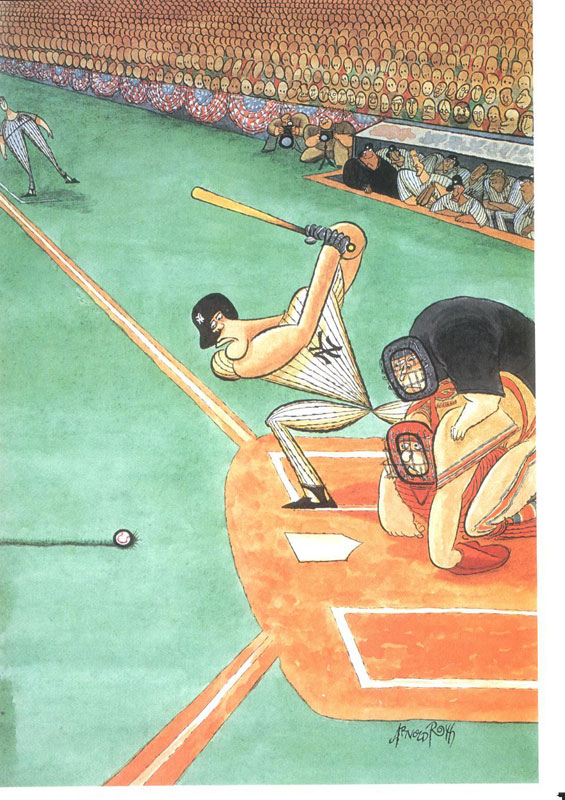
subtleties, it should come as no surprise that he was upset when The New Yorker moved the home plate in
his baseball drawing, “The First Pitch.” “It doesn’t ruin the drawing as a
baseball drawing,” Roth said. “But it reduces the effect. The whole idea is
that the ball isn’t making it to where everything is pointing. The directionals
emphasize the inertia of the ball: they exert a kind of pull on it. And moving
the home plate diminishes the pull that exists when all these pointers,
directionals, direct the reading and the eye toward the place where the ball
ought to be but isn’t. It doesn’t ruin the thing. It’s just it would have been
better the way I did it. My objection to them was that they didn’t tell me they
were going to move it.”
It’s not so much that the drawing is
better Roth’s way. But it is more satisfying to the artist. As he executed the
drawing, he was thinking about its design, and when the diagonals began to
converge, their convergence seemed to him to enhance the effect he was aiming
for and thereby increased his own delight at what he was doing. The humor in
the drawing works regardless of the placement of the home plate; but the subtle
refinement that is achieved by converting the entire composition into a giant
bow-and-arrow, perfectly aimed, is diminished, and the artistic sensibility is
therefore offended.
Every drawing represents an artistic
challenge as well as a narrative one. The cartoonist must not only make the
literal humorous point clearly—the narrative chore—but must make it in a way
that is aesthetically pleasing—to the artist as much as to the reader. In
meeting this challenge, Roth thinks like a jazz musician.
“I enjoy doing it,” he said. “I try
to give myself little problems. Brubeck, years ago, was on a symposium and
somebody asked him, ‘Would you describe what playing jazz is?’ And he said,
‘It’s getting yourself into and out of trouble.’ I thought that was a good way
to put it. If you’re not doing that, you’re really hacking it, doing the same
thing over and over. I always want to push it a little.
“When you’re illustrating,” he
continued, “usually there are givens. The subject matter. Whether I make up the
subject—let’s say biking—or it’s an article about bikes, you shift into that
gear; you start going through that channel. You start to gather pieces of the
puzzle. You might know what you want to do at the end—what the joke is going to
be. And a lot of times, there’s no real joke. It’s just exaggeration that is
funny—which is what cartooning is. But there are all these pieces that you want
to incorporate. And that to me is the fun of it; that’s very exciting. And
that’s where the art comes into it—doing an attractive or interesting or
effective drawing that somebody wants to look at—instead of turning away.
“When I illustrate,” he went on, “I
do a funny drawing about that subject. I won’t just illustrate an occurrence in
the story. I want the drawing to be comprehensible and entertaining apart from
the piece. My experience is that people look at the pictures first and then
they read the piece. If you’re a straight illustrator, you depict an incident
from the story, and the reader thinks, ‘Wow—that looks exciting.’ But what’s
the point of me drawing Joe putting his hat on the rack while Mary shoves her
lover out the back door? You can do that with a photo now. Straight
illustrators used to do those things. I figure my function is to entertain the
person and get them into the piece.”
In solving the gradually evolving
succession of problems that he sets himself in the process of creating a
drawing, Roth tries to avoid using “tricks,” a practice he fell into early.
“I had a great teacher in high
school who was a painter named Frederick Gill,” Roth said. “Composition was his
main interest and it’s always been mine, also—how to put things together to
make a picture and, in my case, to tell a story. I think the thing he imparted
most was the idea of working honest, and by that, I mean not to go for effect.
He taught me not to go for the cheap shot or the obvious and easy solution. He
taught me to create a problem for myself and try to solve it. And no tricks. We
get into habits about the ways we solve problems. If we’re not really
concentrating, we solve problems in an almost automatic way. It becomes a part
of our iconographic language. It’s like saying ‘like’ a lot. After awhile,
you’re not thinking: you’re just saying ‘like’ all the time. I’m thinking
constantly. I give it absolute concentration when I’m working, but these
automatic things can creep in, and you have to be wary of them and try to avoid
them. If you rely on them—after awhile, it kills the fun of doing the work.
Automatic makes it uninteresting.”
A pronounced mannerism in
drawing—artistic style itself—can be such a crutch. Style for Roth is like
handwriting: he draws, and his style emerges.
“People ask me how I worked out my
style,” Roth said with a chuckle. “Well, I didn’t. It sort of like the way you
sign your name. I just do it. When I was very young, I went once to the studio
of a couple of guys I knew in art school, and they hoped to be gag cartoonists.
And I would say, ‘What are you working on?’ And they would say, ‘I’m working
out my style.’ And I said, ‘You mean you’re twenty years old and you’re going
to work out how you’re gonna draw everything for the rest of your life?’ It was
something I never believed—you just drew. If I’m doing a drawing where I want a
lot of tension rather than something that looks pleasant, I think it does
affect the way I inscribe the line. And I think that’s the explanation for it”
Sometimes a raggedy line indicates
texture; but sometimes it suggests tension in a scene. Fat, smooth lines
suggest repose, placidity. Roth feels such emotions as he works, more-or-less
consciously. If he has a rush job, for instance, he frequently works at a
larger scale than usual. But it isn’t entirely intentional. The more rapidly he
works, the more his hand sweeps back and forth across the paper, a large
gesture that results in a large drawing.
Roth typically blocks out a drawing
with pencil, sketching lightly and loosely. Most of the detail is added as he
inks with a pen. “Sometimes I’ll do more pencil if it’s a very complicated
piece,” he explained. “A lot of times I’ll just put in the main figures and
then fill in the ancillary jokes in the background as I ink.”
And sometimes the incidental comedy
is added as he works and realizes that he’s leaving negative space or other
visual awkwardnesses that need to be filled with something so they won’t
detract from the main purpose of the picture. Sometimes, however, he leaves
empty spaces for narrative emphasis.
Once the linework of the drawing is
completed in black ink, Roth begins to lay in color. Since he doesn’t work from
color sketches, he goes slowly, starting with light tints and building up the
color as he goes and sees how the over-all composition is developing. “It takes a little time,” he said, “but in
watercolor, once you commit too much, you’re stuck. I have in mind what I
want—and a lot of the color is determined automatically by the thing being
colored—but my technique allows me a lot of flexibility as I go.”
The more time he has, the more care
he can lavish on the painting. “If the clock is ticking and I can’t really get
into more complicated painting, I use over-all tones of colors, warms and
cools, and then just suggest color. Others I can really develop.”
Although Roth’s work is commercial,
he feels completely free artistically. “I feel very journalistic about it,” he
said. “If a drawing is a little weaker than I want it to be, then I’ll just
make the next one a little better—if time allows. If time doesn’t, I make it as
good as I can under the circumstances. There’s no other choice. If you break
your leg and need to run for help, you can’t say, ‘I’m not going to run; my
leg’s broken.’ You run as best you can.
“In the short run,” he continued,
“the most important thing—for salability and communication—the most important
thing is the joke. But in the long run, the most important thing is the art,
the actual graphic work. And I say this to people, and they say, ‘Oh, no.’ And
I say, ‘Look—none of us care what Gillray’s politics were, or Rowlandson’s
views; you just look at those pictures. They’re funny and they’re great.
They’re beautifully done.’”
Looking at Gillray and Rowlandson
and Roth, we have the sense that they were all having fun being funny. We know
Roth is having fun. We know he does it for the fun of it. And from the evidence
before us, we know that when Roth does it for the fun of it, he creates works
of art as well as works of comedy.
Footnit: The
foregoing essay is substantially the Introduction to Arnold Roth, Free Lance: A Fifty Year Retrospective, which, as I mentioned at the onset, is
still available from Fantagraphics (www.fantagraphics.com).
|
||||||