A LOVE LETTER TO GEORGE PRICE
AND GAG CARTOONING
And a Nostalgic Saunter through the Golden Ages of Magazine Cartooning
DESPITE WHAT YOU MAY HAVE HEARD, gag cartooning is not an expression used to single out really wretched comics. (Or bad puns, for that matter.)
No, even in this early stage of the 21st century reign of the marketplace, we don't yet have a good word for the supremacy of the mediocre and the banal. Not that we need such a term before starting to cast aspersions; where aspersions are concerned, any old word will doubtless serve.
But I digress. To return to gag cartooning, we need observe only that the term is a thoroughly respectable one, often used in certain circles to denominate that branch of the profession that devotes itself to drawing single panel cartoons—mostly for magazine publication.
Some years ago (1988, it was), the work of one of the undisputed masters of the genre went on display in a 55-year retrospective between the covers of a book entitled The World of George Price. George Price, you may recall, is the one about whom a belief stubbornly persisted throughout his long career that he was quite mad. You will be delighted to know that nothing in this book will unhorse that belief.
Historical. Price is one of a half-dozen or so cartoonists whose work gave The New Yorker a large dose of its distinctive character during its crucial formative period in the late twenties and early thirties. With the likes of Peter Arno, Charles Addams, James Thurber, and Helen Hokinson drawing cartoons for him, editor-founder Harold Ross defined his humor magazine in the sophisticated terms that enabled it to survive both the Roaring Twenties and the Depression while other humor magazines with longer lineages—Judge and Life—limped weakly into obscurity.
No less an observer of the era than Alexander King believed that the old humor magazines died because as they became old, they became dignified—conservative. Staid. As agents of the social establishment, they were too hide-bound to be irreverent—which is to say, they could not be funny. Nor could they seem to adapt to the changing times, to catch its spirit—perhaps for the same reason.
The New Yorker, on the other hand, had no history, no tradition, no investment in the status quo to cling to. It was able to define itself. It could suit itself to the times.
And it did. Thanks to Ross, the new magazine saw itself as different from its predecessors. For one thing, it was not written for everyone: it was not, in Ross's celebrated phrase, for the "little old lady in Dubuque."
Certainly one reason for The New Yorker's success (apart from its cartoonists and, of course, its writers) was Ross's determination to be a local rather than a national magazine. He realized that he could keep the humor topical and timely only if he focused on an audience as small as a neighborhood. In this case, the neighborhood, New York, was populous enough to support the magazine. And it was varied enough and rich enough in entertainment and the arts to provide writers and artists with a wealth of material.
But it didn't happen overnight. Launched February 21, 1925, The New Yorker had a fiscally precarious infancy that lasted into the early 1930s, by which time, it finally struggled into the black. Due mostly to Ross and his vision.
As
a tramp newspaperman with a penchant for all-night poker and a wardrobe that
looked everlastingly slept in, Ross was undoubtedly the most unlikely candidate
in captivity  to found what became, thanks almost entirely to his unswerving
insistence, the nation's foremost magazine of urban letters and urbane wit. But
wonders never cease, do they?
Not, apparently, if they are named George and Price, who, after over half a century, was, at the time this retrospective was published, still drawing for Ross's magazine, the last surviving of the original pacesetting cartoonists. (Price died, finally, in 1995, having lived through the entire 20th century history of cartooning.)
Price's Insanity. The work of those five decades is given ample display on this book's 8.5x11-inch pages: 363 cartoons on 250 pages. In straight math, that's about one-and-a-half cartoons per page on the average—a result of the circuitous and wholly diverting editorial practice of giving full-page display to many of Price's cartoons. This generous treatment his cartoons gleefully repay. A bargain upon publication, even at $24.95 a throw. (Now, probably, an even greater bargain with the indispensable help of Amazon and other cut-rate book sites.)
The
celebration gets underway with a loving encomium of an introduction by Alistair
Cooke followed immediately by the first evidence of Price’s derangement, which
we’ve posted nearby.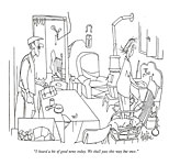
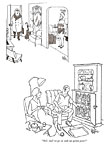
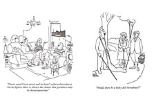
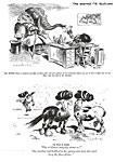
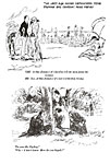
The full-page cartoon ushers us into a day-laborer's dingy two-room apartment. The kitchen and livingroom are one room; we can see part of an unmade bed through a curtained doorway in the rear. In the livingroom, a pot-bellied stove sends its crooked exhaust pipe up to a wall outlet. An electrical wire dangles from the ceiling, a Y-socket screwed to its extremity so that two different-sized light bulbs can be attached. The plaster on the wall has cracked, revealing the lathwork underneath. On the wall, a thermometer and a horse shoe have been hung. Next to a sway-bottomed overstuffed chair on a wooden crate is an empty coffee cup with a spoon in it. A broom and a bucket repose near the kitchen sink on one side; on the other, a plumber's plunger and a box of trash. On a wooden armchair next to the kitchen table a dog sleeps. On the table are a flashlight and two pieces of what might be a soup thermos and a matchbook. The matchbook lies open; it has only one match left in it. In the near corner is a large cardboard box in which a half-dozen baby chicks apparently live.
The master of this house, the workman, has just returned home, carrying his lunchbox. Stoop-shouldered, hatchet-faced and lean with deprivation, a scraggly moustache under his beaklike proboscis, he confronts his raggedy, frazzled sourpuss wife at the kitchen sink with this observation:
“I heard a bit of good news today. We shall pass this way but once."
There you have it: George Price in a single cartoon. A manic attention to amplifying graphic detail, a threadbare milieu awash with quiet desperation, and an incongruously elegant utterance, thoroughly bleak in prospect, comic only in conjunction with the scene Price portrays.
None of the wealth of eccentric accouterments in the scene has any obvious connection to the gag, and yet, the setting is all—the setting in juxtaposition to the words one of the actors speaks.
And there is more of the same in all its variety for the next 249 pages.
Price's world teems with unremittingly wacky types—cops, salesmen, housewives, saloon keepers and dog track touts, keepers of small shops, ne'er-do-wells and no-accounts, and, as Cooke observes about his stuff of most recent vintage, "the raddled wife and her bulbous, cross-eyed mate torpid before the tv."
The certifiability of this population is instantly apparent in their tiny shoe-button eyes: sometimes crossed, always beady, they burn bright with the fever of some bottled-up insanity that threatens to burst into blooming idiocy at any second.
There are precious few good-looking citizens cloaked with middle-class respectability in Price's menage. The women are relentlessly middle-aged or older, all frowzy and worn out. The men are of equivalent vintage, addled and frayed-looking in their derbies and porkpies and cloth caps and other odd headgear, all of it belonging to some vanished era.
They are all—without regard to gender—seedy and vaguely musty, hawk-beaked or bulbous-nosed. And hopelessly, irredeemably befuddled.
But they don't seem to mind: they all behave as if their circumstances were completely normal, Nothing about the oddity of their situations seems to disturb or phase them.
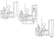
In one of Price's rare multi-panel cartoons, we see a mousy-looking, middle-aged man smoking his pipe and reading his paper in an obviously middle-class livingroom (another Price rarity). In the second panel, an angry overbearing woman—probably his wife—looms into the livingroom and says:
“Is there no end to your treachery?”
She disappears without saying another word. In the third panel, the mousy fellow has resumed his reading in perfect calm. Imperturbable or thoroughly cowed? We'll never know.
They are all like that. Thoroughly cowed by their quirky surroundings and their absurd fates. Or absolutely imperturbable. I favor the latter.
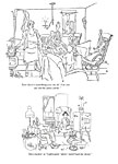
In one of his classic vignettes of domestic tranquility, Price draws a livingroom jammed with his usual assortment of doddering oldsters, children both nitwit and normal, pets, furniture and equipage, and beaming spouse. In the midst of this mob, pater familias is speaking into the telephone:
"Just spending another evening in the bosom of my family," he says. "What are you doing?"
Incongruity is the touchstone of Price's humor.
In another of Price's rumpled livingrooms, a fat, bald man with bulbous nose and five-o'clock shadow is watching his angry spouse make for the nearest exit, carrying her luggage. "I'll miss you," the man says. "'Mary’ is a grand old name."
What sort of reason is that for missing his wife? "'Mary' is a grand old name."
It's a George Price reason. It's a line of an old familiar song quoted unexpectedly in an unusual context. The humor springs from the incongruity of that line being quoted in that cluttered livingroom on just this occasion.
Sometimes Price stresses the familiar element in the formula more than the unexpected.
At the zoo, two chimps in their cage stare at the people outside staring at them.
One of the chimps says to the other: "Lots of new faces this year."
Price has taken an old cliche—at the zoo, who is really on display?—and pushed it to what is perhaps an obvious conclusion. But in a Price cartoon, it's funny. It's funny because of the people standing outside the chimp's cage: they are one of Price's patented collections of weirdos. His people really do belong in the zoo. We've known it for a long time, and this cartoon confirms our conviction.
But most of Price's cartoons are less complex. Most of them juxtapose caption and picture, a familiar utterance in an unanticipated setting.
A woman in bed at night raises herself on an elbow, looking at her husband who stands at the foot of the bed carrying a pick and wearing a miner's gear, including the cap with its light, which is just now shining onto his wife. She speaks: "Put out your light, dear, and come to bed."
A man comes home from work, his shoulders—his whole body, his very being—drooping with weariness. Stepping into his livingroom, he encounters his family—wife, son, daughter-all playing guitars. The caption: "Pack up your troubles in your old kit bag and smile, smile, smile."
A favorite of mine: a dignified elderly couple strolling through the park, she wearing perfectly proper winter coat and sensible shoes and he attired nattily in cap and plus-fours, carrying a picnic basket. They encounter a grounds-keeper who is picking up litter, and the old man accosts him: "Would there be a bosky dell hereabouts?" he says.
Sometimes there are no words at all; the humor springs entirely from the inherent inconsonance of the situation Price depicts.
Another homecoming scene: the breadwinner, this time a dignified, somewhat portly middle-aged well-to-do businessman, enters his apartment, his face frozen in the usual vacant stare that Price people effect. Around the corner in the livingroom just out of his sight stands his somewhat portly (even flabby) middle-aged wife-holding a tray with a martini on it and wearing a Playboy bunny costume.
The book abounds with more of the same sort of dementia—354 more cartoons, to be precise. Most of the collection first saw print in The New Yorker —324 cartoons (or "drawings" as they say at the magazine). Or in one of the 10 other anthologies of Price's work published over the years. Twelve of the drawings in this volume, however, appear here for the first time.
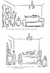
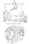
Among those reprinted from The New Yorker are several from Price's famous floating man series. All these cartoons depict a man supine about three feet above his bed, floating fully-clothed in midair, while his on-looking wife comments to a visitor about her husband's peculiar condition.
In the first of the series, the wife remarks to another woman, "He's been up a week now, and there's nothin' we can do about it."
In the last of the series, the fellow is lying on the floor amid the collapsed wreckage of his bed. His wife, holding a smoking shotgun, explains to two policemen:
"He never knew what hit him."
On the authority of Lee Lorenz, long-time cartoon editor at The New Yorker, we accept the unwelcome intelligence that Price did not devise any of his cartoons: they were all drawn to depict someone else’s looney ideas. But the ideas were tailored to Price’s mannerisms; and I submit that none of the Price cartoons would be as funny without Price’s drawing.
Price's graphic style heightens the impact of the incongruous in his lunatic world: his clean and spartan line and the orderliness of his compositions contrast their sublime sanity against the wholesale wackiness being depicted, making it all the more comically discordant.
His style is as unique as the world view depicted in his cartoons. His line is languid, pure and simple and unembellished, and it invests the figures it outlines with a similar languor. Price's people seem not to wear clothes so much as they have their raiment draped on them; and the people, in turn, are also sort of draped. They don't stand: they hang like suits in a closet. Relaxed, unruffled, their wrinkles smoothed out by their pendulous weight.
Price's line delineates shapes with flat planes, all neat and tidy. No loose ends.
There is about a Price picture the precision and economy of a mechanical drawing, particularly when equipage and furnishings are depicted.
Only in L.D. Warren's editorial cartoons for the Cincinnati Enquirer can we find a similar combination of relaxed fluidity and exacting precision.
But Price's line is also eccentric. It wanders unpredictably through a drawing, in and out of the actual outline of some figure or shape, making another kind of design, a thing of intersecting planes and forms that eludes definition, defies description. And yet from this curious geometry, recognizable forms emerge.
But the most eccentric aspect of Price's line is its double-barreled appearance: sometimes it looks as if it were drawn with a splay-pointed pen, the halves of the point tracing parallel lines rather than making a single stroke.
 |
 |
 |
 |
 |
 |
 |
 |
 |
 |
WORD AND PICTURE and manner of rendering—all proclaim the antic incongruity of the world of George Price. Seldom do form and style achieve their effects by blending so thoroughly, each complementing the function of the other. And that, of course, is why George Price is a master of his medium.
And while we're on the subject, let's stay on the subject.
Gag Cartoon Strategy and Design. Price's cartoons give us an object lesson in the art of cartooning. His humor is a direct product of the visual-verbal blending that characterizes the best cartoons: the contrast of the meaning of the words with the situation depicted in the picture animates our risibilities. But the contrast exists solely because of the juxtaposition: the incongruity is achieved by means of the mutual dependency of word and picture. And that creates the comedy: neither words nor pictures by themselves are funny.
The gag cartoon is the haiku of cartooning: to achieve its comedy, words and pictures must be delicately balanced, each contributing meaning to the other, neither funny alone without the other. The picture is a sort of puzzle. It asks the question: What is going on here and why? The caption, the words—which have inherent meaning of their own but probably not humorous meaning—solve the puzzle, “explain” the picture. The picture likewise “explains” the caption.
Either way, as comprehension dawns—in the flash of an instant—the comedy is revealed, and the revelation, coming, as it does, suddenly, gives comic impact to the discerned “meaning” of the visual-verbal blend. In effect, the joke’s impact derives from the “surprise” that is sprung upon the reader when he or she understands the full import of the picture or the caption. The hilarity is further enhanced by the economy in expression that increases the “surprise” inherent in the blend—and, hence, the humor of the joke. And so, in the 1920s and 1930s (as we shall seen anon) emerged the “single-speaker captioned cartoon,” the modern gag cartoon.
Because the modern gag cartoon is more economical in the deployment of verbal and visual resources, it is more focussed and therefore has greater impact. Employing the same economy, cartoonists achieve similar impact in comic strips, too, and the best funnybook artists also strive to yoke pictures and words in tandem for narrative sense. But the blend is more demonstrably evident in the relatively simple gag cartoon.
In all the best gag cartoons, meaning—humor—is achieved by word and picture thus in tandem. "Best," in this context, is defined by the extent to which the resources of the medium are plumbed.
But there's more to the art of gag cartooning than creating visual-verbal interdependence.
A panel cartoon seems simplicity itself. What more is there to do than to depict the speaker of the caption in the situation that makes his or her remark funny?
That's all, of course. But to achieve it, the gag cartoonist makes a host of strategically significant artistic decisions.
Once the gag, or joke, has been determined, the cartoon must be cast. A cartoon is a tiny playlet, and although it lasts only two or three seconds, whether it succeeds or not may depend entirely upon whether the cartoonist has selected the right cast.
Since it must be read and understood so quickly, the cartoon must communicate all its vital aspects instantly, and the right characters help bring the reader to perfect comprehension almost immediately. Because stereotypes are the commonest coin of communication, they are frequently deployed: the apron designates the harried housewife; an hourglass figure, the sexpot; a blackened eye, the neighborhood's mean little kid; a briefcase, the businessman; stubbly beard and striped T-shirt, the burglar; and so on.
In short, each of the characters in the cartoon's cast must be appropriate to the role the character is playing. And each character must be immediately recognizable as playing that role. Virtually every other artistic decision made in drawing the cartoon is resolved in favor of creating a picture the narrative significance of which can be clearly and instantly grasped by a reader.
In a well-designed cartoon, the visual elements are arranged in such a way as to tell a story, the story necessary for understanding the joke, the punch line in the caption. To this purpose, most cartoons are composed with the reader's "reading habit" in mind: since most of us habitually read from left to right, the key visual elements are generally arranged in the picture more-or-less from left to right. Thus, even if a reader doesn't examine every visual element of the picture, he'll probably grasp those aspects of it that are essential to understanding the joke before his eye drops to the caption underneath.
Composition devices other than simple "reading order" can accomplish this purpose, too. We tend to see large things before small things. Perspective can direct the eye to an essential visual element. And solid black areas attract the eye first as it scans the scene.
It sounds as intellectual as an exercise in calculus, but in practice, it's much less analytical. All the decisions I've been listing so systematically here are doubtless made unconsciously by most cartoonists for most of their cartoons—and they are made at the very instant the gag is envisioned. The cartoon—in all of its visual elements, perfectly wedded to the caption underneath—springs, as it were, full-blown from the cartoonist's brow. For only the most complex gag situations must the cartoonist consciously decide how the picture should be composed.
Almost
any cartoon will illustrate what I've been discussing, but let me take a
favorite of mine, a Tom Henderson cartoon that appeared in The
Saturday Evening Post in 1949. 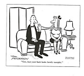
Henderson's bold lines render his comedy in the most uncluttered and economical of black-and-white terms, his big-foot, big-nose style capturing humanity in hilarious shorthand. The pictures themselves are funny, but coupled to captions, they reveal an antic sense of humor of which this cartoon is typical.
A man and woman on a couch. In stereotypical shorthand, a man and a woman (or a boy and a girl) seated on a couch are always boyfriend and girlfriend, never man and wife.
Henderson establishes the scene with minimum elaboration: some sort of screen behind the couch encloses the action, defining an interior, and the end table with a lamp at the side completes the portrait. We barely notice these furnishings, but we are nonetheless perfectly conscious of them: they create the livingroom setting with a few deft strokes of the brush.
Our eyes go first to the tuft of hair the man holds beneath his nose. Virtually every graphic element in the picture forces us to look there: both large noses "point" the way to the man's hand, and the hand itself stands out against the plain white background.
The picture is a puzzle. It is incomprehensible. What is the man doing holding the woman's hair in this curious fashion? The explanation—the solution to the puzzle—is in the man's remark. (And we know it is he who is talking because his mouth is open, of course; but we've already been made more conscious of him than of her—and hence aware that it is he who is speaking—by reason of having noticed him first: his solid black suit is a visual flag, attracting our attention.)
Neither the picture by itself nor the caption alone is funny. But taken together, they are a cartoon. And it is funny.
Henderson has taken a commonplace remark and given it a literal interpretation.
The picture shows us this interpretation.
In its unencumbered economy—simple drawing, single caption—Henderson's cartoon is typical of the genre in its mature form. Today, we can scarcely imagine the gag cartoon in any other terms. But it was not always so.
Early Gag Cartoons. Those associated with The New Yorker are fond of saying that The New Yorker invented the single-caption gag cartoon. Until Ross's magazine came along, they say, gag cartoons usually had several captions—that is, several speakers.
The pictures in early cartoons served merely to place the caption in a general milieu. The joke, then, was almost entirely verbal, arising from the caption alone. Lee Lorenz calls the earliest of these specimens “illustrated anecdotes” because the captions were sometimes two or three paragraphs in length; the drawings did no more than illustrate the situation to which the text applied. The text was gradually refined: first, it was transformed into a sort of conversation among the several persons depicted in the drawing; eventually, the dialogue was reduced to a verbal exchange between two persons. These are the “multiple-speaker captioned cartoons” (the fondly recalled “he-she” cartoons in which He says something; then She responds with something funny—or vice versa). Here are a couple samples:
Wife: How many cigars a day are you smoking now?
Husband: Oh, just enough to show the doctor his advice was wrong.
Or:
She: You were right, dear, and I was wrong.
He: Forgive me, darling.
Or:
She: Do you think he's really in love with her?
He: No—he's just going through the emotions.
Sometimes the captions carried on longer verbal exchanges.
She: Darling, I'm afraid we can't marry while Aunt Suzie is alive.
He: Gracious, why not?
She: She played me a rotten trick: she put all of my money into her will.
In cartoons like these (of which there were millions from about 1880 until 1920), the pictures contributed almost nothing to the joke. We don’t need the picture in order to see the humor in the dialogue: the captions were frequently funny by themselves, as stand-alone snatches of conversation. Cartoonists of the day called these specimens “illustrated jokes,” betraying their belief that the humor was contained in the prose not the pictures.
In such cartoons, the pictures often served simply as visual decorations. They identified the speakers but seldom supplied much more information that was vital to the gag. In one cartoon, the picture shows us two couples clearly dressed to watch a football game; the captions:
"How were your seats?"
"Rotten. Couldn't see a thing.”
"Ours were worse than that: nobody could see us."
In another, the picture shows us a young man standing at what is obviously a sales counter in a department store.
Bewildered Young Man (to new salesgirl): Where will I find silk lingerie?
Salesgirl: Search me.
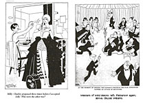
Here (below), the captions with their identifying labels and stage directions supply more information essential to understanding the joke than the picture does:
Backstage in a dressing room, two chorines gossip:
Milly: Charley proposed three times before I accepted.
Lilly: Who were the other two?
Sometimes the information provided by the visual is integral to the gag. In another cartoon, "she" is a typically attired fast-lane flapper—short dress, plunging neckline; and recognizing the daring nature of her attire is essential to the joke:
She: Sir, I'll have you know that I'm a lady.
He: My word! I simply must get over this habit of judging by appearances.
When, at the
close of the 19th century, the great metropolitan daily newspapers
(particularly in New York) sought to increase circulation by publishing
extravagant Sunday supplements that included imitations of the comic weeklies
(often dubbed, now, “the comics”), cartooning expanded in two directions: in
newspapers, cartoonists started creating short narratives by arraying their
pictures in storytelling sequences (“comic strips”); in magazines, cartoonists
continued pretty much as before, but in striving for ways of creating comedy,
they also exploited the capacity of the medium for visual puns. 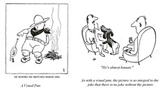 Visual punning emphasized the
importance of the pictures to the comedy in single-panel cartoons. Perhaps
from this development—sporadic and occasional as it was amid the usual array of
“illustrated anecdotes”—cartoonists began to realize that the comedic impact of
their work would be much enhanced if the meaning or significance of the words
under their pictures could be understood only by comprehending the role of the
picture. And vice versa.
Single-Speaker Captions. One of the reasons that the single-speaker captioned cartoon was an important development in cartooning was that it streamlined the medium: it tended to make the pictures and words interdependent. With the advent of the single-caption gag cartoon, the picture began to have as vital a role in the joke as the caption. The narrative economy of blending word and picture for comic effect gave the blend itself greater impact than the desultory illustrated dialogue of yore.
Not that the single-speaker cartoon removed the possibility for a joke that was almost wholly verbal (a tendency that persists even today). In a 1927 cartoon, a delicate society miss leans across a businessman's desk to say: "Oh, Mr. Jones—we are collecting funds to help the starving Chinese. May I put your name on the succor list?"
In any case, The New Yorker did not invent the single-speaker cartoon. Partisan claims by fond proponents of the magazine's eminence to the contrary notwithstanding, the single-speaker cartoon had emerged in the pages of other magazines long before Ross's publication appeared on the scene.
The New Yorker cartoons with their stylish sophistication may have established the single-speaker cartoon by making the "he-she cartoons" seem unnecessarily cumbersome and hence old fashioned, but single-speaker cartoons had been in evidence for years—albeit not regularly or in any great quantity. But The New Yorker scarcely achieved this transformation at once.
In fact, the early issues of The New Yorker had as many multiple-speaker captioned cartoons in them as any of their 1925 rivals on the newsstands. Even the magazine's much- acclaimed sophistication was only hinted at in the cartoons of these early issues.
As Ross doggedly groped for text and pictures that would give his vision form and substance in The New Yorker, the magazine slowly became more and more sophisticated. The slicker it became, the further it moved away from the editorial fashions that had by then become moribund in Life and Judge.
Somewhere along the line, Ross started using more and more single-speaker cartoons—in the conviction, doubtless, that the garrulity of the old-style multiple-speaker cartoons was not as sophisticated as the comparatively concise (and therefore probably more refined, he would think, more crafted) single-speaker version. (The progression of the gag cartoon at The New Yorker is recounted in Harv’s Hindsight for October 31, 2004, should you want to explore the nuances at length.)
And the more attractive The New Yorker became as a magazine, the more its cartoons set the pace for other magazines. By the mid-thirties, the single-speaker cartoon had completely displaced its encumbered predecessor; by then, the single-speaker cartoon virtually defined the gag cartoon. But all of this took time. And all during that time, gag cartooning had a lively existence quite apart from The New Yorker.
In fact, some of the greatest names in cartooning came to greatness in the pages of other magazines long before the single-speaker cartoon became the fashion no one dared defy.
Legendary Cartoonists. In the collective memory of the 1920s, one cartoonist's name stands above all others. John Held, Jr. Indeed, his leggy flappers and their bell-bottomed boyfriends—heads like billiard balls, rendered with spider-web linework and arresting solid blacks—virtually define the Roaring Twenties in the popular mind. (See “Cartoonist as God” in Harv’s Hindsight for August 2007.) But there were other cartoonists whose work then was just as eagerly followed as Held's.
Russell Patterson, for instance. In contrasting fragile lines against stark black shapes, Patterson’s work was kin to Held’s. But Patterson’s women were not cartoon cuties: they were statuesque chorines and flappers, so svelte and stylish that his work helped set women’s fashions for the decade. (See Harv’s Hindsight, August 2006, for more Patterson.)
But neither Held nor Patterson was in high profile in the early twenties. Held appears, but not in such profusion as he enjoyed later in the decade, once the Jazz Age got tuned up in earnest.
In the pages of the old Life of 1924, for instance, Percy Crosby is the cartoonist most visible. His irrepressible Skippy first appeared in Life on March 15, 1923, and for years thereafter, each issue of the magazine offered a handful of kids by Crosby, whose lines alone—feverishly sketchy, pulsing with motion—gave the juvenile antics an energy and vitality unequalled on the pages of his magazine or any other. (So popular was the Skippy feature in Life that Crosby was encouraged to produce a comic strip version for newspaper syndication starting June 23, 1925. The sordid history of how Skippy was stolen from Crosby is rehearsed in Harv’s Hindsight for April 2004.)
Life of 1924 also included the work of Alice Harvey (no relation), whose modest maidens’ dingie doings were rendered in crayon with a delicacy of technique that decorated the periodical’s pages with soft grays and wispy lines.
Most issues carried a full-page editorial cartoon—a comment on the political or social climate of the day—by C.H. Sykes. Vigorous compositions, bold lines, vibrant wash. And Sykes could work in frail penline, too, modeling his figures with subtle cross-hatching.
The great T.S. Sullivant was still represented in Life in those days. And Charles Dana Gibson, then president of the publishing company, found time to do an occasional drawing. And Nate Collier, who would work as a magazine cartoonist into the fifties, was doing stuff for Life then, too.
By 1927, Patterson and Held dominated the art in the magazine. But Garrett Price's work—with as fragile a line as either of the others' and compositions as dramatically spotted with solid blacks—was also appearing. And Johnny Gruelle, already famous as the creator of Raggedy Ann, did full-page cartoons—bird's-eye views of the crises in the lives of the citizens of Yayhoo Center, the drawings filled with tiny people, each doing something worth examining.
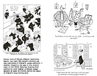
The great Gluyas Williams was also in evidence—full-page drawings, simple outlines and bold blacks, often capturing unforgettable moments in modern or ancient history. (“The King Discovers That the Mustard on the Royal Table Is Not by Special Appointment to His Majesty"—and Williams would give us a populous tableau, the expression of every character registering his or her own individualistic reaction to this astonishing revelation.)
And by then, Ned Hil-ton (his perpetually hyphenated signature) was in for the long, long haul. And Marge Henderson, before she invented Little Lulu, did flappers with the best of her peers; and so did Carl Anderson before he found the mute but astute Henry. (For more about Little Lulu and Henry, consult Lulu, Henry, Hazel and Marge in Harv’s Hinsight for January 2012.)
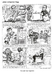
Don Herold was doing highly decorative cartoons in which people were almost geometric abstractions. And James Montgomery Flagg, despite his status as one of the country's foremost illustrators (which persuaded him to disown his early cartooning career), still did a page of cartoons every now and then. In Sykes's cartoons now, Mr. Dry, the caricature of the prohibitionist made famous in Joseph Keppler's 19th century cartoons, appeared regularly in ways that always rendered the dry movement ridiculous.
In the issues of 1929, R.B Fuller (who, a decade later, would find a home in newspaper comic strips doing Oaky Doaks) dominated the magazine. He had a meticulous line with no loose ends. Many of his cartoons were detailed full-page drawings in pencil, marvelously subtle in the graduated grays of their shading. Airplanes and automobiles and wanton destruction seemed to fascinate Fuller: most of his gags involved auto accidents or plane crashes from which the survivors emerge with a witty remark on their lips.
Russell Patterson now did headings for columns and departments, and he illustrated "New York Life" (which he may also have written, signing it Knickerbocker, Jr.) with spectacular drawings contrasting his fragile penline against massive solid blacks. He also did many covers in full color. Later, he would do the same for Ballyhoo, a somewhat less sophisticated humor magazine of the 1930s.
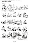
Edwina Dumm began doing a page or two each issue about the adventures of a fuzzy-haired dog. The animal quickly became one of the magazine’s most popular features. One summer, the magazine ran a contest to name the mutt; soon thereafter, Sinbad was christened.
The popularity of Sinbad resulted in one of the medium’s odder developments.
Since 1918, Edwina had been doing her newspaper comic strip Cap Stubbs and Tippie about a boy and his dog—and his grandmother. The dog, Tippie, was a short-haired mongrel, but when Sinbad appeared, Edwina’s syndicate editor asked her to draw Tippie the way she drew Sinbad. Edwina dutifully banished the short-haired dog from the strip and brought in a new Tippie, an exact copy of Life’s Sinbad.
Edwina explained this curious turn of events by having the original Tippie run away from home. When he was eventually found, he had been adopted by a crippled boy, and no one—not his erstwhile master Cap Stubbs, certainly no reader—had the heart to separate the two. So Cap Stubbs got a new pet.
To complete the confusion of identities, Cap Stubbs and his doting granny appeared (albeit unnamed) in Life with Sinbad just as if they belonged there.
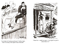
Another regular in the pages of the 1929 Life was Paul Webb. He would achieve notoriety within five years in the new Esquire by drawing full-page cartoons about raunchy hillbillies with long, scraggly beards. For the old Life, though, he drew a weekly panel about Mr. and Mrs. Peebles who were about as far from being hillbillies as Broadway is from the Ozarks.
Mr. Peebles—Baxter—was a short, plump gentleman, always attired in tie and tails and towering silk top hat. The most impressive thing about him was an elegant handle-bar moustache. His wife Sylvia was taller than her spouse, always wore a fur coat, and had the vacuous smiling gaze of a complete air-head. Week after week, Webb followed them into all walks of New York life, which the Peebles seemed to encounter in the wee hours of the morning on the way home from a party they'd gone to after attending the theater or the opera.
Dr. Seuss was doing manic full-page features, Gardiner Rea was a regular contributor, and so was Ralph Barton, who also appeared in The New Yorker. (Ross had not developed exclusive contracts yet apparently.) Garrett Price was now doing wash drawings which were often the feature of each issue's opening page. And the sketchy penwork of Paul Reilly appeared almost as frequently as Fuller's subtle pencil drawings.
By 1933, Life was waning. Russell Patterson was still its star, perhaps its only star. He did covers and great full-page drawings, his women now more full-figured than his flappers of the last decade. And Edwina still did Sinbad.
Marjorie Henderson now did a column ("From Me to You," a cute sort of feature about her adventures with women's fashions and beaux of all sorts, shipped in weekly from her home in Frazer, Pennsylvania) and illustrated it herself (her drawings, signed “Marge,” now perfect evocations of her later Little Lulu style).
Another cartoonist-columnist was Jefferson Machamer, who wrote and illustrated In My Moustache Cups and sometimes did a double-page spread featuring the doings of Polly, a young-woman-about-town. (For more about Machammer, see Rancid Raves, Opus 275.)
Relative newcomers included Dorothy McKay, a minister's daughter turned cartoonist, and George Lichty, who would carve his niche in cartooning's hall of fame with a daily newspaper panel called Grin and Bear It.
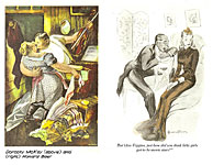
McKay made a home for herself in the nation's newest magazine, launched in the fall of 1933—Esquire. From the second issue on, her full-page drawings in wash and grease crayon of folksy big city dwellers, plump middle-class matrons, and an assortment of mugs and cops appeared therein regularly.
Esquire adopted its own unique cartoon philosophy. Conceding to The New Yorker its near monopoly on sophisticated whimsy, Esquire set out (as the editors said some years later) "to get a corner on something known (if only to ourselves) as Whamsy." A cartoon with Whamsy, it was explained, was one in which the audience participated.
"The most memorable example of this 'Wanna Make Something Out of It' school of comic art was undoubtedly the drawing of the Petty Girl looking you straight in the eye and captioned, simply but eloquently, 'Oh, you would, would you?'
"Cartoons like that brought scads of letters asking us to explain the point. We had to answer that there wasn't any, except as made by the mind of the beholder."
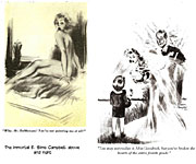
Esquire's most ubiquitous cartoonist was E. Simms Campbell, who would become the nation's foremost black practitioner of the art, taking his shapely chorines into newspaper circulation eventually with a panel cartoon for King Features.
For Esquire, Campbell did virtually everything. He illustrated stories and articles (some of which, particularly those on jazz, he wrote himself) and he did cartoons. Hundreds of them. For at least twenty-five years, he was in virtually every issue of the magazine.
Noted in later years for his cartoons about harem girls, Campbell was not so specialized in the early Esquire. Any subject was legitimate game. And all were rendered in such vibrant hues of watercolor that they seemed to shimmer on the page as if under the sun on a tropical beach somewhere. (We visited Campbell at length in Rants & Raves, Ops. 126 and 155.)
A lot of Esquire's cartoons were in color. Over at The New Yorker, finally getting its financial feet firmly on the ground, Ross resisted any temptation to print "drawings" in color. "What's so funny about red?" he asked, making the irrefutable point with his unanswerable question.
But Esquire used color regardless.
Another cartoonist whose work appeared in Esquire’s first issue was Howard Baer—full-page, splashy drawings in grease crayon and wash. Gilbert Bundy did more stylish renderings of fashion-plate women and men in graceful line embellished with wash or watercolor (and he showed up in the early years of Playboy, too). On the distaff side, Barbara Shermund joined McKay with her starry-eyed frilly females etched with a fine line and fleshed out with a delicate wash.
Abner Dean did cartoons for Esquire in his bold and meticulous style. Jaro Fabry delineated simple figures with bold strokes, creating a broad-shouldered geometric glamour girl reminiscent of Peter Arno's at The New Yorker. (You can see Fabry in greater detail at R&R, Opus 234.)
Paul Webb, as I said earlier, created a gallery of hillbillies in the pages of Esquire.
Others whose work appeared there regularly included Raeburn Van Buren (before he started doing Abbie ’n' Slats for newspaper syndication), Eldon Dedini, Syd Hoff, and Garrett Price.
Meanwhile, Life, after fifty-plus years, was on its last legs. In 1937, it gave up the ghost. For a price. Henry R. Luce bought the name for his new picture newsmagazine, and an old rival, Judge, bought the subscription list.
Judge was skating on thin ice then, too. But it lasted into the forties with a monthly publication schedule.
In the twenties, Judge published many of the same cartoonists as those whose work was found in Life. R.B. Fuller, John Held, Paul Reilly. And G.B. Inwood's spirited pen sketches. Ditto by Ethel Plummer.
Judge had its own version of Gibson, too. A brilliant pen stylist, Gilbert Wilkinson drew loosely, contrasting the most copious fine-line feathering with splashy brush strokes and black solids that defined some aspects of his shapes without actually delineating them.
There was also a Patterson on Judge's pages—Robert Patterson. Although good in its tightly-rendered manner, his work could scarcely compare to Russell's masterful stylings. In fact, as a general rule, the artists printed in Life through the twenties were superior draftsmen whose techniques were more polished than those who appeared in Judge.
By the mid-thirties, Judge was giving great hunks of space to the zany cartoons of Bill Holman. Holman started Smokey Stover for the Tribune-News Syndicate in March 1935, but he continued contributing regularly to Judge for the next couple of years. And the editors apparently printed everything he submitted.
In virtually every Holman cartoon, you could find one of his perpetually grinning cats. Like a dingbat, the Holman cat lurked in corners, peeped out from behind furniture, sometimes joined in the squirrelly action. Sometimes all you could see was the trade-marked bandaged tail waving from behind a bush. The same feline capered through Smokey Stover, too, eventually earning its own topper strip, Spooky. (Holman’s manic history is recounted in Harv’s Hindsight for November 21, 2005.)
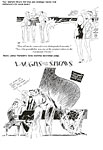
The only other distinguished cartoon work done in Judge during those depressing years was by James Trembath. Every issue contained a page or two of his airy pen sketches. Under the heading "Laughs from the Shows" (or "from the Courts" or some other venue), Trembath drew shapely ladies and fashionable gentlemen parroting lines from Broadway shows or movies or whatever:
"He's a incomepoop, you know," says one bathing beauty to another; "—he lives off his income."
But the magazine cartoonists whose work I remember best (we are on a nostalgic trip here, you realize) are those who appeared in the pages of Collier's and The Saturday Evening Post and Look—even True and Argosy and other such hairy-chested magazines in the fifties.
The Moderns. The "golden age" (if we can invent yet another of those) for magazine cartooning was probably 1945-1960 or so. Collier's and The Saturday Evening Post began running cartoons in the thirties. On weekly publication schedules, these two magazines would create the principal platform upon which gag cartoonists performed.
Other magazines joined in, and by the end of the forties—once wartime economies had eased enough to permit periodicals to use good paper in great quantities again—a cartoonist selling gag cartoons had dozens of markets for his wares. And technical advances in printing made possible the best reproduction of their art.
The panel cartoon flourished.
The names of the cartoonists are too numerous to mention here in anything but a catalogue listing, so I'll ring memory's chimes by dropping the names of only a few of my favorites.
Irwin Caplan, who had attracted a following during World War II with his cartoons in Yank, chisled out his drawings with a crisp, rhythmic, undulating line that made his angular people memorable. (Caplan is the subject of Harv’s Hindsight for May 2007.) In contrast was the juicy brushwork of Reamer Keller, who had begun to appear in Judge in the thirties.
In most issues of Collier’s you could find lush wash drawings of statuesque chorus girls in net hose by John Ruge. And Larry Reynolds made a regular appearance every issue to record the nocturnal explorations of the burglar Butch and his second-story-man buddy named Slug.
Stan and Janice Berenstain were regulars, too—with cartoons usually about kids. (The Berenstains have appeared several times in R&R, Ops. 106, 107, 174 and 291, to cite the lot.) And before Dennis the Menace absorbed his time and energe, Hank Ketcham produced hundres of panels for the general interest magazines. (Ketcham’s history, and Dennis’, are detailed in Harv’s Hindsight for March 2001.) As did the prolific Mort Walker before Beetle Bailey (which history is recited in Harv’s Hindsight for December 2008).
I remember John Gallagher’s skinny comic humanoids—flat-footed and slope-shouldered and bulb-nosed—and his animals. And the ludicrous critters from the pen of Ed Nofsiger, too. And the pouting profiles of Claude Lamb’s pear-shaped people.
Over at the Post, there was Ted Key’s squinty-eye Hazel, who always appeared on the last text page in every issue (following in the footsteps of Little Lulu and, before her, Henry). And Burr Shaffer, whose work turned the expression “bold brush stroking” into an understatement. In sharp contrast, there was Chon Day, who drew with a thin line of unvarying width—a line that did all the work of delineating his world because he used no other embellishment and seldom spotted a solid black anywhere. (More about Day in Hindsight for August 2000.)
Then there was the madcap world of Virgil Partch—the immortal “Vip.” His people were pure abstractions, angular profiles. Their hands were clusters of fingers in random quantities. Vip’s speciality—the visual pun. His jokes frequently interpreted common expressions literally, insanely.
Standing next to a man is a Vip dog whose hind quarters and back legs look just like a small boy's. The man scratches the dog affectionately behind the ears and says to the fellow looking on: "He's almost human." (More about Vip in May 2005 in Harv’s Hindsight, “Making the World Safe for Insanity.”)
But enough. The happy universe of the gag cartoon faded fast in the sixties as, one by one, the great general interest magazines shut down. Collier's ceased publication in 1956; The Post, in 1969; Look, in 1971. Others followed. And before long, the market for gag cartoons had dwindled into nearly nothing.
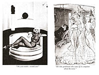
Today, apart from The New Yorker, the chief markets for the single panel cartoon are men's magazines Playboy, Penthouse, Hustler, and all the other copycats. With high-tech color reproduction facilities, these glossy magazines have abetted the transformation of the gag cartoon from drawing to painting. And some of the examples of this new breed are fine art indeed.
But we've lost more than we've gained. The special interests of the girlie magazine have narrowed the cartoonist's scope. And as the cartoonists focus exclusively on the modern rituals of seduction, we forfeit the benefit we used to derive from seeing huge chunks of our world—not just the boudoir and the bar—from their jaundiced viewpoint.
A fragment of an article on this subject from The New York Times has found its way to my desk, and the unknown author puts the matter well:
"The vision of the cartoonist is an endangered outlook. The continued existence of cartoonists has been in doubt since the general circulation magazines that used much of their work began going out of business in the 1960s. Loss of these artists, masters without gilt frames, would be the loss of the rare ability to tell the truth without making people unhappy about it. All they ask is a small smile during those few seconds when you come upon a cartoon—and then turn the page."
The page has turned for gag cartoonists. Their number is dwindling. And so as we add yet another species to the list of those endangered, we have all the more reason to treasure volumes like The World of George Price that preserve the vision of the gag cartoonist.
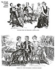
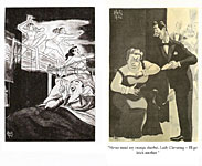
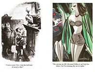
Now, here’s a lengthy gallery of Priceless cartoons by others whose names cropped up as we rambled along. Enjoy.
 |
 |
 |
 |
 |
 |
 |
 |
 |
 |
 |
 |
 |
 |
 |
 |
 |
 |
