CRITIQUING THE ANTIQUE HAPPY HARV
No Surprise: The Critic Likes His Own Cartoons
ONE DAY NOT SO LONG AGO, whilst wandering lonely as a cloud through the subterranean Rancid Raves Book Grotto, I chanced upon a badly beaten-up cardboard box in which were ragged and tattered file folders containing the remains of my renounced career as a magazine gag cartoonist. Taking up one of the folders and peering within, turning the sheets of paper over one at a time, I discovered that I enjoyed—admired, actually—many of the cartoons I’d done in those distant days of yesteryear. Unable to contain myself, I herewith launch a new, stupefyingly short, series in Harv’s Hindsight in which the erstwhile cartooner examines his own work from the exalted perspective of his present role as critic and chronicler of the medium.
Self-indulgent of me, I realize. But then, what can you expect? Anyone who operates a website all of which is devoted to his own writing is overweeningly self-indulgent by definition. Anyone who writes is self-indulgent. In fact, anyone who does anything other than change the baby’s diaper is being self-indulgent. So get over it.
It should come as no surprise, I ween, that I like my own work. What surprised me—and prompted this series—is that I found my previous self doing things that my present self cannot imagine having done. The drawings of long ago are infested with visual nuances of the tiniest sort—little extravagances that reveal, as I think about them, how the cartooning mind works. At least, how my cartooning so-called mind worked in those halcyon daze of yore. And so, as with the posting of my recent effort at attempting the 24-hour comic challenge last fall, this mini-series is offered herewith as an art appreciation lecture. That’s what I do at this site generally, of course; the difference on this occasion is that the art being foisted off on you for appreciation is my own.
You’d think, I suppose, that I’m much too close to my own work to “appreciate” it as a critic. Not so. As anyone who draws for publication knows, as soon as the work is in print, it is magically separated from the artist. So separate is it, in fact, that the artist immediately sees flaws in it that he/she didn’t see when doing the drawing or, even, when giving it a final examination before submitting it for publication. It is as if the drawing is suddenly no longer “mine”: printing it has detached me from it, distanced me so far that I no longer see the piece as my own work but, rather, as orphaned artifact, standing there anonymously, waiting to be studied and judged like any other artwork perpetrated by another artist. As anyone who draws for publication can tell you, the artist improves from seeing his/her work in print because the magical distancing reveals faults that can be avoided with the next drawing for publication.
Apart
from this kind of detachment, in the case of the drawings we’ll look at anon,
the sense of detachment is enhanced by the distance of time. These comic spot
illustrations were done in the mid-1980s, at least 25 years ago. And the
cartoons are slightly older: I ended my short (2-3 years) career as a
freelancing magazine gag cartoonist in about 1980. With this effusion as
preface, then, let us lay eyes upon the first exhibits.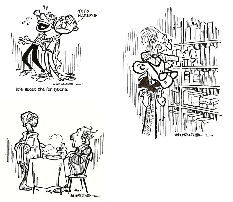
Like most of the drawings we’ll glimpse in a trice, the four you see here were drawn to illustrate a column in an newsletter that explained word origins. At the upper left, we have the drawing I made to accompany the discussion of the origin of the term “funny bone.” “Tres humerus” indeed. This may be my favorite drawing out of the whole lot. The poses seem penetratingly acute: the guy laughing bends backwards so excessive is his amusement: he’s laughing so hard that tears come to his eyes and he holds a hand to his forehead. The seeming cause of his hilarity, the other guy gazes out at us with an expression of bemused but barely tolerant boredom on his face. “Tres humerus,” he murmurs in the grip of his ennui. Beyond the postures of the principals here, the drawing itself amazes me: the skinny arm that the laugher holds in his fist-like grip is perfectly skinny for the purpose; and the linework in the wrinkles in clothing is relaxed and expressive. Nice job, I think to myself.
I can’t remember all of the word origins that are depicted in these drawings. Some of the humor, as we’ll see shortly, arises from the connection to the origin being explicated. But the drawings are often funny in themselves (funny to me, anyhow). Going clockwise, I can’t remember why the bibliophile has clambered up the neck of a giraffe to get to the upper shelves of his library, but the whole idea seems funny enough on its own. Adding to the comedy: the professorial guy’s roosterish hair-do, his blase expression, and the spectacles the giraffe wears. Details: the way the guy’s left hand is grasping the book—wonderfully authentic, methinks; but he’s wearing two right shoes.
The last drawing in this exhibit can stand alone as a comment on how slow the service sometimes seems in a restaurant. The detail that amazes me: the diner has a napkin on his lap! Who’d have thought of that wholly extraneous visual detail? Evidently I did. And I astonished myself a quarter of a century later.
I’m equally amazed by “tres humerus.” But that seems just too perfect: I can’t believe that I thought of that. I suspect it was supplied by the man writing the column, a longtime friend whose appreciation of jokes and command of language was legendary. He could think of that expression; I don’t think I could. Or did.
Let’s see if I can pick up the pace a little on our next exhibits by focusing only on the infinitesimal details.
 |
 |
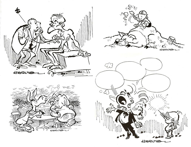
Well, maybe not exclusively. The first drawing at the upper left could be an editorial cartoon even today, but it wasn’t concocted for that purpose. I can’t remember the etymological errand, but I admire the linework—the thicks and thins, the carefree loops and swirls and overlaps. And the fingers on the doctor’s left hand as he holds the stethoscope to his victim’s—er, patient’s—chest.
I like the little kid in the next picture clockwise: he looks like he’s having a great time, and his cap is just right. I like the depiction of the sand, too, and the pig. This picture accompanied a discussion of the origins of school names: one of which was called Pig’s Trot School (because the building lacked underpinning, local farmers’ pigs “trotted” underneath to wallow in the cool shade); the other was Sand Everywhere School (but the name was not about sand; instead, it invoked South Arsenal Neighborhood District).
At five o’clock on the clockface, we have a little kid (hand behind his back, nifty; right foot slightly behind for balance) deflating a politician’s speech. Nice use of the conventions of the medium, I think—blank speech balloons indicating the vacuousness of political speech, the emptiness of a politician’s promises. And I like, particularly, the Exploditron marking the onetime whereabouts of a destroyed speech balloon; also, one of the pol’s bushy eyebrows clinging to the brow that he’s turned, in stark terror, toward the kid.
I like the ass and the pachyderm in the next picture, another seeming political cartoon but not invented for that reason here. I suspect the expression being explored had something to do with a “smoke-filled room.” It’s difficult to give the feet of hoofed animals very much anthropomorphism, but I think I managed all right here. And getting the elephant to cross his legs convincingly was a major achievement.
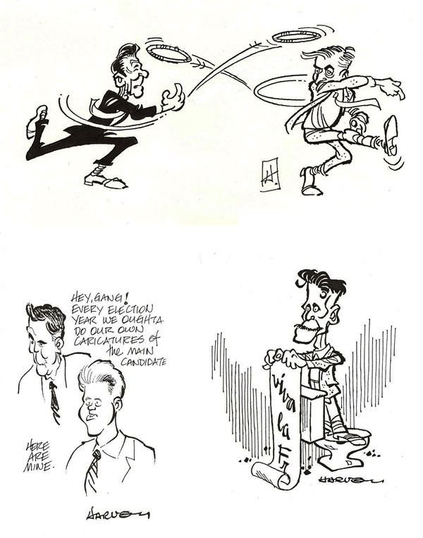
More overt political commentary invests our next exhibit at the upper left. That’s Ronald Reagan and Walter “Fritz” Mondale throwing rings rather than hats in the 1984 Prez Election. (If these caricatures are as good as I think they are, I shouldn’t have to tell you who they are.) “Hat in the ring” was probably the expression being discussed. I particularly like Mondale’s pose—his hands, mostly the right; ditto the right leg, elevated in a pitcher’s stance.
Other caricatures showed up occasionally. Here, lower right, is George Orwell. Nifty likeness, I think, but I can’t remember why he’s standing on a toilet and extolling the French. In the 1996 race for the White House, I tried caricatures of Bob Dole and Bill Clinton; not part of the word origins series though. The Dole caricature is pretty good, even if I do say so myself.
A couple more caricatures on our next exhibit.
 |
 |
 |
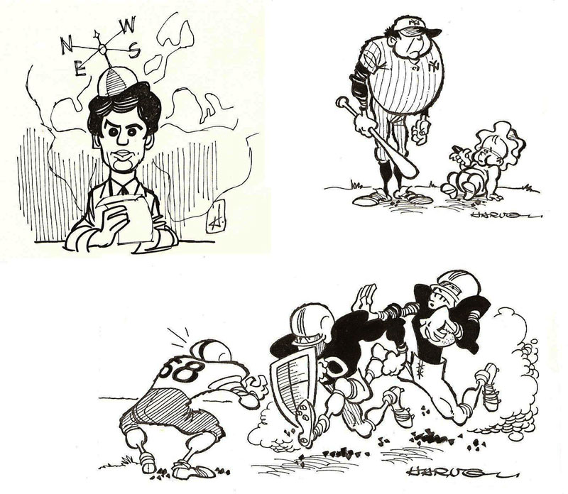
That’s supposed to be Dan Rather wearing the beanie; not too good of him, but an admirable beanie, I’d say. The contention is that the four points of the compass—North East West South—lend their initials to create the word “news.” But I suspect that’s fallacious etymology.
That’s Babe Ruth at two o’clock: you don’t need a face because his body is so distinctive. And the gridiron scene across the bottom illustrates a column published early in the fall when the football season is getting underway: one of the expressions discussed therein was the aged Greek admonition that mothers pronounced when sending their sons off to war—“Come back carrying your shield or upon it”; the first circumstance indicating victory, the second, an honorable death on the battlefield. The drawing unintentionally turns an athletic contest into a pretty serious event. I like everything about this drawing: it crackles with action, and the details all seem right—the ball-carrier on the right’s straight-arm posture, the cloud of dust indicating speed and forcefulness, and the coiled energy of the defensive player, crouched, his left foot turned outward so you perceive it only from behind, the heel-view.
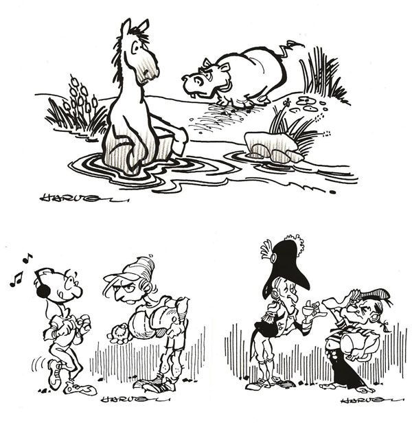
Our next exhibit takes us back to word origins, the first drawing illustrating the origin of the Greek word hippopotamus for a critter that lives in the river (potamus) and resembles, but only barely, a horse (hippos). I like particularly that the horse is sitting in the water, making overtly visible the origin of the other creature’s name.
The next drawing illustrates the origin of the term grog, a sailor’s drink made by diluting rum. The recipe was originated by a British admiral, Edward Vernon, who habitually wore a cloak made of grogram, a coarse corded fabric, and sailors gave him a nickname derived from his apparel—Old Grog. Over the years, the sailors honored the inventor of their moral-boosting drink by naming it after him.
Vernon, incidentally, gave his name to an American landmark. He commanded several naval campaigns in the Carribbean when America was still part of the British Empire. One of the American colonists who served under Vernon was Lawrence Washington, the older brother of our first president. Later, when Lawrence became owner of a Virginia estate called Hunting Creek, he changed the name of the place to honor his former commanding officer. It’s a good thing Lawrence was a serious fellow, perhaps even a tea-totaller, otherwise tourists would be visiting Mount Grog instead of Mount Vernon.
You’ll notice that the sailor saluting Vernon in my drawing resembles an internationally famous American, Popeye. I think I got his saluting hand just right; and why I deprived him of shoes I can’t remember, but that seems right for a deckhand, too. Vernon sips genteelly from a tea cup (note the elevated pinky), but Popeye is carrying a giant mug for his rum, no fool he.
Can’t remember anything about the reason for the next illo in our clockwise progress, but the drawing shows an all-sports enthusiast (football helmet, basketball, and baseball) glowering at a guy whose only athletic ambition seems to be jogging, accompanied by music in his ears. Visual details: the glowerer’s hat, which contains an unaccountable but valuable extra looping line, and his expression, particularly the lower lip part.
In the next cluster, starting clockwise from the upper left, I like the guy’s costume (I love those 18th century uniforms) and his hands, performing aptly an explanatory gesture. The next picture illustrates a column about states’ names, in this case, Iowa, named, it seems, by the Dakota Indians. Iowa depicted in the outline of its border appears as an Indian, and it has sleepy eyes because, according to one origin tale, the Dakota Indians were belittling the Indians who lived in Iowa, calling them “sleepy eyes” or “those who put one to sleep.”
Dunno what the guy in the storm is supposed to depict, but it’s strange that his umbrella seems wholly unaffected by the high winds that bend his hat brim and flutter his coattails. I think I got his furtive expression right, big nose peeping out over his color, under his hat. And the lily in the snowbank? Who knows.
Our last picture in this series illustrates a column about some words denoting certain kinds of the ruling classes—shogun, mogul, high-muck-a-muck (derived from the Chinook words hiu muck-amuck, meaning “plenty to eat”), nabob and pooh-bah. The cloaked and sceptered guy in the drawing is the nabob, of course, and to emphasize his grandiosity, I’ve given him an attendant whose job is the carry the train of the cloak, which duty the servant performs with the aid of roller skates. I like the exaggeration in the servant’s posture and the nabob’s legs and feet, but I don’t like the faces on either of these exemplars.
One
more before we get to some cartoons. 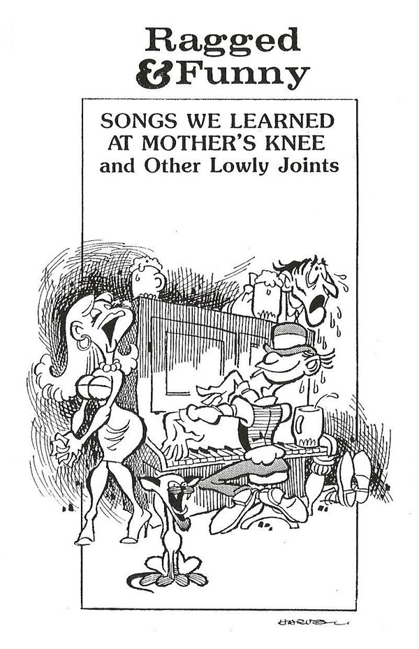 This is the cover of a song book of old standbys,
barrackroom ballads and saloon serenades, the songs we sang just before they
closed the place. I like almost everything about this drawing—the piano player,
with his derby down over his eyes (Beetle Bailey after retirement?), his hands
dancing over the ivories, and how he crosses his feet while seated at the
keyboard (a right foot and a left foot, you see); the exaggeration of the
singer’s face and form, and the cat at her feet, yowling like the songstress we
assume; the sentimental listener (who’s weeping into the piano player’s beer);
and, the final touch, the feet of someone who’s passed out behind the piano.
Glad I did this one.
This is the cover of a song book of old standbys,
barrackroom ballads and saloon serenades, the songs we sang just before they
closed the place. I like almost everything about this drawing—the piano player,
with his derby down over his eyes (Beetle Bailey after retirement?), his hands
dancing over the ivories, and how he crosses his feet while seated at the
keyboard (a right foot and a left foot, you see); the exaggeration of the
singer’s face and form, and the cat at her feet, yowling like the songstress we
assume; the sentimental listener (who’s weeping into the piano player’s beer);
and, the final touch, the feet of someone who’s passed out behind the piano.
Glad I did this one.
FINALLY, AS A BONUS for your staying with me this long, here’s a selection of cartoons from that nefarious but expired career I spoke of earlier.
 |
 |
 |
 |
 |
 |
 |
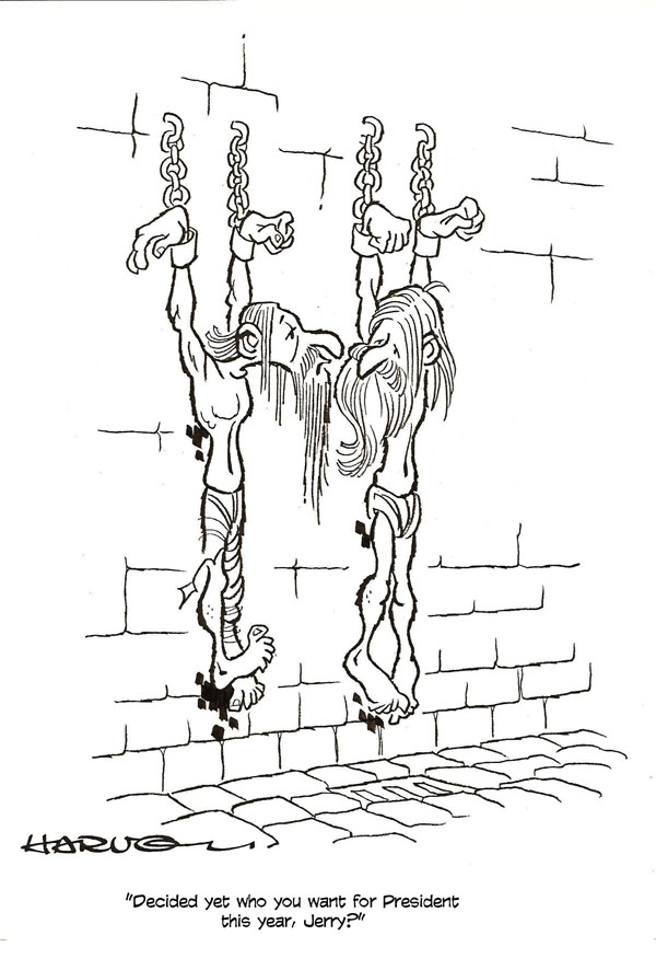
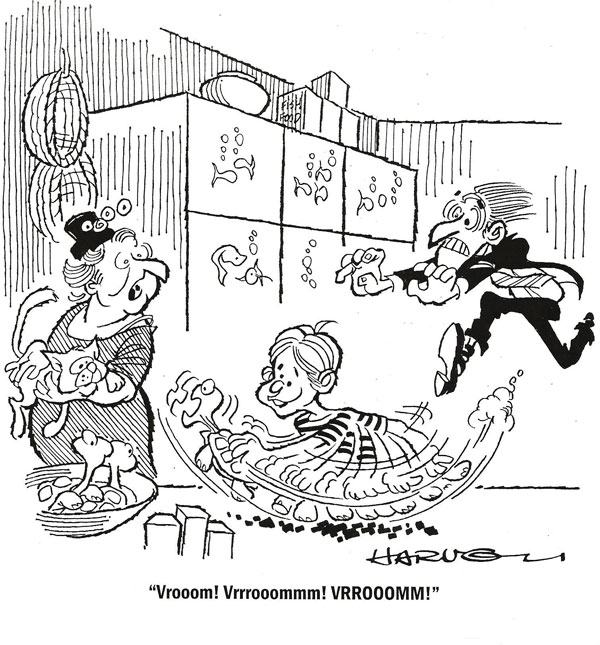
I like the anatomy of the prisoners hanging on the wall; I think I got the muscle tension and the flat-against-the-wall aspects just about right. The cartoon with the kid and the turtle in the pet store is one of my all-time favorites: the expressions on the woman’s face and the store operator’s, the latter exaggerated by the furious energy of his dash to rescue the turtle, the background details (basket, fish in tanks). And the whole notion of the kid treating the turtle as he would one of those toy cars that you can rev up and let go—hysterical. Not my gag, I hasten to add. Most of the cartoons I did during my short foray into the biz were drawn to suit gags sent to me by gag writers. This one, I loved. Something unexpected about it—yet entirely reasonable, given children’s preoccupations.
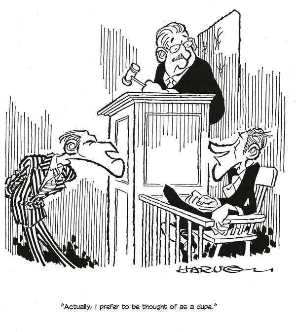
Birds and animals. I almost always like the way they turn out. Maybe I should have stuck to birds and animals instead of quietly retreating into the realm of barenekkidwimmin. (In a minute, inna minute.) The posture of the man on the couch is good—natural, I think. And in the courtroom, I like the lawyer’s stance, prosecutorial exaggeration as if the guy is a bird of prey, and his striped suit (for its black-and-white contrast).
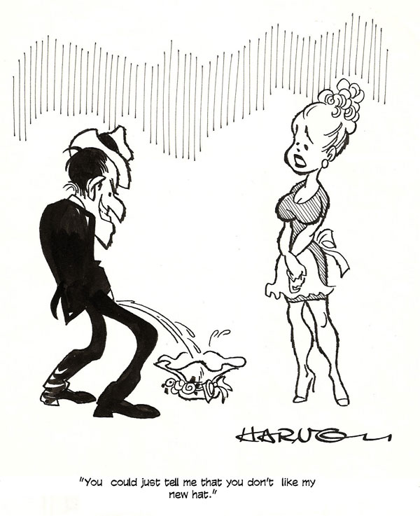
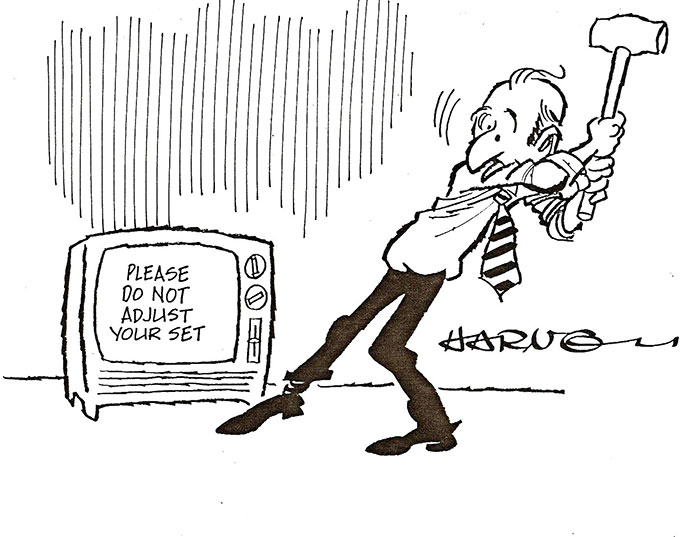
With the last two, we move into the category of magazine I did most of my cartoons for—men’s magazines. The guy pissing on his wife’s hat seems to me just perfectly rendered—the right aggressive posture, the right angry but triumphant expression on his face. And his poor wife—she could have been angry, but I thought a gentle protest would make the cartoon funnier. The guy about to adjust his television set is another that seems just about perfectly rendered—just the right body language, poised and balanced against the weight of the sledge hammer. From this position, only one of two outcomes is possible: either he swings the sledge and demolishes the television. Or he falls down.
Next, we finish today’s sermon with a smattering of the “girlie cartoons” I did. (I did lots of them because they sold better than kids with turtles in pet shops, alas.)
 |
 |
 |
The jogging cartoon is my own invention; no gag writer contributed to this idea. And I’m sure the idea surfaced in my banal brain pan because of the drawing: I suspect I did the drawing of the girl first, just playing around with the anatomy of the female chest. And once I got a picture that pleased me, I came up with a gag to go with it. One of my favorite cartoons.
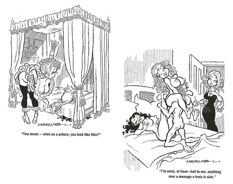
I’ve always been fascinated by enchanted frogs, so whenever a gag writer offered me a gag with an enchanted frog in it, I took it. And it was always even more attractive if the gag permitted, demanded (better), that I draw barenekkidwimmin. Or at least parts of them nekkid. I like the frog here as well as elaborate bed linen (not to mention, but I will, the girl’s spectacular emergence from her neckline). In the next cartoon, it’s the round parts that I think came out the very best.
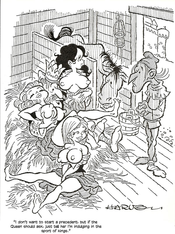
Another of my career favorites takes place in a stable, as you can see, and this one came from a gag writer. First of all, I liked doing all the comfort creatures in the picture with their pillowy bosoms, but mostly, it’s the over-all composition of this cartoon that I admire. Given the gag, the cartoon had to be set in a stable because there had to be a horse around to remind the viewer that the “sport of kings” is horse-racing. The joke required lots of visual elements—horse, king, several of the sporting sort of femme. Oh—and someone for the king to be giving his message to. I’m amazed that I got it all in. And more.
I was able to do it by elevating my camera so I was “shooting” downward. That permitted me to array the visual components clearly in the picture. And I believe the “action” in the picture, despite the complication of having so many moving parts, is clear. I like the tell-tale details—the king’s feet sticking out from under the heap, his arm around the brunette and her hand on his (a natural gesture, I think), the horse’s halter hanging on the wall, the water bucket next to the its stall, the stupid expression on the horse. Ditto on the servant standing in the door—and the castle in the background, seen through the open stable door (I had to get a castle in somehow to suggest the medieval venue). Finally, the thing that pleases me most about the picture—the shading on the servant; it’s just this sort of shadow that would appear on the “interior” side of a man standing in the doorway with daylight behind him. Bravo.
How I thought of all that, I can scarcely say. Except—as I discovered when doing the 24-hour comic—that you “get into it.” You’re submerged in the milieu of the drawing you’re making. It’s a part of you and you of it. You begin living the lives of the persons you’re depicting. You hear them talking, and as you draw, you see their surroundings. You’re thoroughly into it, and so you see things around you in the scene that probably wouldn’t occur to you if you’d planned it all in advance.
You’ll notice, being highly observant as you are, that Cahoots the rabbit (whose actual name is Harvey) doesn’t make any appearances in any of these efforts, whether the spot illos for word origins or the cartoons. I’d invented Cahoots in the late 1950s when I was in college, but I didn’t resume using him as a signature until just a few years ago. Some of the cartoons I did thirty years ago I was hoping to sell to Playboy or other men’s magazines, and I knew a rabbit signature wouldn’t go over very big at any of those markets for obvious reasons. And the word lore stuff was too small to tolerate, even at the edges, a rabbit, whose presence would doubtless detract from whatever humor resided in the illustration. So I didn’t use Cahoots there either.
Next time in Hindsight, I’ll continue this series by talking about the freelance cartooning business and the ways a cartoonist (this one, in any case) composes the pictures of his cartoons.