DUPIN & DOOLEY
Another Oeuvre of My Long Lost Youth
WARNING NOTE. What follows is such an extravagant indulgence that it is sure to be a model of tedious, boring exposition. It is likely to be of interest (assuming such a thing is at all possible) only to other cartoonists—if that. No other brand of being will be even remotely interested or nearly as fascinated by this plethora of detail as I am, revisiting the scenes of my own grippingly mundane past. Okay: you’ve been warned. Onward.
HERE
TO HELP CELEBRATE the dawn of spring and the approaching completion of another annus
mirabilis (“marvelous year”) of Rancid Raves and Harv’s
Hindsight we have a relic of another asshole of a year, 1955, which
earned its nom de anus by not doing anything particularly noteworthy
except graduating from Edgewater High School the last class to commence from
that neighborhood institution—namely, my class (population, 22). The relic at
hand is the cover of a presentation booklet I made hoping to sell my
college-based comic strip, Dupin & Dooley, to the editor of the
campus newspaper at the University of Colorado (population 35,000), whence I
was bound that fall. 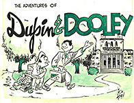
I’d seen a presentation book a few months before, so I knew what one looked like. That specimen offered 6-8 weeks of strips, prefaced with a few pages that introduced the main characters and described the general themes of the strip. I undertook making my presentation book as a summer project that year just before trekking 35 miles north to Boulder and the U. of Colorado on the inskirt of Boulder.
The comic strip starred a couple of characters I’d invented to go with two words my father had foisted off on me. “Dupin and dooley,” he said, were terms that originated during World War I: the words were British soldiers’ corruptions of French for bread (du pan, “some bread”) and milk (du lait). Dupin and Dooley—perfect names for a comedic duo in a comic strip.
The
face of Dooley, the chubby one, was based upon a caricature of Leo Gorcey of
the Bowery Boys series of movies. Gorcey was short and stubby rather than round
and chubby, but his face, as I tinkered with it, devolved into the visage of a
plump guy. Dupin’s mug was derived from another comic strip character, Cecil
Jensen’s Elmo, whose vacuous grin had captivated me a few years earlier.
(For more about Elmo and Jensen, see Hindsight for June 2013.)
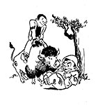
The
second page of my presentation booklet, seen hereabouts, took aim at the
targeted audience by featuring CU’s mascot, a buffalo, whose name, which I
didn’t know at the time, was Ralph. The mascot was otherwise completely
misnamed “Golden Buffaloes” even though the creatures are bison, not buffaloes.
But no one at this institution of higher learning has ever fussed about it
(although my Rabbit did in a 60th reunion drawing I did last fall).
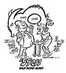
On
the third page of my presentation booklet, I followed the example of the
presentation booklet I’d seen and introduced the characters. The other booklet
spent a couple pages at this task, but I thought one page was enough.
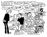
I was aping the format of Gene Ahern’s one-panel features, Our Boarding House and, later, Room and Board, in which several characters in the same scene offer comments on an inaugurating speech by one of the characters (usually Major Hoople or Judge Puffle). Looking at it now, I’m mildly amazed that, at the tender age of 18, I pulled off such a loping series of puns.
Other influences abound: Dan DeCarlo’s formulaic pretty girl, for instance, and Jack Cole’s shoes from Plastic Man (not from Playboy, in which his men seldom were shown wearing shoes—and we never noticed). I think Dooley’s head is too big, but I’m not at all embarrassed to see that I appear in the strip as an idiot cartoonist.
On
the next display, we have the first three strips. 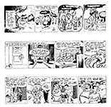 Remembering how I began at
least two other aborted comic strips (one of which, the immortal and immutable Fiddlefoot, which we posted here in Hindsight in July 2012), I seem always to
begin them the same way—without introducing the title characters right away.
Suspense. Wow. Who are they? What do they look like? And as you see, I’m doing
it again in Dupin & Dooley.
And here in my very first comic strip attempt—nine years before Fiddlefoot— I’m overusing Zip-a-Tone, deploying as many dot and texture patterns as I could find. And some of the patterns obliterate rather than illuminate the drawing.
The “Beat Arizona” crack made by a short character in the distance of the second panel suggests that I followed CU football, but I didn’t. Never did. In the third panel, the middle guy with the gorilla visage and hairy chest betrays my biases: he’s obviously a football player.
Otherwise, I’m offering up a rousing cliche situation: in contrast to the cheery opening caption, we have pictures wholly lacking in cheer. Mystery. Suspense. Cliche.
The second strip in our lineup—more cruel suspense—another day without the title characters in view. Instead, the blustering egocentric prez of Limbo University, Julius Overdrive, and his dutiful retainer, Simply (whose name works better when you can capitalize initial letters, a maneuver lost in comic strip speech balloons in which all letters are capitalized). The mouse in the opening panel is on strike; the mouse shows up again occasionally but has nothing to do with the so-called plot. The tiny lettering on Overdrive’s desk reads “kneel.” I was suffering from Mad comics at the time. The next D&D follows toute de suite (“tootie sweetie” in English).
Here, at last, in panels three and four, we see the strip’s title characters— Dooley, the chubby and brainy one, and Dupin, the muscular and brainless one. I was drawing with a brush in those distant 1955 days; and I had incorporated aspects of Gus Arriola’s distinctive drawing style in Gordo—hands, most notably. I wasn’t doing it well, mind you—but it seems passable today as I gaze upon it. I was also addicted to certain formalistic infantile gags: Overdrive grabbing the panel border in panel two, f’instance; and even Simply playing cats’ cradle.
Dupin’s empty speech balloon as a response to Dooley’s terrible joke is an novel ploy, though: I don’t think I’d seen this trick played elsewhere before (but I must’ve: I’m not that innovative myself).
I
planned for the strip to be published only three days a week—Monday, Wednesday,
and Friday. Canny of me: although I had yet to experience collegiate life, I
planned on taking classes, and—sheerly perceptive—I knew I wouldn’t have time
to do a daily, 6-times-a-week comic strip AND be a full-time student.
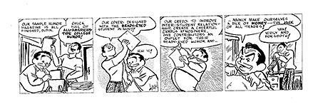 The strip at
hand would run on the second Monday, beginning the second week of the
continuity.
Here we find out what Dupin and Dooley have been up to: they intend to produce a campus humor magazine. And we get some ample hints about Dupin’s fascination with the opposing sex.
A thing that mildly amazes me about this strip—produced, remember, before I’d entered the U. of Colorado—is the humor magazine gimmick. Within months, I’d begin a four-year engagement with campus humor magazines, beginning with the infamous Flatiron—see Hindsight for May 2017 (scroll down for a long time to get past the Easter bunny). But how did I know about humor magazines before I’d even set foot on the Boulder campus?
I like the third panel—Dooley’s rotundry and all those radiating rays, which, here, pointlessly proclaim something Significant where there is no such thing. In the last panel, Dooley looks like his model, Leo Gorcey.
Next,
our heroes take their sample humor magazine to the university prez, Julius
Overdrive, for approval.  Several Mad influences here—“curb your dog,” for
one. It was all over most issues of Mad comics, but I never realized its
significance until I moved to New York City after college and stepped in some
dog do while walking innocently along the sidewalk, gawking upwards at the
skyscrapers instead of watching where I was stepping.
The mouse is quoting from Tennyson’s “The Charge of the Light Brigade,” giving to Dupin and Dooley’s errand a faux sense of profound seriousness that it doesn’t deserve—another borrowing from Mad.
I think I handled the creation of suspense here pretty well, particularly the pacing—leaping from the second panel to the third. Judging from the reactions of the characters in the last panel (even Dooley’s tie is all wrought up), something astounding “happened” between the second and third panels. Something that alarmed—or surprised— Overdrive. Naturally, we want to know what. And it’s entirely possible that we’ll find out tomorrow.
But,
no. Having created that stupendously suspenseful conclusion in the previous
day’s strip, I didn’t resolve it in today’s installment.  What happened that got
University Prez Julius Overdrive so exercised? We still don’t know. Instead, we
have this thoroughly lame joke—lame because it has nothing to do with any of
the rest of the story. It’s just a Mad comics gag wedged into the
sequence. Ew.
Incidently, when I say “Mad comics” I mean the comic book Mad, not the magazine Mad. The magazine format had been adopted with the July 1955 issue of Mad, and while I’d seen it, it was the comicbook that I’d read so assiduously as to have my brain permanently damaged.
In
the strip at the top of the accompanying visual aid, our heroes finally make
their presentation to the University Prez. 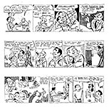 And he approves. In real life at a real
university—as I was later to find out—this sort of approval isn’t so easy to achieve.
But even at 18 and having never attended college, I knew publishers of campus
humor magazines needed approval from The Powers.
The first panel is done wrong. Overdrive should be on the left instead of on the right so his speech balloon would come first. And because I was unwilling to re-draw the panel (I didn’t have a light-table that would have permitted me to easily reverse the picture and trace it), I had to try to solve the speaking-reading order problem with oddly shaped and arrayed balloons.
Part of the oddness is a sort of vertical gap at the upper left-hand corner of the panel. The gap is more noticeable in the next strip in which a speech balloon is sculpted to create space above the words “that although.” Newspapers often dropped the typeset name of a comic strip into that corner of the first panel. By doing so, the paper gained a little extra vertical space on the comics page and could cram another comic strip or two onto the page. So cartoonists always made room in their strip’s first panel for that “slug’ of type to be dropped in.
Otherwise, the strip ends with another terrible joke. (I was only 18, remember.) Will Eisner fans will notice that the decorative window in the third panel is stolen, every stroke, from the Wildwood Cemetery lair of the Spirit. (I would steal this again for my Fiddlefoot strip, as you’ll doubtless recall; and for that, if you’ve read Harv’s Hindsight for July 2012, you know I eventually got my comeuppance.)
Given Prez Overdrive’s excitement two days ago at “something” Dupin and Dooley must’ve said, why did I wait so long to reveal the wholly unastounding fact that they told him about their humor magazine? Why? Because I wanted to created suspense in the most outlandish way I could imagine.
I’m glad to see that the joke in the second strip down this lineup arises from a blend of word and picture because it shows I was thinking like a cartoonist. In the first two panels, while Prez Overdrive raves on, a visual comedy ensues as Dooley consumes the chocolate cigar Overdrive gave him in yesterday’s strip. In the last panel, I like the way the Zip-a-tone shading worked on Dupin and Dooley’s faces (even though, in this reproduction, the effect is somewhat smeary).
In this page’s bottom strip, Dupin and Dooley are cleaning up the closet that Prez Overdrive gave them for an office out of which they’ll produce a campus humor magazine. Amazingly enough, a couple years later, I was helping to produce a campus “general interest” (but funny) magazine, and we worked out of an office that was just a little larger than this closet. In a previous life, it was, I think, a storage closet.
The opening panel here is a nice montage, I think. And the punchline is a blend of word and picture—in which each character is “in character”: Dupin chases after girls; Dooley, the intellectual, keeps track of reality.
MY PRESENTATION BOOKLET for Dupin & Dooley included seven weeks of continuity, but only four weeks of strips (three strips a week, Monday, Wednesday, Friday). The rest of the continuity consisted of typed prose scripts—like scripts of a play. Visually boring, so I’ll skip those here.
Two
daily scripts intervene between our last D&D posting and the strip
at the top of the adjacent exhibit. 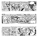 In those, Dooley decides that the humor magazine he and
Dupin plan to produce is in desperate need of —a cartoonist! So they go to the
Student Employment Office to advertise for a cartoonist. Logical. And that
brings us to the only part of the presentation enterprise that surprises me.
I’d forgotten the song-and-dance team that ran the Student Employment Office. How I came up with them, I cannot recall, but they seem to be the only inspired part of the whole project—singing and dancing “alphabetically.” What possessed me to compose a rhyming jingle for these guys—again, I dunno. Writing any sort of poetry is foreign to my inclinations or (as you can see) ability. But when I encountered this thing again as I reviewed the strip for this Hindsight essay, I liked it. Better than anything else herein.
This SEO pair look somewhat like fugitives from the Mad Hatter’s tea party in Disney’s “Alice in Wonderland,” so I wonder if that lurked in the back of my mind. The animated cartoon came out in 1951, so the lurking would have taken place over four years. Possible.
The tiny asterisked vertical line of text between the second and third panels, too small to read in its present state, says: “Fortunately for him, the author of this verse has left town.”
And my signature in the upper right-hand corner of the last panel isn't my name. It says "Author," and the “A” is crossed with a fat slash, echoing the signature of Hank Ketcham (as does my actual signature). And under that— continuing the conceit of the vertical line— "unknown (luckily)." More lame humor.
In the second strip down the page, we have more shenanigans at the Student Employment Office where rhyme rules. Brilliant stuff, no doubt, but not Shakespeare. Not even Byron. The weirdly tumbling strip panels betray my continuing fascination with Arriola’s Godo, which, about this time, often deployed odd-shaped panels.
Having witnessed Dupin and Dooley placing an ad with the Student Employment Office for a cartoonist, we now shift our scene in the third strip to the moth-ridden garret in which impoverished student cartooner Walt Frisby abides. Yes, he looks remarkably like me. No accident but probably a breach of decorum.
The signs all over the walls are unadulterated Mad imitations. The notation before my signature references a 91-pound stitch collector, alluding to a sign on the wall. In Walt’s sticking his tongue out all the time we see what might be a good dose of Shelly Mayer’s Scribbly, but I can’t say for sure that I ever saw Scribbly before I committed this strip. I don’t think I’d ever encountered a frisby either; they were just hoving over the horizon at the time.
But I must’ve seen the word somewhere, and I picked it for the name of my cartoonist character because it sounded somewhat like “Disney.”
The rest of the continuity of this story in the presentation booklet is carried in typewritten script, not drawn strips. In them, Dupin and Dooley hired the “boy cartoonist,” Walt Frisby, and then Walt and Dupin team up to demand that Dooley hire a secretary. Dupin has in mind some species of gorgeousness. For several days, they interview a parade of good-looking girls. Dupin turns them all away because they all want to work, and he doesn’t want that sort of bad example around the office. They finally hire pretty September Jones (“Call me Sadie”), who takes the job because she’s attracted to—Dooley!
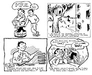
That’s the end of the continuity. The next two pages of the presentation booklet suggest future stories.
 |
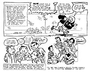 |
In the lower left panel of the second of these pages appear caricatures of Arthur Godfrey, George Gobel and Jack Webb (the latter I think I stole most of from Al Hirschfeld), all of whom were popular tv stars in 1955, the year of my concocting the strip.
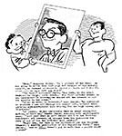
The last page in my presentation booklet was an autobiographical blurb, which you’ll see hereabouts, decorated with a self-portrait in which it is revealed that I had hair all over my head at the age of 18.
 |
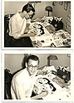 |
The accompanying photographs reveal the same hirsuteness. They were artfully composed in imitation of other photographs of working cartoonists that I’d seen.
I was modeling my booklet on another I’d seen, and it had an autobiographical page about the cartoonist; ergo, I had one. (Attentive readers will note that as a misguided youth, I did cartoons for the state Republican Party’s newspaper, The Trumpet. Amazing, isn’t it?—how misguided youth can be. But not as misguided as the Republicon Party has become in recent years—so much so that I long ago deserted.)
Soon after I arrived on campus at CU, I took my presentation booklet in to the offices of the Colorado Daily, the campus newspaper. No sale. The editor said he had no extra money to make the plates that would be necessary to publish the strip. He was already running Little Man on Campus, a panel cartoon self-syndicated by Dick Bibler, and Pogo (which, in 1955, was spiraling into the satiric atmosphere after Walt Kelly’s expose of Joe McCarthy). Probably thought he had enough comics.
He said he was surprised, though, that I had captured as well as I did the atmosphere of campus life since I was merely a green-beanied freshman with no prior experience of college. And today, reading this ancient stuff, I’m mildly surprised myself. I eventually followed in Dupin and Dooley’s steps (or Walt Frisby’s) by cartooning for the CU campus humor magazine, The Flatiron—which was banned after I’d contributed cartoons for the two last issues. I can’t say that my cartoons brought on the magazine’s demise, but the second (the last) issue had about 22 pages, and 7 of those were my cartoons—about 33% of the magazine’s editorial (non-advertising) pages.
I didn’t sell D&D. And I hadn’t seen the presentation booklet since I sadly put it away over three decades ago. And nobody else has seen it until now. But we’re not quite through with Dupin and Dooley.
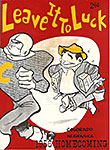
DUPIN AND DOOLEY didn’t sell to the Colorado Daily editor, but the characters lingered in my head, haunting me. (Well, that’s a little over-dramatic; but they were residents there.) The fall of my sophomore year, 1956, I drew the cover for the “Leave It To Lucky” Homecoming football game program, and as you see on the display nearby, Dooley played a role.
 |
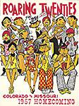 |
The next year, I did the Homecoming program cover again—for the “RoaringTwenties”— and you can see both Dooley and Dupin in the upper right-hand corner.
I like the “Roaring Twenties” cover because so much is going on with it. The basis for this visual is John Held, Jr.’s flapper cartoons of the 1920s. I could have managed the feat by simply taking the two women at the lower left and duplicating them all over the scene. But as I noodled around with the idea, the people in the bleachers started behaving like individuals. At the center—and provoking most of the action—is the woman standing up and cheering. Her enthusiasm disrupts everyone around her.
She accidentally hits the guy on her left, causing him to spill his soda bottle on his date at his left. On her right is a guy holding two hot dogs, which he intends to pass along to the couple at the far right, and he’s a bit upset that the cheering gal has upset his activity temporarily. And the longer she stands there, waving her pennant, the cooler the hot dogs are going to get before they reach their destination.
And the cheer leader’s physical spontaneity has also discomboblulated three people behind her, one of whom moves abruptly, accidentally shoving his hot dog into the face of his date.
Oh—and I managed to slip Cahoots (Harvey the Rabbit) into this tableau on the first row, holding a sign with my signature on it.
All in all, a very satisfactory experience for me.
Both of these covers, incidentally, were recently appropriated by Asgard Press for a series of “Vintage” calendars in which covers of antique college football game programs were resurrected to illustrate each of the months. Asgard did this without asking anyone’s permission, of course. So I knew nothing about the project ans was surprised when, several years ago, I picked up one of their Vintage calendars at a store on Boulder’s Pearl Street Mall and, turning it over to see what was on the back, discovered the Lucky Dooley cover. Naturally, I bought one.
And then, the next year, imagine my surprise when, as I was in line at Whole Foods to check out, I saw my Roaring Twenties cover gleaming at me from a rack of calendars.
As you can tell, D&D were stuck in my head. Couldn’t rattle them out of there. Somewhere between entering college in the fall of 1955 and graduating four years later, I did a brochure about the strip. Not a presentation booklet this time—just a brief, almost cryptic brochure, an 8.5x11-inch sheet, folded in half.
By this time television had finally arrived in Denver (we didn’t get it at first; something about the curvature of the earth and the straightness of tv rays), and I thought my blundering duo would make good tv comedians. Why not? From producing a campus humor magazine to cracking jokes on camera—seems a natural progression to me.
Not
really. I changed the concept quite a bit, as you’ll see. The brochure began
with a mock TV Guide cover.  When you open my TV Guidepost magazine,
you don’t get television program listings. Nope. You get the three introductory Dupin & Dooley strips arrayed across the center spread.
The
first day’s strip seems to me a fairly complex composition—going from the tv
mogul’s office to the Jay Gleesong studio during a broadcast, the tipsy tv
camera suddenly focusing upwards toward the balcony where we see D&D,
engaged in some sort of comical mishap. 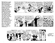 This time, I didn’t postpone bringing the
title characters into the strip.
I was still under the influence of Gus Arriola: you can tell from the cubist desk in the first panel and the layout of panels 2 and 3 in the second strip. Incidentally, I think the face in the lower right corner of the last panel is a caricature of Jack Parr. The third strip is a nice lively episode, I think; I particularly like the second panel’s action.
Oh, and—yes: Dupin is now a blond.
The
last page of the Dupin & Dooley brochure was an unabashed teaser:
here’s what’ll happen next, and these are the absolutely hilarious characters
you’ll meet if you buy this strip. Or ask for more of it. 
Actually, I never mailed the brochure to anyone. Dunno why. After all that work. Got involved in something else on campus, I suppose.
And
then—still not shut of D&D—I did another “promotion.” Calling it that is a
joke: it is, as you can see hereabouts, a one-page—“treatment,” I suppose you
could call it. 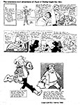 A new concept for these two guys to get into television, which is
still the ambiance I envisioned for the strip. This sheet is dated 1959, the
year I graduated from the University of Colorado. I suppose I thought I’d send
this around to all the syndicates and be deluged in return with contracts to do
the strip. But I never sent this one to anyone either.
But I did get a look on Dupin that I liked. Neither of us, however, ever went anyplace in newspapers. And Dooley was pretty good now, too—roly-poly and cute, a few chubby steps away from the cynical Leo Gorcey character whose face inspired Dooley’s.
We
conclude this survey of the sins of my juvenile years with a final portrait of
the duo, Dupin on the left; Dooley, on the right. Dooley’s head is still too
big, but that’s understandable: this portrait was made just about the time I
was conjuring up the strip, so it suffers from the same blemish. 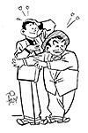
And here, in the bold outlines, you can see, more evident than in the other materials I’ve posted, the influence of Gus Arriola—and in the hands. I hadn’t yet given up on rendering the interior of ears with a squiggle like Gus had done about this time—and that makes me think this drawing was made before I did the strips: the ears in the strips have no interior at all. (Like the interior of the heads they decorated, I suppose.)
Dupin
and Dooley seem momentarily besotted with love or lust. And for the
explanation, look at the next visual aid.  I’d fallen in love with Bob Lubbers’ Long
Sam, and I’d written him, begging for an original (and as an opening gambit
in a trade, I sent him one of my originals, a drawing of a character I did in
high school called Stormy Smith). He generously sent the inscribed drawing you
see here.
I framed it and had it on my bedroom wall next to my drawing table. And since I’d given up on ol’ Stormy in favor of Dupin and Dooley, I drew them about the same size as leggy Long Sam and framed that picture and put it just to the left of her. And that’s what Dupin and Dooley are drooling over and spouting hearts all over the place. Notice that the hearts I drew are exactly like the hearts Lubbers drew. Amazing, isn’t it?
And this is a fitting place to end this saga. If you’ve been following along, you’ve seen work that no one else on the planet has seen—until this very minute.
