 |
||||||||||||||||||||||||||||||||||||||||||
Opus 428 (April 30/May17, 2022). It isn’t often that two giants in any medium die within a week of each other, but it happened this month when Neal Adams died and then George Perez died a week later. We celebrate their lives and achievements, and, as usual, we also review recent comicbooks and editoons and several books (including two reprinting EC works by Elder and Wood) and offer a way to prevent mass murders. In order to assist you in wading through all this plethora, we’re listing Opus 428's contents below so you can pick and choose which items you want to spend time on. An asterisk* marks the longest items. Here’s what’s here, by department, in order, beginning with the news of the day—:
NOUS R US CORRECTIONS FIRST; THEN— Cartoonist on U.S. Postage Stamp National Cartoonists Day Again Ted Rall on the Supremes’ Leak Sack Sacks Sack An Evening Out with Grammy
FUNNYBOOK FAN FARE Cassidy’s Secret Little Monsters Monkey Meat (again) She-Hulk Batman Catwoman Number One
EDITOONERY The Mock in Democracy *A Selection of the Month’s Editorial Cartoons —with a Brief Sprinkle of Gag Cartoons
NEWSPAPER COMICS PAGE VIGIL The Bump and Grind of Daily Stripping
ACCRETION OF INTENTION DEPARTMENT Somewhat Older Books In Need of Good Reviews, Namely—: Obsessed with Marvel: Test Your Knowledge of the Marvel Universe
RANCID RAVES GALLERY Abortion Rights
PEEVES & PRATFALLS TV Commercials Are Disgustingly Taking Over
BOOK MARQUEE Short Reviews and Proclamations of Coming Attractions, To Wit—: The Million Year Picnic and Other Stories Illustrated by Will Elder with John Severin Atom Bomb and Other Stories Illustrated by Wallace Wood
BOOK REVIEWS Long Reviews, Critiques & Crotchets *The Place To Be: Washington, CBS, and the Glory Days of Television News By Roger Mudd
ONE OF MY FAVORITE CARTOONS And How It Came To Be
LONG FORM PAGINATED CARTOON STRIPS Called Graphic Novels for the Sake of Status *Berlin By Jason Lutes
Another Favorite Cartoon of Mine
PREVENTING MASS MURDERS
Passin’ Through— *Neal Adams *George Perez
QUOTE OF THE MONTH If Not of A Lifetime “Goddamn it, you’ve got to be kind.”—Kurt Vonnegut Our Motto: It takes all kinds. Live and let live. Wear glasses if you need ’em.
But it’s hard to live by this axiom in the Age of Tea Baggers, so we’ve added another motto: Seven days without comics makes one weak. (You can’t have too many mottos.)
And in the same spirit, here’s—: Chatter matters, so let’s keep talking about comics. AND— “If we can imagine a better world, then we can make a better world.”
And our customary reminder: don’t forget to activate the “Bathroom Button” by clicking on the “print friendly version” so you can print off a copy of just this installment for reading later, at your leisure while enthroned. Without further adieu, then, here we go—:
NOUS R US Some of All the News That Gives Us Fits
AND: NOTED IN PASSING—A CORRECTION!!! In Opus 427a, we published the following advisory: Watch CNN to Keep Up-to-date on the Latest Commercials. CNN spends more time airing commercials than it does reporting the news. I’ve timed it: the usual relationship is an average of 23 minutes of commercials for every 2 minutes of news. And here is the same notice, with the correction made (it’s two-to-three minutes, as you can see): CNN spends more time airing commercials than it does reporting the news. I’ve timed it: the usual relationship is an average of 2-3 minutes of commercials for every 2 minutes of news. Watching Jake Tapper a few minutes ago, the commercial I came in on took at least 4 minutes; and so did the ensuing news segment. Even. But I came in on the commercials already I progress; they’d probably been going for a minute or so before I tuned in. Probably naive of me, but shouldn’t we get at least twice the news? Eight minutes of news vs. four minutes of commercials? That sounds adult. But the people that own the tv networks have another agenda. And we all know what that $tands for. Still, I like the implication of the typo in the first version of this note. It dramatizes the inequity.
CARTOONIST ON STAMP It’s harder to get your phiz on a U.S. Postal Service stamp than you might think. First, you gotta be dead. No live persons can have their faces on a stamp. So for the sake of postage fame, Shel Silverstein is deceased. Having
met the first criteria, Shel went on to get his name—but, alas, not his face—on
a stamp. As we can plainly see in the illustration posted nearby (which
includes a picture of Shel’s face, just in case.) The image is taken from one of his earliest books for children. Published in 1964, The Giving Tree is about an altruistic tree that sacrifices its shade, fruit, branches, and even its trunk to make a little boy (eventually a man) happy. The book inspired much comment from pulpits and ecologists, all favorable; but feminists criticized the story because the tree was feminine and, therefore, the boy was sexist.
Silverstein was somewhat puzzled by the phenomenal sales of The Giving Tree. "Maybe it’s because the book presents just one idea," he said once. The controversy of the supposed symbolism of the book was another thing that didn’t concern him. He resisted reading moral significance into the story. "It’s just about a relationship that exists between two people," he once said; "one gives and the other takes." Shel Silverstein was a giver. Silverstein’s first collection of poetry for children, Where the Sidewalk Ends, came out in 1974, followed in 1981 by A Light in the Attic. Both were bestsellers, the latter spent 182 weeks on the New York Times list. These and the more recent collection, Falling Up (1996), will secure Silverstein’s place in American letters. (In fact, Twayne’s Authors Series published Shel Silverstein by Ruth K. MacDonald in 1996, marking a spot for him on literary criticism.) But Shel was more than just a writer of poems for children. His was a protean talent, and he applied it everywhere. To see how (and where), go to Harv’s Hindsight and scroll down until you get to April 2001. There you’ll find Shel Silverstein in all his multifaceted glory. His most enduring connection was with Playboy, where he functioned in his basic mode as a cartoonist. Apart from Playmates and founder Hugh Hefner himself, Shel may be the most famous (and lasting) outcome of the magazine. The basis—the foundation—upon which Shel built all his life was that he was, first, a cartoonist. And so we’re celebrating herewith the historic moment that a cartoonist got on a stamp. He didn’t get there for being multifaceted. He got there because he was a cartoonist who produced children’s books. An author, yes; but a cartoonist first. Shel isn’t the first cartoonist to get on a stamp. Walt Disney may be the first. But Shel is a cartoonist with a vengeance, and that gets him on a stamp.
THE SUPREMES OVERTURN ROE v WADE And here’s Ted Rall’s verdict—: “Recent appointees to the Supreme Court of United States, justices elevated by former President Donald Trump, told the United States Senate during their respective confirmation hearings that they considered the landmark 1973 abortion-rights decision Roe v. Wade to be ‘settled law.’ But a leaked draft opinion indicating that the conservative majority plans to overturn that decision belies their assurances. The fix has been in for years, and desperate women will pay the price.”
SACK SACKS SACK Editoonist Steve Sack announces his retirement with a letter to his cohorts—: I’m sorry to report this, folks, but after 45 years of cartooning I’ve decided to retire from the business. I’ve been away from my drawing table (or iPad La-z-Boy) for 7 weeks now, recovering from hand surgery for carpal tunnel and assorted nerve issues. Healing has taken much longer than expected, and I still have a ways to go before I’m able to draw with sufficient control. But I’ve taken time to reflect and decided that at this stage of my life, I’d like to focus on other interests and projects, artistic and otherwise. My editor has kindly left the door open to me for occasional cartooning should I ever feel the itch. No decision has been made about a replacement. So I wish you well, comrades. I hope to stay in touch, and I’ll be watching as you carry on. I’m your biggest fan. Steve
AN EVENING OUT WITH GRAMMY Nobody got slapped, but the evening nonetheless had its moments for us. The host for the second straight year, Trevor Noah, proved he could hold the rambling thing together without telling dirty jokes but keeping the atmosphere light and airy. Through the evening, I had to kick myself mentally every now and then to remind myself what the awards were for: the brassy and elaborate staging of the musical numbers drew attention to the imagery rather than the music. But reminding myself didn’t improve matters much: the so-called music was loud and throbbing, leaving long behind the simple-minded notion of melody, once music’s forte. Noah introduced a clip starring Ukraine’s prez Volodymyr Zelensky, who reminded us of the grim realities on the other side of the Atlantic, “contrasting the carefree lives of those attending the ceremony in Las Vegas with the menaced lives of musicians in his battered homeland” according to report. “Our musicians wear body armor instead of tuxedos,” Zelensky said. “They sing to the wounded in hospitals, even to those who cannot hear them. But music will break through anyway.” He ended with: “Tell the truth about the war on your social networks, on tv. Support us in any way you can—any but not silence. And then peace will come to all our citizens.” Ending with that assignment, Zelensky’s message managed his purpose without depressing the otherwise upbeat show. My wife and I are steady watchers of Stephen Colbert on “The Late Show” where we also see band leader Jon Batiste, a quiet delight all by himself. So we were happy to watch him collect the Album of the Year award for his “We Are,” capping his evening with five awards, nearly the record that his 11 nominations was.
“I am so grateful for the gifts that God has given me and the ability to share that for the love of humankind,” he said. “We just wanted everyone to see it. Any depression, any bondage or any darkness that was over your life is completely removed by just the love and the joy of music.” Music fosters love and a sense of community. Yeh, I know: no comics or cartoons. But sometimes, other happinesses of the entertainment universe overwhelm us, and we must recognize them.
ODDS & ADDENDA Republicons have introduced 253 bills to restrict voting access in 43 states according to Ari Berman at MotherJones.com. These numbers change weekly, but the circumstance prevails: Republicons want to restrict voting rights to those who will vote Republicon.
Fascinating Footnit. Much of the news retailed in the foregoing segment is culled from articles indexed at https://www.facebook.com/comicsresearchbibliography/, and eventually compiled into the Comics Research Bibliography, by Michael Rhode, who covers comic books, comic strips, animation, caricature, cartoons, bandes dessinees and related topics. It also provides links to numerous other sites that delve deeply into cartooning topics. For even more comics news, consult these three other sites: Mark Evanier’s povonline.com, Alan Gardner’s DailyCartoonist.com (now operated without Gardner by AndrewsMcMeel, D.D. Degg, editor); and Michael Cavna at voices.washingtonpost.com./comic-riffs . For delving into the history of our beloved medium, you can’t go wrong by visiting Allan Holtz’s strippersguide.blogspot.com, where Allan regularly posts rare findings from his forays into the vast reaches of newspaper microfilm files hither and yon.
FURTHER ADO What’s the leading cause of dry skin? Towels. Wanna hear a joke about construction? I’m still working on it. There’s so much anger in the world right now. Yesterday the tire of a used car kicked me.
FUNNYBOOK FAN FARE Four-color Frolics An admirable first issue must, above all else, contain such matter as will compel a reader to buy the second issue. At the same time, while provoking curiosity through mysteriousness, a good first issue must avoid being so mysterious as to be cryptic or incomprehensible. And, thirdly, it should introduce the title’s principals, preferably in a way that makes us care about them. Fourth, a first issue should include a complete “episode”—that is, something should happen, a crisis of some kind, which is resolved by the end of the issue, without, at the same time, detracting from the cliffhanger aspect of the effort that will compel us to buy the next issue. A completed episode displays decisive action or attitude, telling us that the book’s creators can manage their medium.
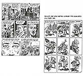
AFTER TWO ISSUES of Cassidy’s Secret, we don’t know the secret. Cassidy is a lawyer and the secret paramour of “John Doe,” known as the superhero Airstrike, who landed on Earth two decades ago. We watch them having sex and then, half-a-dozen pages later, we watch Airstrike die in a coughing fit. In the next issue, we find out he’d been poisoned. There are completed episodes enough in No.1 to establish the personalities of the principals and to demonstrate a certain storytelling competence but not for comicbook stories which do not survive well when broken apart as they are here. No.2 introduces a lot of characters, but their relationship is not clear. Everyone is trying to find out who killed Airstrike. We don’t see Cassidy again until late in this issue. She places under arrest one of the richest men in the world, Rex Russell, who owns 3 of the only 5 labs in the world that could have produced the poison that killed Airstrike. The world includes “nomals” and “ultras,” but we don’t know anything about either. Is an ultra like Airstrike? And a normal, therefore, not an ultra? Who knows? Not us—and we’ve read the book. The back cover blurb alone tells us more than two issues of the book could manage. “Cassidy Crawford is the most prominent defense attorney of this world who leads a law firm that specializes in protecting this new minority population [probably the superpowered offspring of Airstrike] from overzealous laws, police and prosecutors.” Charles
Holland, the creator/writer of this mess, is responsible for all the confusion,
but he is ably aided and abetted by Antonio Fuso. Fuso is an excellent artist
but not for visual storytelling. Comicbooks require characters who are
instantly recognizable, and none of Fuso’s creations are. Cassidy is a woman, a
blonde who wears her hair in a ponytail. Does she always? We don’t know. But
all the women look alike because of Fuso’s habit of cloaking them in solid
black shadows. Very nice artistically, but very bad for comics storytelling.
Even when they are not shadowed to obscurity, Fuso’s linework is cryptic rather
than revealing; his characters remain visually obscure throughout. Holland’s
storytelling technique is to introduce fragments of his story. And he manages
his narrative with speech balloons; pictures, arranged in page layouts, do not,
of themselves, create a story. Too confused as a result of the fragmentary
nature of Holland’s storytelling. I assume that he will eventually connect all
the pieces, but in the meantime, we have meaningless narrative scraps. What brought me back for the third issue was simple proximity: I was strolling along the book racks at my local comicbook store and saw the cover of No.3. Thinking it might explain Cassidy’s secret, I bought it. Sure enough: it explains (well, begins to explain) the secret. When Cassidy was seven, her home was attacked by some unspecified power, and her father picked her up to comfort and protect her. At the same time, he grew horns—antlers, actually, of the elk sort, as you can see in the accompanying illustrative material.What Holland will do with this factoid is anybody’s guess, but me? I’m through.
JEFF LEMIRE’S Little
Monsters has artist Dustin Nguyen going for it. His crisp
black-and-white artwork with gray tones carries Lemire’s simple story and
creates most of its suspense. A half-dozen children—probably in their early
teens—wander through a thoroughly wrecked urban landscape. They play
games—capture the flag, jumping off buildings, tag. They catch rats But several completed episodes convince me that the book’s producers know what they’re about and understand the comicbook medium. Towards the end of No.1, we learn that the kids expect someone—“he”—to return. Or not. Then on the last page, we learn that the kids are not absolutely alone: one of them encounters a derelict adult, who says, “Please ... please help me.” And the kid who finds him opens his mouth slightly, revealing fangs.
THE THIRD ISSUE
of Juni Ba’s delightfully drawn Monkey Meat presents an actual
story—a narrative with a beginning,
WITH THE SECOND AND THIRD ISSUES of the new She-Hulk we realize what writer Rainbow Rowell and artist Roge Antonio are up to. Glamour. The whole reason for the present storyline is to show off She-Hulk’s stunning figure and her facial beauty. Which is to say, it’s Antonio’s title. While we’re waiting for the next excuse Antonio has to drawn figure or face and color them green, Rowell strings together a sort of story. Jennifer Walters, She-Hulk, is an attorney and goes to an office for a while to work the phone for clients. But mostly, she tries to figure out whether Jonathan “Jack” Hart—i.e., Jack of Hearts—is alive or not. He’s shown up at her new apartment and promptly collapses. Then, despite protesting that he requires neither water nor food, he pigs out on water and food. That’s about it. Oh—except for the pictures. Hereabouts, some samples. Glamour on every page (and the covers, of course).
ALL OF
WHICH—glamour, I mean—brings us to No.10 of DC’s Black Label Batman
Catwoman, which I bought solely because of Clay Mann’s spectacular
cover. Primed by the glamourous indulgence of the She-Hulk books, Catwoman’s
decolletage was more than I could resist. So I didn’t. In fact, there are three Catwoman costumes on display, and the one with a zipper on the front always has the zipper pulled up as far as it will go—except on the cover, which shows the zipper pulled down somewhat. The
most spectacular of the three costumes is the one that’s skin-tight all over.
So tight is it, in fact, that even Catwoman’s navel shows. That’s skin-tight,
kimo sabe. The third costume has wings (like a bat, not a cat) and a wing symbol on the front. Otherwise, there is no story. Most of the book is devoted to conversations the three Catwomen have with the Joker or, perhaps, each other. And given the dramatic lighting, it’s not always clear which of the Catwomen is speaking. None of this goes anywhere, but I haven’t seen Nos.1 through 9, so I can scarcely render a judgement—although it’s difficult to understand how Tom King’s pointless conversational fragments fit into anything but a nightmare or dream sequence. Given the usual insanity of the Joker, that’s about all we can expect.
WITH A COMICBOOK entitled Number One, presumably a one-shot production, we have for the first time that I know of a comicbook devoted entirely to the in-shop adventures of a comicbook store operator. The text—captions mostly but occasional speech balloons, too—is specific about the various lures and pitfalls a comicbook store operator encounters and, somehow, survives. Historic stuff researched and presented in detail by writer Gary Scott Beatty. The most entertaining part of the book is in Aaron Warner’s pictures. Individual portraits, pictorial personalities—all expertly rendered. Warner exploits all the capabilities of the medium. Where he learned how to do this I can’t say. But his stuff is spectacular in a run-the-gamut sort of way.
Otherwise, there is no story. It’s an expository book.
QUOTES & MOTS There’s nothing sadder than an old hipster.—Lenny Bruce What wisdom can you find that is greater than kindness?—Jean-Jacques Rousseau
EDITOONERY The Mock in Democracy IT’S BEEN ONE OF THOSE MONTHS—full of horrific disasters and laughable self-indulgences by officials too high up to realize what they’re doing. The latter, at least, providing plenty of fodder for the nations editoonists. Our duty here, as usual, is to emphasize the way editoonists deploy imagery to make their political points, thereby, we hope, enhancing all of our enjoyment of the medium. By
way of summarizing the month, we post our first visual aid, whereupon we see
the Russian War in Ukraine, the new status of masks, and Governor De Santis of
Florida declaring war on Disney and all other reasonable populations. At the upper left is Pat Bagley’s comment on the shortage of Russian oil that the war-inspired-sanctions-of-Russia are likely to bring about. In two panels, Bagley portrays a GOP elephant who, while agreeing with the Democrank donkey that we’ll have to learn to live without Russian oil, chooses to remain ignorant of the implications of what he’s said by sticking his head in the sand. At least the Democrank is now wearing sun glasses. Next around the clock, Rick McKee shows is a jubilant citizen throwing her mask away when wearing masks is no long mandated. But McKee has put an asterisk in the woman’s exclamation—and the asterisk looks like the symbol cartoonists have been using for COVID-19. Next, we have Dave Granlund’s meticulous caricature of Florida Governor Ron DeSantis, who is doing his best to defy all outside authorities (all authorities outside of his own, that is). His objection to outside interference with Florida’s public education is teach the alphabet with the letters representing oppressed sexual minorities removed because we wouldn’t want to remind school children of anything that might make them feel uncomfortable—like, say, the existence of sexual minorities to oppress. DeSantis is a great champion of parental involvement in their children’s educations. I saw footage a month or so ago of him about to give a speech somewhere over microphones. He came up to the microphones, and then turned around and looked at a crowd of young people, perhaps school or college kids, that had been assembled to stand behind him when he spoke. All the kids were dutifully wearing masks because that’s what the requirement was at that moment. DeSantis was mildly outraged. He demanded that the kids tell him who had made them wear masks, and then he told them to remove the masks at once. What foolishness, he said (or implied). I wonder if he’d talked to the kids’ parents before undermining their authority. For out last preview of coming detractions, we turn to the Russian War again, or, more precisely, to Russian Prez Vladimir Putin, who is caricatured three successive times by Mike Smith to illustrate Putin’s peculiar mastery of logic. And Putin’s logic here is impeccable. It begins with a simple proposition: deny everything.
NEXT, WE TAKE
UP in detail aspects of the main events of the month, beginning with our next
visual array about the Russian War in Ukraine. The evidence has been
sufficiently accumulated to establish that the Russian military is committing
war crimes with virtually every bombing run of its aircraft. It is not an
accident that they’re hitting schools and hospitals and civilian residences: in
this day and age, computer-controlled weaponry can hit designated targets with
precision. No, Putin wants to bomb schools and hospitals and civilian
residences. And editoonist Clay Bennett is arrived at the same conclusion and
constructed a conspicuous verdict by using the yellow ribbon that police use to
identify a crime scene. Then Chip Bok uses the customary bear to represent Russia and shows the bear devouring (“killing”) people (Ukrainians). The hesitant helicopter dramatizes NATO’s dilemma. NATO was formed by the U.S. and certain European countries for self-defense: signers to the NATO treaty agree to attack anyone who attacks a fellow member of NATO. But Ukraine is not a member of NATO. It wants to be but isn’t, so far. NATO, therefore—according to its founding document—cannot attack Russia because Russia is not attacking a NATO member. Despite overwhelming Western sympathy for the Ukrainian situation, NATO countries are not attacking Russia, however brutal Russia’s attack becomes. Apart from this aspect of the dilemma, it is widely (and justifiably) believed that if a NATO country attacks the bear, the bear will be justified in returning fire, and we’ll be in the third world war. According to the Russian Ministry of Defence, the "Z" on the bear’s side means "for the victory.” The mark prevents Russian forces from attacking their own vehicles (but also lets opposing forces identify the marked vehicles as those of opposing forces). Next, John Darkow takes up the matter of the sanctions. Supposedly, all Western countries have joined in establishing sanctions that isolate Russia, punishing it economically (in lieu of militarily). How effective sanctions are is sometimes debated. They may hurt economically; but how much? Enough to persuade Putin to give up his war? We don’t know. Darkow’s cartoon dramatizes the dilemma. The umbrella of sanctions seems a rather feeble defense of the little old lady Ukraine when she’s about to be splattered by a huge bomb. By the way, “all Western countries” (as defined by NATO) are not sanctioning Russia; about a dozen have failed to sanction the country, thereby weakening the power of the sanctions. So who belongs? What’s happened to group unity? Andy Marlette ridicules the U.S. and the other Western countries for not coming to Ukraine’s aid militarily. Given that everyone agrees that Ukraine has heroically resisted the Russian invasion while being victimized by horrendous war crimes, still no one is coming to its aid with troops on the ground, backed by tanks and military aircraft. Western values call for a more meaningful response than sending financial aid. But—nothing. The West, in its ludicrous Batman costume here, is reduced to blurting out endlessly meaningless phrases, offered, supposedly, in its defense as a self-determined powerless power. Not only is it laughable: it’s shameful. And it’s difficult to find any logic that will defend shameful acts. In
our next visual collection, Patrick Chappatte begins with a striking
image: Russian tank tracks that, upon close inspection, are the silhouettes of
human bodies. And since the bodies are not accompanied by any weapons, they are
civilian bodies, dead civilian bodies. We’ve had Batman, why not Superman? Yes, the only heroic figure in this miserable affair is Ukrainian Prez Volodymyr Zelensky. Hence, Clay Bennett’s portrait of him with a Superman insignia on his underwear. Then John Deering shows us that the “eternal flame” is a molotov cocktail, a telling symbol of civilian defense. Finally, Kevin “Kal” Kallaugher constructs a comic strip that reveals Uncle Sam’s futile attempt to extricate himself from foreign engagements. The
bad guy in all this is Russian Prez Putin, and in our next display, he is the
principal player. John Darkow shows Putin striding along next Joseph
Stalin, amid piles of dead bodies, Putin saying just what the last brutal
Russian dictator would approve of. Putin seated at one end of a long table is a familiar image from the news columns, and in our next image, John Deering has transformed that long table into a long coffin, suggesting the graveyard that Ukraine has become. Pat Bagley offers a stark, haunting image of Putin and a helpless female, presumably Ukraine, as Putin hovers, vampire-like, over her body. This echoes, probably, some famous image somewhere, but I don’t know what it is; sorry. Then someone (who failed to sign his work with a discernible signature) gives us an image to suit the picture’s caption, thereby reminding us of Putin’s apparent attempt by ironing a curtain to bring back the “iron curtain” that separated Russia from the rest of the world in the bygone days of yore. I thought he knew better what the iron curtain actually referred to; guess not. And here, we’ll take a break from the strenuous activity of examining editorial cartoons, and we’ll look at some single-panel gag cartoons.
UNLIKE EDITORIAL CARTOONS, these gag cartoons are not chosen for any particular virtue or educational aspect. I just think they’re funny. Single-panel gag cartoons are the haiku of cartooning. The comedy arises from the blend of words and pictures in which neither words nor pictures makes any comedic sense alone without the other. And that’s mostly true of all twelve of the species on display near here. Enjoy.
WE RETURN IN
THE NEXT VISUAL AID to our own domestic problems—the price of gas being one of
them. Andy Marlette’s imagery shows us that the price of gas is paid by
the lives of Ukrainian women and children killed in the Russian invasion which,
in turn, has brought about our sanctioning. The Ukrainian flag identifies the
victims. Next around the clock, Lisa Benson’s images reveal that just as
we’ve learned to live with COVID-19, here comes the inflation monster,
demanding our attention. Then Dick Wright offers an energetic image in which Wages attempt to keep up with Inflation, an impossible task. And Rob Rogers concludes with two panels that show how shallow our sympathy with the Ukrainians is. It’s all about the price at the pump. Trump
returns to the national spotlight in our next collection, starting with Bob
Englehart, whose picture invokes Trump as the all-knowing guru atop the
mountain of popular culture. His advice is predictable. Randall Enos’ image is that of the Pied Piper of Hamlin, who piped the rats out of town with
a hypnotic musical instrument. Here, it’s the Big Lie en route to the midterms
that captivates GOP candidates, none of whom dare to call Trump’s lie what it
is. Paresh Nath’s cartoon shows the Republicon pachyderms trapped by Trump with an image of a maze that the frustrated elephants cannot find their way out of. And then Mike Luckovich’s picture of the Trumpet seated on boxes of “top secret” classified documents while pursuing the comparatively minor matter of Hunter Biden’s laptop indicts the Trumpet for his hypocrisy and misguided diligence. In
our next batch, we take a look at Prez Biden and how he’s faring. Not too well:
whatever his faults, he must be pleasing editoonists because they resort
frequently to cartoons about him. He makes the cover of the right-wingnut
magazine Washington Examiner often, and there, he’s usually ridiculed.
In the adjoining illustration, I’ve included another portrait of him from the
magazine’s interior pages—this one showing Biden kicking the student loan
problem down the road rather than tackling it. He’s treading on Uncle Sam, and
a face mask is dangling from his ear. Editoonists
go to work on Biden in the next collection of editoons. Steve Kelly finds
inspiration in a news report about how a bird shit on Biden’s shoulder while he
was standing at the Presidential Podium. The bird shit in Kelly’s cartoon is
the polls. Then Mike Luckovich, taking his imagery from the NCAA
basketball finals (“March Maddness” was at its height when this cartoon was
published on March 20), shows Big Oil keeping gas prices high but passing the
blame on to Biden. In A.F. Branco’s visual metaphor, Biden and the Democrank donkey are siphoning gasoline out of the strategic oil reserves, intended for “emergencies only,” to fill the tanks of Democrank candidates running in the 2022 mid-term election. The emergency is the election, in which the Dems will not do well if they follow the historical pattern in which the party of whoever is in the White House loses seats in Congress. And gas shortage/prices won’t help at all. Next, Dick Wright gives a bad-tempered right-wingnut interpretation to Press Secretary Jen Psaki’s announcement that she’s leaving her job. But Psaki isn’t leaving because she’s tired to cleaning up after Biden: she announced when taking the job that she’d hold it for only a year, and that’s what she did. And here, we’ll stop again for the nonce and continue in our next outing, Opus 429, which we’ll try to post within 10-14 days.
READ & RELISH Here at the Intergalactic Rancid Raves Wurlitzer—: Mister Potato Head has come out as nonbinary, said Amanda Arnold at TheCut.com, quoted in The Week, March 12. Hasbro—the maker of the 70-year-old toy vegetable—said last week it was dropping the gender from the official name and would refer to “him” simply as “Potato Head,” no “Mr.” or “Mrs.” ... Conservatives threw “a fit’ in response to the news that “a little plastic potato would no longer be known as a man” (or as a woman). ... On Fox News and its business channel, it was a huge story, said Alexis Benveniste on CNN.com. Mr. Potato Head was mentioned no fewer than 35 times y Fox hosts and a parade of experts who denounced Hasbro for what they saw as a “left-wing attack on traditional families.” ... It’s an unmistakable symbol of how the Left won’t stop until they “erase sex and gender distinctions” from everything.
NEWSPAPER COMICS PAGE VIGIL The Bump and Grind of Daily Stripping OUR ORIGINAL PURPOSE in summoning up current comic strips in this corner was to demonstrate that the taboos of yesteryear no longer function. What was once forbidden in syndicated comic strips is now performed routinely, day after day. And our examples this time prove exactly that, once again. In Rick Detorie’s One Big Happy, Ruthie has her dog
“tinkle”—urinate—on crabby old Miz Snorf’s house. Continuing in the same
alimentary mode, Brian Crane in his Pickles has Roscoe the dog
wagging his tail in anticipation of doing at what Opal has just said. And Rick
McKee celebrates farting in today’s Pluggers. In Bound and Gagged, Dana Summers has a small flock of birds poised to make deposits on the guy’s card. And Mother Goose in Mike Peters’ strip of that name almost names what Grimm might do on her freshly stained floor. Then Detorie is back with an allusion to swearing—“one damn thing after another”—in One Big Happy.
AT THE TOP of
our next visual aid is the last Beetle Bailey strip penciled by creator Mort
Walker before he died. Mort had not inked the strip for years; I think Greg
Walker, one of his sons, did the inking; still does Mort died January 27, 2018, more than four years before this Sunday strip was published. Sunday strips are usually published some months after they are drawn, but a 4-year lag is unusual. Dunno why. Probably because the Beetle production operation works in several directions at once—albeit always far ahead of publication dates. Having posted one Beetle strip herewith, I decided to fill up the page with some of my favorite Beetles. Crisp drawings, easy humor.
THE GENERAL
HEADING for the strips of our next array is “only in comics”—that is, only in
comics can you find comedy of this kind. And Patrick McDonnell’s Mutts hereabouts is a perfect example. The joke is the blank panel that comes about
when the character quits. If he’s not there, neither is the strip—or, at least,
the operative panel. Only in the comics can the humor of this strip be
achieved. In his Macanudo, Liniers frequently plays with the comics artform in creating comedy, and we have three examples to demonstrate. In the first example, “over there” is the next couple of panels. In the next strip, Liniers is playing with the panel division itself, inserting the action into irregular shaped panels. And in the last Macanudo, the panel division lines have disappeared, leaving the little girl Henrietta to float through the expanse of the strip. Then her faithful cat Fellini gives her some advice. And then, we have Luann by Greg Evans. The last panel’s visual is spectacular—a stunning black-and-white image that ends the day’s action.
OUR LAST
OFFERING, this time, begins with Pearls Before Swine in which Stephan
Pastis makes reference to a current event—namely, the war in Ukraine. Back
in the dawn of time, comic strips never alluded to life beyond their borders.
But in recent years, strips have taken political positions. But this strip may
be the first time a cartoonist has referred to a war that’s underway somewhere
on the planet. Next, in Brian Basset’s Red and Rover, Rover does what dogs do when they encounter upright constructions. You doubtless cannot read Mike Lester’s Mike Du Jour: sorry, the penlines are too thin to get picked up by my primitive copying device. But the joke we can decipher easily. You scan see Mike spinning all around across the second tier. He’s just put on his new slippers in the first tier. Then, once he has them on, he starts, er, slipping. And then he falls down. And the dog clarifies: “What’d you expect when you bought ‘slippers.’” Ha. Why no one else (to my knowledge) has picked up this one, I dunno. But it’s a beaut. Across the bottom, an installment of Gasoline Alley in which Dick Tracy makes a guest appearance. He’ll be around for a less than a week, but all of it great fun: Jim Scancarelli does a better Dick Tracy than we can find in the Dick Tracy strip. Check it out: Gasoline Alley is viewable online.
GOSSIP & GARRULITIES Name-Dropping & Tale-Bearing Once you can accept the universe as matter expanding into nothing that is something, wearing stripes with plaid comes easy.—Albert Einstein What sane person could live in this world and not be crazy?—Ursula K. LeGuin The truth will set you free. But not until it is finished with you.—David Foster Wallace
ACCRETION OF INTENTION DEPARTMENT Books In Need of Good Reviews THE RANCID RAVES Book Grotto is littered, literally, with books we acquired with the intention of reviewing them. Alas, they’ve piled up over the years, and it has become increasingly apparent that we’ll never give most of them the kind of intensive examination they deserve. So rather than let the accretion be entirely in vain, we’ve started this new department wherein we’ll briefly describe books by way of urging them upon you, beginning, this time, with—:
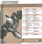
Obsessed with Marvel: Test Your Knowledge of the Marvel Universe By Peter Sanderson and Mark Sumerak 320 8x8-inch pages in duotone; 2017 Titan Books (first published in 2010 by ChronicleBooks) paperback, $22.95 ONLY THOSE TOTALLY OBSESSED with Marvel are likely to need this book: it is composed of 2,500 multiple-choice questions and their answers, arranged by superhero. And not much else. Nothing else, in fact. The book is divided into chapters, each chapter devoted to one group of heroes (X-Men, Fanastic Four, The Avengers, the Incredible Hulk). The page layouts are nearly identical to the example we’ve posted near here; answers to the questions are at the bottom of each page, upside-down. On each 2-page spread a single picture illustrates one of the questions, accompanied by a couple pertinent paragraphs, which are information-laden enough to provide enjoyment for those of us who like Marvel but aren’t obsessed with it.
Apart from amusing yourself by testing your knowledge of Marvel by answering (or not) questions Sanderson and Sumerak pose, this tome serves no purpose that I can discern. As a reference book, it fails: it hasn’t any of the usual finding aids that reference books have—no index in back, for example. I tried to find out when Wolverine first appeared as “Patch”; no luck. The book has no way to discover such information. I thumbed through the X-Men chapter, reading quickly the text sections on each page; still no luck. Sanderson has co-written and authored ten books about Marvel Comics, which credential is sufficient for this tome.
CLIPS & QUIPS Having your book turned into a movie is like seeing your oxen turned into bouillon cubes.—John le Carre Never trust the teller; trust the tale.—D.H. Lawrence We look at the world once, in childhood. The rest is memory.—Poet Louise Glick
RANCID RAVES GALLERY
NOTHING QUITE LIKE a fluffy-looking cloud to bring peace of mind. As a service to our readers, then, we post the accompanying picture. Sadly, it is taken from a magazine that printed in as a 2-page spread, which means part of the picture is sacrificed to the gutter. You can see the damage, but the cloud is so magnificent that it survives. Bravo.
AND JUST AS IT
APPEARS that the Supreme Court will overturn Roe vs Wade thereby depriving
women of the right to decide whether to have a baby or an abortion, my home
state of Colorado has passed legislation guaranteeing women that right. I’m thinking of Article VI.2 on the Supremacy of National Government: “The Constitution ... shall be the supreme law of the land, and the judges in every state shall be bound thereby, any thing in the constitution or laws of any State to the contrary notwithstanding.” Were I a Constitutional lawyer, I think I could argue that this passage means states can’t have laws that contradict national laws. But I’ve been wrong before. And it seems odd to me that almost none of the conversation (i.e., argument) about abortion rights takes into account the life-and-death circumstance of women in childbirth. In other words, at issue with abortion rights is more than a moral question about taking the life of an unborn “person” or whether pregnant women can terminate their pregnancy because it is inconvenient to have a child and/or raise him/her. In modern times, we don’t think of childbirth as a cause of death. It is too rare. But it exists. In 2020, 861 of the 3,613,647 births in this country resulted in the death of the mother—that’s 23.8 deaths per 100,000 live births. That ratio in 2019 was 20.1; in 2018, 17.4. So women have a right to be apprehensive about pregnancy. They could die of it. And for that reason, they should be afforded the means by which they can avoid the threat—namely, aborting the child. Colorado State Representative Dafna Michaelson Jenet, a Democrank from Commerce City, is one of those rare cases cited in which pregnancy is a death threat. Jenet had an abortion about seven years ago. She was 20 weeks pregnant and the baby inside of her had died in the womb, she said (as reported in the Denver Post, May 4, 2022). If she hadn’t been able to access safe and legal abortion quickly, she said, “I would have very likely died.” The Post continues: She shudders to think of herself having to wait even one more day for that procedure. She wonders what would’ve happened if she hadn’t had the $500 the hospital asked for before performing the procedure. “I am horrified at the idea that people will have to wait. The body is not going to wait. The process is going to continue. Whatever the reason (for someone’s abortion) is none of my (expletive) business. When you need it, you need it.” I’m glad I never had to make a decision—or, rather, join with my wife in making a decision—to abort a child. But if such a question were to arise, I would hope that the decision would be made by the couple involved, not by a law that prohibits a decision.
PITHY PRONOUNCEMENTS —on Life: Life is a zoo in a jungle.—Peter de Vries Life isn’t a cabaret; it’s a dive bar.—Woody Paige Life is something to do when you can’t get to sleep.—Fran Lebowitz When life gives you lemons, squirt someone in the eye.—Cathy Guisewite To be continued and concluded....
CIVILIZATION’S LAST OUTPOST One of a kind beats everything. —Dennis Miller adv. HAVE YOU NOTICED THIS? The heads of talking heads on tv are larger than they are in real life when you compare the size of the head looking at you to the breadth of the speaker’s shoulders. When you do that, the head seems larger than heads normally are. This is undoubtedly an optical illusion (or an optical distortion, to be more exact) inherent in the television cameras.
Peeves & Pratfalls TV COMMERCIALS ARE DISGUSTINGLY TAKING OVER Which Is What They’ve Always Done I’ve been timing television commercials lately. Not with a stop watch (which I don’t have) but just using the second/minute hand on my wrist watch. On the average—speaking generally without a stop watch—commercials take about 4 minutes; the program segments between commercials last about 6 minutes. So the time we spend watching commercials is almost equal to the time left for watching the programming we turned the tv on to watch. NBC is sensitive to this criticism looming on the horizon. And they’re doing something about it. NBC’s Evening News goes without commercial interruption for the first 15 minutes of the broadcast. Then comes a commercial—which is preceded by this message: “We’ll return in one minute, sixty seconds.” And then for the next sixty seconds, the top of the screen includes a strip that ticks the seconds from 60 to zero—a constant reminder that the commercial interruption is going to last only 60 seconds, just one minute. For the rest of the program, the usual 4minutes/6minutes ratio is diminished somewhat to 3minutes/4minutes. But right there, at the very beginning, we’re reminded that a commercial break will take only 60 seconds. Just a minute. And we should be properly grateful. Some of the evening programming follows the same pattern: 15 minutes at the start with no commercials; then a 60-second commercial break. So we’re reminded throughout the evening how lucky we are that commercials take only 60 seconds. They don’t, of course. But the maneuver is designed to make us think it’s true. And that we’re awfully lucky.
BOOK MARQUEE Short Reviews and Proclamations of Coming Attractions This department works like a visit to the bookstore. When you browse in a bookstore, you don’t critique books. You don’t even read books: you pick up one, riffle its pages, and stop here and there to look at whatever has momentarily attracted your eye. You may read the first page or glance through the table of contents. And that’s about what you’ll see here, beginning with—:
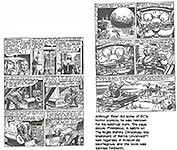
The Million Year Picnic and Other Stories Illustrated by Will Elder with John Severin; written by Al Feldstein and Jack Mendelsohn 210 7x10-inch pages, b/w; 2017 Fantagraphics hardcover, $29.99 HALF OF THE 27 STORIES reprinted in this volume were initially published in 1953 (mostly in EC’s Weird Fantasy title) and the other half in 1954 and 1955 (mostly in EC’s mad Panic). In other words, half are serious scary tales; the remainder, idiotic parodies, showcasing Elder’s uncanny ability to mimic the drawing styles of other artists. Severin shows up to pencil some of the former; the latter, Elder does solo. Larry Stark provides an insightful introduction, giving the history of each story and offering analysis and interpretation. The book concludes with a short 6-page biography of Elder by S.C. Ringgenberg and paragraph profiles of the writers plus a 3-page history of EC Comics by Ted White. The Table of Contents lists the credits for each story. A very helpful footnote to history is a listing of the First Appearances of each story. The back cover blurb says all of Elder’s non-Mad EC work is reprinted here—science fiction, crime, horror, and all his parodies in Panic (Mad’s sister title, also published by EC), including the infamous “The Night Before Christmas” which got Panic banned in Massachusetts. With collaborator Severin, Elder adapts two classic Ray Bradbury stories—“The Million Year Picnic” and “King of the Grey Spaces.” And there’s a horror story not seen since its initial publication more than 60 years ago: “The Strange Couple” originally written and drawn by Feldstein, then re-worked by Elder for a 3-D appearance.
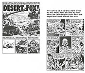
Atom Bomb and Other Stories Illustrated by Wallace Wood; written by Various 266 7x10-inch pages, b/w; 2020 Fantagraphics hardcover, $35 THIS VOLUME OFFERS 39 stories drawn by Wood, 27 of them scripted by Harvey Kurtzman, about which the back cover says: “When Wood teamed with Kurtzman to tell stories about men in combat, they created some of the best war stories ever put to paper. Together, they crafted emotionally searing, strikingly human stories from ancient times to the Civil War to both World Wars to Korea. From battling knights to Bunker Hill to the Light Brigade to Custer’s Last Stand; from the Army to the Navy to the Air Force to the Marines. “Wood and Kurtzman pulled no punches in depicting the folly, madness, and horror of war, especially in the title story—the bombing of Nagasaki as seen by the victims on the ground—a decidedly ‘politically incorrect’ subject in 1953,” the year of its publication. The book collects all the combat tales Wood drew for EC, plus two aviation war stories that he drew for the “legendary Blazing Combat.” It is sometimes maintained that the EC war stories were anti-war. That’s actually not the case. Kurtzman was never a cheerleader for war as were most of the other war comics of the day; but he recognized the sometime necessity for war. He always spotlighted the cruelty and senselessness of war (which is not quite the same as being outright against war). Kurtzman’s war books acted as a sort of reminder that war was not as glorious as it was portrayed in comicbooks by publishers other than EC.
The volume includes all of the features described in the Elder book, just above, including the list of First Appearances (from 1950 through 1955 in EC’s Two Fisted Tales and Frontline Combat. Here, the introduction is by Thommy Burns; S.C. Ringgenberg again provides a short biography of the artist. Like the Elder book, this volume is part of Fantagraphics’ ambitious project to produce similar tomes about all the EC artists. The last page lists 19 titles, from Harvey Kurtzman’s Corpse on the Imjin an Other Stories to Joe Orlando’s The Thing From the Grave and Other Stories.
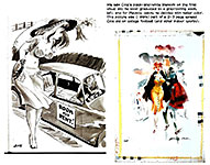
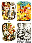
JACK COLE, creator of Plastic Man and of a lavish watercolor style of rendering full-page gag cartoons for Playboy, needs recognition in the form of a reprint volume devoted to those magnificent cartoons. Fantagraphics produced an ambitious (and successfully achieved) volume reprinting the gag cartoons Cole did for Humorama magazines, signing them “Jake,” but his Playboy stuff was simply magnificent, and in full color, a couple lightyears’ improvement over the Humorama material (which was just a tense shy of magnificent itself), and no one has stepped up to do a book of them. Not that I know of.
THE FROTH ESTATE The Alleged “News” Institution The magazine that prides itself on its sophistication (supposed), The New Yorker, published in the May 9 issue about a dozen 2-page spreads of full-page black-and-white photographs of Ukrainian dead and other crimes committed by the Russians. The magazine’s conviction was, probably (and if so, I agree), that showing is more persuasive than telling, pictures rather than words; and so in this pictorial display, The New Yorker was doing its bit for Ukraine: publicity about the atrocities committed in that country by its invader would help in creating funding for them to help fight the war. The photographs were, indeed, convincing. Only one problem: publishing them on 2-page spreads put the center of every photograph in the magazine’s gutter, that place were the pages are bound together. And that obscures—obliterates— whatever is in the center of the photograph. And most photographers, James Nachtwey did these, compose their photos with the center being the focus of the picture. So the most telling aspect of every one of these photos was effectively out-of-sight, bound away in the gutter. Shouldn’t the editors of this magazine know better? To get something of the effect that Nachtwey doubtless aimed for, the magazine should avoid printing the pictures in 2-page spreads. One page, admittedly, doesn’t give the photos the display space that makes them most impressive. But these photos could have been printed sideways on pages, still full-page, not quite as big as 2-page spreads but at least all entirely visible. Ah, well. Nobody asked me.
NOTED IN PASSING Portion of daily newspapers in the U.S. that are controlled by investment groups: ½ Of daily newspapers in the U.S. that have been shuttered since 2005: 1/4 Factor by which PR specialists outnumber journalists in the United States: 6 Percentage of people alive today who have never used the Internet: 37
BOOK REVIEWS Critiques & Crotchets
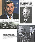
The Place To Be: Washington, CBS, and the Glory Days of Television News By Roger Mudd 430 6x10-inch pages, b/w; 2008 Public Affairs (Perseus Books Group) hardcover, $27.95 MUDD HAS THE
KIND OF FACE THAT betokens moral rectitude and strength. Everything he ever
said or did—everything he wrote about in this book, his autobiography—is the
sort of thing that goes with that face. Especially when, looking at it
carefully, we see the beginning of a smile at the corners of that otherwise
firm mouth. That’s what I like about him. Strong face with the hint of a
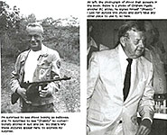
twinkle. Wait a minute. Why are we contemplating a book about Roger Mudd? He wasn’t a cartoonist, and this “online magazine” is about cartooning. So why spend any time with Roger Mudd? He’s just a journalist. Why spend time with a journalist? Well, because he’s a journalist. After all, so am I a journalist—a hack writer, reporting on comics news and cartooning history and lore. Reporting. And as a journalist, I’m interested in other journalists. Particularly this guy with the face he has. Now, having cleared up that errant error, we can proceed. And so we do—: Mudd joined the Washington Bureau of CBS in 1960, and he was there for the next 20 years. It was a time (quoting the dust jacket flap) when the Washington Bureau was instrumental in setting the agenda at home and abroad on issues like Vietnam, civil rights, and Watergate. It was “the place to be” if you liked being a part of the action. The last six years of his CBS career, Mudd was Walter Cronkite’s official substitute. Whenever “the Cronk” went on vacation, Mudd took his place, anchoring the CBS Evening News. But he didn’t take his place when Cronkite finally retired. Dan Rather did. Diane Rehm of National Public Radio wrote this about Mudd: “When Roger Mudd delivered the CBS Evening News, Americans paid attention. From his early days as a budding broadcaster, through his coverage of the Senate filibuster debate over Civil Rights, to his devastating Peabody-Award winning interview with Ted Kennedy [who was about to declare his candidacy for Prez but, astonishingly, couldn’t answer Mudd’s question, “Why do you want to be President?”], Mudd demonstates why CBS was The Place To Be. He candidly recounts the gritty details behind the scenes, and the power struggles among the people shaping network news.” At the end of the book, Mudd confesses that he didn’t really know what his book was to be about. “At first, I wrote in fits and starts but with no narrative arc.” And when a lawyer friend told him there was no market for journalist’s memoirs unless he dished about the famous and the powerful, he almost gave it up. Then another friend suggested that Mudd write about “how great network news used to be. Why don’t you write about that great Washington Bureau you were part of?” That did it. Mudd was off and running. And the book is full of anecdotes about covering the news in Washington. And although Mudd was a highly respected and honored journalist at the time—and he records his award-winning adventures—he has a sense of humor about it.
HE REMEMBERS A FULL-PAGE ad CBS News took out in The New York Times boosting Mudd. At the time, he had been with CBS only three years; he was a novice. And he couldn’t take his eyes off the ad. “That ad was a big deal” for a young and not too experienced a journalist. “I could feel my head swelling,” he says, finishing the anecdote. But for all the events he describes, he begins the book by recalling an event that seems to frame the whole book. The first sentence reads: “The story was on every newscast and front page in the country; thousands of editorial writers and columnists weighed in over Valentine’s Day weekend in 1980. The story was that Dan Rather and not I would succeed Walter Cronkite.” That was the “big story” about Roger Mudd. Dan Rather doesn’t command Mudd’s resentful attention on every page of this book, but he shows up enough to make me wonder if the book was inspired by Mudd’s bad luck. If it hadn’t been for Dan Rather, there’d be no book. Probably. Mudd doubtless began writing it a couple years before its publication in 2008. Maybe 2005? 2006? That was right about the time Rather was stunningly fired at CBS. According to St. Wikipedia, “Rather left the anchor desk in 2005 following the Killian documents controversy, in which he presented unauthenticated documents in a news report on President George W. Bush 's Vietnam War-era service in the National Guard. He continued to work with CBS until 2006, when he was abruptly fired.” Friends of Mudd’s probably told him this would be a good time to write a book in which he could confront Dan Rather’s anchoring CBS Evening News for the last 25 years. Instead of Mudd’s anchoring the CBS Evening News.
WHEN DAN RATHER ARRIVED at CBS, he and Mudd became friends. They dined at each other’s houses and went to musical events together, as two families. But, Mudd says, when Rather came back from his stint in London, he was a different journalist. He now had his eye out for the main chance, and he didn’t worry much about how others might be hurt when he succeeded. And when Rather became famous for his sharp exchanges with President Richard Nixon, Mudd comments: “He violated a central rule for journalists: never become more important than the story and never get in the way of the story.” In short, Mudd grew to distrust Rather as a professional journalist. But apart from mentioning a few key moments in Rather’s career and the Rather-Mudd relationship, Mudd is not preoccupied with Rather. He devotes maybe 15 pages, total, scattered throughout the book, to Rather. The rest of the time, Mudd is reporting on his own career and adventures and littering the book with stories of his colleagues’ work (each accompanied by a short bio). Mudd has received numerous awards— the Peabody Award, the Joan Shorenstein Award for Distinguished Washington Reporting, and five Emmy Awards. On Valentine’s Day 1980, the day Mudd was told that Rather would get Cronkite’s anchor desk, he abruptly left CBS. He was offered several possible roles at CBS, but none of them seemed attractive. He was bitter and hurting about the cavalier manner of his treatment. As soon as the meeting was over (the meeting that told him his fate), he went to his desk and gathered up his personal items and walked out, not to return for 26 years (and then just to do research for the book). After his shocking rejection at CBS, Mudd joined NBC where he co-anchored the weekday NBC Nightly News, and was the host of the NBC-TV Meet the Press and American Almanac TV programs. He stayed at NBC until 1986, when he left to work with the MacNeil/Lehrer NewsHour on PBS, where he thrived for “five happy and rewarding years.” After PBS, Mudd moved to the History Channel for ten years to host documentaries until he retired. But, he says, he never ceased being a CBS man. And during the years he was with NBC, he says, “there was always a little hitch, perhaps a slight choke, in saying, ‘I’m Roger Mudd, NBC News, Washington.’” Mudd died at the age of 93 in 2021, just 13 years after the publication of his autobiography.
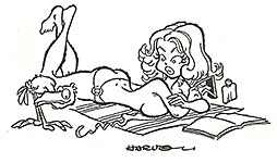
ONE OF MY FAVORITE CARTOONS During my short
career selling gag cartoons to magazines (roughly 1978-83), I used gag writers,
who would each send me batches of gags, 15-20 gags written on separate scraps
of paper. Every once in a while, I'd have an idea myself, and the cartoon
posted nearby is one of those occasions. It's essentially a funny picture rather than, strictly speaking, a "cartoon." The comedy emerged slowly, a piece at a time, as I drew the picture. First, the trailing "string" of the bikini top, which seemed entirely appropriate for the sun-bathing occasion. Nothing funny about it, but then came the bird, which, mistaking the string for a worm (impossible in any medium but cartoonery). Then the sunbather notices the bird and its desire for the worm. A piece at a time. Then, altogether, comedy. It seems to me (always ready to plug a favorite theory about cartooning) that cartoon comedy is best when it emerges from the drawing—the drawing itself as well as the act of drawing. A cartoonist, thinking and working in verbal/visual terms, invents verbally and visually as he goes along, drawing all the way. And this cartoon illustrates that process better than many others I might've picked for the purpose. The gags supplied by gag writers are not terribly inventive pictorially. And I noticed as I worked through heaps of gags supplied by gag writers, that boredom teeters on the edge of every cartoon eventually. There are, after all, only so many ways you can draw a housewife that signal visually that she's a housewife. Ditto drawing naked women. There are only so many ways to draw a naked woman. After a while, boredom sets in, and you spend a certain amount of creative time inventing just one more pose that's different from the others you've done. The result is that the pictures often have little visual comedic parts that you invent just to keep the drawing part interesting to you as you do it. Unfortunately, those little inventions, while they make the drawing effort more interesting to you, the cartoonist, they don't in-and-of themselves make the cartoon more marketable. The little inventions amuse you but, probably, are not even noticed by anyone else. They're private and personal. In a few minutes down the scroll, we’ll d another one.
IRKS & CROTCHETS —more on Life: Life would be tolerable but for its amusements.—George Bernard Shaw Life is not so bad if you have plenty of luck, a good physique, and not too much imagination.—Christopher Isherwood The moments that make life worth living are when things are at their wordst and you fd away to laugh.—Amy Schumer Life is what happens when you’re not watching television.—Jason Love I intend to live forever. So far, so good.—Steven Wright Not a shred of evidence exists in favor of the idea that life is serious.—Brendan Gill It’s not true that life is one damn thing after another; it’s one damn thing over and over.—Edna St. Vincent Millay
LONG FORM PAGINATED CARTOON STRIPS Called Graphic Novels for the Sake of Status, Here’s One—:
Berlin By Jason Lutes 580 7.5x10-inch pages, b/w; 2018 Drawn & Quarterly hardcover, $49.95 UNTIL DECORUM, the most impressive performance in the medium was Jason Lutes’ 600-page graphic novel, Berlin. Even after Decorum, Berlin is the most impressive performance in the medium. But while Decorum plays with the nature of the medium, Berlin exploits its traditional function. It does so at a massive scale, and the achievement is equally massive. And
so is the actual book, which is gigantic enough without reading a word of it
except the words on the cover. It’s not exactly a door-stopper of a book; with
pages measuring 8x10 inches, it’s not compact enough. But with nearly 600 of
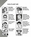
those pages, it’s almost 2 inches thick, so it comes close. Berlin, like Decorum, has no central character. Or, rather, it has lots of central characters. Artists, factory workers, policemen, newspapermen, prostitutes, orphans, and cabaret performers—ordinary citizens during a tumultuous time, 1928 to 1933, in the last years of the Weimar Republic and the rise of Adolf Hitler. At first, the book seems focused on two lives. A young artist, Marthe Muller, who leaves her sheltered life in Cologne to go to Berlin, where she gets involved with the cynical, disillusioned journalist Kurt Severing. Rob Spillman at guernicamag.com takes up the thread: “She is trying to make her way in the bright lights, studying drawing and, in the rest of her time, the city’s decadent underbelly: jazz clubs and cabarets, open queerness and drug-fueled sex parties thrown by the rich. Severing works for the very real newspaperman Carl von Ossietzky, who was arrested for his reporting on the abuses of the Nazi party, received the Nobel Peace Prize while in prison in 1935, and died a year later under Gestapo supervision. Marthe and Kurt both struggle with their crafts, not believing they are sufficient to match the brute forces ruling the streets.” But Marthe and Kurt are not the only characters Lutes focuses on. He attends to at least a dozen others, telling fragments of their stories. Almost none of them meet any of the others. So what we have is a collection of individual life fragments. Says Spillman: “What emerges from all of it is the texture of a moment on the cusp. There are no inevitabilities. There is constant flux and tumult. There are arguments about politics, but also about aesthetics and the use of art, the grotesquery of the realists versus those trying to capture an increasingly rare vision of beauty. And always the futility of words and images against the jackboot and the mob. Marthe and Kurt collaborate to draw and document Berlin’s ordinary citizens, much like Lutes himself, all the while wondering what good it is doing when people are being gunned down in the street. ... “But, as the Nazis move ever closer to consolidating their power, Marthe and Kurt are not so clear, unsure of how to resist the tide of tyranny. Kurt flirts with the idea of joining the street-fighting Communists, while Marthe considers giving up on her dream of being an artist to return to Cologne, and a quiet domestic life near her family. It was a moment to choose sides, or even to opt out, to flee for the countryside or leave the country altogether. This dilemma— whether to stay and fight for what one believes, but in so doing to face the very real threat of death—is heartbreakingly played out by a Jewish family that takes in a factory worker’s orphan. We know what they do not: Kristallnacht is just around the corner. ...”
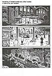
DESPITE THE TIME LUTES HAS CHOSEN for his graphic novel, we are not conscious of the rise of Nazi Germany in Berlin. We are conscious of the lives of Lutes’ characters. That those lives take place at a pivotal time in a pivotal place seems almost incidental as you are reading the book. Marthe eventually does return to Cologne. But most of the other characters Lutes abandons. In their brief moments in the narrator’s spotlight, they have served their purpose: they help tell the story of Berlin, a city on the cusp of change. It took Lutes 22 years to complete the book. “It is an incredible feat of concentration and sustained storytelling,” Spillman says, “— with compelling, complicated characters from beginning to end. Berlin ends with a lack of certainty or conclusion that is nevertheless satisfying. History’s hammer is about to descend, but we know how that story goes. The characters have made their choices. We can imagine how they lived, or didn’t, with their choices.” Remarkably, Lutes had no plan for his tale. His method is jazz-like. He improvises, following his muse without knowing where it will take him. In an interview with Zack Smith at newsarama.com, Lutes says: “A lot of it is improvised from panel to panel. That’s a truly jazz-like way of doing comics. ... That’s where comics come alive for me as a writer—I don’t want to know what happens next because that’s what keeps me engaged in the story. I’m curious about what my characters will do. If I knew every single thing that was going to happen, I wouldn’t want to write: it’d become dead.” Lutes did a spectacular amount of research, delving into the history of the period and the place. “But the goal is not to retell history,” he says. “The goal is to retell human experience.” The extent of Lutes’ research into history is only hinted at in the people’s stories he tells. His research into the appearance of things is evident on every page. His drawings are meticulously executed. Panels are crammed with telling details. On the pages of Berlin, we are asclose to photographic realism as line drawings can come. This kind of drawing proclaims this book a serious tome that must be taken seriously. Berlin, in effect, is the announcement that comics are both literature and art. Lutes is already at work on his next graphic novel. This one, entitled Arizona 1865, is set in the American West. In his 2018 interview with Smith, Lutes said he’s completed most of the research and has outlined 3/4 of the story. And he’d drawn the first page of the story. “I’m drawing smaller,” he said, “I’m drawing simpler. I want it to be in color, [so] the drawing style is going to be different from what I used in Berlin.” I can’t wait to see it.
BEEFS & BOFFOS Another Favorite Cartoon of Mine
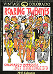
Each scrap of comedy was probably introduced by way of keeping my interest alive in the drawing. After all, there are only so many ways to draw a naked woman. After a while, boredom sets in, and you spend a certain amount of creative time inventing just one more pose that's different from the others you've done in order to keep yourself awake and your pencil scraping away. The result is that the pictures often have little visual comedic parts that you invent just to keep the drawing part interesting to you as you do it. The “roaring twenties” homecoming program cover near here is another of the occasions when bits of furtive comedy infect the scene. Once I’d decided to draw a crowd of 1920s Colorado University football fans in the stands, I was suddenly bored. Before I lifted a pencil, I was bored. Nothing, it seemed to me, could be duller than a crowd of football fans watching a game. Dull to the viewer of the picture but also boring to me, the cartoonist who must make the picture. Then, as a way of stoking my interest in the project, I started fooling around with the individuals I was depicting, showing them doing different things. It began, as I recall, with the woman in the center, standing up and waving the CU pennant. This is an ordinary happening at a football game: someone gets excited and stands up, cheering. That drawing gave the over-all picture a jolt of action. And then I started imagining the effect of her action on those nearby. First, there’s the guy behind her, who can’t see with her standing in front of him; so he moves a little to his right—which disturbs the guy on his right, who, reacting, manages to shove his hot dog into the face of the woman next to him. On the standing woman’s row, the guy on her right, with a hot dog in each hand, reacts—verbally. I think he and the woman on his right were passing hot dogs down the row. Then on the standing woman’s left, her gesture hits the pop bottle of the guy next to her—and the result is that some of the pop spills on the woman next to the pop bottle guy. The front row—four people—is undisturbed: they establish the “norm” for seating in the stands. But elsewhere in the picture, I’ve managed to amuse myself by creating several “action” centers that sustain my interest in drawing the picture without destroying the visual impression of a crowd in the stands at a football game, a typical homecoming scene.
BADINAGE & BAGATELLES Smooth the descent and ease the way (The Gates of Hell stand open night and day); But to return and view the cheerful skies, In this the task and mighty labor lies. —Dryden’s Virgil
ONWARD, THE SPREADING PUNDITRY The Thing of It Is ...
PREVENTING MASS MURDERS We now have a clue as to why mass murderers commit mass murders. According to a report in The Week for January 28, 2022, “many mass shooters, who are almost entirely men, are linked by a common thread: a history of misogyny, violence against female partners or family members, or sharing women-hating views online. A Bloomberg analysis of 749 mass shootings from 2014 to 2019 ... found that 60 percent of the attacks were either acts of domestic violence or committed by men with a record of domestic violence. ... “Some of the worst mass shootings in recent history have been committed by ‘incels,’ short for ‘involuntary celibates’: members of an online subculture of men without romantic partners who bond over a shared loathing of women.” One of these shooters, Elliot Rodger, “who in 2014, killed six people and then himself,” before he embarked on his killing spreed, e-mailed “a lengthy manifesto detailing ‘his burning hatred for all women who rejected me through the years.’” A review of the book The Right to Sex (The Week, October 8, 2021) refers to Rodger (without naming him) “who blamed his crime on the sense of worthlessness he experienced because women showed no interest in him.” Circulated throughout the “manosphere,” Rodger’s manifesto drew the applause of mass shooters who “approvingly cited Rodger. In incel lingo, ‘going ER’ means copying Rodger by killing the women and ‘normies’ who spurned you. These online communities are full of men who are ‘angry and bitter, and feel helpless and in some cases suicidal, said journalist David Futrelle, who runs a blog monitoring the incel movement.’” My bet is that like most males in Western Civilization, the mass shooters found relief and satisfaction by masturbating while looking at pictures of naked women. Our culture disapproves of such behavior even while realizing that it is widespread—even normal. My bet further is that if our culture tolerated and encouraged masturbation, we would have fewer mass shootings. To the extent that mass murder is striking back at women who rejected the murderer romantically, they are also striking back at a society that disapproves of their secret practice. If that society approved of masturbation—even encouraged it— the would-be killers would have less to feel resentful about. And their subconsciousness, with less to fuel its anger, might relax enough to forego committing murder as a relief valve, as an expression of their resentfulness. If you need any other of the ills of civilization removed, just drop me a note.
WE’RE ALL BROTHERS, AND WE’RE ONLY PASSIN’ THROUGH Sometimes happy, sometimes blue, But I’m so glad I ran into you--- Tell the people that you saw me, passin’ through
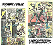
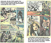
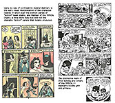
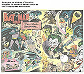
Neal Adams, 1941 - 2022 Adams is the artist who, more than anyone else, made comicbook superheroes look realistic enough to leap off the page. With such spectacularly dynamic artwork, Adams revitalized the medium virtually single-handedly. He died in a hospital on April 28 of complications of sepsis. I consulted two or three obituaries and was surprised that all of them credit Adams with “restoring” Batman to his original brooding self from which he had strayed thanks to a “campy” tv series in the mid-1960s starring Adam West as Batman and Burt Ward as Robin. I don’t remember Adams on Batman as well as I remember him doing a green duo, Lantern and Arrow. I suspect that the obit writers got Adams a little confused with Frank Miller, whose Dark Knight series in 1986 really re-set the cowled crusader, plunging him into self-flagellating gloom. But I could be wrong. I quote The Guardian’s Michael Carlson at great length below, and he says: “Some of Adams’s most well-regarded work resulted from his partnership with the writer Denny O’Neil. In 1969, the two began to restore Batman to a brooding vigilante, as he was originally conceived, and in 1971 they created a new foe for him, the eco-terrorist Fu Manchu-like Ra’s Al Ghul, whose goal of saving the planet usually involved eliminating much of its population, and his femme fatale daughter Talia. And their recreation of the Joker in 1973 as a psychopathic killer set the bar for future reinterpretations.” Adams would draw Batman stories through 1973. “They also redid the awkward pairing of Green Lantern and Green Arrow,” Carlson continues, “with a story arc including the discovery that the Arrow’s sidekick, Speedy, had become a junkie. Besides having contemporary resonance, it was arguably the first comic storyline to examine the now-familiar paradox of the inability of superheroes to actually change the world.” Other GL and GA stories dealt with such contemporary matters as racism, corporate greed, and poverty. “Neal was a master at every facet of art — his range of expressions, the dramatic use of lighting and shadowing, the seemingly facile command of anatomy and, of course, the trademark finger-pointed-in-your-face foreshortening was all just unbelievably next level,” Jim Lee, the chief creative officer and publisher of DC Comics, wrote in an Instagram post remembering Adams. Adams also brought about changes to business practices, most notably winning artists the right to their original artwork, and getting long-delayed credit and compensation in the 1980s for the Superman creators Jerry Siegel and Joe Shuster, who, after creating the superhero who would inspire an industry, were living in poverty. Now, I’ll let Carlson go on at great length (which Adams unquestionably deserves), into which I’ve occasionally inserted squibs of information gleaned from George Gene Gustines at the New York Times and others.
IN THE PERIOD FOLLOWING THE EXPLOSION begun by Marvel Comics in the 1960s and accelerated by the campy Batman tv series in the middle of the decade, Neal Adams was one of the greatest, and probably most influential, artists in comics. Adams was central to the rethinking of characters including Marvel’s X-Men and, for their rival DC Comics, the Spectre, Deadman and, most crucially, the Batman. “He reinvented the look of comic pages and characters,” said the writer Neil Gaiman. “He was the reason I drew Batman in every school exercise book.” Adams combined the powerful dynamism and expressionist movement of early Marvel’s two masters, Jack Kirby (Fantastic Four, Captain America) and Steve Ditko (Spider Man, Doctor Strange). But his work, influenced by the limitations of four-panel daily comics and glossy ad work, also displayed the more romantic attractiveness usually offered by less dramatic artists. His characters could be as muscular as Frank Frazetta’s barbarians and as appealing as Alex Raymond’s daily strips, but they soared through the panels, every movement telling the story – he was always cinematically aware of the viewer’s place outside the page. Adams knew early he wanted to draw comics. He was born June 15, 1941 on Governors Island, New York, where his father, Frank, was stationed with the US army. His mother, Lillian, ran a boardinghouse. Neal grew up on military bases, including in Germany, but his father was not heavily involved in his upbringing. His mother, in addition to running a boarding house, worked in a shoe factory and for the national phone company. When his father left, Neal worked on the Coney Island boardwalk, near their home, to help support his mother. He went to the School of Industrial Art (now the High School of Art and Design) in Manhattan, leaving in 1959, and then sent his work to DC, who rejected it. When he took it to Archie Comics, the editor Joe Simon (co-creator of Captain America) told him not to ruin his life in the business. Nevertheless, Adams drew sample pages for Archie’s nascent superhero, the Fly, and some of the work was used. He was hired, but to draw comic fillers for Archie’s Joke Book. After this, he assisted Howard Nostrand, mostly drawing backgrounds on his daily newspaper strip, Bat Masterson, then he worked in advertising before getting his own strip in 1962: this was Ben Casey – like Masterson based on a successful tv series. It ran until 1966. Though daily strips tended to soap opera, the strip, about a hospital surgeon, touched on contemporary issues. And
it was masterfully rendered. Adams as a beginner was more adept at investing
his strip with visual excitement than many others in the field. He shifted his
camera wildly, from extreme close-ups to aerial views. And his Casey looked
exactly like tv’s Casey. In 1967 Adams began drawing stories for Creepy and Eerie, black-and-white magazines emulating the 1950s EC horror comics. When DC’s Joe Kubert began drawing the Tales of the Green Beret daily strip, Adams was hired to replace him on DC’s war comics, yet soon found himself working on such unlikely enterprises as Jerry Lewis and Bob Hope comics. But his spectacular cover for The Brave and the Bold featuring Batman and the Spectre led to more work on superheroes, including a remarkable sequence on Deadman. Deadman had been co-created by Carmine Infantino, who was now DC’s publisher. He called Adams his “sparkplug.” Adams was one of the few people to freelance for DC and Marvel simultaneously. In 1969 he and the Marvel writer Roy Thomas tried to revive the failing X-Men book. Their run lasted only nine issues before cancellation, but they brought back Professor X, and when the series was revived in 1975, theirs was the template it followed. Adams, Thomas and the inker Tom Palmer brought the Avengers to new heights with the Kree-Skrull War series (1971-72). But his key partnership occurred back at DC, with the writer Dennis O’Neil, with whom he had also worked at Marvel. They “recaptured” the Batman from the TV series’ camp “Pow! Wham!” characterization and “redid the awkward pairing” of Green Lantern and Green Arrow.
Dissatisfied with both the artistic and economic strictures of comic books, Adams and the DC artist and editor Dick Giordano formed their own studio, Continuity Associates, in 1978. His final story for DC was one of his favorites, Superman Vs Muhammad Ali (1978), a giant format with its famous cover containing dozens of celebrities (and colleagues) at ringside. Adams’ company moved in new directions, primarily providing storyboards for movies, but also into animation, game design, computer graphics and advertising. Adams could be a hard teacher, but he was also a supportive resource, whose wide respect in the field opened doors for newcomers. The artists gathered around Continuity Associates also packaged comics for the big companies; they were known as Crusty Bunkers. One of the most famous Bunkers, Denys Cowan, called Adams his “second dad.” Adams himself illustrated books and worked for some new independent publishers. For years he battled the big companies to establish copyright for artists. In 1987 he won a court decision that denied copyright but compelled the return of original art to the artists who made it. Along with the golden age artist Jerry Robinson and the lawyer Ed Priess, he won Siegel, Shuster and their families recognition and royalties from DC just as the Superman franchise was becoming huge. The story, as epic as any Batman tale, is worth telling in some detail.
SIEGEL AND SHUSTER, like most early comicbook creators, sold their rights to whatever they produced. For Superman, they were paid $130 in 1938. Later, they both fell into poverty. When they tried to claim a share of the enormous revenue Superman generated, DC stripped them of credit and denied them further work. Adams was a vocal supporter, joining a successful publicity campaign in the 1970s that brought them recognition for their work, as well as health benefits and, for each, a substantial annuity. It was the Superman movie (“he flies” was the promotional blurb) that helped. The Superman movie was being touted around in the mid-1970s, and huge amounts of money were being cited. While Superman was earning millions, his creators were living in poverty. During those years, Jerry Siegel had taken to writing to DC to protest the treatment that he and Shuster had received regarding Superman. Some of those exchanges got very heated and at one point, Siegel apparently even threatened to dress up as Superman and jump off of a building. But this approach ultimately got him nowhere, so in October 1975, Siegel released a nine-page press release to the media where he placed a "curse" on the upcoming Superman movie. Here is a snippet—: "It has been announced in show business trade papers that a multi-million dollar production based on the SUPERMAN comic strip is about to be produced. It has been stated that millions of dollars were paid to the owners of SUPERMAN, National Periodical Publications, Inc., for the right to use the famous comic book super-hero in the new movie. The script is by Mario Puzo, who wrote "The Godfather" and "Earthquake." The film is to have a star-filled cast. “I, Jerry Siegel, the co-originator of SUPERMAN, put a curse on the SUPERMAN movie! I hope it super-bombs. I hope loyal SUPERMAN fans stay away from it in droves. I hope the whole world, becoming aware of the stench that surrounds SUPERMAN, will avoid the movie like a plague. “Why am I putting this curse on a movie based on my creation SUPERMAN? “Because cartoonist Joe Shuster and I, who co-originated SUPERMAN together, will not get one cent from the SUPERMAN super-movie deal." Neal Adams later recalled reading the letter for the first time: “It was a staggering moment,” he said. “I mean, I stood in my studio, and after I read it, I was quiet. I got myself a cup of coffee and I walked out to the front of my studio, and I kind of announced: ‘Guys, anybody in the studio who wants to read this letter can read this letter. But I am going to see to it that this gets fixed, and I am not going to stop until it does. So if any of you want to help me, I’d appreciate the help. If you don’t want to help me, there’s no obligation. But we are going to see that this gets taken care of or I will know why. I’m not going to stop until it gets done, so it’s going to get taken care of.’ The letter also got the attention of former Batman artist, Jerry Robinson, who had gone on to become an editorial cartoonist. Robinson had recently been the President of the National Cartoonists Society and was then the current President of the Association of American Editorial Cartoonists. Adams and Robinson were joined by lawyer Edmund Preiss, who was the father of the independent comic book publisher, Byron Preiss. Paul Levitz recently wrote about how the three men paired with each other's skills beautifully, explaining, "Jerry was probably the more suave negotiator, Ed the wise lawyer … but Neal roared the loudest. Neal was the loud voice of justice. And they won." Adams brought Siegel out to New York, and they did the rounds on every talk show that would have them and the negative publicity was enough that Warner Bros. ultimately agreed to acknowledge Siegel and Shuster as the creators of Superman and give them an annual stipend of $20,000 [later raised to $30,000] as well as health benefits. And of course, part of the deal meant the return of the Siegel and Shuster byline, now as a "created by" byline. It appeared in an issue of Superman "first" by virtue of that book just coming out first that particular month, but the first Action Comics issue it appeared in was No.461, a full 343 issues after it was removed.
IN 2005, ADAMS RETURNED TO COMICS, making his way back to Batman when he wrote and drew the miniseries“Batman: Odyssey,” a lavish seven-part series that was met with mixed reviews (some critics found it hard to follow), though his daughter said it was the project he was most proud of. He also did The First X-Men (2013) for Marvel. His pairing of Superman and Muhammad Ali in 1978 in a tabloid-size comic book, which he wrote and drew from a plot by O’Neil, initially drew a tepid response. The boxing match at the center of the story takes place over six pages and ends with the Man of Steel, who had temporarily deactivated his powers, on a stretcher. But the two fighters shake hands at the end, Ali declares, “Superman, WE are the greatest.” In 2008, Adams worked with the David S Wyman Institute for Holocaust Studies, Washington, lobbying the Auschwitz-Birkenau museum to return Dina Babbitt’s original artwork, drawn to illustrate Dr Josef Mengele’s racial theories in order to save herself and her daughter from the gas chambers. Adams illustrated, with Kubert, a six-page story about Babbitt, with a foreword by Stan Lee; two years later he illustrated and narrated a Disney series, They Spoke Out: American Voices Against the Holocaust. Adams enjoyed nurturing talent, but his nurturing was merciless. “He was the teacher who encouraged more than a handful of people who became the leading lights of the next generation of the field, including Frank Miller, Bill Sienkiewicz and Denys Cowan,” Levitz said. But it was a tough-love encouragement. “Kids would bring them their portfolios, and he would rip them to shreds,” Levitz said. However, after two or three times, if they improved, Adams would call DC or Marvel on their behalf.” Scoop quoted writer-editor-publisher Jim Shooter for a eulogy: “Neal Adams is one of the greatest artists our medium has ever known. He is also the single most influential artist in the history of comic book publishing. An amazing number of artists, including many whose styles are nothing like Neal’s, many you’d never guess, started out trying to emulate Neal. He has personally trained a small army of artists. Not only a master of the visual, Neal writes as well, and also does, it seems, whatever else he wishes to with ease and grace. “His brilliance extends beyond the printed page. He works with light, motion and sound. He creates three-dimensionally. Any medium is his medium. And, everything he does, he does with rare excellence. He brings insight to any endeavor. Most importantly, he truly creates. New ideas. Original thoughts. Genesis! Beyond that, he has always been a force in the industry – a righter of wrongs, a bringer of change, a leader. Neal is a genius and a giant who has lifted up us Shooter wrote when he inducted Adams into The Overstreet Hall of Fame.
George Perez, 1954 - 2022 Best known for his densely-populated crossover books, Pérez, 67, a celebrated comic book artist and writer, died Friday, May 6, at his home in Sanford, Fla., from complications of pancreatic cancer. Pérez, whose career spanned more than four decades, was known for his richly detailed drawings and his enthusiasm for stories filled with superheroes — the more capes and cowls, the better. He gave new life to Wonder Woman in the 1980s and helped create series for DC Comics and Marvel Comics that brought together some of the biggest heroes of the comics world, including the New Teen Titans. According
to Tim Hanley at Polygon, Pérez’s work “defined superhero comics in the 1980s
and 1990s, and his impact on the genre still echoes through superhero media
today. Over the course of the artist’s prolific comic book career, he did his
best to draw every iconic DC and Marvel superhero, preferably all at once in
the span of an epic double-page spread.” Perez came to prominence in the 1970s penciling the Avengers for Marvel Comics and returned to the franchise in the 1990s. In the 1980s he penciled the New Teen Titans, which became one of DC Comics' top-selling series. He penciled DC's landmark limited series Crisis on Infinite Earths, followed by relaunching Wonder Woman as both writer and penciler for the rebooted series. In the meantime, he worked on other comics published by Marvel, DC, and other companies into the 2010s. He was known for his detailed and realistic rendering, and his facility with complex crowd scenes. Pérez was born in the South Bronx, New York, in 1954, the son of a Puerto Rican couple who had recently moved to the city. Hanley reports that George discovered superheroes at a young age, and comic books helped him learn English. The colorful adventures also offered a respite from the violence of his rough neighborhood, and by the time he was 5, he knew he wanted to be an artist when he grew up. Entirely self-taught, Perez was 19 when he got his start in the comics business, landing a job as artist Rich Buckler’s assistant in 1973. His first published work appeared the following year, a two-page Deathlok story in Marvel’s Astonishing Tales No.25. More Marvel gigs soon followed, and in 1975 he and the writer Bill Mantlo created the White Tiger, the first Puerto Rican superhero in the series Deadly Hands of Kung-Fu. The editor of the series was Marv Wolfman, who was initially critical of Pérez’s grasp of anatomy and perspective. “He asked me years later why, considering I had problems with his art in those early days, did I continue to use him,” Wolfman recalled in a telephone interview with George Gene Gustines at the New York Times. “Perspective is something you can learn, but you can’t teach storytelling. George was a natural storyteller from Day One.” One of Pérez’s attempts to prove his skills to his editor was a full page aerial shot of the White Tiger, crouched above an urban skyline, with the buildings forming the letters of his name. Pérez soon began drawing the Avengers and would later draw the Fantastic Four, including a story written by Wolfman, who subsequently asked the artist to work with him at DC. Pérez agreed, hoping he would get to draw the Justice League — and he did. He drew several issues of their series, including the cover of issue No.200, which was sold at auction for $76,675 in 2016. Also in 1975, Pérez began his much-lauded tenure drawing the Earth’s mightiest heroes starting with Avengers No.141. Team books weren’t popular with artists at the time; compensation was minimal, and a large cast of characters meant a lot more work, drawing all those colorfully costumed heroes. But Pérez happily embraced the chance to draw so many of his childhood idols, and channeled his artistic heroes, like Sal Buscema and Curt Swan, to create a distinctive and realistic take on the Avengers. In 1980, Wolfman offered Pérez The New Teen Titans, a contemporary update of the young team. Pérez wasn’t particularly interested in the project, but the offer came with the opportunity to draw Justice League of America as well, so he agreed. Then, a few months into working on The New Teen Titans, he fell in love with the gig. Wolfman was a generous collaborator, and Pérez felt a sense of ownership of the team as they worked together to revamp existing characters like Beast Boy and Robin, as well as to introduce new ones like Cyborg, Raven, and Starfire. Unlike the Justice League series, which typically had little space for personal developments, the Titans could evolve more freely. This was most evident with Dick Grayson, who, as Robin, had been Batman’s junior partner since 1940. He became Nightwing, a hero stepping out of the shadow of his mentor, in 1984. “We finally got to make Dick Grayson become an adult in the way we wanted him to be,” Wolfman said. The series became a critical hit for DC Comics and was the inspiration for the kid-friendly animated series “Teen Titans” (2003-6) and “Teen Titans Go!” (2013-21), as well as a more mature “Titans” series currently on HBO Max. The book focused as much on the characters’ civilian identities as their superhero antics, and this combination of drama and action proved to be a surprise success for DC, which was in need of a hit after a disastrous run of cancellations. Pérez and Wolfman won scores of industry and fan awards for classic storylines that still remain popular today, most notably “The Judas Contract.” In the sort of creative-team consistency that’s all but gone in modern superhero comics, Pérez stayed with The Teen Titans for the entire decade, and returned for another run in the mid-1990s. (We’ve posted examples of his work on this title at the end of this article.) Pérez developed a reputation as a master of team books, said Hanley, “but one of his most beloved projects was a solo venture.”
WHEN DC PREPARED TO REBOOT WONDER WOMAN in the late 1980s, all of the pitches the publisher received were violent and hypersexualized, an approach that didn’t sit well with Pérez’s feminist sensibilities. He offered himself as an alternative, despite the series’ perennial poor sales: Wonder Woman had been a book DC had to assign, not one that creators clamored for. Pérez traded in all the cachet he’d built up at the publisher to do a different take on Wonder Woman, one rooted in mythology and female power. The relaunch debuted in 1987, and was an instant hit. (While apparently many rejoiced at revisiting Wonder Woman’s birthplace on a Greek mythological island, I demured. I thought the Greek stuff was boring.—RCH) Pérez played a key role in rebooting Wonder Woman. Writer Greg Potter spent several months working with editor Janice Race on new concepts for the character, before being joined by Pérez. Inspired by John Byrne and Frank Miller's work on refashioning Superman and Batman, Pérez came in as the plotter and penciler of the series, which tied the character more closely to the Greek gods and jettisoned many other elements of her history. Pérez at first worked with Potter and Len Wein on the stories, but eventually took over the full scripting chores. Later, Mindy Newell joined Pérez as co-writer for nearly a year. While not as popular as either Titans or Crisis, the series was a very successful relaunch of one of DC's flagship characters. Pérez wrote and drew the book, “bringing dignity and excitement to the long-floundering title,” said Hanley. “He rebuilt Wonder Woman’s mythos from the ground up, honoring her feminist origins while updating the character and her rogues’ gallery for the present day.” His five-year run brought female creators into the fold as well, including co-writer Mindy Newell and artists Colleen Doran and Jill Thompson. (Doran and Thompson went on to Eisner Award-winning careers, with Doran winning for Neil Gaiman’s Snow, Glass, Apples and Thompson for her Scary Godmother.) Today, Pérez’s revitalization of Wonder Woman is widely regarded as the definitive take on the character, and his time on the book has remained an inspiration to everyone who has written or drawn her since. Pérez would work on the title for five years, leaving as artist after issue No.24, but remaining as writer up to issue No.62, leaving in 1992. Pérez returned to the character in 2001, co-writing a two-part story in issues Nos.168–169 with writer/artist Phil Jimenez. Pérez also drew the cover for Wonder Woman No.600 (Aug. 2010) as well as some interior art. For the successful 2017 Wonder Woman feature film, director Patty Jenkins would credit Pérez's work on the title character as a major influence, on par with the work of the original creator, William Moulton Marston. “Wonder Woman had to rise or fall based on me,” Pérez said in a telephone interview in December. “It was a great success that gave me an incredible sense of fulfillment.” His editor on the series, Karen Berger, said in an email, “What set George apart on Wonder Woman was that he really approached the character from a woman’s perspective — I found her relatable and authentic.” Patty Jenkins, the director of the “Wonder Woman” films, cited this version of the character as an influence. Beyond his long-term character work, Pérez was also the master of epic event books. In 1985, he re-teamed with Wolfman for Crisis on Infinite Earths. A 12-issue maxi-series celebrating DC’s 50th anniversary and attempting to streamline the sometimes convoluted history of its heroes, the project allowed him to draw every character in the DC Comics universe against the backdrop of multiversal destruction. A cover by Pérez depicting a distraught Superman holding the dead body of Supergirl, his cousin, became a classic. It is one often referenced by other artists, not to mention Pérez, who drew a similar Mighty Mouse cover. Perez returned to Marvel in 1991 for the Infinity Gauntlet miniseries with Jim Starlin and Ron Lim that saw Thanos destroy half of all life in the universe. Then he brought both universes together in 2003 with JLA/Avengers, a massive crossover written by Busiek. In 1997, Perez had ushered in a new era for that team with the writer Busiek. “I asked which Avengers he’d like to use, and his response was, ‘All of them,’” Busiek said in a phone interview with Gustines. “Their collaboration was a creative and commercial success,” said Gustines, “and helped pave the way for the Justice League/Avengers series in 2003, which featured the biggest heroes from both DC and Marvel.” In the December interview, Pérez recalled one of the first images the team came up with: Superman holding Thor’s hammer and Captain America’s shield. “We didn’t know how we were going to get there, but we knew it was going to be there,” he said. The series was wildly successful, Gustines said, and subsequent collected editions sold out, leaving fans with little hope of obtaining additional copies at affordable prices. But that changed after Pérez’s unhappy health prognosis became known. In March, a reprint limited to 7,000 copies was produced by Hero Initiative, a charity that supports needy comic book artists and writers. Pérez was a founding board member. “Whatever it was that allowed this reprint to be released, I am very grateful, and on behalf of the fans, all I can say is well done DC and Marvel!” Pérez wrote on Facebook. “And of course, I am so elated that all profits from this reprint are going to one of my favorite personal charities!” Pérez threw himself wholeheartedly into these projects, and his boundless enthusiasm for the characters was evident on every page, said Hanley. Uniting all of DC and Marvel’s heroes was especially exciting for Pérez, who tackled JLA/Avengers with such passion that he developed tendonitis while drawing a cover featuring over 200 different superheroes.
SEPTEMBER 2011, DC LAUNCHED A NEW SUPERMAN SERIES written by Pérez, who also provided breakdowns and cover art, with interior art by Jesús Merino and Nicola Scott. Pérez remained until issue No.6. The New Teen Titans: Games hardcover graphic novel was published the same month reuniting the creative team of Wolfman and Pérez. He was the inker of the new Green Arrow series, also launched in the same timeframe, over artist Dan Jurgens' pencils, reuniting the mid-1990s Teen Titans art team. Pérez and Kevin Maguire were alternating artists on a Worlds' Finest revival written by Paul Levitz. But Perez abruptly left the book. In July 2012, Pérez explained his departure from Superman as a reaction to the level of editorial oversight he experienced. This included inconsistent reasons given for rewrites of his material, the inability of editors to explain to him basic aspects of the New 52 Superman's status quo (such as whether his adoptive parents were still alive), and restrictions imposed by having to be consistent with Action Comics, which was set five years earlier than Superman, a situation complicated by Action writer Grant Morrison having not been forthcoming about their plans. From September 2014 to December 2016, Pérez wrote and drew six issues of his own creation, Sirens, published by BOOM! Studios. It is a science fiction miniseries dedicated to a group of women with extraordinary powers, who fight against evil across time and space. The artist slowed down in his later years, trading long-term jobs for special appearances. He had already, in October 2013, revealed that he would soon undergo laser and injection surgeries to address hemorrhaging in his left eye that had effectively made him blind in that eye. By the following June, the procedures were not yet completed, but his condition had improved to the point that he was able to resume his work. Then in May 2017, he was admitted to a hospital with chest pains due to a heart attack while traveling to a convention, and had a coronary stent fitted. By January 2019, Perez was dealing with multiple health issues, including diabetes and problems with his vision and his heart. On December 7, 2021, Perez revealed on his Facebook page that on November 29, after having undergone surgery for a blockage in his liver, he had been diagnosed with inoperable pancreatic cancer. Given a prognosis of 6 to 12 months, he chose not to pursue treatment. In early 2022, both DC and Marvel included tributes to him and his work in their comics and jointly approved a limited-run reprint of the 2003 JLA/Avengers story he illustrated (long tied up by disagreements between the rival publishers), as a benefit for The Hero Initiative. In a press release, the artist and writer announced “it’s been no secret that I’ve been dealing with a myriad number of health issues (diabetes, heart ailments, vision issues, etc.). They have indeed have forced me to, for all intents and purposes, formally retire from the business of creating new comic stories.” Pérez concluded his announcement saying, “Long story short, I will be just fine. I’ve had a wonderfully good run doing exactly what I have wanted to do since I was a child. Now I can sit back and watch the stuff I helped create entertain whole new generations. That’s a pretty nice legacy to look back on. And so much of that is thanks to all of you, the GREATEST fans in the world. I am humbled and forever grateful.” After Pérez announced his cancer diagnosis, comics creators shared their thoughts on his legendary impact. Testimonials included articles like “How George Pérez Changed Comics Forever,” which noted his enjoyment of comics that teamed up superheros, his depiction of female characters with a diversity of body types, his positive interactions with his fans and his charitable initiatives. “We lost another of the absolute greats this weekend,” Jim Lee, the chief creative officer and publisher of DC Comics, wrote in an Instagram post. “His career is truly a testament to what one can achieve in life when singularly focused on what one loves to do.” Avengers scribe Jason Aaron wrote, “George Pérez made me a comic fan. His art seized hold of me as a child & forever imprinted in my mind as what a comic book should look like,” while writer Vita Ayala, who is, like Pérez, of Puerto Rican descent, said, “The impact of George Pérez, on our culture as well as on the individual level, cannot be quantified. Pérez is a legend. He helped shape the world as I know it.” His longtime collaborator Marv Wolfman wrote, “I can honestly say I have never known a better or more caring person,” and former Wonder Woman writer Steve Orlando echoed those sentiments, calling Pérez “a great person, and a role model for all creators.” Writer Gail Simone summed it up succinctly, simply calling him “the best ever, that’s all.” In a message to fans, Pérez wrote, “It’s quite uplifting to be told that you’ve led a good life, that you’ve brought joy to so many lives and that you’ll be leaving this world a better place because you were part of it.” He leaves behind a library of iconic superhero stories for new generations of fans to discover, all of them infused with his enthusiasm and love for the genre. It’s certain that George Pérez will continue to bring joy to many for ages to come. We conclude with a showcase of Perez’s work on The Teen Titans.
FOOTNIT. For the Perez obit, I am indebted to George Gene Gustines at the New York Times and Tim Hanley at Polygon. I’ve quoted them by name occasionally, but for the sake of a smoothly unfolding narrative, I did not quote them as often as I should have. My apologies. As you both will be able to tell, this piece could not exist without you.
To find out about Harv's books, click here. |
||||||||||||||||||||||||||||||||||||||||||

send e-mail to R.C. Harvey Art of the Comic Book - Art of the Funnies - Accidental Ambassador Gordo - reviews - order form - Harv's Hindsights - main page |
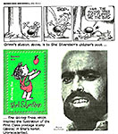

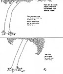

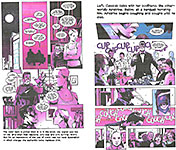
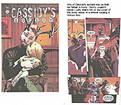
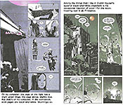
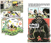
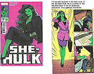
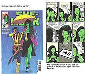
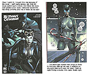
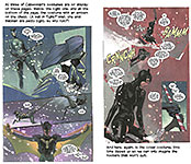
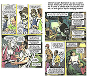
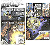
1.jpg)
2.jpg)
3.jpg)
4.jpg)
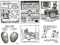
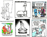
5.jpg)
6.jpg)
7.jpg)
8.jpg)
1.jpg)
2.jpg)
3.jpg)
4.jpg)

