 |
||||||
|
Opus 191:
Opus 191 (September 12, 2006). Manga is our Big Feature this
time, but not the manga you’re thinking of. Not the tediously paced comics for
teenage girls. No, instead, we start with a look at Yoshihiro Tatsumi’s Push Man
and Other Stories, a collection of gekiga, gritty, naturalistic stories. And then we go on to recite the history of the
term manga by focusing on the life
and “random sketches” of Japan’s master print-maker, Hokusai. That’s at the end of this installment. Between here and
there, we have the usual round-up of news that gives us fits, plus reviews of a
half-dozen new comic book titles, as follows (in order):
NOUS R US
Marvel’s heroes get postage stamped
Animated comics for newspaper websites
Canadian newspaper deliberately makes room for new
strips
“Where My Dogs At” draws fire
Dick Tracy news on the eve of its 75th anniversary
Bazooka loses suit
A.C.T.O.R. no more
Paul Norris, a short bio and his opinion about the
present-day treatment of his Golden Age creation, Aquaman
Is hip-hop over?
NEVER-ENDING
DANES
Testimony from a Canadian cartoonist about Iran’s
exhibition of bigotry
COMIC STRIP
WATCH
Male stereotypes are dangerous
Get Your War
On, a prose newspaper column in
masquerade
BOOK
MARQUEE
New Luckovich
More Nemo (and other classics) from Peter Maresca
FUNNYBOOK
FAN FARE
Reviews of Superman
Batman, Wonder Woman No. 2, JLA
Classified No. 16, Loveless, Civil
War, 52, and the Escapists
The Trials of Shazam, the latest revival of the Big
Red Cheese
A LOOK BACK
—at an age when everyone drew pictures
GRAFIC
NOVIL AND MANGA BY THE MASTER
Push Man and How Hokusai Invented Manga
And our usual reminder: don’t forget to activate the
“Bathroom Button” by clicking on the “print friendly version” so you can print
off a copy of just this lengthy installment for reading later, at your leisure
while enthroned. Without further adieu—
NOUS R US
Just the
news that gives us fits.
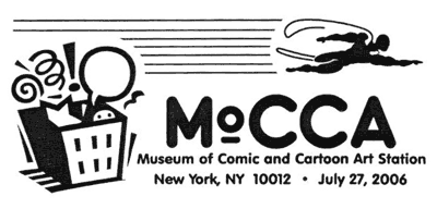
Seething with envy, doubtless, Marvel has succeeded in getting its longjohn legions on postage stamps, just like its rival DC, only a year later. Marvel’s stamps will be released in 2007, saith ICv2 News, “and the smart money is betting that the Postal Service will release them just in time for the San Diego Comic-Con.” And if the Postal Service is present at the Con to sell sheets of the stamps, we suspect they’ll bring more of them than this year’s crew did: they ran out before the weekend was over. And they ran out of the superhero-stamp imprinted tote bags they were selling before noon on the first day. The Marvel line-up includes Spider-Man, Incredible Hulk, Captain America, Iron Man, Sub-Mariner, Silver Surfer, Spider-Woman, Elektra, and, representing the groups Fantastic Four and the X-Men, the Thing and Wolverine. Each character will be depicted twice, in an individual portrait and on a comic book cover, resulting in a sheet with 20 stamps. The San Antonio Express News Blog, Geek Speak, quotes USPS spokesman Mark Saunders who says the ten covers will be: Number Ones for Amazing Spider-Man, Incredible Hulk, Sub-Mariner, Silver Surfer, Iron Man, and X-Men (the 1963 issue with Wolverine on the cover), plus Fantastic Four No. 3, Captain America No. 100, Marvel Spotlight No. 32 (Spider-Woman), and Daredevil No. 176 (Elektra). This line-up, though, is still preliminary. Fans are wont to quibble with the character choices. Like many, I doubt that Elektra or the Sub-Mariner are in the same class as the rest; ditto the Silver Surfer. But the Sub-Mariner and the Silver Surfer are at least highly visible creations in the pantheon of Marvel’s superheroes; Elektra isn’t. Why is she there and Daredevil isn’t? Okay: DD isn’t female. I get it. Regardless of the choices, it’ll be fun to see these images on postage stamps. Oh, the ICv2 article also let it slip that postal rates are likely to increase by the time the Marvel characters line up for a licking: the stamps, it says, are 42-centers. By the way, before we forget again, the official dedication of the DC stamp issue took place in New York at the Museum of Comic and Cartoon Art on July 27 at 10:30 a.m. A special one-day-only MoCCA pictorial cancellation was available; designed by John McCarthy, MoCCA’s pr guy, it featured the usual MoCCA symbol plus a caped and flying figure speeding overhead. The ceremony was a big success. “We were pretty crowded,” McCarthy told me. “I knew we had done a good job when I had to make room for a fourth camera crew.”
“Snakes on a Plane” didn’t live up to
the hopes of its producers, who, astonished at the buzz the film was generating
even before its release, expected box office receipts to be much higher;
according to ICv2 News, the movie dropped almost 60 percent in its second
weekend of release. ... The Segway personal transporter, that revolutionary
invention by Dean Kamen, son of Jack
Kamen, once a stalwart in the EC Comics line, isn’t living up to
expectations either. Time remembers
that Kamen had predicted “that cities would banish cars from their congested
hearts” once people discovered the ease and convenience of the self-balancing,
battery-powered two-wheeled scooter. But it hasn’t happened. Yet. Kamen hasn’t
given up hope, though, and in August, he introduced the new and improved model,
which he hopes will finally appeal to the mass market. ... Neatly Chiseled
Features (NCF), the syndicate founded by cartooner Joe Martin, has started offering animated comics to newspapers for
their websites. Editor & Publisher reports that Martin’s “main reason” for forming his syndicate was to market
animated comics, which, Marin contends, are a great way to attract more young
readers to newspaper sites. He’s thinking of a future of newspaper comics.
Martin is the creator of Mr. Boffo, Willy
’n’ Ethel, Cats with Hands, and On
the Edge—all features that, I assume, can be obtained in animated versions
now. NCF is also offering to animate other cartoonists’ work. ... Also from E&P: the Witchita Eagle’s recent readership survey found Brian Crane’s Pickles comic strip at the top of the
list; Lynn Johnston’s perennial
favorite, For Better or For Worse, came
in second. Johnston plans to retire in 2007, but few would expect the strip to
slip in popularity before then. Meanwhile, continuing to record
earth-shattering developments, E&P saith the Gazette of Montreal dropped seven older comic strips to
make space for newer ones. “New artists with fresh ideas and strong talent are
trying to break into the business,” the paper said in announcing the changes in
its line-up, “and we want to make space for them.” The dropped comics are Adam, Herman, Sally Forth and two more
prominent stalwarts, Beetle Bailey and Garfield. Peanuts had already been
cancelled in 2005; and The Boondocks hiatus
left the seventh slot open. Into those slots, the paper inserted Between Friends, Dog Eat Doug, Lio, Non
Sequitur, Pearls before Swine, Pooch Café, and Rhymes with Orange.
An
MTV cartoon aroused the ire of viewers by depicting a Snoop Dogg-like personage
strutting around, two bikini-clad black women in tow on leashes fastened to
their dog collars. One of the women squats on all fours and scratches herself
like a dog, and later in the episode (No. 4 of the series “Where My Dogs At?”), the Snoop character puts on a plastic glove
and scoops up his enslaved ladies’ defecation. The New York Post quotes Paul Porter, founder of a watchdog group, who
said: “This only serves to reinforce negative images of women, conveying to
kids on a Saturday afternoon that all women are bitches and ho’s. In my ten
years of monitoring children’s programming, I’ve never seen anything this
offensive.” Alas, the episode’s satire misfired: the scene was intended to
ridicule an actual Snoop Dogg appearance where he was accompanied by two women
wearing neck collars and chains. “The goal,” said a spokesperson, “was to take
aim at that incident for its insensitivity and outrageousness.” The perpetual
problem with parody is that if it looks too much like the thing being
ridiculed, it will be guilty of the same offense; and yet good parody requires
nearly exact mimicry. ... According to Michael Giltz in the New York Post, the July release “Ren & Stimpy: The Lost Episodes” puts the manic chihuahua and the dim-bulb cat through paces that are “ruder
than ever.” Bigger fart jokes, I suppose. ... Rancid Raves correspondent Bill
Crouch conjured up this bit of trivia: Dick
Locher, who produces Dick Tracy, turned
77 in June and is therefore older than Tracy’s creator was when he retired from
doing the strip; Chester Gould was
only 75 when he put down his pen. ... And for Tracy fans, a DVD of the sixties
animated tv series, “The Adventures of Dick Tracy,” will be released on
September 26 to mark the strip’s 75th anniversary. Editor & Publisher adds that a
limited edition Dick Tracy comic book
will be included with the DVD.
“It
is a tale of two companies, once friends and collaborators, now enemies and
scorched-earth litigators—and of chewing gum,” according to U.S. District Judge
Charles S. Haight. He was issuing a ruling August 31 on a sticky case involving
an Argentine company that persists in making its sweet-tasting Bazooka gum even though its
relationship with The Topps Co. that made the brand famous has long since
soured. The ruling described not just the decades-long history of the
companies—family-owned friends that became corporate rivals—but also the
millennia-old history of gum, stretching back to when the ancient Greeks chewed
on a substance ACTOR (A Commitment To Our Roots), the organization that
claims to have helped countless numbers of down-on-their luck, struggling
comics professionals, has announced a name change from ACTOR to The Hero
Initiative. The change became effective on September 4th and the ACTOR Website
now has a new address www.HeroInitiative.org. The organization's
mission remains the same—helping comics creators of yesteryear in medical or
financial need. The organization felt that a name change was necessary to get
the general public have a clearer immediate impression of the organization's
mission. “I think we did a very good job of establishing ‘brand identity’ for
A.C.T.O.R. within the comic market,” said the organization’s president Jim
Mclauchlin. “But as soon as we took the mission outside the village of comics,
you’d see confusion in people’s eyes. The ‘Hero’ concept is one that ties very,
very closely to comics, and resonates well. It lets everyone know what we're
about.” I dunno about that: I suspect that the notion of a “hero initiative”
wouldn’t make much sense to anyone not already cut into the superhero concept.
But “actor” probably suggests Hollywood more than funnybooks, so it’s clearly a
non-starter. This is all legit, I’m sure, but I was leery of this operation
when it started. Apparently a stand-alone charity operation, with, admittedly,
support from several publishers (among them thoroughly respectable operations
like Dark Horse, Top Cow, and Wizard), it sounded, at first, a little
suspicious. Because it operates as its own entity rather than as an arm of some
other external outfit, I wondered who the watchdog was. With the Milt Gross
Fund of the National Cartoonists Society, NCS is the watchdog—that and the IRS.
But here, we have only A.C.T.O.R.’s honchos to depend upon for an up-and-up
operation. And who are these folks? Well, turns out the folks are some pretty
well-known personages: Joe Quesada, Michael Richardson, Dick Giordano, George
Perez, John Romita Sr., and Roy Thomas, to start with—and that’s not a complete
list. So I reckon we’re safe. I’d feel better, though, if that URL got me to
the A.C.T.O.R. or Hero website instead of the site of a full-service
construction company in Cleveland. Try actorcomicfund.org for the time being.
Paul Norris, the 91-year-old cartoonist
who created Aquaman and then drew the comic strip Brick Bradford for over thirty years, 1952-1987, got his college
degree from Dayton School of Art in Ohio, but he took journalism and art
courses at Midland Lutheran College in Freemont, Nebraska, where a cousin was
teaching. Last winter, the Freemont college mounted a collection of his
drawings, “A Tribute to Paul Norris,” and Norris attended the opening reception
on February 10. Dane Stickney at the Omaha
World-Herald interviewed the cartoonist, and we learn that Norris decided
to become a cartoonist when he saw his first comic strip, which he thinks was Happy Hooligan. “I started drawing my
own cartoons from the time I was able to hold a pen,” Norris said. In 1941 when
he was 26, he went to New York, looking for work. He went to DC Comics, and
that resulted in the creation of Aquaman. Probably he was told what Marty Nodell was told when he went to
DC looking for work about the same time: invent a costumed hero for us, and you
can draw that. “I made a lot of sketches just from my head,” Norris said. “I
decided to color him green and orange, and the editors really liked that. He’s
worn green and orange almost the whole time he’s been around, and I still get paid
royalties for every time they use those colors with him.” He drew the character
for only a short time. About a year after Aquaman’s debut, Norris was offered a
contract to take over the comic strip Vic
Jordan, and after he signed the contract, he discovered, having left the
small print to his lawyer until then, that he was expected to work
“exclusively” on Vic Jordan. So
Aquaman lost his creator. Shortly after that, Norris was drafted and spent the
next three years in the Army. When he returned to civilian life, he went to
work in the bullpen at King Features, drawing Jungle Jim and Flash Gordon comic
books. He graduated to the Jungle Jim Sunday
strip in 1948, and then in four years later, he inherited Brick Bradford, which he continued until both he and the strip
retired in 1987. Brick Bradford was
his favorite. “I liked the science fiction,” Norris said. “Brick could go back
or forward in time. There were no limits with him. He could go back and fix
historical events so they’d turn out the way they should have.” Norris never
imagined Aquaman would last as long as he has. “I love to see him showing up
more and more these days,” he said. But some of today’s comic book writers
“have made him a little too rough and violent for me.”
“Hip-hop”
as a cultural and artistic phenomenon embraces break dancing, dejaying (mixing
recorded music), rapping (“emceeing”), and graffiti. The so-called hip-hop
drawing style derives from the latter. It’s sometimes called “urban style”; and
“retro” bears a resemblance. Hip-hop as a whole, however, is more attitude than
style. Graffiti, for example, is a sort of outlaw art, taking its definitive
shape on the sides of subway cars, warehouses, and highway overpasses where
expanses of space tempted aerosol-can wielding youths to express themselves as
“a form of macho bluster,” according to Ariella Budick in Newsday some weeks ago. She was reviewing an exhibit of graffiti at
the Brooklyn Museum, which, she said, was “a requiem for a movement killed off
by an excess of respect.”
Fascinating Footnit. Much of the news retailed in this segment is culled
from articles eventually indexed at http://www.rpi.edu/~bulloj/comxbib.html,
the Comics Research Bibliography, maintained by Michael Rhode and John Bullough, which covers comic books, comic
strips, animation, caricature, cartoons, bandes
dessinees and related topics. It also provides links to numerous other
sites that delve deeply into cartooning topics.
THE
NEVER-ENDING DANES
U.N. Secretary General Kofi Annan didn’t have much
luck when he visited Iran a week or so ago. He didn’t get Iran President
Mahmoud Ahmadinejad to back off even a little from his insistence that Iran
would continue enriching uranium. And when Annan heard about the anti-Holocaust
cartoon exhibit, the Associated Press said he voiced disapproval: “We should
avoid anything that incites hatred,” he said. He didn’t visit the exhibit, but
his spokesman implied that Annan didn’t need to see the cartoons: “From what he
heard, he would find them pretty distasteful, as he did the Danish cartoons
about the Prophet Muhammad, which he strongly condemned at the time.” Last I
heard, the exhibit is still open, the SecGen’s disapproval notwithstanding.
The
exhibit includes some cartoons submitted by Europeans and other Westerners. The
only interview I’ve seen with one of these non-Muslim entrants was the one
sprung on a Canadian in Quebec named Marc Pageau, conducted by Bryan Munn at www.Sequential.spiltink.org where they extol the news of Canadian
comix and culture. Pageau entered the contest, he explained, because he viewed
the Danish Dozen controversy last winter as historic, an unprecedented
cartooning event, and he wanted to be part of it. Moreover, he relished the
chance to test the validity of free speech tenets in the West.
“It
gives me a chance to test for myself Freedom of Speech here, in Canada and in
the United States,” he said. “How will the knowledge of my participation be
received by fellow cartoonists, journalists, average individuals and friends?
It will be interesting to follow the reactions!”
He
is not too concerned about the criticism he might get for participating in the
satirical albeit bigoted Iranian contest. “Some will say I am stupid because
Iran is the Number One Enemy of the United States! Come on! Since the beginning
of the Iraq war, everybody is the enemy of the United States, even Canada! You
don’t believe me? Try a Google search with the word ‘Canuckistan’! Even the
Pretzels are the enemies of the U.S.A., for menacing the life of the President
Bush years ago!”
Pageau
finds the controversy over depicting Muhammad in cartoons more than a little
ridiculous. Historic in the attention it gained for cartoons, but still
ridiculous. “It’s obvious that this is just another good example of mass
manipulation,” he said. “The Muslim fundamentalists have learned it very well
from the U.S. administration. ... When I studied Fine Art at Laval University,”
he continued, “in art history, I learned that Islam doesn’t permit [artists] to
picture the human body, but nobody told me that it is completely forbidden to
draw Muhammad the Prophet or Allah for everybody in the world, Muslim or not!
What is that? I can realize a caricature of God, Jesus, Yahweh, Buddha, Ra, but
not Allah or Muhammad? Drawing a cartoon criticizing Muhammad is attacking and
insulting Islam? What about Jesus, my God—considered in the Quran for centuries
as only a little prophet lost in the multitude of other prophets—isn’t it
insulting for all the Christians? And I
bet easily that a lot of people in the world drew at home much more silly
cartoons of Muhammad than before in history since last February’s events! It is
in the human nature to defy authority.”
Except,
apparently, in the United States. He went on: “I was very shocked when the
Canadian and United-stater newspapers refused in block to reprint these very
inoffensive cartoons. A great gain for the so-beloved Freedom of Speech of the
western world, really! Welcome to the Mighty America, land of the Freedom of
Expression! It seems that it is almost
criminal these days in America to express publicly sincere opinions about the
Forever War in the Middle-East. ... And they dare to call their country Land of
Freedom of Speech!!! Please, let me laugh (out loud)!!!”
Is
the Iranian contest anti-Semitic? Pageau scoffed at the idea: “That doesn’t
make sense for me! If I draw a cartoon mocking or criticizing the stupidity of
the Foreign Policy of the United States, I am anti-American. If I draw a
cartoon mocking or criticizing the stupidity of Foreign Policy of Israel, I am
anti-Semitic. If I draw a cartoon mocking or criticizing the stupidity of the
Islam, I am anti-Muslim. If I draw a cartoon mocking or criticizing the
stupidity of the actual Government of Canada, I am anti-Canadian. If I draw a
cartoon mocking or criticizing the stupidity of the actual Government of
Quebec, I am anti-Quebec. And if I draw a cartoon that shows a dog, I am
anti-animal. If I draw a cartoon that shows a stone, I am anti-mineral. If I
draw a cartoon that shows a tree, I am anti-vegetable. Where would the
anti-everything stop? Can I draw something without being insulting? If not, I
believe that our beautiful Western Democracy is totally sick. If I am
anti-something, then I am anti-stupidity!”
Pageau
submitted four cartoons to the competition. He didn’t describe any of them;
maybe he wasn’t asked to. But if you click on the link in our second paragraph,
you can scroll around to find the Pageau Interview and one of his cartoons, a
fairly outrageous example of racial stereotyping that, now that I’ve heard
Pageau himself, I’m sure he enjoyed doing, hooting with perverse laughter the
whole time as he defied the authorities of good taste and civic comity like a
kid throwing rocks through the neighbor’s window.
A society that doesn’t allow religions to be mocked
cannot be considered free. —A Nanny Moose
COMIC STRIP
WATCH
Violence Is Not Funny
Apparently,
a letter to the editor of the Washington
Post, published September 2:
The Aug. 26 Hagar the Horrible comic strip showed the result of a couple “ironing out” their differences. The
man's head was heavily bandaged; the “punch line” was that the wife hit him
with her iron. If the situation had been reversed, with a man giving his wife a
black eye, I’m sure you wouldn’t have run it. Attention is only beginning to be
paid to the physical and psychological harm to men and boys when men are
routinely depicted as fools on television and in movies and when boys’ academic
performance and dropout rates are at a crisis level. Such stereotypes can no
longer be played for laughs. —David S. Rose, Silver Spring
True,
all true. No comic strip ever depicts the husband bashing the wife. Maggie got
away with skimming crockery at Jiggs’ head for at least forty years, and he
could never raise a finger to her. (Well, maybe, unbeknownst to us, there was a
finger that he raised, surreptitiously, when no one, including the redoubtable
Maggie, was watching. You could hardly blame him for resorting to this antique
gesture of defiance.) No one ever complained, that I know of, about Maggie’s
brutality. They surely would have had the situation been reversed. But today,
we have David Rose to protest the battered husband syndrome. But he’s wrong
about one thing. I doubt that boys today suffer much psychological harm from
the funnies: American youths no longer read newspapers, David, so the young
male animal isn’t likely to encounter any of these psyche-distorting images in Hagar.
Elsewhere: David Rees’ Get Your War On is not much of a comic strip. It’s illustrated with
clip-art, and the pictures veer off in the direction of being the same poses
over and over again. In a visual medium, such a performance very nearly
disqualifies the effort. Rees completes the disqualification by choosing clip-art
without regard for what’s transpiring in the speech balloons. For him,
visual-verbal blending isn’t part of the game at all. Like too many of today’s
so-called comic strip cartoonists, Rees isn’t; he’s a writer who has wandered
into an artform that is only half-write. In a more advanced civilization, he’d
be writing witty paragraphs in a daily newspaper column, a genre that, sadly,
expired a few decades ago. Here’s one of his recent “columns” as it appeared in Rolling Stone, September 7: How come the terror plots that lead to the
worst airport inconveniences are the fuckin’ B-list, retarded terror plots that
would never work? If I’m gonna have to surrender my shoes or my shampoo or
whatever, at least let it be because people have actually been killed! Enough of this theoretical bubblegum-missile bullshit! I wish someone would try
to blow up a plane using New Age music so I wouldn’t have to sit and listen to
that shit while people are boarding. Do you think we could pay a terrorist to
try to kill infidels using some kind of “lack of legroom in coach” bomb? There. Funny, right? Witty, biting satire. But we don’t need pictures to
appreciate the jokes. So why does Rees get away with inflicting on us clip-art
of two guys talking to each other on the telephone? Dull, lifeless visuals.
Dull, dull, dull.
BOOK
MARQUEE
Four More
Wars! is the title of a new
collection of cartoons by Mike
Luckovich, editoonist for the Atlanta
Journal-Constitution and winner last year of both the Pulitzer and the
Reuben. Editor & Publisher notes
that the 180-page paperback will also include humorous features by Luckovich,
such as anecdotes about his encounters with Secretary of Defense Rumsfeld
(something about a push-up contest) and President Bill Clinton (who Luckovich
persuaded to draw a self-caricature).
In
case you missed it, Peter Maresca’s archival reprinting at its original publication size of Winsor McCay’s Sunday masterpiece, Little Nemo in Slumberland, was a gigantic success: the initial
printing of 5,000 sold out quickly, and Maresca went back for another 4,000.
The success of this venture seems poised to bring about a whole new era in
comics appreciation. First, Calvin Reid at PW Comics Week reports, Maresca is
presently at work on a second Nemo volume, this one reprinting strips from 1910-1914, when McCay had left the New York Herald and was doing Nemo for the Hearst works, plus some
pages from the 1924-26 revival. The book’s format at 16x22-inch page size is
the same as the first volume’s, and the second will be offered with a slipcase
for both books. Maresca, who is doing the high-res digital scans and
corrections himself, as he did for the first volume, says the new book will be
out next summer. And after that, Maresca expects to launch a monumental
historical comics project—The Best American Newspaper Comics, another
restoration enterprise that will feature full-size reproductions in full color
of classic comic strips beginning with the 1895 Yellow Kid and including strips
from the next six decades. It will run seven or eight volumes, all of the Nemo tome’s size until the project
reaches the 1930s, when newspaper page size began shrinking. Printing such
volumes is a long process. “Each book is hand-bound because they’re so big,”
Maresca said. And they will be expensive to own: the first Nemo book was priced at $120, and subsequent volumes of the series
are not likely to cost less.
FUNNYBOOK
FAN FARE
My stack of unread comic books must be nearly three
feet tall. I vow, repeatedly, to do my duty and read them, but before I can get
a grip on even a small corner of last week’s pile, this week’s books arrive,
and I’m further behind than ever. But I managed to look into Superman Batman Nos. 21 and 25 this week
and was impressed by the lavish color and the anatomy all over the place.
Corded muscles abound, knotting and unraveling and knotting again. But not much
else. The usual slugfest, but, even sadder, these events seem to transpire
entirely in the void of outer space. Ed
McGuinness, for all his drawing skill, supplies so little in the way of
background that the story has no locale. In contrast, consider the Dodsons’ (Terry and Rachel) Wonder Woman No. 2, in which we find
lavish color, anatomy all over the place, a slugfest or so, and copiously
detailed backgrounds. We know where all this takes place. Like McGuinness, the
Dodsons are experts at figure drawing, but they’re more than just figure
artists: they’re also comic book storytellers. The story finds Diana Prince in
an identity crisis: she is charged to find the real Wonder Woman so three
villains will retain their new benevolent natures. Giganta inspires the
slugfest. Speaking of experts, I picked
up a copy of JLA Classified No. 16
purely to look at the work of Jose Luis
Garcia-Lopez again. I confess that I find something a little old timey
about Garcia-Lopez’s breakdowns and layouts: he pulls every composition trick
in the deck, and the resulting ensemble evokes the time when comic book
cartooners manipulated these aspects of their medium for dramatic effect and
visual excitement. Now, all we seem to have in abundance is expert figure
artists like McGuinness. Give me Garcia-Lopez every time. I’ll keep his JLA
title but not McGuinness’ Superman
Batman.
Loveless with No. 9 is finally resuming
a storyline. I liked very much the atmospherics of a few of the done-in-one
issues, but Brian Azzarello keeps
insinuating some larger tale, lurking at the edges, waiting to be told. Maybe
now we’ll get to it. Azzarello’s storytelling gimmick, though—his running at
least three stories (or is it four or five?), in fragments, that seem to take
place at three different times—is annoying in the extreme. And neither of the
artists drawing this title, Marcelo
Frusin or Danijel Zezelj, render
the continuing characters recognizably from page to page (or era to era in the
time shift). Zezelj’s art is profoundly moody, capturing the eye and seducing
the imagination. And it’s also beautiful deployment of muted color and solid
blacks. But his shadowy figures have no faces. Frusin is somewhat better in that
regard, but too many of the continuing characters have beards and wear their
hats so low that the upper portions of their faces are in shadow. And the
monochromic coloring effects, subtle indicators—often too subtle—of the time
frame, don’t help at all. A character’s blond hair appears gray or orange in
different times. It often takes me a page or more to realize which of the
characters is now on stage; and by the time I’ve figured that out, Azzarello
has shifted the time frame again, and we’re back in Civil War Kansas, riding
with the guerrillas. Seth Cutter seems to be the central figure in this series,
and his wife Ruth hovers around, too. Or is his wife Julia? And if so, who’s
Ruth? Something terrible happened when Seth went off to the war, and now he’s
come back to Blackwater and become sheriff and must contend with the local
corrupt political boss. Is Seth looking for revenge? And why does he wander the
town with his peter hanging out in No. 9? Or is that just a joke? Probably
Azzarello intends his tale to accumulate, to amass narrative detail and
connective tissue bit by bit, until, at last, the whole yarn will lie before
us, a tangled yet decipherable skein. As we go along, we are expected to
collect the bits and store them away, awaiting the revelation of their
significances. He does somewhat the same thing in 100 Bullets, but in that series, there are fewer sidetrips,
apostrophes to tangential issues, than in Loveless. Whatever he intends, we are left with little choice: if we want to find out what
Seth Cutter means, we must trail along Azzarello’s route, picking up pieces as
we go.
And
while we’re on the subject of elliptical narrative technique, here’s Civil War 1. I think that’s the title,
but Marvel’s “Civil War” runs with so many titles and subtitles that it’s
difficult to sort them out. I bought Civil
War 2 twice, the second time with Peter Parker on the cover, not realizing
that the interior of these two books is exactly the same. Because cross-over
series like this are so dazzlingly convoluted, the numbering and continuity so
baffling, I refuse to participate: I won’t get started buying a string of
connected titles that threatens to be unending when the plots require not only
endless purchases and numerical record-keeping but intimate knowledge of the
past histories of the characters and their fraught relationships. While I have
no intention, then, of following the bends and twists of the Civil War, I
bought Civil War 1, as I say, just to
see how it started. (And I picked up Civil
War 2 because I wanted to see Peter Parker unmask himself in public—a
historic moment that no one should miss. Apparently, no one did: my comic book
shop ran out of this title almost at once and had to order more.) I was pleased
to realize, when I reached the end of the first issue, that the proposition
that launched the Civil War—the government’s requirement that superheroes
register, thereby revealing their secret identities—is not nakedly propounded
and then flung out at the reading masses in the usual fashion of these
four-color frolics. Instead, the treatment is elliptical, as I implied: we
witness the incident that started the outcry for registration, but we learn of
the “movement” for registering superheroes on “Larry King Live” when King’s
interviewee responds to a question that King presumably asked just before we
tuned in. And gradually, as the pages turn, the complications pile up,
eventually constituting a crisis. But the crisis isn’t sprung on us, full
blown, in the customary manner of comic book scripting. That is, in the way it
was done in the old days. Nicely wrought, Mark
Millar.
I
also dipped in DC’s 52 series, the title that is coming at us once a week for the
next year. To properly appreciate it, you must, as with the Civil War across
town, buy every issue and keep cross-referenced records. Which I’m not doing.
But I bought Week Two and Week Eleven. The death of Ralph Dibny’s
wife last year I thought was a particularly egregious abuse of the medium,
employing death merely to shock and to sell comic books, I thought. Maybe not.
Maybe it was all part of a vast plan of which 52 and “One Year Later”
(OYL) are a part. More likely not, but whatever the case, Dibny is clearly a
part of the 52 tale. And in Week Two, we encounter the most provocative of the story’s elements: Superman’s
chest-symbol, when upside down, represents, we learn, Resurrection, and Dibny
sees it spray-painted on his wife’s tombstone. H’mm. This could get
interesting. As for Week Eleven, the
much touted debut of Batwoman as a “lipstick lesbian” (she enjoys being
feminine), it was both disappointing and intriguing. It was disappointing, no
doubt, to the salivating sorts who want to “watch” lesbian love-making:
Batwoman, Kate Kane, commits no lesbian act that I could detect. As for the intriguing
part: Renee Montoya, the defrocked lesbian cop from Gotham Central, is in pursuit of Intergang accompanied by a
supposed faceless fella named Charlie, and they fall into the clutches of
Whisper d’Are and her henchman, Abbot, a sort of werewolfie, and Renee and
Charlie are rescued by Batwoman, who Renee, once Kate Kane’s lover,
“recognizes” (we think). Well.
I’m
not sure, after witnessing several attempts, that the Escapist comic book hero
from Michael Chabon’s novel can be turned into an actual comic book character,
but Dark Horse is determined to try. The latest attempt is The Escapists, plural, which, I’m ashamed to admit, was so bland
that it didn’t inspire any sort of reaction at all in Rancid Raves critique
department. Eduardo Barreto’s 3-page
“golden age” comic book excerpt, however, is nice. But Philip Bond’s squat figures in the main story left me just staring
blankly down at them. And Brian K.
Vaughn’s story, which concerns a obsessive comic book fan named Maxwell
Roth and his fascination with the Escapist, seems a little jejune for Vaughn.
The Big Red
Cheese Returns Again
The Trials
of Shazam is another in DC’s
spasmodic attempts to revive and rejuvenate the Fawcett character who was so
popular in the 1940s that his books outsold Superman titles. And this attempt,
like all the others except the first, to which Captain Marvel’s creator C.C. Beck contributed the art until,
exasperated by puerile scripts, he threw up his hands and quit, seems doomed.
Although this is another try at squeezing the character into today’s mold, the
relevant and personality fraught hero, writer Judd Winick and the DC minions have finally comprehended one aspect
of Captain Marvel’s mythos that has so persistently avoided corporate
understanding heretofor. The magical aura of the Fawcett hero’s adventures.
Superman is science fiction, but Fawcett’s Big Red Cheese was about magic. Many
of the previous abortive attempts at reviving the character have failed because
this essential fact has escaped notice. This time, they notice. Winick is
making a serious try, here. “Captain Marvel has been treated like a lightweight
for years,” he told Matt Brady at Newsarama.com, “and I don’t think the
character deserves that. He needs his own place, where he rightfully should be
in the DC Universe.” Priding himself on doing fun dialogue, Winick intends the
book to have “a lighter feel—but it will have some weight. The character
deserves to be taken seriously. That doesn’t mean it’s a serious book; it means
that I’m going to take the character and what he means seriously.” For Winick,
that means, apparently, something like Aaron Sorkin’s “West Wing.” “Sorkin
wrote really funny dialogue,” Winick said. “Dialogue can be humorous and light,
but still have gravitas. That’s what I’m talking about.” Winick wants to avoid
“silly” though. Fawcett’s Captain Marvel was, he said over and over, “silly.”
And he doesn’t want silly. “We’re not going to have a tiger walking around in a
suit,” he said. “That’s silly.” But “that doesn’t mean we’re not going to have
a tiger that is somewhat anthropomorphic and talks like a man.”
To
achieve the new title’s magical nimbus, Winick reminds us that the Wizard
Shazam is dead, leaving “a void” in the world of magic, “a break in the chain.
Magic is all about power,” Winick continues, “and the Wizard Shazam is the
keeper of that power, and it had to go somewhere [when he perished], so it went
to Captain Marvel. That magical energy is [now] flowing through him.” Which is
why, in the first issue, we see Captain Marvel with Shazam’s long white hair at
the end. This issue also includes a four-page interlude with Captain Marvel
exchanging fast-paced Sorkin sentence fragments with Zatanna. It didn’t seem
all that funny, but Zatanna is a magician, so in Winick’s perception of the
series, she clearly belongs in the same book with the new wizard of magical
power, Captain Marvel. Winick admits that the first issue isn’t where he wants
the title to be yet. He has a higher opinion of his second and third issues.
But if the first issue is any indication, I think he’s off on the wrong tack
just as all his revivalist predecessors were.
Winick
thinks Kyle Baker’s revival of Jack Cole’s Plastic Man was “brilliant”
but “nobody bought it.” Baker’s Plastic Man was highly amusing, but it wasn’t
Cole’s Plastic Man. It was Baker’s. So it wasn’t a revival at all. If Winick
thinks he’ll achieve his goal with Captain Marvel if he does what Baker did
with Plastic Man, then we’re not going to have any kind of a revival of the
fantasy spirit that once animated the Fawcett character. Instead, we’ll have
another Superman but one that wears red tights.
There
are two aspects to the problem in reviving Captain Marvel, or one with two
branches. The Fawcett Captain Marvel was written for juvenile readers, readers
who could identify with Billy Batson and were thrilled at the idea that saying
a magic word could turn a kid into an all-powerful adult. Kids, we suppose,
aspire to the same effortless mode of transition to adulthood. And power. The
comic book readers Winick and DC aim for aren’t kids, so that essential aspect
of Captain Marvel’s historic appeal won’t work. Those of us who remember the
Big Red Cheese with a fondness surpassing all actuality won’t find him in
Winick’s new Wizard. The second aspect to the problem is the magic. Magic
instead of science fiction. Winick has seized this interpretation with both
hands and made it central to his concept. But he seems bent on making the magic
serious: Captain Marvel as the new Wizard Shazam is laced with gravitas,
world-saving gravitas. But in Fawcett, the magic was an aspect of the
silliness. Just as Captain Marvel is created when hit by a magic bolt of
lightning, so are the crimes he solves the crimes of magicians—evil scientist
inventors whose inventions threaten civilization even though they are silly.
Here’s a mad man who invents a machine that makes history go backward, so all
the inventions of the modern world disappear. The mad genius takes them all to
a parallel but somewhat primitive world where he hopes to make millions by
selling them to the local populace. Captain Marvel takes most of the story to
figure this out, and then removes the threat to civilization by knocking the
mad scientist on his keister. Many of the Fawcett stories are like that: Captain
Marvel struggles for most of an adventure to figure out what’s going on, and
then restores civilization with a few well-placed punches. Lots of flying but
not much pugilism. But that’s beside the point. The point is that magic in the
Fawcett oeuvre wasn’t an occult machination: it was, rather, an aspect of
fantasy. Superman is science fiction; Captain Marvel is magical fantasy. Winick
has taken the magic seriously: he’s explaining it as he would science fiction.
And the fantasy is draining away.
The
object in reviving the Fawcett character should be to recapture the feeling
that was generated back then by magical fantasy. And if the adult readers DC is
aiming for no longer pine for magical fantasy, what would inspire the same
feeling? I’d opt for a super-powered character that gently, subtly lampoons
super-powered characters. The stories would center on Captain Marvel’s struggle
to be a super-powered hero in a world in which science fiction seems, to
Captain Marvel, to be magic. There’d be a satirical edge. I wonder how far that
would take us to the spirit of the original. Farther, I ween, that burdening
the Big Red Cheese with Shazam’s role as the Big Wiz.
Howard Porter’s art for The Trials of Shazam is impressive in
its painterly approach. Even spectacular sometimes. But he hasn’t the knack,
yet, of getting the faces right. Captain Marvel looks different in nearly every
picture. Alex Ross got that right:
he uses real life models, whose faces, naturally, are the same from pose to
pose. And Ross copies them. Porter isn’t doing that: he’s painting like a
cartoonist, using the faces he sees in his head and, then, on the paper in
front of him. He makes the faces as he paints them, and so each one is a little
different. Spectacular art, but not as functional as it should be in a
storytelling context.
THE THINGS
PEOPLE SAY
From Entertainment
Weekly, September 1: Bob Dylan says
music hasn’t sounded good for 20 years. “Granted,” he concedes, “that’s around
about when, on doctor’s advice, I stopped hearing it through my nose.” I’ve
never seen a photo of Dylan smiling. He always looks so ponderously serious, so
significant. So pained. Why is that? With his funny hats and electric shirts,
he gets to play dress-up all day long every day. You’d think he’d be happy about
that. That and his uncommon luck in parlaying a grating nasal twang into a
musical career.
HOW IT WAS
ONCE: A SOFT-FOCUS LOOK BACK
I don’t
often do this—pad the proceedings with the wholesale appropriation of others’
penmanship—but Michael Kimmelman’s July piece in The New York Times is too delicate to suffer the dismemberment of excerpting and too good
to pass by. So here ’tis, whole:
An
Exhibition About Drawing Conjures a Time When Amateurs Roamed the Earth
By Michael Kimmelman
New York
Times, July 19, 2006
“Playing
the Piano for Pleasure” is a minor classic of self-help by Charles Cooke
promoting musical amateurism, published in 1941 in the upbeat style of Dale
Carnegie. It lays out a strict regime of practice and discipline, the musical
equivalent to a better body in 30 days. “We will worm our way, expending
considerable effort, into the small end of the cornucopia,” he promises, “in
order that we may later emerge, expending less effort and having the time of
our life, out of the large end.”
I was
reminded of Cooke while visiting the Grolier Club, where a show called
“Teaching America to Draw” provides a refresher course in pencil-pushing and
other sorts of sketching as a collective pastime. It’s about that golden era,
from the time of the founding fathers nearly to Cooke’s day, when educated
Americans drew as a matter of course. Drawing was a civilized thing to do, like
reading and writing. It was taught in elementary schools. It was democratic. It
was a boon to happiness.
From
1820 to 1860, more than 145,000 drawing manuals circulated, now souvenirs of
our bygone cultural aspirations. Not many of these manuals are still intact
because they were so heavily used, worn down like church relics, which
supplicants rubbed smooth from caressing.
We’re
addicted to convenience today. Cellphone cameras are handy, but they’re also
the equivalent of fast-food meals. Their ubiquity has multiplied our distance
from drawing as a measure of self-worth and a practical tool. Before box
cameras became universal a century or so ago, people drew for pleasure but also
because it was the best way to preserve a cherished sight, a memory, just as
people played an instrument or sang if they wanted to hear music at home
because there were no record players or radios. Amateurism was a virtue, and
the time and effort entailed in learning to draw, as with playing the piano,
enhanced its desirability.
Drawing
promoted meditation and stillness. “A sustained act of will is essential to
drawing,” Paul Valéry put it. “Nothing could be more opposed to reverie, since
the requisite concentration must be continually diverting the natural course of
physical movements, on its guard against any seductive curve asserting itself.”
A
century ago it was possible for a Philadelphia educator named J. Liberty Tadd
to instruct young women to stand in pigsties to learn to draw animals directly
from nature. There’s an illustration in the show from Tadd’s “New Methods of
Education” of a girl in a long, improbably immaculate dress sketching pigs on a
blackboard.
The
exhibition is full of such exhortatory books, many of them discomfiting today
because they presume a degree of skill among ordinary citizens—even
children—that would now be regarded as noteworthy in the art world. There are
exceptions, like a popular manual from the 1840’s by Benjamin Coe, one of
Frederic Church’s teachers, who, to judge from his illustration of a maiden in
a glen, needed a little brushing-up on perspective. On the other hand, there’s
J. T. Bowen’s “United States Drawing Book,” from 1839, with its moody view of a
crumbling cathedral in a landscape, and P. Fishe Reed’s “Little Corporal’s
Drawing Book,” a progressive manual from 1869 with bird drawings that Audubon
might have been proud to make, conjuring an America in which 10-year-olds are
absorbed not by Game Boys and iPods but by the finer points of mastering
realism. Clearly these manuals were aspirational no less than educational or
recreational. It’s hard to imagine that most American schoolchildren during the
1870’s could duplicate the leaves and bugs and complicated curlicue patterns
that Herman Krusi Jr. drew in his manuals for classroom instruction. But
Americans wanted their children to: that’s the point.
Something
happened between then and now, and it wasn’t just the invention of gadgets that
eliminated the need to draw. There was also a philosophical change, away from
drawing as a practical endeavor and toward art appreciation. From dexterity and
discipline to feelings and self-esteem: the shift in values is implied by some
of the later books in the show. Consciously or not, they parallel changes in
modern art, which threw out the rule books of draftsmanship and proposed a new,
free-thinking attitude.
As
for expending effort to become skilled at drawing, the post-Cooke postwar
generation introduced Paint by Numbers, and the situation has gone downhill
from there.
“Drawing
in America is as much a basic human activity today as it has always been, even
if it is not perceived to be as necessary to economic and cultural progress,”
Albert A. Anderson Jr. writes in the slim pamphlet accompanying the show.
I
don’t think so. Drawing and doodling are not the same. With the arts, American
adults have acquiesced to playing the passive role of receivers. In a new
memoir, Let Me Finish, Roger Angell
recalls trips to the Polo Grounds and Yankee Stadium in the 1930’s with his
father, who also liked to join pickup games when middle-age American men still
did that. Today baseball is like the arts, with grown-ups mostly preferring not
to break a sweat. “We know everything about the game now, thanks to instant
replay and computerized stats, and what we seem to have concluded is that
almost none of us are good enough to play it,” Mr. Angell writes.
So
it is with classical music, painting and drawing, professional renditions of
which are now so widely available that most people probably can’t or don’t
imagine there’s any point in bothering to do these things themselves.
Communities of amateurs still thrive, but they are self-selecting groups. A
vast majority of society seems to presume that culture is something specialists
produce.
Rembrandt
Peale published one of the drawing manuals in the Grolier Club show. Besides
being an artist, Peale became Pennsylvania’s first high school art teacher in
the 1830’s, hired by Alexander Dallas Bache, a grandson of Benjamin Franklin.
People, Franklin pointed out, can often “express ideas more clearly with a lead
pencil or a bit of chalk” than with words. “Drawing is a kind of universal
language, understood by all nations,” he reminded Americans.
We
have given it up, at a cost that, as Franklin might have put it, is beyond
words. Mr. Angell goes on in his book to say that television and sports
journalism have taught us all about the skills and salaries and private lives
of professional ballplayers, on whom we now focus, instead of playing the game
ourselves. As a consequence, he writes, “we don’t like them as much as we once
did, and we don’t like ourselves much, either.” You can draw the analogy.
Dunston
Barswig’s Favorite Quotations
“You are not drunk if you can lie on the floor
without holding on.” —Dean Martin
“You'\’re
only young once, but you can stay immature indefinitely.”—Ogden Nash
“You
know you’re getting old when you fall down and you wonder what else you can do
while you're down there.” —A Nony Muss
“Ever
notice how ‘Wot the hell’ is always the right decision?”—Dunston Barswig
GRAFIC
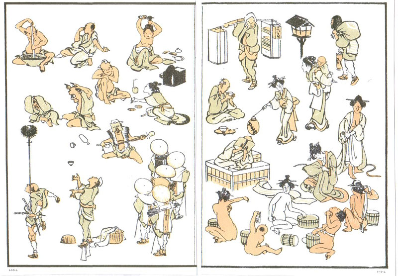
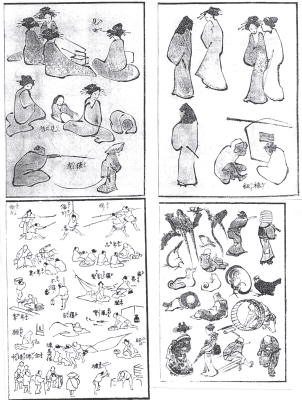
NOVIL AND MANGA BY THE MASTER
The graphic novel sections of our bookstores are
awash in manga, the Japanese-style
comics populated by large-eyed, pointy-chinned, pinch-faced adolescents, who
all look so much alike that the men seem effeminate, rendered with a wispy line
that emphasizes hair styles and lingerie, and paced not by incident but by
instants so that every event, however mundane, takes pages to relate, making
feelings more important to a story than actions. Perhaps because of the
enhanced emotional engagement, manga seem
to appeal more to women than to men in this country, where domestically
produced comics traditionally have had almost no female readership. To take
advantage of the feminine appeal, most manga now available here is shoujo manga, created expressly for teenage girls. Whatever the cause, the appeal of manga has translated into whopping numbers:
last year, Americans and Canadians spent over $120 million on this literary
form that is foreign to U.S. readers not only by reason of its origins but in
its very mechanisms. It is a mistake, however, to think all Japanese comics are
frilly-witted shoujo manga. They
aren’t. And here to prove the point is The
Push Man and Other Stories by Yoshihiro
Tatsumi (208 6x9-inch pages in hardcover; Drawn & Quarterly, $19.95).
Tatsumi’s
characters don’t have particularly large eyes; the women are not costumed as
school girls with skirts short enough to offer a sexually intoxicating glimpse
of panties; his lines are bold, his renderings simple, stark in clarity and
impact. The
sixteen stories herein are short and focused with the high emotional clout of
O. Henry’s ironic plot twists, and Tatsumi’s storytelling is much more direct
and to the narrative point than most manga. He proceeds methodically, panel by panel, to present only the narrative details
that are essential to the story and its ultimate impact. In every story, the
protagonist is male, and nearly every one of them suffers in silence the
ignominies inflicted upon him—faithless wives and lovers, sex without affection,
meaninglessly routine employment, emotional isolation. In the first story, a
factory worker is afflicted with an ambitious wife, who nags him to make more
money so she can open her own business. Eager to please her, he shoves his hand
into machinery, losing it in order to collect the insurance money, which she
uses to establish her own club. She proves not very grateful for her husband’s
sacrifice, denies him her sexual favors, and threatens to leave him. He grabs
her arm and thrusts her hand into a fish tank inhabited by piranha, which
attack her hand. She escapes with her hand merely lacerated and leaves him; he
kicks over the fish tank and goes out to find work where “disabled workers” are
welcomed.
The
title story is about a “push man,” whose job is to shove people into the
commuter trains, jamming them in, thereby increasing their capacity. By the end
of the story, we see his work as a metaphor for sex. In “Test Tube,” a young
student makes extra money by donating to a sperm bank. When he loses his job,
he attacks a young woman who has been impregnated with his sperm. In “The
Pimp,” the pimp is revealed as imprisoned, like the bird he keeps caged in his
apartment. A sewer worker finds his girlfriend’s just aborted fetus in the
sewer. A transvestite seems more “alive” to his wife once he has found a second
sexual relationship outside of marriage. In “Disinfection,” a man whose job is
to disinfect telephones tries to disinfect a prostitute. In “Telescope,” a
one-legged man watches through a telescope a couple making love, an old man and
a young woman. The old man is impotent, but he achieves arousal once he knows
he is being watched. The one-legged watcher, who is also impotent, is so
frustrated by the old man’s success that he kills himself.
Almost
none of the male protagonists speak; almost all of them are betrayed by their
spouses or friends, and several take revenge by murdering or maiming. Or they
kill themselves. Tomine, who arranged for the publication of this volume,
rejoices that the stories read “like the direct expression of a personality
that is keenly observant, deeply self-critical, and constantly torn between
sympathy and misanthropy.” The device of the silent sufferer enhances the
effects of the stories: since they don’t speak, they don’t communicate, and
without communication— without connecting to anyone else—their isolation is
complete, and therefore abject. Enduring the confined monotony of urban life in
absolute psychic solitude, they either abide joylessly or strike out in frustration.
Decidedly, not manga in either
appearance or ambiance.
Push Man, published in September 2005,
had sold 7,000 copies by December and went back to press for more. The online
Comics Week of Publishers Weekly quoted Peggy Burns, D&Q publicity director: “I always said that Tatsumi’s
work was manga for the New Yorker set.” D&Q is committed to
publishing more Tatsumi, each subsequent volume representing a year of his oeuvre. A second collection, Abandon the Old in Tokyo, is out this
month with stories from 1970. If the Push
Man stories are dark, the Abandon tales go “much further in that direction,” Tomine told PW. “Some go beyond ‘gritty realism’ and into the realm of gothic
horror.” At the same time, they are more comic. “There is a new level of humor
on display, as well as a greater expression of human empathy. There are a
couple stories that are extremely comedic and satirical—and several that will
just break your heart.” Some of this volume’s stories feature a continuing
character, a moon-faced young man who seems the prototypical loser. About him,
Tatsumi says in a 2006 interview included in the book: “You could say I
projected my anger about the discrimination and inequality rampant in our
society through him.” About the book itself, Austin Ramzy in Time Asia Magazine writes: “An example
of early manga as nihilist social
commentary, Abandon the Old in Tokyo is
a revealing time capsule and a strangely moving portrait of survival in a land
where everything is changing.”
With
its emphasis on ordinary people and everyday life, Tatsumi’s stories are closer
to the subjects of the original 19th century manga, which are not to be confused with 20th century manga, largely inspired by the
post-World War II work of Osamu Tezuka.
It was Tezuka who established the round-eyed style of cartoon characters in manga; with his Astro Boy and other such
creations, he was imitating Betty Boop and Disney cartoon character designs,
and his work was so popular that anyone who aspired to be a cartoonist aped its
visual mannerisms. Tezuka’s first work in 1947, the 200-page New Treasure Island, was an immense
success. According to Frederik L. Schodt in his seminal Manga! Manga! The World of Japanese Comics, “No precise records
exist, but sales of the comic are estimated at between 4000,000 and 8000,000,
without benefit of publicity.” Tezuka also inaugurated the pacing style in manga. In his autobiography, he writes
about the “limiting” conventions of comic art in the late 1940s, all intended
to be witnessed at a distance through the arch of a proscenium stage as an
audience experiences a theatrical production. “This made it impossible to
create dramatic or psychological effects,” Tezuka said, “so I began to use
cinematic techniques. ... I experimented with close-ups and different angles,
and instead of using only one frame for an action scene or the climax (as was
then customary), I made a point of depicting a movement or facial expression
with many frames, even many pages.” Tezuka’s comics were therefore many pages
long, and they explored human emotions at the prolonged intervals the
pagination permitted. “I believed that comics were capable of more than just
making people laugh,” Tezuka said. “So in my themes, I incorporated tears,
grief, anger, and hate, and I created stories where the ending was not always
‘happy.’”
Cartooning
in Japan has ancient roots, the first uncontested masterpiece created, Schodt
says, at the beginning of the 12th century by “the now legendary
Bishop Toba,” who produced several scrolls depicting animals engaged in
various, sometimes scatological, human endeavors, almost always humorously
portrayed. Toba’s work was imitated by others over the ensuing years but had
only the limited circulation that handwrought pictures can achieve. When the
woodblock printing process was sufficiently refined by the early 17th century, pictures both didactic and comical were produced in quantity and
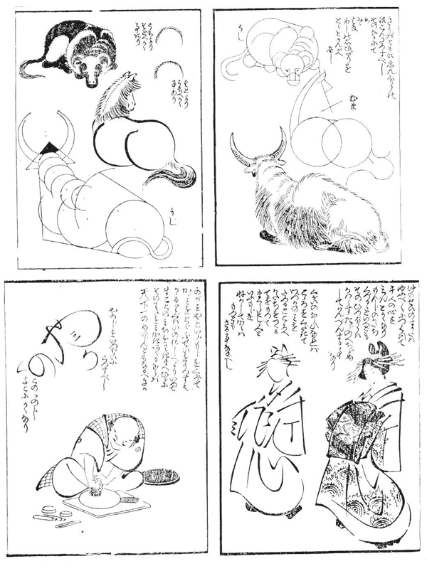
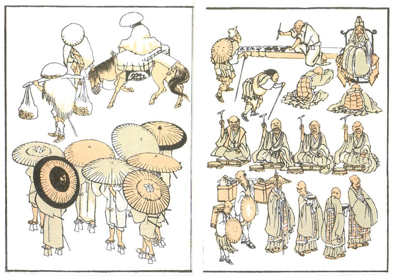
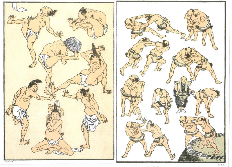
expanded the appeal of the medium. But the term manga didn’t show up until the 19th century. It was
coined in about 1814 by famed woodblock print artist Hokusai Katsushika
(1760-1849), one of the “Five Great Names” in the art of his age, celebrated
for, among other things, his masterful three-volume picture book, One Hundred Views of Fuji (1834-40)—“Fuji
in a snowstorm,” “Fuji from the sea,” “Fuji through spider’s web,” “Fuji
through a fisherman’s net,” etc.
In
English, manga has been translated as
“random sketches of life,” “cartoons,” “whimsical sketches,” “drawing things as
they come.” Hokusai’s Manga appeared
in 15 volumes, issued periodically between 1814 and 1878, the last three
published after the artist’s death. In his Hokusai
Sketchbooks: Selections from the Manga, novelist James A. Michener
rehearses the legend about the origin of the manga. According to the preface in the first volume, Hokusai, on a
trip to Nagoya, north of his home town of Edo (today’s Tokyo), met with a
number of his pupils and admirers, and in the course of a somewhat inebriated
evening, he, and they, produced some 300 sketches of all kinds of
subjects—Buddhas, scholars, fishermen, women, birds, beasts, grasses, houses,
trees and so on, “the spirit of each captured fully by the brush.” Said
Michener: “From this first preface, some critics have got the idea that a group
of jovial drunks dashed off more than three hundred fortuitous sketches in a
few days. Certainly, the haphazard aspect of the Manga would support this view.” Michener elaborates on the legend
by supposing that after the “delightful brawl” of the soiree, Hokusai gathered
up the sketches and re-drew them, assembling like subjects on the same page,
then turned them over to a publisher. And when the book sold well, Hokusai
produced more sketches in the same vein. This account, however, seems a little
too casual an explanation for the nearly four thousand plates that make up the
15-volume series. More likely is the explanation offered 30 years after
Michener by Richard Lane in his Hokusai:
Life and Work.
By
1814, Hokusai was a commercial artist of considerable renown, having produced
an impressive oeuvre of prints, picture volumes, posters, greeting cards,
illustrated books, and paintings. In the feudal tradition of the day, artists
began by apprenticing with a master, who taught them as they produced work
under his supervision and over his signature. Hokusai had spent 17 years in the
atelier, or workshop, of a woodblock carver and print maker named Shunsho, who
specialized in picturing Kabuki actors as individuals rather than in their
roles, the usual custom in the tradition of ukiyoe, “the floating world.” Ukiyoe initially focused on the activities of men and women cavorting in the red-light
district of Edo but eventually diversified to depict the ordinary pleasures and
pastimes of the day and became part of the culture of the “Edo Period”
(1603-1868, its end marked by the restoration of the Emperor). According to
Schodt, ukiyoe “were lively, topical,
cheap, entertaining, and playful. Masters of the genre regularly infused their
works with humor, experimented with deformation of line, and dabbled in the fantastic,
the macabre, and the erotic.” For Hokusai, these were a prelude to manga.
In
1793, Shunsho died and the leadership of the studio fell to an artist younger
than Hokusai. Two years later, Hokusai left the studio and struck out on his
own, an extremely risky enterprise for the time when artists succeeded largely
by trading on the reputation of the artist they apprenticed with, perpetuating
in their work the style of the master. The speculation is that the installation
of the new, younger, master created tensions and jealousies in the studio, and
that when the new man criticized Hokusai’s work in public, Hokusai left,
escaping both the stress of the studio rivalry and the customary slavish
atmosphere that was inhibiting his desire to expand his artistic repertoire. By
all accounts, Hokusai was stubborn, proud, fiery individualistic and
independent-minded—and somewhat conceited—as well as being extraordinarily
talented. He had been accepted in the studio on the strength of his ability
rather than family connections, of which, being of “unknown parentage,” Hokusai
had none. He was, in short, not the sort of personality to accept the primacy
in the studio of younger less experienced artists.
Hokusai
had earned a reputation while still, technically, an apprentice in the Shunsho
studio, and within a short time after leaving it, he was attracting a following
of younger artists. Although he never established a formal atelier, he loved to
teach and had over 150 known pupils, whose signatures included, in the usual
practice, overt reference to Hokusai. Says Lane: “The Hokusai School may well
have been not only the largest in Japanese art history under a single master,
but also unique in making wide use of the modern techniques of mass education:
printed texts, after hours instruction, correspondence courses, advertising and
self-publicity stunts.” Among the latter, several incidents of monumental
painting, one of which was performed before hundreds of people and took an
entire afternoon. Dipping into numerous buckets of paint, Hokusai painted a
portrait of the Zen Patriarch Daruma on a giant cloth measuring 240 square
meters (800 feet). On another public occasion, in the spirit of a competition
with another artist who had produced a formal design, Hokusai stepped up to a
large expanse of paper and painted a decorative background of blue water. He
then produced a rooster from a cage, quickly dabbled its feet with vermillion,
and set the bird dashing across the paper, leaving red footprints, which
provoked the artist’s prompt christening of the piece, “Maple leaves on the
Tatsuta River.”
The
first of the printed instructional texts that Hokusai produced was entitled Foolish Ono’s Nonsense Picture-Dictionary (invoking the name of a famous ninth century statesman known for adroit word
play). A set of two volumes, the 1810 Picture-Dictionary provided guidance in drawing specific subjects with both word and picture. When American novelist Michener first saw Hokusai’s Manga, he was utterly captivated. “The sketches in these books had a little for everyone,” he wrote, “from rural scenes to everyday life in Japan, and throughout you could get a sense of comedy.” It was a kind of storytelling achieved entirely by visuals distinguished by their design quality.
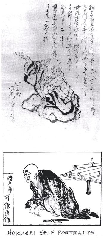
An
charming glimpse of Hokusai as a man and as an artist can be found in Francois Place’s ostensible children’s
book, The Old Man Mad about Drawing (110
6x9-inch pages in hardcover; $19.95), in which a young street seller named Tojiro
becomes apprenticed to Hokusai, and we learn something of the artist’s working
methods and attitudes. His famous name, for instance, is not the name he was
born with: during his working life, he changed his name (his signature) many
times. “An artist like me changes names every time he starts a new period of
his life or changes his way of painting and drawing,” says the Old Man in
Place’s book. Hokusai employed about thirty names during his long artistic
career, Lane tells us. Some of them appeared only briefly; six lasted long
enough and were attached to art significant enough to be important. He didn’t
start using the name “Hokusai,” which means “North Studio,” until 1796, shortly
after he left Shunsho’s workshop at the age of 35. When Place’s young street
merchant meets him, he is signing himself “Gakyorojin Hokusai,” which means, he
explains, “Old Man Mad about Drawing.” He had been signing some of his work
“Man Mad about Drawing,” but in his mid-forties, he added “old” to his
signature. His alleged madness was an affectation, Lane says, although “he
could be so single-minded as to seem mad in the eyes of more ordinary and
temperate contemporaries, and a reputation for eccentricity certainly gave him
an excuse to indulge in his inspirations without interruption or overt
criticism.” In his claim to be old while not yet fifty, Lane “senses not only a
desire prematurely to present himself as an established ‘grey eminence,’ but
also the beginning of a strong tendency to distance himself from the frenetic world
of fashion and sophistication that was the milieu of the traditional ukiyoe artist.”
Place’s
book is handsomely, ingeniously, illustrated: a score or more of Hokusai’s
paintings and prints, including several from the Manga, are reproduced, and Place illustrates the doings of his Old
Man and Tojiro in the style of Hokusai’s manga, a delightful tour de force. Place’s
story about how the famous manga came
about fits nicely into Lane’s version. Place says they were produced in
response to a challenge from some other artists who criticized Hokusai for not
teaching anyone how to draw. Says Place’s Hokusai: “I took a great bundle of
sheets of paper, ink, and a brush, and began to draw [by way of demonstration
or instruction] everything that came to my mind, as quick as thought, without
stopping. A mountain? Here it is. A bunch of beggars? Here they are. Acrobats,
a cascade, a pine forest, three frogs, a woman combing her hair, an old man
yawning. ... I drew all day long. Caught up in the game, my friends suggested
things for me to draw. Later, a publisher friend wanted to reproduce these
drawings in an album. The idea appealed to me, so I drew hundreds more, enough
for several books. I called them manga, ‘thought-up drawings’ [done without a live model], and these collections became
known as the Hokusai Manga.”
With
the Manga, “a debauch of sketches”
one critic called it, Hokusai liberated himself. “Hokusai is incomparable,” one
commentator said. “While all his predecessors were more-or-less slaves to
classical tradition and inherited rules, he alone emancipated his brush from
all such fetters and drew according to the dictates of his heart.” And ordinary
citizens, in their turn, took the books to their hearts. Until the Manga, popular art extolled imaginary
heroic actions like those of the theatrical world; Hokusai’s books filled a
void by focusing attention on everyday life. The books of Manga, Michener believes, were purchased mostly by the common
people, not the intellectual or art elite. The Manga were a popular as well as a vital art experience. As they are
today, albeit in a vastly different form.
Pondering
the enduring popularity of Hokusai’s Manga, Michener concludes that it is its
“simple honesty, its peasant force, its lack of pretension that have kept it
popular with artist and layman alike. ... In the perverse manner that
oftentimes makes the village drunkard and not the vicar the most loved man in
the countryside, just so does the Manga hold our affection.” Michener quotes an art critic for the Japan Times: “the vivacity of this pageant recalls a related sense
of human turmoil in the sketches and etchings of Hokusai’s contemporary, Goya.
But Hokusai is without the bitterness that choked the Spaniard. The Japanese comedie humaine has a strain of satire
and ridicule, but no more than actually resides in the human species and is
there for all to see who have the piercing vision of a Hokusai.” In Lane’s
view: “The Master’s work is so full of humanity as almost to obscure the true
quality of his artistic talent. ... Commonplace humanity is the essential
element of Hokusai’s theme, but design is the keystone of his artistry.”
In
the seemingly endless invention of subjects and designs in the Manga, we can find intimations of the
sensibility that produced the famed One
Hundred Views of Fuji, about which we, as did J. Hillier, a British critic,
must marvel “at the originality, the fecundity, the virtuosity, the revelation
of immense vistas newly opened [that] can be achieved by ingenuity in choice of
view point, inventive composition, [and] marriage of central theme with minor
motives.”
Hokusai
was one of the most prolific of the world’s artists. He produced something like
30,000 designs, about 170 print series and nearly 300 illustrated books and
albums. His passion, his hunger for artistic expression and his dedication to
excellence, are legend. Mad about drawing indeed. Place notes that on the last
page of One Hundred Views of Fuji,
the artist had recorded his progress as an artist: “At fifty, I had already
drawn a great deal, but nothing that I did before my seventieth year was worth
any great note. At seventy-three, I began to understand. ... At eighty-six, I
will have made more and more progress, and at ninety I shall have penetrated
even further into the essence of art. At a hundred ...” On his deathbed at the
age of 89, Hokusai is said to have cried out: “If Heaven could only grant me
ten more years! Only five more, and I would have become a real painter.”
Heroic.
About
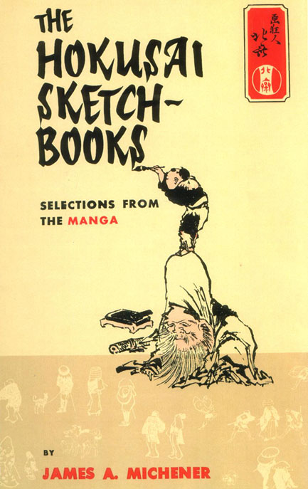
Michener’s Book of Hokusai’s Manga
Michener’s book has a piquant Carlylean history.
Published in 1958, it was not the book Michener expected to produce. The one he
intended to publish was lost at sea: Michener was taking it to its Japanese
publisher when the airplane he was aboard with his completed manuscript crashed
into the Pacific Ocean. “Fortunately,” Michener writes, “all passengers and
crew members were saved, but my manuscript and the make-up pages illustrating
it were lost. But,” he continues, “there could have been no finer therapy for
me, in the days following the accident, than the reconstruction of this
manuscript because it dealt with Hokusai, and if there is any artist in the
world who has caught the exact emotions that possessed me when I looked out of
the door of the ditched plane and saw the friends who had preceded me
struggling in the ocean—if there is any artist who has depicted men and women
tangled up in life—it is the man who drew the teeming, tangled pages for the Manga sketchbooks.”
I
encountered Michener’s book of Hokusai’s manga in the fall of 1959 during my
first sojourn in New York, but I didn’t know what it was. In those days,
Brentano’s had a bookstore on Fifth Avenue. So did another publisher,
Scribner’s, just across the street. (Brentano’s is gone now, but Scribner’s is
still there with its wrought-iron balcony railing; it’s now a beauty salon or
something equally mundane.) I used to visit both establishments regularly. One
day in Brentano’s while browsing the tables of books in the mezzanine art books
section, I came across The Hokusai
Sketchbooks in its yellow dust jacket with the comical artist lettering the
title. Metaphors
be with you.
To find out about Harv's books, click here. |
||||||
send e-mail to R.C. Harvey Art of the Comic Book - Art of the Funnies - Accidental Ambassador Gordo - reviews - order form - Harv's Hindsights - main page |