 |
|||
|
Opus 141: Opus
141 ( Nous R Us. Last-minute news flash: John Cullen Murphy, who recently retired from drawing Prince Valiant after 34 years, died Friday,
July 2, at the age of 85. A sadly short retirement.
... Spider-Man made it to the cover of Newsweek
(June 28) for the launch of the sequel flick. Apart from flogging the
movie, the cover story explained that the confusion about Tobye Maguire's losing his option on the part last year arose chiefly because
all the conversation was taking place between Maguire's agents and studio
execs rather than between the principals, the actor and the director,
Sam Raimi. ... The two most recent comic strip
figurines from Yoe Studio via Dark Horse are
of Walt Wallet from
Gasoline Alley and the eponymous
Dennis the Menace. In a line of exceptional
products, both are exceptionally good three-dimensional renditions of
the characters, Walt in his 1921 incarnation, holding the baby Skeezix. Next up, Barney Google, for which I have justifiably
high hopes. ... Correction: I thought Glenn McCoy's The Duplex was a recent comic strip phenomenon, but according to its
website habitat, it's been around since 1993; sorry Glenn. ... Promotional visuals for the forthcoming "Catwoman"
flick depict Halle Berry bent forward in a crouch that, we suppose, is intended to suggest
a cat on the prowl but that serves, instead, to accent her cleavage.
I sometimes wonder what she and other exhibitionists of her gender are
thinking when they bend over that way. "Take a look at these, fan
boy"? What else could be crossing their minds? ... One might ask
a similar question of the growing domestic market for manga
featuring toothsome "school girls" whose cavortings
are often viewed from angles that reveal their underpants. What are
we thinking? ... In The
Comic Book Legal Defense Fund applauded the recent Supreme Court decision
that, for the moment at any rate, prevents John Ashcroft from enforcing
the Child Online Protection Act, a law that
would penalize online content providers for posting material deemed
"harmful to minors." Writing for the majority, Justice Kennedy
said: "Content-based prohibitions, enforced by severe criminal
penalties, have the constant potential to be a repressive force in the
lives and thoughts of a free people. To guard against that threat, the
Constitution demands that content-based restrictions on speech be presumed
invalid and that the government bear the burden of showing their constitutionality."
The Court sent the case back to a lower court for another look, but
at least two of the Justices stated unambiguously their belief that
the law was flagrantly unconstitutional. For the time being, then, the
Court made it safe for artists, sex educators, health workers, and web
publishers to post their wares without fear of prosecution. CBLDF Director
Charles Brownstein said that in halting enforcement of the dubious law,
the Court permits "cartoonists and other creators of web content
to exercise their First Amendment rights online. It has also asserted
the importance of parents, not government prosecutors, in guiding the
intellectual development of children." Hear, hear. Sophie Crumb deliberately kept her last
name off the comic book Fantagraphics recently
published, Belly Button Comix, because, she told Daniel Robert Epstein in an interview,
"I wanted people to buy it not because they are fans of my dad's
but because it looks cool on the shelf. I wanted to see if it actually
sells." And did it? "It's doing okay," she said. The
comic book features such characters as ZoZo
and ZaZa, the oversexed humanoid insects,
Eddy Bear "the bear who doesn't care," and Ms. Crumb's own
autobiographical explorations. I haven't seen the book yet, but Epstein
said he thought her work resembled that of Gilbert Shelton and R. Crumb. Sophie doesn't think so, but
she acknowledges sharing a tendency her father indulges: "The only
thing I can decently write about is myself,"
she said. "All I really want to do is write about myself and face
the truth." The truth, probably, is that she doesn't have much
to say but wants to draw comics. That's not inherently a bad thing:
in fact, as I'll later elaborate, it's a very human thing-the thing
that will, ultimately, insure the continued existence of comics. Sophie
didn't start cartooning until after she'd dropped out of art school
("because I was a spoiled brat") and circus school (which,
nonetheless, "whipped me into shape"), after which she pursued
a career in tattooing for a time. At 23, she's just on the cusp of beginning
an adult life and career. Daryle Cagle's online Professional Cartoonists
Index (www.cagle.slate.msn.com)
publishes about 100 political cartoons every weekday, drawing upon the
work of 200 or so cartoonists. It's a very popular site, Cagle says-generating
the most traffic of any cartoon site on the Web. I drop in frequently
myself, and so do cartoonists everywhere. Some report that it's a mixed
blessing for them: they like seeing what their colleagues are doing,
but they find it vaguely depressing when they realize that large numbers
of cartoons on particular topics used the same approach. They'd be happier
not knowing that their cartoon that day seemed to echo those of a dozen
other cartoonists. When Bill Clinton's book came out, for example, half-a-dozen
cartoons played with the title of the book, calling it My
Lie instead of My Life. Other repetitive efforts on the
subject called the tome a "pop-up book" (alluding, one supposes,
to the constant state of sexual excitation that seems to have plagued
or 42nd President most of his life); others, in the same
spirit, noted that it came with a fold-out. And
here, http://home.nc.rr.com/jape77/ATTACKPR.pdf
is a full-blown press release about that new book from the Association
of American Editorial Cartoonists that I've been mentioning lately.
It's now out and available in the stores, Borders, Barnes & Noble,
and Waldenbooks. To the press release, I can add that the book's design
by AAEC editor J.P. Trostle is
beautifully functional-clean, clear, airy-giving each of the 150 cartoonists
a single page for his/her short biography and photo, plus three or four
cartoons (yrs trly included). Only about 40
or so of the cartoonists herein are widely enough circulated through
syndication to be familiar to most of us. That leaves over 100 you may
never have heard of. And there are another dozen or so (like Pat
Oliphant, Paul Conrad, Mike Peters, Don Wright, Gary Brookins,
Michael Ramirez, Robert Ariail, and Jeff Danziger)
who aren't between these covers. (To be included, you had to send material
in. Presumably, these worthies did not do so.) Altogether then, the
book seems to trumpet a persistent liveliness in the editoonery
profession: from the profile inherent in the numbers I've just cited,
it's clear that editorial cartooning is far from dead or dying, recent
hand-wringing protestations to the contrary notwithstanding. Well, yes
and no. We must distinguish between the profession and the professionals,
separating the play from the actors. The plight of editorial cartoonists
in recent years is not encouraging: several major newspapers ( Art Spiegelman's
reaction to September 11 was more personal than most: his studio
is in And
here's something that messes with your head: http://fun.tmc.dyn.ee/Recursive.swf
-try it, you'll recognize an old funnybook
cover trick and you'll never be the same again. Finally,
here's Ray Bradbury in a
swivet because Michael
Moore appropriated the title of Bradbury's novel, Fahrenheit 451, for his propaganda broadside, "Fahrenheit 9/11."
Said Bradbury: "He stole my title and changed
the numbers without ever asking me for permission. That's not
his novel, that's not his title, so he shouldn't have done it."
Bradbury phoned Strip Watch. To help launch the 19th
anniversary of National Literacy Day on July 2, the Latino milieu comic
strip Baldo by Hector
Cantu and artist Carlos Castellanos showed a couple of the strip's juvenile cast
running a sidewalk service stand (like the lemonade stand of yore) with
a huge sign over it that reads: "Can't Read? We Can Help!"
And the kids are wondering why they don't have any customers. (Well,
think about it.) ... In the Sunday Phantom,
we met Old Man Mozz the week before last, and here's his Li'l Abner-ish riddle: "You
look once and see nothing. Look 30,000 times and see everything."
This week, July 4, we are promised the answer. In
a recently completed reader survey, the Dallas
Morning News discovered the top ten strips in its comics section;
in order, starting with the most favorite: Luann,
Crankshaft, For Better or For Worse, Peanuts, One Big Happy, Zits, B.C.,
Pickles, Dilbert, and Get
Fuzzy. I was surprised (pleasantly so) to see such durable titles
as Luann, Crankshaft, One Big Happy and Pickles ranked so high; the rest of the
list, except for fast-rising newcomer Get
Fuzzy, seems usually to land in the top tens. An astounding 25,
096 readers voted-14,864 online; the remaining 10,232 via printed survey
form. Considering that 55.7 of the respondents were age 55 or older,
the percentage trafficking through the electronic ether is gratifyingly
high: even old gaffers (like me, kimo sabe) are resorting to the
'Net more and more, it seems. Slightly more than half of the voters
were men; 81 percent read the paper seven days a week, and 97 percent
read the comics on Sunday. Mike Peters, reporting the survey results,
noted that strips of social or political commentary "got low average
scores but were also rated 'favorites'-or the opposite-by many readers.
The Boondocks' scores were highest among black readers (60 percent
like it extremely [but most of the survey's respondents were white]).
La Curaracha ...
got low marks from Hispanic readers (15 percent dislike it extremely;
59 percent wouldn't miss it if it were dropped tomorrow) as well as
the overall audience. Number One complaint," Peters continued,
"-most comics are not funny anymore-too political and too controversial,
many readers said." This last seems strange: except for Doonesbury
and The Boondocks and
La Curaracha,
relatively few comic strips make it their primary task to carry political
or social comment. And Luann and
For Better or For
Worse, both high ranking in the survey, often take up real-life
issues that prove controversial in some circles. Peters also noted that
Beetle Bailey fans wanted Mort Once A Month Isn't Fat Enough It's been two weeks since the June issue of the Comics Buyer's Guide landed on my front
stoop with a shuddering thump. I speculated last time that the new monthly
format is fat enough to require four weeks to digest, thus compensating
for CBG's less frequent arrival. Well, after having
the actual experience, that's a considerable exaggeration. Turns out that this overweight mag isn't,
despite its increased girth, the equivalent of four separate weekly
issues. There are more reviews, probably a number equal to four
weeks' worth. But the regular columns herein are not four times longer
than they were when they came out once a week. In fact, apart from the
reviews, I'm not sure there is more of anything in this monthly package
than there was in a single weekly issue. A little, maybe. But not four times as much. Counting a smattering of news (somewhat stale by the time of publication),
the new CBG carries probably
the content equivalent of two weekly editions. But not four. All of which betrays to the
real reason for the format change: to produce a monthly price guide
based upon eBay activity and CGC slab grading. Now I'm even sorrier
to see that venerable weekly pub slip over the horizon into the past.
The new CBG, particularly on its maiden voyage
in June, is still a considerable achievement, but it's not the equivalent
of four weekly issues of the old CBG.
It's nice to see Chuck Fiala's work in
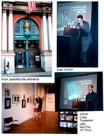
print again, though, decorating various departments and columns. The Harvey Awards were presented this year in what is
undoubtedly the most fitting venue for the recognition of excellence
in the cartooning arts-the Puck Building at the corner of Houston and
Lafayette streets in New York City. When it was built in 1885, the seven-story
red brick Romanesque Revival structure with its ranging arches towered
over the Irish and Italian neighborhood in which it stood, a vivid testament
to the power of cartooning: it had been built to house the editorial
offices of the weekly humor magazine, Puck,
and the printing concern that published it. The English language edition
of Puck, which had been launched as a German
language publication in September 1876, started Puck's place in the history of American
publishing was secured by the prominence it lent to the cartoons that
gave the magazine its distinctive character. Weekly and monthly humor
magazines in By
the mid-1880s, Puck was so
successful that it employed almost 400 people and leased space in twenty-two
adjacent premises in lower Craig Thompson, whose graphic novel Blankets was not only the year's best but
perhaps the best of the last decade, reaped a goodly heap of the awards-for
Best Cartoonist, Best Artist, and Best Graphic Album. Next came
Charles Burns, Chris Ware,
and Tony Millionaire, each of whom received
two awards. (All winners are listed below; be patient.) But the big
winner of the evening was without question the The
The
keynoter for the evening was The
Sandman's Neil Gaiman, who, attired in
his usual Beatles' coiffure and black leather biker's jacket, looked
more like a rock star than a writer. Novelist (American
Gods) and comics writer, Gaiman
began by paying homage to Harvey Kurtzman
and then rambled through a litany of advice to creative souls. "My
first piece of advice," he said, "is this: Ignore all advice.
In my experience, most interesting art gets made by people who don't
know the rules, and have no idea that certain things simply aren't done:
so they do them. Transgress. Break things. Have too much fun."
Delivered in the patented clipped tones of a British accent, Gaiman's
advice assumed, for American listeners, the status of holy writ. It
is also eminently sensible. In short, good advice. He urged creators to read outside comics-"Learn
from places that aren't comics." But don't neglect to "read
all the comics you can. Know your comics. ... There's more classic and
important material in print now in affordable editions than there has
ever been. Let it inspire you. See how high people have taken the medium
in the past, and resolve to take it further." Among
Gaiman's other remarks (which can be found
entire at www.neilgaiman.com): "I've
learned over the years that everything is more or less the same amount
of work, so you may as well set your sights high and try and do something
really cool. ... Make good art. ... Keep moving, learn new skills. Enjoy
yourself. ... Be proud of your mistakes. Well, proud may not be exactly
the right word, but respect them, treasure them, be kind to them, learn
from them. And, more than that, and more important than that, make them.
Make mistakes. Make great mistakes, make wonderful mistakes, make
glorious mistakes. Better to make a hundred mistakes than to stare at
a blank piece of paper too scared to do anything wrong-too scared to
do anything. ... Most of the things I've got right over the years, I
got right because I'd got them wrong first. It's how we make art." As
for the future of the medium, Gaiman said
this: "If I have a prediction, it's simply this: the often-predicted
Death of Comics won't happen. There will be more booms and there will
be more busts. Fads and fashions turn up in comics, as with all things,
and, as fads and fashions always do, they end, normally in tears. But
comics is a medium, not a fad. It's an artform,
not a fashion. The novel was once so called because it was indeed something
novel [something new and different], but it's lasted, and I think, after
a few shakedowns, the graphic novel, in whatever form, will do likewise.
... Right now, I actually believe that the best thing about comics may
well be that it is a gutter medium. We do not know which fork to use,
and we eat with our fingers. We are creators of a medium, we create
art in an artform, which is still alive, which
is powerful, which can do things no other medium can do." Master
of ceremonies for the evening was Evan
Dorkin, whose Milk
and Cheese and Dork have
garnered Harveys, Eisners,
and Ignatzes. He was, I'm sure, very
funny: I could tell from the laughter his remarks inspired anytime he
made one. But, alas, he had laryngitis something fierce,
and my overworked hearing aids could not keep up with the irregular
decibels his affliction generated: his voice rose and fell, faded and
blurted-and I couldn't make out much of it. Thanks to Rabbiteer
John McCarthy (at www.comixview.com), here's
a too brief sample: Someone remarked that it took the Harveys
some time to find a decent home, and the next time Dorkin
came up to the mic, he said, "Welcome
back to the Harveys, the Awards that have
been thrown out of more places than Jim Shooter." The
Best New Talent:
Mat Brinkman, Teratoid Heights; Jeffrey Brown, Unlikely; Sophie Crumb, Belly Button Comix;
*Derek Kirk Kim, Same Difference
& Other Stories; Sara Varon, Sweaterweather. Best New Series:
Betty Button Comix, Human Target, Love Fights, *Plastic Man, The Pogostick. Best Syndicated
Strip or Panel: Doonesbury (Universal
Press), Garry Trudeau; *Maakies (self-syndicated), Tony Millionaire; Mutts (King Features), Patrick McDonnell;
Underworld (self-syndicated),
Kaz; Zippy (King Features), Bill Griffith. Best Biographical,
Historical or Journalistic Presentation: *Comic Art Magazine;
Comic Book Artist, The Comics Journal, Stan
Lee and the Rise and Fall of the American Comic Book, Will Elder: The
Mad Playboy of Art. Best American
Edition of Foreign Material: The Bloody Streets
of Paris, ibooks; 5 Is The Perfect Number, Drawn & Quarterly; Icaro, ibooks; The Iron Wagon, Fantagraphics; *Perseopolis,
Pantheon. Special Award
for Humor in Comics: Jimmy Gownley, Amelia Rules; Sam Henderson, The Magic Whistle; Batton
Lash, Supernatural Law; *Tony
Millionaire, Sock Monkey;
Johnny Ryan, Angry Youth Comix.
Best Letterer: Todd Klein, Promethea; Clem
Robins, 100 Bullets; Robbie
Robbins, Dark Days; *Dave Sims, Cerebus; Richard
Starkings, Superman/Batman.
Best Colorist:
Jeromy Cox, Promethea;
Bill Crabtree, Invincible; Alex
Sinclair, Arrowsmith;
Dave Stewart, Beware the Creeper;
*Chris Ware, Acme Novelty Datebook. Best Inker: *Charles Burns, Black Hole; Mick Gray, Promethea; Jaime Hernandez, Love & Rockets; Jimmy Palmiotti, Two-Step; Scott Williams, Batman. Best Anthology:
The Comics Journal/2005 Winter
Special, *Drawn & Quarterly No. 5, Kramer's Ergot No. 4, Nickelodeon
Magazine: The "Comic Book" Section, Project Telstar. Best Cover Artist:
*Charles
Burns, Black Hole; Tomer Hanuka, Bipolar; Adam Hughes, Wonder Woman; Dave Johnson, 100 Bullets; Alex Ross, Astro City. Special Award
for Excellence in Presentation: *Acme Novelty Datebook, Popbot, Project Telstar, Quimby the Mouse, Yossel. Best Domestic
Reprint Project: Cat on a Hot Thin Groove, Honour Among Punks, *Krazy and Ignatz, Al Capp's Li'l Abner:
The Frazetta Years, The Spirit Archives, Best Graphic
Album of Previously Published Work: Louis Riel,
Palomar, Quimby the Mouse, Summer of Love,
Vic & Blood. Best Graphic
Album of Original Work: *Blankets, The Fixer, Nightmare Alley, Sgt. Rock: Between Hell and a Hard
Place, Yossel. Best Writer: * Best Artist:
Charles Burns, Black Hole; Jaime Hernandez, Love & Rockets; George Perez, JLA/Avengers; *Craig Thompson, Blankets; Ashley Wood, Popbot. Best Continuing
or Limited Series: Black Hole, *The League of Extraordinary Gentlemen (Vol. 2), Love &
Rockets, Promethea, Supernatural Law. Best Single
Issue or Story-A tie!- Best Cartoonist:
Chester Brown, Louis Riel;
Charles Burns, Black Hole;
Jaime Hernandez, Love & Rockets; Jeff Smith, Bone; *Craig Thompson, Blankets. Anyone
with good sense would hesitate, in the thundering midst of these congratulatory
pyrotechtronics, to enter even the slightest
of demurers. But I've never had good sense and am always losing
my head when all those about me are keeping theirs. That may explain
why I have trouble sorting out all the compartments of excitement. I
don't intend to disparage the awards or the artistry that has earned
these accolades, but some of these categories and winners seem strangely
out-of-kilter to me. Best Artist, for instance. Craig Thompson won that. He also won Best Cartoonist-for the same
work, Blankets. Three of the
five Best Artist nominees were also among the five nominees for Best
Cartoonist. On the basis of the evidence before us, it doesn't seem
to me that those who devised these categories know the difference between
"artist" and "cartoonist"-or maybe there is no difference?
If not, why have two categories? Clearly, Thompson was a big favorite
among the voters: his profoundly felt and deftly executed Blankets
was the Best Graphic Album (Novel?) of the year, after all, and it looks
as if the voters fell all over themselves to give him every award they
possibly could in recognition of his ineffable achievement. Why isn't
he listed among the nominees for Best Writer then? Chester
Brown won that, but Brown draws as well as writes his stuff, and
he's also nominated for Best Cartoonist. On the other hand, The
parade of inconsistencies lurches on. We have a Best Inker but no Best
Penciler. And at least two of the five "inkers"
are inking their own pencils; at least one, is not. So what, exactly,
is meant by "inker" and what are the criteria by which "inking"
can be evaluated? Chris Ware
picked up Best Colorist, but if Acme
Novelty Datebook (which, alas, I haven't yet seen) is much like
his other work, his coloring is distinguished by a uniform low-key flatness.
Nice, no question, but compared, say, to Dave
Stewart, whose computer coloring of Cary
Nord's uninked
pencilled artwork in the Dark Horse Conan reincarnation gives the pictures substance and volume as well
as color-compared to this unique achievement, what is so outstanding
about flat coloring? I haven't seen the work of all five Best Cover
Artist candidates, but based upon what I have seen, I'd veer off in
the direction of Dave Johnson: Johnson's work on the covers
of 100 Bullets combines painting
and design, hues and linear embellishments, in a way that is distinctive
and pace-setting. Hughes' Wonder
Woman covers, for all their elegance, are achievements in pin-up
art-wonderful, and I love 'em, but they're not in Johnson's class. Ross's accomplishment
is as painter, not as designer, and it seems to me that having a category
for "cover artist" implies that doing a cover is something
different from illustrating the interior pages of a comic book or graphic
novel. The implication is that "design" plays a larger role.
Finally, Dave Sim
garnered an award for lettering-in the year he completed the 300th
issue of Cerebus. And Jeff Smith, who finished Bone, the other long-running continuing
story title on the stands for the last decade, received only applause
when he came to the podium to present an award, not to receive one.
Maybe the time has come for the But enough carping. I don't know the work of all the nominees,
but I know much of it, and from what I know,
the list of nominees is a distinguished gathering of talent and accomplishment.
Quibbles such as I make here ought to be strenuously sneezed at so we
can move on. It
is clear from the list of nominees that when professionals are left
to their own devices, they tend to reward new developments and novelties
and more-or-less innovative enterprises. They also tend to bunch up
around a few favorite talents like Thompson, Ware, Brown, Burns, and
I was
delighted to be asked to make the presentation in the Best Biographical,
Historical or Journalistic Presentation category. Since I've written
substantially in all three genre (but have never been nominated for
any of them), I suppose that qualifies me to announce the winner with
a few remarks honed to a snide edge with appropriately self-deprecatory
apostrophes. What I actually said, however, was that I eagerly accepted
the assignment because it gave me, at long last, the opportunity to
disabuse many ill-informed persons of the Younger Generation about the
name of the award. The Harvey Awards, I said, are not named after me.
The reverse is actually the case: I am named after them. I remember
the day exactly: there I was, a nameless youth of twelve years, when,
at the corner drugstore at 25th and Incidentally,
there is an entire book devoted to exactly the sort of thing I'm talking
about with children and pictures and storytelling. Quentin Blake, writer and children's book illustrator and the first
Children's Laureate, assembled the book, a collection of 26 pictures-paintings,
mostly-called Tell Me A
Picture. Blake selected pictures that "had some sense of story
in them. "The idea is for kids to look at each of the pictures
and think and talk about what they feel is happening in the pictures.
Exactly what I have been describing (although, when I was thinking about
pictures and storytelling during the Studio in the Schools exhibit,
I wasn't thinking about Blake's book; I've had it here for months, planning
to review it, and just now realized it will fit right in with what I've
been saying). "Sometimes the exact nature of the story [in the
picture] isn't clear," Blake said, "but then the invitation
to imagine it may be all the stronger." Following each of the paintings
in the book are Blake's antic penline drawings of kids talking about the painting-supplying
clues about what stories might lurk therein. Charming pictures with
the utterances of the kids clustered over their heads in word bunches
just as if they'd popped out of speech balloons. Blake's
comics. A charming, captivating volume.
But
I divaricate. To return to the podium from
which I was holding forth-as you might expect of so verbose a galoot
as I, I went on to extol the virtues of biography, history, and journalistic
enterprises in comics. Before cartooning can be an art, I said-and it
is, without question, an art-there must be a body of work, enough of
it to view and enjoy and evaluate. It is the task of history and biography
to establish this body of work, to identify it, and it is the task of
journalism to disseminate the body of work and its history and the professional
biographies of those who have made the work, thereby enhancing our appreciation
of the art. Together, historical and biographical and journalistic endeavors are necessary
to create the foundation upon which an art, the art of cartooning, rests
and, subsequently, thrives. It is therefore fitting that we recognize
outstanding achievement in this arena. The
Harvey Awards banquet was the centerpiece of MoCCA's
two-day art festival. The work of many of the nominees was on display
in the Museum, around the corner from the At
one end extremity of storytelling visuals that I encountered is a little
4x6-inch 24-page booklet in black-and-white. The drawings are deceptively
simple line work, little more than stick figures, but the "more"
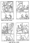
here is expressive beyond what mere sticks can do. Entitled Love Is in the Air, it tells a story about a man and a woman who meet
in a bar and enjoy separate and wildly divergent fantasies about what
this encounter will come to. Each page consists of three panels: one
across the bottom depicts the couple at the bar, and then in two panels
over their heads, the thoughts of each are portrayed. At
the other extremity, we have Ashley
Wood's Popbot No. 5, an 8.5x11-inch 48-page coated stock
extravaganza that cobbles together every graphic technique known to
man, including typographic, to present a helter-skelter tour de force,
a smattering of painting, drawing, splatter, and speech balloons. In
between the extremes, we have Tom
Neely's One Fine Day,
a comic strip in booklet form with a page for every panel. Neely's cleanly
rendered roly-poly style evokes the 3-fingered gloved-hands manner of
the Mintz animation studio of yesteryear, and the presentation,
panels in pantomime with occasional "speechs"
appearing as "title cards," takes the form of old timey
silent movies. See www.iwilldestroyyou.com.
Everybody's on the web as much as on the page. Wesley Gunn was selling a booklet of his strips, taken from his website,
www.toonsnthangs.com,
where his weekly postings are, I gather, accompanied by rap. In print
form, Gunn's strip, Tripple Dubble, is a
striking manifestation with its bold lines and geometric manga-style
depictions. Not, Gunn assures us, "a basketball story" ("triple
double"? I'd opt for baseball, but what do I know?)-but "just
a day in the life of Damion Bubble and his
interaction with friends, family and the world." Nifty looking
and fraught with the argot of the 'hood, but Gunn could use an editor
who can spell and punctuate. In a more conventional mode, here's Meat
Haus, a tidy 5.5x7.5-inch 128-page package anthologizing
short stories by a host of contributors, now up to No. 6. A widely diverse
assembly but obviously selected with care: the stories are narratives
with beginnings, middles, and ends, and they're rendered in a variety
of individual styles, all attractive. For a catalogue, write meathauspress@hotmail.com.
On my way out of one of the interlaced trio of exhibit rooms, Rina Piccolo (Tina's Groove)
handed me three mini-comics by her husband, Brendan Burford. Pseudo-autobiographical
12-page booklets, each of them is a musing soliloquy, telling a despondent
joke, tongue thoroughly in cheek. In "Brendan Proves Nothing,"
the title character wonders whether he should be more "political"
but finally decides against it because, he realizes, he can't even win
his own inner debates. In "Brendan Wishes He Were Dead," our
hero comes to this conclusion because the repetitive single-gag comic
strip he wants to draw would have been perfectly at home on the page
with Winsor McCay's one-joke opus, Little Sammy Sneeze; but with "over
100 years of ideas to compete with," Brendan feels stuck, his dream
a hopeless yearning. Roz Chast, whose
frail-looking drawings have been appearing as cartoons in The New Yorker since 1978, defining a new genre for magazine cartooning,
was inducted into the MoCCA hall of fame on
Sunday, June 27, joining Art
Spiegelman (2003) and Jules Feiffer (2002) as Art Festival honorees.
I left town early that day and so, alas, missed the occasion and her
remarks. But my first experience of MoCCA
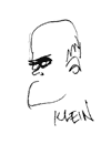
and of the annual Art Festival was nonetheless memorable. Klein and
his volunteer crew have wrought minor miracles on the landscape of American
cartooning in an astonishingly short time. Who know what they'll be
able to do in another five years? Under the Spreading
Punditry The infamous Justice Department memos that explain how
elements of the American military could torture prisoners claim their
nefarious license under the authority of the President as "commander
in chief." This explains a lot. As commander in chief, so the reasoning
unravels, George W. ("Warlord") Bush should be able to do
anything and everything to protect the Luckily
for us all, the U.S. Supreme Court recently issued a somewhat corrective
judgement when it decided that the President could not, even
as commander in chief during time of war, hold people prisoner without
allowing them access to legal counsel. In commenting on the case, Justice
Souter recalled the Court's 1952 decision that overturned
President Harry Truman's seizure of the steel mills. Said
Souter: "It is instructive to recall Justice Jackson's
observation that the President is not commander in chief of the country-only
of the military." Bravo.
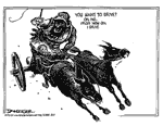
Things are looking up. I begin to revive a little. The Way to Fight the War. The suicide bombardiers who drove air liners into the sides
of buildings in September 2001, killing themselves and thousands, effectively
brought a war into the How to Win the War. Invest in life, not death. Instead of spending billions of
national treasure on bullets and bombs, spend the money to remove the
conditions of poverty and starvation and blighted hope that infect vast
regions of the planet and thereby create the bitter dissatisfaction
and frustration that fosters suicide bombers and other recruits to the
terrorist ranks. Schulz B.P.,
"Before Peanuts" Last year, a remarkable historical document appeared,
nearly unheralded, shrouded, instead, with the sort of all-out unobtrusiveness
that seemed so typical of the person about whom the tome concerned itself.
Officially entitled Charles M.
Schulz: Li'l Beginnings (298 8.5x11-inch pages in paperback, $30;
www.SchulzMuseum.org),
the book's cover carried, superimposed over the understated title, an
illustration, the logotype of the cartoon that is the subject of the
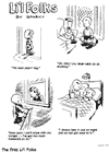
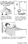
volume, Li'l Folks, the newspaper feature that was
Schulz's training ground. Li'l Folks appeared
once a week in Schulz's hometown newspaper, the St. Paul Pioneer Press, The
book is equipped with editorial commentary and annotations by Derrick
Bang, a Schulzian of heroic proportions, whose knowledge of all things
Schulz is vast and detailed. An earlier Bang effort, 50 Years of Happiness: A Tribute to Charles M. Schulz (200 8.5x11-inch
pages in hardback, $24.95), is a vivid witness to his encyclopedic grasp
of the subject. (It includes, among many such riches, a list of all
the Peanuts characters with their debut dates, a list showing how many
strips each year are, as yet, unreprinted,
the initial broadcast dates of all the tv
specials, a year-by-year timeline of all significant events in the strip,
and a list of all the dates Charlie Brown has tried to kick the football
that Lucy snatches away at the last minute, accompanied by Lucy's comments-to
supply a tiny sampling of the wealth of Bang minutiae marshaled herein.)
In Li'l Folks, Bang
annotates every one of the cartoons, supplying information about references
to real persons or events, characters that reappear in other Li'l Folks cartoons, characters or situations that foreshadow Peanuts
characters or situations, and the like. The Li'l Folks cartoons are halftone reproductions of newspaper clippings,
a process that gives the artwork a background of gray newsprint. The
drawings are not, in other words, pristine black on white. But each
weekly installment, typically a cluster of three or four individual
single-panel cartoons mustered under the Li'l Folks heading, is given an entire page
to itself; on the facing page, Bang's commentary and, occasionally,
a reproduction of a Peanuts strip
that uses a Li'l Folks gag or alludes to one. As historical insight, the book is invaluable and nearly unprecedented. (Only the Fantagraphics reprinting of the unsyndicated Pogo by Walt Kelly offers a comparable glimpse into the evolution of the creative process.) Schulz's comedic posture, the thing that distinguishes even the early years of Peanuts -the humor inherent in witnessing tiny children talking like adults, often uttering the conversational platitudes of grown-ups-is already amply in evidence in Li'l Folks. Here are two kids, each seated in a highchair for dinner; one says, "I find that this high altitude does wonders for my appetite." Many of the Li'l Folks gags show up again in Peanuts, but seldom exactly the same: when Schulz repeats himself, he makes tiny adjustments in the language, or, transforming the single-panel gag into a 4-panel strip, he stages the comedy, building to the punchline instead of springing it all at once, as in the single-panel version. The strict chronological sequence of the volume's contents shows that Schulz's manner of rendering small children changed over the years. At first, his kids were about "three heads tall," a nearly normal, realistic proportion; by the end of the series, the children had shrunk to Peanuts-size, "two heads tall" (heads as big as the bodies). Schulz had also simplified his drawings considerably, eliminating much of the shading and modeling with clothing folds and the like.
The
book is a mother lode of such information, a perfect companion to the
Fantagraphics Complete
Peanuts series. The only other early work of Schulz
to have been reprinted prior to this are the cartoons he did
about teenage church-goers. They appeared in three paperbacks: Young Pillars (1958), "Teenager"
Is Not a Disease (1961), and What
Was Bugging Ol' Pharoh
(1964), all from Warner Press in Metaphors
be with you. To find out about Harv's books, click here. |
|||
send e-mail to R.C. Harvey Art of the Comic Book - Art of the Funnies - Accidental Ambassador Gordo - reviews - order form - Harv's Hindsights - main page |
