 |
||||||||||||||||||||||||||||
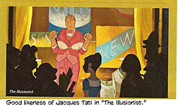
Opus 312 (June 26, 2013). With this hare-raising posting, we launch our Annual Open Access Month: for all the month of July (starting with Opus 312 even though it’s dated June 26), the online magazine Rants & Raves, as well as archived R&R and the entire Hindsight archive—thirteen years of history, lore, reviews and commentary—is open to non-$ubscribers in the hope that they will be so thrilled with what they find that they’ll $ubscribe. Join the happy throng. Our current posting headlines the execrable “Man of Steel” movie. It stinks. That’s the considered opinion of Our Stalwart Reviewer as spewed out copiously. We also report on the recently concluded and impressively successful second Denver Comic Con, the desecration of a Superman shrine in Cleveland, the courage of Syrian cartoonist Ali Ferzat, and the current status of Mike Diana (by reviewing the crime against him). And we review a gem of an animated film, “The Illusionist,” and numerous books, all of which are listed below. This listing, by the way—in case you haven’t already figured it out—is to enable you to scan the contents of enormous postings like this one and pick the articles that interest you so you don’t have to scroll, paragraph after paragraph, through the whole enchilada to get to what you like. Here’s what’s here, then, in order, by department—:
Side of Beef: A Birthday Celebration NOUS R US Action No.1 Found in a Wall Downey to do Iron Man Twice More Archie Bound for the Big Screen Time Turns Off Weekly Online Editoon Spotlight Buck Nekkid in the 25th Century Playboy’s Fraudulent Double Summer Issue James Joyce in Graphic Biography Another Editoonist Raptured
DENVER COMIC CON No.2
Dick Locher Retires
SUPERMAN STUFF In Entertainment Weekly Cleveland Shrines Man of Steel Movie
STORIES OF A CARTOONIST OF COURAGE Syrian Ali Ferzat
A CRIME AGAINST OUR VALUES Mike Diana Returns to Florida
EDITOONERY Some of the Latest Editorial Cartoons With the New Yorker, Too
RANCID RAVES GALLERY Zero Hero by RCH Jack Cole Outside Playboy
BOOK MARQUEE Forbidden Worlds, Vol. 2: Nos.5-8 Black Cherry Ratfist
WOODWORKS: Against the Grain Wally’s World Woodwork: Wallace Wood, 1927-1981 Came the Dawn and Other EC Stories by Wood
Halloween Classics: Graphic Classics, Vol.23 Native American Classics: Graphic Classics, Vol.24
TURNING LITERARY CLASSICS INTO CLASSY COMICS Tom Pompun and Graphic Classics
MOVIE REVIEW The Illusionist
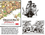
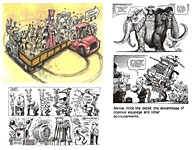
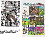
BOOK REVIEWS Daggers Drawn: 35 Years of Kal Cartoons in The Economist The Graphic Canon: Adapting 19th Century Literary Works to Comics Form
LONG FORM COMICS Graphic Novel Punk Rock Jesus
COLLECTORS’ CORNICHE RCH’s First Published Cartoon
PASSIN’ THROUGH Kim Thompson
Our Motto: It takes all kinds. Live and let live. Wear glasses if you need ’em. But it’s hard to live by this axiom in the Age of Tea Baggers, so we’ve added another motto:.
Seven days without comics makes one weak. (You can’t have too many mottos.)
And our customary reminder: don’t forget to activate the “Bathroom Button” by clicking on the “print friendly version” so you can print off a copy of just this installment for reading later, at your leisure while enthroned. Without further adieu, then, here we go—:
A SIDE OF BEEF Your old men shall dream dreams.—Acts 2:17 AT SEVENTY-SIX, a milestone I passed a few days ago, I’m pretty sure I qualify as an Old Man. And the dreams I have tend to be of fond moments in the past rather than of glories in the future. I probably qualified as an Old Man when I was merely 65, but then there were fewer past moments to conjure up again than there are now. Among the ones available to me even then, however, is a moment at the Menger Hotel in San Antonio. The Menger is about a block from the Alamo, and it was built in 1859, just 23 years after Davy Crockett and Jim Bowie gave their all for Texas independence. Today’s Menger is an expanded version of the 1859 structure: it has been added onto at least twice since it opened. The old part is still habitable—and its rooms are specious and filled with antiquy-looking furniture and fittings; the next stage of expansion wasn’t quite up to the grandeur of the original, and the last addition is an even cheaper installation. A long lobby stretches from the old part to the newer parts, but the part I remember fondly is the “historic” bar, a replica of London’s House of Lords Pub. On my first visit to the Menger, I was on a site inspection—visiting the city and its hotels as potential sites for a future convention. And I was conducted around the Menger by two sales persons, one from the San Antonio Convention Bureau and the other from the hotel. When we entered the historic bar, the hotel sales lady said that it was here that Teddy Roosevelt first met the officers of his famed Rough Riders, which troops had gathered in San Antonio for “training” en route to embarking for Cuba. There was a bar that stretched along one side of the room; on the other side, clustered some booths (and in my recollection there were a few booths on a sort of mezzanine or loft above the other booths), and in the middle, round tables. All very woody of the dark and mahogany kind. The bar was closed at that time of day; no one was there except me and my escorts. So Teddy Roosevelt met his officers here, I thought, and I gazed around the room appreciatively. And then, standing in the middle of the room, I shouted: “A side of beef for me and my men!” For years, I’d been looking for just the right occasion to utter this imposing command. Roosevelt’s bar in the historic Menger seemed the right place, and the time was convenient.
NOUS R US Some of All the News That Gives Us Fits JUST AS WE WERE WINDING UP for this posting, we received the sad news that Kim Thompson, co-publisher of Fantagraphics for 36 years, had died. Over the 30-plus years that I have been published by Fantagraphics (in The Comics Journal and otherwise), I worked most closely with Kim’s partner, Gary Groth, so my personal experience of Kim is too limited to afford me anything insightful to say about him—except that he was surpassingly businesslike in his dealings with me (chiefly over the annotating of the Pogo reprint books); in response to my every inquiry, he was always prompt, concise and complete. And we both loved Franquin. Many others knew him better, and some of those are quoted in the article that concludes this Opus. I hope you’ll go there to get to know Kim through those who knew him well.
SPINNING AROUND A copy of Action Comics No.1, wherein Superman debuted in 1938, was found in the wall of a Minnesota house built during the same year. Found during a renovation, it sold for $175,000, according to comicbook seller ComicConnection. It might’ve been more, but it was graded only 1.5 out of 10 because of a detached cover; a near-mint copy graded at 9.0 sold for $2.16 million in 2011. USA Today reported that Marvel Studios announced June 20 that Robert Downey Jr. has signed a deal to return as billionaire playboy philanthropist Tony Stark and his superheroic alter ego Iron Man for two more movies: the team-up film The Avengers 2, writer/director Joss Whedon's sequel to last year's $1.5 billion hit, as well as The Avengers 3. They will be Downey’s fifth and sixth times playing Iron Man on the big screen. Archie, who, at 72, may now be America's oldest teenager, is headed to the big screen for the first time, at least if a new project at Warner Brothers proceeds as planned. Brooks Barnes at the New York Times reported in early June that Warner closed a deal for a live-action adaptation of the small-town adventures of Archie, Betty, Veronica, Jughead. “As their traditional showcases melt like Arctic ice, the nation's visual commentators have one less mainstream floe to go to,” reported Mike Cavna at ComicRiffs. “Time magazine is discontinuing its popular Cartoons of the Week online feature, according to several sources. The most recent COTW published on Time's site was for mid-June.” Sad, but you have to admire Cavna’s metaphor. Hermes Press is launching a 4-issue series, Buck Rogers in the 25th Century, done by Howard Chaykin, who is reknowned in these parts for scabrous sexual adventure comics. I can’t wait. If past performance is any indicator of the future, we can look forward to Wilma (who, Chaykin protests, is merely Buck’s colleague, not a romantic interest) in garters and bustier and Buck buck-nekkid much of their interplanetary time. Playboy’s “summer issue,” dated July-August, is out. The touted “double issue” is double only in the sense that it offers two Playmates instead of one: by page count—208 pages this time vs. the customary 150 pages of late—this issue is only 35% larger than the usual issue. But it does have a two-page spread of 8 previously published Dedini cartoons, some of the funniest of his oeuvre (but none displaying his love of design particularly).
GRAPHIC NOVEL OF A NOVELIST’S LIFE James Joyce, Portrait of a Dubliner, is purported by John Spain at the Irish Independent to be “a remarkable depiction of the Dublin of the author’s time, his family, his friends, his travels in Europe and how he overcame poverty, rejection and ill-health to create some of the greatest works in the English language” (the stream-of-consciousness novel Ulysses for one). But “the core of the book” is its depiction of the James’ “all-consuming love” for his wife, Nora. “As is usual in graphic novels, the love affair is shown in an explicit manner at some points, including sections showing them cavorting together in the nude on Howth Head and naked on a bed in the town of Pola, now in Croatia.” Probably, unless I miss my guess (which I have done at least once before), the book does not record the event of their first date which no doubt contributed to James’ infatuation with his wife-to-be: she reached under the table at the pub and into James pants to jack him off. Nor, probably, does it reveal that Joyce, who drank considerably, “overcame” his poverty by begging money from his friends. According to Spain, the 228-page book has thousands of drawings “and the surprising thing is that the book is not the work of an Irish artist, but a young Spanish illustrator and Joyce admirer, Alfonso Zapico.”
ANOTHER EDITOONIST RAPTURED Sean Delonas, The New York Post‘s veteran Page Six editoonist, is taking a buyout after 23 years at the paper, he announced on his Facebook page: “Almost 23 years ago, I took a temporary 3 month job cartooning for The New York Post. Nearly 6,000 cartoons later, I’ve drawn my last cartoon for the paper. I’ve accepted a buyout. I’d like to thank all my colleagues for the great memories. I have nothing but gratitude for Mr. Murdoch and the Post. I believe the paper has a bright future and I look forward to reading it for many years to come.” “During a long career at the Post, Delonas was definitely un-PC,” wrote Kara Bloomgarden-Smoke at observer.com. “His cartoons for the tabloid at times attracted controversy—like his 2009 cartoon of cops shooting a monkey, while quipping that they will need to find someone else to write the stimulus bill, prompting cries of racism since Delonas seemed to be equating a chimp with President Obama.” Delonas plans to continue editorial cartooning by posting three new cartoons each week, with commentary, on his website. Delonas’ departure from a full-time staff position brings the national total in that category down to 51, a drop of 50% in five years.
DENVER COMIC CON THE SECOND Larger and Better THIS YEAR’S DENVER COMIC CON, May 31-June 2—the second annual fest—tallied about 48,000 attendees. More or less. Topping last year’s near-record-breaking 27,000. (A first con crowd second only to New York’s inaugural a year or so ago.) The Con moved to a much larger venue in the Denver Convention Center; the Food Court alone was about the size of the exhibit hall last year. In the aisles of the exhibit and Artists vAlley, the milling throng never thinned: all day long, for three days, the populace eddied through the displays. At
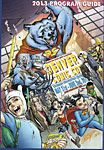
your eye’s elbow is the cover of the Denver Comic Con program booklet—by Scott
Campbell, and nicely done even if most of the women depicted are not attired in
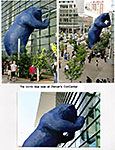
skimpy underwear costumes. Next in the array of accompanying visuals is the big blue bear in all its actuality. The people strolling by give you an idea of the bear’s size.
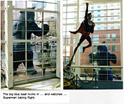
And the second views of the bear are from inside the Center, where you can see one of the sights the bear sees—a statue of Superman launching himself skyward. Stan Lee, who had been signed on as a guest of honor during last year’s inaugural extravaganza, reneged the week before the Con in order to make a cameo appearance in a Marvel movie being shot at a conflicting time. William Shatner took his place. “As a result of playing Kirk—and as a result of being a celebrity—I am here taking over for Stan Lee,” Shatner said, “—who else would they have called?” Before taking to the stage to address a packed auditorium, the Denver Post reported, Shatner signed a Star Trek communicator toy for a terminally ill 9-year-old boy who couldn’t attend the event. Another “Star Trek” hero, George Takei, was also a celebrity guest. He arrived early on Friday and stayed late that night to sign autographs for all those who had been waiting in line to pick up their badges. “Many people said this was the only day they could be here, so that is why I stayed,” he said. The Friday crowd was too much for the city’s fire marshal. The doors opened at 3 p.m., but two hours earlier, a line of people estimated at 15,000 began snaking around the Convention Center, spilling across downtown Denver. The fire marshal reacted by shutting the doors, leaving (it sez here) 6,000 angry fans on the sidewalks. Con officials admitted that the size of the crowd on Friday took them by surprise. But while a couple thousand might have been stranded outside, I think 6,000 is an exaggeration. Many of those admitted were just getting into the exhibit hall at 8 p.m., the announced closing time. The Con crew kept the hall open another hour to give the recent arrivals a chance to see some of the displays and exhibits. By Saturday morning, Con operatives responded to the large numbers by adding staff in the registration area (some of whom went up and down the lines, checking people in and issuing badges). Saturday and Sunday was a smoother operation; and no one was left out on the streets. Complimenting the exhibits of comics, games, toys and other pop culture phenomenon, the program featured about a dozen simultaneous panel presentations and lectures and the like every hour—comics, tv/film, manga/animation, celebrities, education/diversity (the Con is sponsored by Denver’s Comic Book Classroom, a non-profit program teaching reading skills through comics to kids in economically straightened neighborhoods), gaming and cosplay, to mention some of the themes taken up in the Center’s meeting rooms on the floor below the exhibit hall. As with the San Diego Con and others of the ilk, many of the guest celebrities were from tv and film, but at least as many were comics personalities—Alfred Trujillo, Brian Pulido, Chris Ware, Denny O’Neil, Gerry Conway, George Perez, Doug TenNapel, Farel Dalrymple, Fiona stapes, J. Scott Campbell, Andrew Pepoy, Jim Mahfood, Jim Steranko, Joe Rukbinstein, Neal Adams, Jon Bogdanove, Matt Wagner, Mike Baron, Moritat, Ramona Fradon, Allen Bellman, Paul Ryan, Peter Bagge—and more. In short, it’s clear that the DenComCon is now a destination for comics creators and fans of comics as well as pop culture, tv and movies.
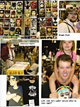
I WAS ESTABLISHED AT A TABLE in the usual habitat for cartoonists and artists. In recognition of the venue being near Colorado’s majestic mountains, Artists Alley here is called “Artists Valley” (probably because it's between peeks). The table next to mine was Allen Bellman’s, and he and his wife Roz held forth like yoemen all day for three days (and he’s 89). Bellman is one of the nearly forgotten comic book artists of the Golden Age. He joined the Marvel (then Timely) bullpen in 1942 at the age of 18 and did some backgrounds in Syd Shores’ Captain America. He also worked on the Human Torch, the Patriot, the Destroyer, and the weirdly named World War II hero, Jap-buster Johnson, among other characters and titles, and he wrote and drew a one-page feature, “Let’s Play Detective,” but it was his almost parenthetical contribution to Captain America that has underwritten his appearances at comic cons since about 2007. After his stint at Marvel, he worked for Gleason comics in the early 1950s; then after a while, he was freelancing for Marvel. But he left comics in about 1952, and following a brief career in illustration, he went to Florida where he joined a Florida newspaper as a photographer. Then in 2007, a couple of funnybook fans found him and persuaded him to venture forth into the burgeoning business of being a Golden Age celebrity at comic cons, where he appears as a Captain America/Human Torch artist. “This is what I live for now,” he told me, nodding at the milling throngs passing by his table. And it is a lively living: he signed autographs (often on cosplayers’ Captain America shields) and sold energetic sketches of Captain America and talked with whomever stopped to chat. I asked if I could photograph him with his cane, the grip of which, as you can see, is a Jaguar hood ornament. “Never could afford the car,” he quipped, “—this is as close as I could get.” He struck his comic con pose—fist defiantly, victoriously, thrust at the photographer. When little kids wanted to be photographed with him, he instructed them in how to do the fistic pose, and they did it together.
The table across from Bellman’s and also capping the end of a row of Valley tables was Ramona Fradon’s, and across from hers was Doug TenNapel’s. I’m a fan of the work of both of them. I told Fradon that I thought she did the best Plastic Man of the Silver and subsequent Ages. TenNapel’s
storytelling and rendering is among the most wildly kenetic in comics, and I
went over to his table to see what he was selling. I wound up buying three of
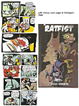
his graphic novels—Gear, Ratfist, and Black Cherry, “a lurid tale
of sex, violence and the supernatural” it sez on the cover (“I did this one
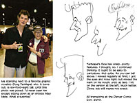
especially for you,” TenNapel said; so how could I resist?). I bought Gear partly because of the stunning color inside and also because it is TenNapel’s first work: it collects the six issues of the comic book title he published in 1998. “There are no people in this book,” I observed, displaying my uncanny observational skills. “That’s because I didn’t know how to draw people then,” TenNapel explained, adding that after Gear was published, he submerged himself in months of self-instructional exercises to develop an ability to portray others of his own species. Gear is dubbed a “surreal epic” for which TenNapel looked for inspiration to his pet cats, Simon, Waffle, Gordon and Mr. Black. The cats do battle with dogs and insects, using giant robots as weapons. The cats went on to star in the Nickelodeon series “Catscratch.” TenNapel began as an animator and was soon working on video games, all of which led to producing graphic novels, which he’s done at the rate of about one a year until, now, there are 13. According to Wikipedia, “he is best known for creating [in 1994] Earthworm Jim, a character that spawned a video game series, cartoon show, and a toy line.” TenNapel lives in Colorado Springs these days, so he’s close enough that he brought his entire family (wife and four kids) with him to Denver for the Con. While we were talking, his wife said she wanted a photograph of the two of us, and TenNapel readily agreed, standing up and coming out from behind his table. What a shock. I’ve run into him several times at the San Diego Con, but he’s always been seated at a table. Suddenly, I was confronted by a six-foot eight-inch hulk, standing by my side.
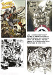
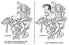
Later, as you can see from the visual aids just posted, I decided he’d be a perfect subject for caricature. True, but he was more difficult to capture than I thought he’d be, but I finally managed it and then transferred the image to my Artists Alley gimmick. Some years ago, I made prints of several of my magazine cartoons, removing the heads of the male characters. The gimmick is that for a modest fee, I do a caricature of the buyer and put it in the place where the head had been, making the caricatured custoemr a cartoon character—surely the goal in life for every comics fan. I also did a special drawing for the purpose—a rendering of a muscle-bound hero who is rescuing a damsel but is so clumsy in handling her that he nearly disrobes her as he rescues. It was onto this print that I put my caricature of TenNapel. I gave him the final product; the one you see here is my first attempt. Not bad, but not, yet, very good. Almost everyone who sees this gimmick in the display of headless cartoons and drawings that I arrange for my Artists Alley stints agrees that the gimmick is brilliantly conceived. But almost no one ever buys one.
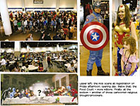
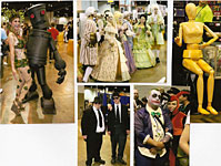
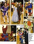
THE PARADE THAT IS THE CON continued to stream by my table and throughout the Valley and the hall all day for two-and-a-half days. I was vastly amused by the number and variety of cosplayers. My guess is that one of every five people attending the Con was in costume, playing the part of a favorite tv or movie or cartoon character. Zombies were numerous. And Star Trek warriors. I was surprised by the quantity of steam punk fashions on display. But I wondered as I watched: do any of these colorfully costumed persons ever buy anything offered for sale throughout the Con? None of the cosplayers I saw were carrying bags bulging with purchases. They were all playing but, seemingly, not buying. Still, when I asked some friends from my favorite comic book shop, they said they’d experienced great sales. No one complained. T-shirts were also big. One exhibit booth was a “tower of t-shirts,” reaching a height of at least twenty feet. T-shirts are expensive—at least $25 each, sometimes more. Merchants must charge high prices these days because the men’s clothing industry isn’t making anything on regular shirts anymore: everyone is wearing t-shirts all the time. Casual Friday has exploded into Casual Week and all but destroyed the men’s clothing business and the surrounding economy as it did. As a results, t-shirts rule, and they’re priced to prop up the entire sagging men’s shirt industry. I attended only one presentation over the weekend: Kevin G. Robinette (who lives in Denver but commutes once a week to San Francisco to teach a course in comics at a local college, which pays his expenses) talked about comics 50 years ago. In 1963, he reported, the comics industry, which many of us have assumed was dead after the Wertham-inspired “kill off” of 1954-55, was producing 296 titles a month. Most of these (21% Robinette said) were humor comics, featuring humans and tv characters. Next, with 19%, was the funny animal category; then teenagers (13%), westerns and superheroes (11% each), then war and romance (each 8%), and, finally—at the low end with merely 1%—crime. Wertham prevailed. Back in Artists Valley, I took photos of the passing throngs, some of which I’ve posted in this vicinity. See how many of the following you can find in this array: steam punkers, strangely religious paraphernalia on display, mobs, Captain America and Wonder Woman, Poison Ivy, a gaggle of 18th century French dandies and their well-coifed bimbos, a chubby Joker and a plump Superman, Harley Quinn, an artist’s model, Alice and the Mad Hatter, Hagar (?), and more. Wait’ll next year.
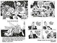
DICK LOCHER RETIRES AFTER FOUR DECADES OF EDITOONING By Scott Stantis, editorial cartoonist for the Chicago Tribune; May 20, 2013 PULITZER PRIZE-WINNING editorial cartoonist Dick Locher, 83, has put the stopper in the ink bottle for the last time after more than 40 years of capturing modern life through political cartooning. He recently announced his retirement. Dick's
career as an editorial cartoonist began inexplicably in 1973 when he was
offered the staff cartoonist position at the Chicago Tribune even though
he had no experience in the job. (He had assisted on the comic strip Dick
Tracy for many years with legendary cartoonist Chester Gould, who
recommended him for the Tribune job.) Over the years Dick had more than
10,000 cartoons published ("That's a whole lot of getting mad six times a
week," he said); won a bunch of awards, including a Pulitzer in 1983; had
a private lunch in the Oval Office with President Ronald Reagan; received two
death threats; took over drawing and writing the Dick Tracy strip (he retired
from that job in 2011); created the coveted John Locher Award for college
cartoonists to honor the memory of his deceased son; and designed the Land of
Lincoln Trophy, awarded to the winner of the Illinois-Northwestern college
football game. In
an era many consider the golden age of editorial cartooning, his work stands
among the greats. His cartoons have been nationally syndicated by Tribune Media
Services and featured in Time, Newsweek, Playboy, the Congressional
Record, Life and hundreds of newspapers internationally. Always a gifted
draftsman, his work was studied and emulated by generations of aspiring
cartoonists, myself included. Dick's work is remarkable for the power of his message
and his fearless graphic sense. What I admire most is not his incomparable resume, his wall of awards and plaudits or his ceaseless flow of creativity, be it painting or sculpting, (as I write this he is in the middle of completing a sculpture of the founder of Naperville), or even the fact that he is tall, slender and handsome to this day. What comes to my mind is a word we rarely hear, let alone use today: courtly. For all of his accomplishments I have never known Dick Locher to be anything but kind, generous with his time and always a gentleman. My respect and admiration for him is boundless. In short, when I grow up I want to be Dick Locher.
***** Feetnoots by RCH. Good work, Scott. Take the rest of the day off (as Dick was wont to quip by way of congratulating a noble effort). Dick is not only courtly but witty, a pleasure to be with and to listen to. I interviewed him several years ago, and the career-spanning result is posted in Harv’s Hindsight for March 2011. Some of Dick’s favorite stories are enshrined therein; don’t miss it if you can.
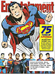
SUPERMAN COVERS ENTERTAINMENT Awash in
blockbuster movies of comic book superheroes over the last few years, Entertainment
Weekly periodically puts one of the funnybook longjohn legions on its
cover. The current issue (cover herewith) celebrates Superman’s 75th anniversary as a comic book character—and, of course, the opening of the new
blockbuster Superman flick. “Man of Steel” raked in $113 million on its opening
weekend ($125 mil if you count Thursday “screenings”; still well below “The
Avengers” record of $207.4 million but surpassing “Toy Story 3's” $110.3
million as the best June opening of all time). Only
two versions of the comic book Superman are depicted across the bottom: on the
left, Joe Shuster’s iconographic rendering (his was, after all, the very
first interpretation of his friend Jerry Siegel’s super-powered
concoction); on the right, Jim Lee’s. The big Superman on the cover is
by Neal Adams. Inside, a two-page spread lays out 18 different Supermen,
actors and comic book characters. Boring and a number of other Golden Age DC artists were summarily dismissed in 1967-68 when the company purged itself of the “old school” artists. Too bad. The purge was directed by the legendary malcontent, Mort Weisinger, who called Boring into his office and told him he was fired. Boring related the details to Richard Pachter in a 1984 interview (published in Amazing Heroes): “You mean I’m not working for you anymore?” “You’re fired,” Weisinger repeated. “Fired?” Boring, flabbergasted, persisted: “What do you mean? All you’ve got to do is stop sending me scripts.” (Why, in other words, use the word “fired”?) Weisinger went on: “Do you need a kick in the stomach to know you’re not wanted?” Wonderful fella. Said Boring: “I was kind of down—after 30 years!” As for his opinion of Weisinger: “I was afraid I’d die and go to hell and he’d be in charge!” Boring joked. “That would have been the capper!” Boring dabbled in comics for other publishers for a while, then retreated to Florida where he found a part-time job as a bank security guard. He died in 1987 of a heart attack. We’ll stage a retelling of the birth of America’s first and most ubiquitous longjohn superhero in Opus 313 (in July, during the rest of our Annual Open Access Month); one or two possible surprises, perhaps. To tide you over, here’s a short squib about Superman’s creators—:
THE SHRINE BULLDOZED AGAIN For the second time in two years, one of Cleveland’s four shrines to its spandex-clad native son has been desecrated by a driver who lost control of his vehicle. The first of this noteworthy quartet is at the city’s Hopkins International Airport: erected last October, an imposing statue of Superman stands at attention (his usual posture) in front of a verbal mural proclaiming Cleveland his birthplace. And near the clock tower at the corner of East 105th Street and St. Clair Avenue is a two-sided imitation bronze historical marker honoring Jerry Siegel and Joe Shuster, Superman’s creators. Set up in 2003 on the 65th anniversary of the Man of Steel’s birth, the marker manages to misspell Siegel’s name on one of its two sides. The $2,500 marker was sawed off its post and stolen last year; but the thieves returned it three weeks later, undamaged (Siegel’s name still misspelled). The house where Siegel lived when he invented Superman during a hot, sleepless night in 1933 is the third shrine. At 10622 Kimberly Avenue, just three blocks from the marker on East 105th, it was designated a landmark by the city in 1986, but it wasn’t properly refurbished until 2009, when Brad Meltzer, who’d written The Book of Lies (a sort of novel based upon supposed mysteries—among them, the death of Siegel’s father a few years before Superman was born), visited the site and, alarmed at its shabby condition, worked with the Siegel and Shuster Society (formed in 2007) to rise $111,000 for renovating. (At BradMeltzer.com, a video reportedly depicts the condition of the place before it was refurbished; I couldn’t make it work on my machine, but then, I’m notably inept at technology.) The
couple that has owned and occupied the house since 1983 is apparently delighted
by all the attention their home gets—bus-loads of passing tourists and
occasional drop-in visitors (who, if Jefferson and Hattie May Gray aren’t too
busy at the moment, might get to peek inside at the attic room where Siegel
liked to work in seclusion and where the Grays display Superman memorabilia
they’ve collected). At the time of the renovation, an “S” plaque was affixed to
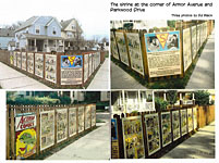
the fence in front of the Gray house. The fourth Superman shrine is at the corner where Armor Avenue deadends at Parkwood Drive, the site of the apartment building where Joe Shuster lived, eleven blocks south of Siegel’s house. It was to Shuster’s that Siegel ran the morning after his sleepless night conjuring up Superman, eager to tell the young artist about this new creation; Shuster, acting upon Siegel’s prompts, then drew the first depictions of the pace-setting superhero. The
apartment building was torn down in 1974, but the Siegel and Shuster Society
built its shrine around the private home that was built there in place of the
apartment building. Raising money with an online auction, the SSS had the first
Superman story from Action Comics No.1 transferred to metal plates,
which were then hung on a fence at the property. Portions of the fence have twice been demolished by errant drivers, most recently on June 5, when Antwann Houston veered off Parkwood into the left half of the V-shaped fence shown in our visual aid, taking down also the corner plaque depicting Siegel and Shuster and describing their creation. Houston was charged with drunken driving, leaving the scene of an accident and driving without a license. The family that lives in the house behind the fence collected the plates; at least one has been badly damaged. The previous demolition took place in May 2011, when a neighbor drove his car through the other half of the V-shaped fence. The damage then was estimated at $2,600. The plates were replaced. And where was Superman when all this destruction was transpiring? In the movies. Which brings us to—:
“MAN OF STEEL” HAS ALMOST NO REDEEMING FEATURES as a movie. It may, in fact, be the worst action movie I’ve ever seen. The fight sequences were supersonic car crashes with the opponents rushing headlong at each other and knocking one another down repeatedly. And they moved too fast for a viewer to follow the presumed action; all we see is visual representations of a high wind. After a dozen or so of these head-on collisions, ennui sets in pretty numbingly. Some relief from the noise of the crashes is afforded in several nearly endless expanses of exposition. For an action movie, there were far too many extreme close-ups; we don’t need to count the hairs of Superman’s eyebrows. Apart from the wholesale destruction being wreaked on the cityscape during fights, we were also treated to unremitting sequences of slow moving—but menacing—space craft that looked like metallic crabs or sea turtles or hovering jelly fish, sequences punctuated by belching firey explosions of the highest decibels. British actor Henry Cavill is adequately stalwart and muscled heavily enough for the Superman role. The Superman’s chain-maily sort of costume is the best thing in the movie, but the cape is too long. Alas, Amy Adams is wrong for the part of Lois Lane: instead of a hard-charging reporter, we have a prom queen. Lois and Clark fall in love and, at the end of the movie, they kiss. This development severely alters the Superman mythology, in particular the love triangle that has animated the comic books for 75 years—Lois loves Superman but disdains Clark Kent, not realizing that the two are one and the same. I can’t imagine how DC consented to the violence this development does to the enduring psychic appeal of the character: every pimply-faced adolescent under the spell of the Siegel-Shuster creation can imagine that he, like nerdy Clark Kent, is secretly a champion. This movie blasts that fond daydream to tiny pieces of Kryptonite, thanks to writers Christopher Nolan and David S. Goyer, ably assisted by director Scott Snyder. The best scenes in the movie belong to Clark and his mother, feelingly played by Diane Lane. They seem unabashedly fond of each other, and their obvious affection lends their scenes emotional impact—about the only human drama around. All of the rest of the intended drama is drowned in cliched dialogue. But the movie’s most serious flaw is its relentless seriousness. The idea of a flying, invulnerable super-powered hero is laughable on its face, but most successful superhero movies of late have the saving grace of a self-deprecating sense of humor. None of that here. In fact there are only two funny lines in the two-and-a-half hour flick, and they’re both Lois’. She arrives at some frozen outpost of scientific inquiry to report on it, and endures a typically masculine us-guys-know-it-all-but-you-poor-deluded-female briefing, which she finally terminates with a quip: “Now that we’ve finished measuring dicks, maybe we can begin.” And the penultimate line in the movie is hers, and it is also humorous with double entendre. At the end of the movie, Clark decides to find a job, and he dons specs and reports to work at the Daily Planet, where Lois is the star reporter. When he is introduced to her, she pretends she doesn’t know him—despite having been gaga over him for the whole movie—stands up and shakes his hand and says: “Welcome to the Planet,” a nice play on words. The movie also supports what appears to be a stunning irrationality. If Clark is invulnerable because he comes from a planet with a different atmosphere than Earth’s, then all those Kryptonites who come looking for him with kidnaping on their agenda are similarly invulnerable. How, then, are they all killed? But they are. Some unspecified how. And Krypton’s General Zod laments their death and vows to kill all of Clark’s earthling cohorts in revenge. Clark finally dispatches the evil warlord by choking him to death, the only way he can be killed if he’s otherwise invulnerable. That seems to work. But how were all the other Kryptonites killed? Oh, and—according to Asawin Suebsaeng at motherjones.com—“one of the most fascinating things about this movie is how blatantly littered with product placement it is—roughly $160 million in product placement and promotions went into its makers' coffers. ‘Man of Steel’ has over 100 global marketing partners, surpassing Universal's 2012 animated flick ‘The Lorax,’ which reportedly had 70 partners. So if you have forgotten recently to eat at IHOP or to shop at Sears, this film will remind you to do so in big letters.” But the most troubling aspect of this production for me is the flying. Advertisements for the first Superman movie of modern times touted the flying: it was so convincingly faked that we would know, the ads insisted, that Superman can fly. This Superman takes flight like a bullet being fired. No flapping of arms, no quick crouch and then a jump up into the air. Nothing. Just—bang! out of the chute. What propels him? The only thing I can think of is, well, super flatulence. Superman farts himself into flight. And that seems a suitable end for this review. (Unintended word play—but relished nonetheless.)
QUOTES AND MOTS “We have to admire the world for not ending on us.”—Colum McCann Comedy springs from irritation: “That’s what comedy’s about. It’s the oyster that takes the irritating grain of sand and turns it into a pearl.”—Jerry Seinfeld
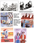
STORIES ABOUT A CARTOONIST OF COURAGE Updating the Adventures of Ali Ferzat (Reuters, summer 2012—a year ago) - Cartoonist Ali Farzat's hand glides over the paper, once more creating the images of defiance he says have helped mobilize Syrians to revolt against President Bashar al-Assad. Just over 12 months ago, the Syrian was kidnaped, beaten and burned in an attack he blamed on Syrian security police trying to silence him and stop him drawing the caricatures that protesters have waved aloft as they took to the streets. His
hands were smashed and he suffered facial burns, temporary loss of his eyesight
and multiple broken bones. One of Syria's most famous artists, Farzat earned recognition in the Arab world and beyond for stinging cartoons of Arab leaders such as Libya's Muammar Gaddafi and Iraq's Saddam Hussein and finally, Assad. Farzat, 60, escaped to Kuwait to recuperate. Now in Egypt, which overthrew its own president in an 18-day uprising in 2011, Farzat told Reuters he was determined to continue his work and support those still seeking to topple Assad 19 months after they began. "Everyday the revolution inches a step forward. I am very optimistic. Do you see anyone turning back?," he said, proudly gesturing with his hands to show they were back in action. "Fear has been defeated in Syria when the people marched 19 months ago against tyranny. "I began to directly draw people in power including Assad and his government officials, to break the barrier of fear, that chronic fear that Syrians suffered from for 50 years." One of his first cartoons portraying Assad—long a taboo in Syria––showed the president reluctantly ripping a page off a calendar on Thursday, knowing that Friday would bring another wave of popular protests to the streets of Syria. In another, Assad tries to hitch a lift with Gaddafi, and a third shows Assad beside a large armchair, unable to sit down because the springs have broken. [For other Ferzat cartoons done before the beating, see below.—RCH] Demonstrators carried banners of his work as new-found expressions of resistance. Farzat, who now works for Kuwait's al-Watan newspaper, has been denied entry into Iraq, Libya, Jordan and Oman because of his work. The uprising against Assad, whose family has ruled Syria in autocratic fashion for four decades, began as a peaceful protest but soon degenerated into civil war as Assad tried to exert autocratic control. More than 32,000 Syrians have been killed [at the time of this story’s publication, mid-June 2013, 90,000-plus]. Farzat said Assad initially tried to get him and other Syrian artists on his side, promising reforms to all but, he said, setting up a system of patronage to win the loyalty of some and exclude those who resisted him. "On a personal level we found Assad contradictory. One day, we would speak and agree on a specific issue. The next day we would find out he had changed his mind," said Farzat, recalling the day he decided to take on Assad in his work. "Satirizing a dictator empowers the masses. It strengthens them and undermines their enemy," he said. Assad says he is pursing reforms, but the opposition says they are meaningless without genuine participation. Sitting on his desk in a building overlooking Tahrir square, the heart of the uprising in Egypt, Farzat sketches on white paper. A tiny bird emerges, chipping and breaking off the head of an axe that sticks out of a Syrian military fatigues, a symbol of Assad's power. He quickly draws a tank unable to roll over a flower that blocks the tank from moving forward. These sketches and others will be showcased in his independent magazine Al-Domari, meaning the Lamp Lighter, which he plans to relaunch in Egypt. The magazine, which was founded in 2000 during a brief period of media freedom, was forced to shut down by Assad's government in 2003. "The magazine's purpose is to gradually remove the darkness that befell our Arab world," said Farzat. He hopes to form a symposium with young artists and cartoonists in Egypt to support the art movement that grew out of Egypt's uprising. "These cartoons stem from the sorrows of people. They give them courage and determination," said Farzat.
A Year Later: Cartoonist Still Stands Up to Syrian Regime By John D. Sutter, CNN Opinion columnist, who interviewed Syrian cartoonist Ali Ferzat in Oslo, Norway, where Ferszat was regrouping after his ordeal; story dated May 21, 2013. THE MASKED HENCHMEN grabbed three fingers on each of the Syrian political cartoonist's hands and pulled them back all the way—so far that they cracked. "Break his arms so that he doesn't ever draw again," one said. Ali Ferzat—the cartoonist who described the 2011 attack to me in a recent interview—soon found himself bleeding and left for dead near the Damascus airport. His assailants, who he believes were acting on behalf of the Syrian regime, dragged him alongside a moving car. His head and shoulder bounced on the pavement and then the men shoved him out of the vehicle, dumping him on the side of the road. Ferzat wondered if he would live, let alone draw again. It would be months before he would learn the second answer. Before I'd heard these and the other horrifying details of this attack against one of the Arab world's most notable artists, I asked Ferzat—an Arab-Santa-looking character with a smile that could cheer up Tilda Swinton [a European actress noted lately for sleeping in public as part of an artwork]—if he was sure his hands were broken to stop him from drawing cartoons critical of Syria's leader, Bashar al-Assad. His answer made me laugh. "Obviously," he said. "What do I look like to you, a chef?" I met Ferzat in at the Oslo Freedom Forum, a gathering of dissidents and human rights activists, where he received the Vaclav Havel Prize for Creative Dissent. Being in his presence was the human-rights nerd version of a basketball fan meeting LeBron. But what impressed me most about Ferzat is that he's maintained his wit and cheer despite the darkness that has fallen on him and on his country, which is in the grips of an intractable two-year war that's killed an estimated 80,000 people [over 90,000 as of this writing, June 15]. He is almost naively optimistic about Syria's future. And it's infectious. The rest of Syria's opposition should take note. As his story shows, the true strength of a revolution is in its ideas—in nonviolent actions such as drawing truth to power. Dictators do have reason to be scared of cartoons. That's why Ferzat's hands became some of the most feared objects in Syria. "They came after me," he said. "Obviously (cartooning) has power." The self-taught artist, who's in his early 60s, has been using them to mock authority since he was a young boy—first imitating cartoons he admired and then creating satire of his own. He went pro in the 1970s, gaining notoriety for publishing cartoons domestically and internationally. Back then, before the current war, Ferzat never dared to depict specific people in his cartoons. He drew autocrats and dictators, but they never looked like real, identifiable people. He did it to avoid censorship or retaliation. But that was before the war—before reports emerged, in May 2011, that a 13-year-old had been tortured and killed in Daraa, Syria. Stories like those of Hamza Ali al-Khateeb's death, which reportedly involved his genitals being mutilated, pushed Ferzat across a threshold. He started to draw exact likeness of al-Assad in his satire. Enough was enough. His pen would hold no punches. Ferzat drew al-Assad standing on the side of the road with his thumb in the air, ready to hitchhike out of Syria. A crazed Moammar Gadhafi, who was still alive at the time but later would be killed in Libya's uprising, was driving a getaway car. The message was clear: Syria's leader had to go. That was the image, he told me, that led to his attack on August 25, 2011. Ferzat's animated demeanor—his eyebrows bounce when he talks and his hands, now unbandaged, gesture wildly—flattened as he told me the story. That day, a white car with darkly tinted windows followed him out of the studio before dawn. He's been working there by candlelight to avoid detection. Frightened by the car, he drove to the center of Damascus, to a square he knew to be home to government buildings and the president's palace. The car followed and crashed into him at the square, he said, forcing him stop. Three men emerged and yanked off the doors of Ferzat's car. They pulled him from it, beat him with crowd-control batons and then yanked plastic handcuffs around his wrists. "They handcuffed me so tightly I felt that one of my wrists was going to break," he said. SANA, the Syrian state news agency, reported Ferzat "was attacked by veiled people" and that "authorities concerned are conducting an investigation." My e-mail requesting further information, however, was not responded to. And the U.S. State Department condemned the attack, saying in a statement that the al-Assad regime was sending "a clear message that (Ferzat) should stop drawing." They beat him so badly that his vision failed for days in one eye, Farzat told me, and he could barely see out of the other. Confused, Ferzat asked what was happening to him. "Don't you ever dare to cross your bosses and to cross your leaders, because Bashar al-Assad's shoe is on your face and on your head." (For evidence of the severity of that insult, recall the Bush and Ahmadinejad shoe-throwing incidents). They drove 30 minutes to a road near the Damascus airport. That's where they threw him from the car. "My white shirt was completely, totally, red from the blood," he said. He thought he surely would bleed to death there. Cars wouldn't stop, perhaps afraid to pick up a person targeted by the regime or by police. But then the first of three miracles happened: A truck's tire burst, forcing it to stop exactly in front of Ferzat. "This is like something out of a freakin' movie," Amir Ahmad Nasr, a blogger-author friend who was translating the conversation from Arabic, said to me. Ferzat threw himself into the bed of the pickup and begged the three men who drove it to take him back to the city. They agreed to drop him at the gates of Damascus, but wouldn't take him further—definitely not to a hospital—for fear of being targeted themselves. Still bleeding and barely able to see because of the beatings to his head, Ferzat wandered up to a house and asked its guard for help. Then the second miracle: The guard agreed to give him a ride to a nearby clinic, where (here's the third) doctors recognized the cartoonist and were sympathetic to his cause. They treated him at his house to avoid detection. But there was always the worry: his hands. Would he draw again? "My hands became stuck like this," he told me, tensing up his digits into a wooden, claw-like shape. "The doctors told me I needed to get treatment overseas." Fate, again, would intervene. Using a newspaper contact in Kuwait, Ferzat arranged to leave Syria and seek treatment in a hospital there. After six months of surgery and physical therapy, he was able to put pen to paper. The first cartoon he created after the attack was not diluted by fear. He drew al-Assad and Russia's Vladimir Putin walking side by side, their legs intertwined to make the shape of a Nazi swastika. Ferzat is still living in exile. But the revolution needs him. It needs his art. He's seen images of protesters and rebels carrying printouts of his drawings. So he contributes art from outside the country. The outcome of the war in Syria is anything but sure. But talk to Ferzat and his optimism will rub off on you. He's convinced he will live and draw in Syria again—that people in his country, a cradle of civilization that invented one of the world's first alphabets, are no longer afraid and eventually will triumph over the regime that would crush their spirits and their art. After hearing his story, I'm hard-pressed not to believe him.
A CRIME AGAINST OUR VALUES As the first artist ever to be convicted of criminal obscenity in the U.S., Mike Diana is the central figure in what should be roundly condemned as a national disgrace. He was convicted in Florida, a state infamous for its backwoods attitudes about sex and race (among other dubious achievements), and his conviction enjoyed considerable publicity at the time (1996-97) as an outrageous instance of police power gone amuck in a society of antiquated sexual mores. The case against Diana materialized under highly suspicious circumstances that suggested he had been targeted by an ambitious assistant state’s attorney, who, understanding perfectly the troglodyte attitudes of Floridians on matters of sex, saw Diana’s self-published comic book efforts as flagrant assaults in the moral sensibilities of a population he regarded chiefly as voters. Subsequently, in a Largo, Florida district court, Diana was found guilty on three counts, and was sentenced to a three-year probation. He was to avoid all contact with children under 18, undergo psychological testing, enroll in a journalistic ethics course, pay a $3,000 fine, and perform 1,248 hours of community service. He was also ordered to cease drawing even for personal use, and his home was to be open to visitation by the police, who, without warning or warrant, could enter the premises at any time, to discover if he was violating this ruling. He was not sentenced to any jail time, but spent four days in jail between the dates of the verdict and the sentencing. At the time, the sentence was widely decried as a draconian denial of the principles upon which this country was founded, an odious offense against individual liberty and democratic ideals, including, most obviously, freedom of speech and artistic expression. Just down the scroll, I’m posting a recent Miami News Times story by Liz Tracy because we need to be reminded about how frail our grip on so-called liberties is. And because Diana relates some aspects of his horrendous legal execution that I hadn’t heard before. Diana’s whole story is posted at Opus 284, and I recommend that you re-visit that posting to refresh your memory of just how high-handed and unjust the entire adventure was. Then come back here and continue reading (below) about Diana’s latest adventures, which includes his description of his initial encounter with the long arm of Florida law and his reaction thereto and subsequent episodes, revisited.
Mike Diana Returns to the State That Convicted Him of Obscenity By Liz Tracy at the Miami New Times; Thursday, May 16, 2013 WHEN 18-YEAR-OLD MIKE DIANA RETURNED HOME from Christmas shopping with his mom in 1990, two cops were waiting for him on the lawn of their home in Largo, near Tampa. One officer pulled from his briefcase the teenager's underground comic book Boiled Angel No.6. He flipped through the pages, showing Diana’s mother the creatures inside: a woman with a pentagram on her chest and stubs for arms, saying, "Fuck you & yer big ass." On the cover, a man with an erection and a bloody knife ripped a mangled fetus from a dead woman's belly. The policeman then informed him that he was a suspect in the Gainesville student murders. "At first I felt offended," Diana remembers. "I said, 'What about freedom of speech?'" The cop responded like a television detective: "'I don't like your attitude.'" The next day, police grilled Diana about his drawings. He gave a blood sample, at his mother's insistence, to prove his innocence in the killings. But his troubles with Florida law enforcement didn't end there. Diana was eventually convicted on three misdemeanor counts of obscenity for publishing, distributing, and advertising his works Boiled Angel No.7 and Boiled Angel No.ATE. He became the first artist in U.S. history to be convicted on criminal charges of obscenity. He spent four days in jail and three years on probation. "It was definitely a strange time," he says, reflecting upon those days. "I feel that one thing that upsets me, that I think is obscene, is the jail and prison system. A lot of people are put behind bars who don't need to be there." The sawing of babies and penises in his art, he points out, is a critique of actual situations and power structures such as religion — particularly reports of child abuse. Boiled Angel No.6 was, in fact, influenced by the murders in nearby Gainesville. The shock his art elicits allows Diana to communicate the gravity of real-life horrors. Local nomadic arts collective the End/Spring Break and Miami Art Museum have invited Diana to speak in Miami. The speech this Thursday will make a statement about censorship and art. His controversial work will be shown nearby at Bas Fisher Invitational's "Mike Diana: Miami or Bust," alongside the art of those he has influenced, including Mike Taylor, Heather Benjamin, and Mat Brinkman. "When I watched the news, read the newspaper, I couldn't ignore the reports of children being abused, and basically all the different ills of society." Diana says. "I felt like people were desensitized. ... I felt if I did comics that dealt with these issues, [it would] make people think about these things that are happening in their own communities." Back then, he was a teenager who bought Blowfly records on sale. He drove to Orlando to see GG Allin smash a whiskey bottle on his head and bleed through a nude, diarrhea-and-urine-stained performance. At the time, he says, "I was harassed by the police a lot ... curfew things. I had long hair, so I think I fit a certain type of profile that they liked to stop." Moving from upstate New York to the Tampa Bay area at age 9 was jarring for the young artist. The heat was extreme, and his teachers paddled students. His artwork evolved from "just not liking Florida, feeling like I wanted to go against the system, and feeling like I was challenging Florida in a way, with religion, and reports of child abuse." He felt there was a battle going on between old and young here. His reaction to that and his love of horror films and horror comics resulted in art that is both brutal and surprising, yet also somehow beautiful and amusing. But the literal trial he endured here was not funny. He remembers seeing the final jury selection. "I figured I was in trouble." It was, he says, "definitely not a jury of my peers. It was all elderly people." In court, Diana wasn't allowed to show other underground comic books as evidence that his work wasn't an anomaly. They were trying to prove, he says, that the Boiled Angel series wasn't "artwork anymore; it's just something that can turn people into serial killers." Now, though, he says, "I just try to make the best of everything that happened." He's working on a graphic novel about what he calls the "whole Florida ordeal.” "All these years later, I think I'm able to think about it without getting as stressed out as I used to." Today he lives in an exile of sorts in New York, where he moved when his 1994 case went into appeal. The conviction was eventually upheld, but he was granted permission to complete his probation remotely — which, among other things, forbade him from making art for three years. What's prevented him from returning to the Sunshine State, where his parents still live, isn't a hatred for the place, but lingering unpaid legal fees and a subsequent warrant for his arrest. About a year ago, a conversation with Miami artist Kathryn Marks set some wheels in motion, wheels that would eventually send him back to Florida for an exhibition and talk. She'd bought one of Diana's paintings to use as the cover of Miami beatmaker Otto von Schirach's unreleased album, appropriately titled Hermaphrodite Tampon Eater. Once she heard Diana's tale, she knew he had to come to Miami. Asked about Diana's work, Marks says: "On the most basic level, obscenity is rooted in maliciousness. Most important, it must be lacking a sense of humor, rooted in parody with a critical eye. ... What we find obscene today is very different from what it was in the early ’90s. It's pretty interesting that around the time Mike went to trial, Judas Priest was taken to court for subliminal messages in their music and 2 Live Crew was convicted of obscenity." Censorship now isn't as much of an issue as it once was. "Today the cesspools of the internet have had a desensitizing effect," Marks points out. "You can find anything if you look hard enough." As part of MAM's New Work Miami 2013 exhibition, curated by the End/Spring Break, the museum paid Diana's fines in an honorarium so he could return to Florida. "MAM is hosting this talk because of the questions Mike Diana's art and personal story raise about freedom of expression," MAM director Thom Collins says. Diana hasn't let his legal tragedies bog him down. A two-volume box set of his art was recently published by Divus London, a gallery in the United Kingdom, where he's shown in the past. He'll also have a July solo show at Superchief Gallery in New York. Over the years, he's been interviewed by Playboy and defended by Neil Gaiman, illustrated for Wired magazine, and drawn show posters for Marilyn Manson and the Voluptuous Horror of Karen Black. Once a small-town kid photocopying his comics at the local police station, where his mom was a secretary, and selling them to nerds by mail, Diana is an exciting, effective artist with possibly the best story of our time. Also with kind of the worst, weirdest luck.
Fascinating Footnit. For even more comics news, consult these four other sites: Mark Evanier’s povonline.com, Alan Gardner’s DailyCartoonist.com, Tom Spurgeon’s comicsreporter.com, and Michael Cavna at voices.washingtonpost.com./comic-riffs . For delving into the history of our beloved medium, you can’t go wrong by visiting Allan Holtz’s strippersguide.blogspot.com, where Allan regularly posts rare findings from his forays into the vast reaches of newspaper microfilm files hither and yon.
In 1787, Founding Father James Madison warned: “The means of defense against foreign danger have been always the instruments of tyranny at home.” How true, as we are now finding out as never before.
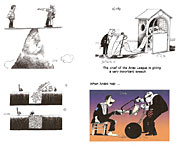
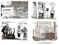
EDITOONERY The Mock in Democracy SPYING INTO THE LIVES, E-MAILS and telephone calls of Americans has preoccupied the Froth Estate and, consequently, editorial cartoonists for much of June.
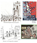
In our first visual aid at the upper left, R.J. Matson offers an inventive image of the U.S. capital building as a listening device, but the next metaphor, Mike Luckovich’s deployment of the airport security apparatus, is even more jolting. Oddly, I could find almost no editoons supporting the necessity of spying in order to achieve something akin to national security. Well, spying is the scandal; there’s no satirical fun in calling for security. At the lower left, Luckovich also captures with a uncompromising visual the brute senselessness of the GOP’s pursuit of the Benghazi situation. The New Yorker cartoons have always had so topical a ring to them that many could well run on newspaper editorial pages. With the cartoon at the lower right, we take a look at the magazine’s reaction to the spy scandal with P.C. Vey’s effort. And in the next exhibit, we see Paul Noth’s take on the usual froth and fulmination about Obama the Socialist Dictator, who knocks over all civilized restraints in his tapping of wires and electronic ether. Below that, Dave Sipress offers a moment of truth about crowdfunding. At the upper right is one of the best caricatures of Barack Obama I’ve seen. The eyes are quite right on Eric Allie’s drawing, but over-all, it’s better than many these days. And below that, a recent masterpiece by David Horsey: the cherub’s caution (“Remember what happened when you made ’em different colors”) takes me to a better place.
PERSIFLAGE AND FURBELOWS Walter Mosley interviewed in By the Book at the New York Times: What were your favorite books as a child? I know that as a working writer I should answer this question in such a way as to make me seem intelligent; maybe Twain or Dickens, even Hesse or Conrad. I should say that I read intelligent books far beyond my years. This I believe would give intelligent readers the confidence to go out and lay down hard cash for my newest, and the one after that. But the truth is that the most beloved and the most formative books of my childhood were comic books, specifically Marvel Comics. Fantastic Four and Spider-Man, The Mighty Thor and The Invincible Iron Man; later came Daredevil and many others. These combinations of art and writing presented to me the complexities of character and the pure joy of imagining adventure. They taught me about writing dialect and how a monster can also be a hero. They lauded science and fostered the understanding that the world was more complex than any one mind, or indeed the history of all human minds, could comprehend.
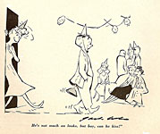
RANCID RAVES GALLERY Pictures Without Too Many Words JUST RAN
ACROSS THIS FABULOUS (hoohah) piece of work when rummaging through an Antique
File. I invented a mock superhero named Zero Hero for the RocketsBlast
ComicCollector when Jim Van Hise was editor. JACK COLE’S
CARTOONS began appearing in Playboy (where he quickly established the
painterly style of color cartoon rendering for the magazine) in the spring of
1954. The cartoon you see in this neighborhood appeared in the May 1957 issue
of Tiger, a Playboy imitator—just a little over a year before
Cole committed suicide.
CIVILIZATION’S LAST OUTPOST One of a kind beats everything. —Dennis Miller adv.
From The Week: College sports coaches are the highest-paid state employees in 41 states, receiving checks that surpass the salaries of governors, university presidents, and doctors and lawyers working in state agencies.
GITMO Forever. One of the first to become a captive at the Muslim Prison in Gitmo is Abdul Rahman Shalabi, 37, who has been on hunger strike since 2005. That means that for at least 7 years, he’s eaten nothing except the liquid nourishment that is forced into him through his nose twice a day. Of the 166 detainees at Guantanamo, about 48 are judged so dangerously dedicated to the extremities of the Islamist cause that they cannot be released because as soon as they are, they’ll start setting off bombs in crowded American shopping malls; nor can they be tried because evidence against them was obtained by torture, or because the troops who captured them didn’t collect any evidence or because they supported al Qaeda before the U.S. made that a crime for foreigners overseas. They constitute a predicament that is, as Time asserted, “the legal equivalent of radioactive waste”: they’ll be prisoners forever. Republicons resist Prez Obama’s proposal to move these prisoners to secure prisons in the U.S. (thereby reducing considerably the estimated $38 million per year that it costs to keep them at Gitmo), arguing that the risk of detainees’ committing future acts of terrorism outweighs the damage Gitmo does to the international reputation of the U.S. What? If they’re in prison—maximum security lock-ups—how can they commit terrorist acts? Are any of these Republicons capable of thinking?
BOOK MARQUEE Previews and Proclamations of Coming Attractions & Short Reviews This department works like a visit to the bookstore. When you browse in a bookstore, you don’t critique books. You don’t even read books: you pick up one, riffle its pages, and stop here and there to look at whatever has momentarily attracted your eye. You may read the first page or glance through the table of contents. All of that is what we do here, starting with—: Forbidden Worlds, Vol. 2: Nos. 5-8 Edited by Philip R. Simon with Foreword by Dan Nadel 190 6.5x10-inch pages, color; Dark Horse Archives hardcover, $49.99 ANOTHER IN THE DARK HORSE series exhuming historic comic book titles from the last spasm of the Golden Age, in this case, 1952 issues of the American Comics Group’s Forbidden Worlds: Exploring the Supernatural. As Nadel notes in his appreciative introduction, “Against the baroque grotesqueries of William Gaines’ EC Comics or the gutbucket horror of Harvey’s Bob Powell/Howard Nostrand stories, ACG was relatively, well, straight.” I think by “straight,” he means a little less sensationally horrifying. Good stories but not pacesetting in gruesome detail. EC has always rightfully worn the laurels for the finest artwork in comics of the period, and in the shadow of that achievement, we forget that other publishers often printed comics in which the drawing was not too shabby, ACG among the foremost. So we’re happy to have this archival project from Dark Horse to remind us of past glories that were only a little shy of glorious. Most of the artists represented in this volume are not well-remembered these days—Lou Cameron, Lin Streeter, Al Camy, George Wilhelms, Pete Riss, Sam Cooper, Paul Gattuso, Sam Cooper, Harry Lazarus, King Ward—but a few ring a bell in the memory—Paul Gustavson, Ken Bald (nice clean covers), and Al Williamson (inked by Roy Krenkel and Larry Woromay). And the reproduction of their drawings herein is mostly decent. Cameron’s bold and crisply rendered pictures, for instance, are sharp and clear (evoking the style of Johnny Craig a little). Williamson, however, does not survive happily. Through much of his early career in comics, Williamson was apprehensive about inking his own pencils: his pencils were superb, and he was afraid of ruining them in the inking. So he usually recruited artist friends to finish his work. But his inkers on the two Williamson stories here do not reproduce well: too many delicate fineline embroideries, and the fillagree gets mashed up and blotchy. Virtually all the rest of the work in this tome survives very well.
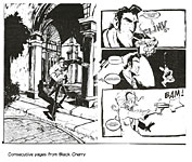
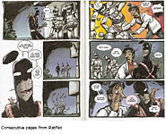
Black Cherry: A Lurid Tale of Sex, Violence, and the Supernatural By Doug TenNapel Approximately 160 6.5x10-inch pages, b/w; Image paperback, $17.99 Ratfist By Doug TenNapel 176 6.5x10-inch pages, color; Image paperback, $19.99 JUDGING FROM
THE BACKCOVER BLURB and the subtitle, Black Cherry is a fairly
straight-forward story of Eddie Paretti, “a down-on-his-luck Mafioso who is so
desperate for cash that he’s agreed to steal a dead body from his own mob boss.
Things only get worse when he discovers the body isn’t human.” The body is that
of an extra-terrestrial being, who turns up, at the end, in the most unexpected
place. There’s also a love story: Black Cherry is an exotic dancer and drug
addict with whom Eddie is in love. She slips in and out of the story, which, at
the end, turns out quite unexpectedly. Along the way, Eddie, like all TenNapel
protagonists, is in constant vigorous motion, running, swinging fists,
brandishing firearms—the usual array. Ratfist, on the other hand, is about a would-be costumed superhero, who, in civilian guise, is Ricky. In its inaugural form, the book appeared a page at a time on TenNapel’s website as he experimented with web comics. TenNapel was careful to give every page some “take-away” quality that a viewer would enjoy. Generally speaking, that results in every page ending on a suspenseful or comedic note, which gives the whole production, now assembled into a single volume, a sort of breathless excitement, an aspect that is wonderfully suited to the headlong dash that is the chief and commendably exciting aesthetic of TenNapel’s works. In
the opening sequence, Ricky resolves to propose to his girlfriend Gina, but during
the dinner at which he plans to spring this surprise, Ricky suddenly grows a
rat’s tail and his face blossoms out with rat’s hair. Ricky dons a mask in
order to hide the hair. From there on, meaning and narrative coherence
deteriorate rapidly into a frenzied rollicking romp of explosive action and
daunting plot twists and looney layouts. And strange beings. Ricky cuts his
tail off, but it acquires a life of its own and wraps itself around him like a
bandolier; henceforth, Ricky (Ratfist) deploys the tail like a whip whenever
he’s not engaging in conversation with it. Or with a rat that rides on his
shoulder most of the time. The story is a manic delight, leap-frogging from one madcap episode to the next without quite resolving the first. There’s a monkey and a cat-faced former boss at the Simian Icthus Institute where Ricky and his lab cohorts are searching for a cure for cancer. Gina, it seems, marries Rick in some other life and they have a child, but she gets cancer. At the end, she seems cured, Ricky’s face loses its rat-hair, and he gives millions of dollars that he’s inherited to cancer research. On the last page of the book, TenNapel supplies what might be a coda for the work, quoting from Ecclesiastes 3:19: “Everything is meaningless.” Or not. TenNapel, who is a conservative Christian, gets God into his stories of late, but not obtrusively—and definitely not evangelically. He’s got some heat lately from more liberal-minded souls, who find his opposition to same-sex marriage reprehensible. I support same-sex marriage (and think civil unions are no substitute for the real thing—nor do they seem to come with all the attendant legal benefits that regular marriage has; they are, therefore, a cheap, petty compromise not worthy of the name), but TenNapel doesn’t seem to be doing anything more than exercising his right to freedom of expression, and that’s okay by me, even if I disagree with his religious views. His expression, on the other hand—his wildly energetic cartooning—captivates me every time.
WOODWORKS
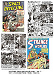
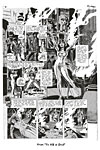
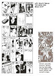
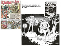
Against the Grain: Mad Artist Wallace Wood Edited by Bhob Stewart 238 8.5x11-inch pages, b/w with 14-page color section; 2003 TwoMorrows Limited Edition, hardcover, $59.95 Wally’s World: The Brilliant Life and Tragic Death of Wally Wood, the World Second-Best Comic Book Artist by Steve Starger and J. David Spurlock 224 7x10-inch pages, b/w with a color section; 2006 Vangard hardcover, $34.95 WoodWork: Wallace Wood, 1927-1981 342 9.5x12-inch pages, color throughout; 2012 IDW hardcover, $59.99 WALLY WOOD, OR “WOODY” as his friends called him (he never liked “Wally”), undoubtedly deserves three books. Even more. If you need some sort of justification, then you don’t know Wood’s work. Here, from Bill Mason in Against the Grain, is a hint about what you’ve missed: “After spending most of 1951 [the first year of his work for EC Comics] restlessly changing his style, alternately refining and coarsening the self-assured, effortless-looking manner of his early New Trend stories, Wallace Wood suddenly, in the May-June 1952 issues of EC science-fiction and war titles, brought eye, heart and mind into perfect synch and emerged as one of the great masters of comics illustration. [His stories of that period] are more than the first fruits of Wood’s hard-won technical mastery: they are graphic expressions of everything Wood knew and felt about life and art, and harbingers of a period of artistic growth and achievement that lasted almost [all of the next] three years.” I first encountered serious efforts at Wood biography in Nos.7-13 of Outre magazine (1997-98), in which David J. Hogan did his best with the text, and the publisher, printing on porous newsprint, did the worst he could do with tiny bits of Wood art. All of these books are better than that—heroic as it was back then; but the books at hand are not equals. The
text in Against the Grain consists of essays by many of those who knew
Wood, including Stewart and others who worked with Wood in his studio. Some
“essays” are transcripts of recorded interviews—with John Severin, for
instance, and Al Williamson. In the opening chapters, Stewart provides a
biographical overview, including lots of pre-pro Wood art. Wood’s try-out page to do Prince Valiant is here, but his notorious “Disneyland Memorial Orgy” done for Paul Krassner’s Realist (printed as the center spread in the issue for May 1967) is missing—although, perversely, Krassner, one of the essayists, described how the infamous art came about (“the most pirated drawing in history,” Wood called it). Stewart and his cohorts were doubtless trying to be discrete. They apparently did not want to besmirch Wood’s towering reputation by printing any of the brasher undertakings of his later years—no Sally Forth (one of the more voluptuous of Wood’s ever sensuous wimmin in a refreshing comedy of sf and perpetually naive disrobing), only a few panels from Cannon, Pipsqueak Papers, and The World of the Wizard King; nothing at all from Wood’s contributions to porn magazines. That
Wood was himself much less restrained in depicting the erogenous dimensions of
female characters—and doubtless enjoyed doing so—is evident in the drawings he
made while a teenager. As a teenager myself once, I shared his enthusiasm, and
took lessons in the limning of the curvaceous gender from his rendering of such Mad wimmin as the Draggin’ Lady in “Teddy and the Pirates” (Mad No.6, August
1953). Wood’s sharply angular way of drawing women’s knees when shapely legs
were bent was particularly instructive. Years later, I sent in “dues” to join one of the clubs Wood had conjured up as a fund-raising scheme; you joined, and he sent you an original drawing, and with my drawing, he sent a note, asking me what I thought of pornographic cartoons. I replied that there was no such thing as a pornographic cartoon: cartoons are either funny or they’re not. And if they’re not, then they’re not cartoons. Despite the book’s shortcomings, it is copiously illustrated and the essays provide critical analyses of Wood’s work, biographical detail, and insight into his complex personality.
Wally’s World worthy for its text rather than its pictures. The text seems a somewhat novelized recitation of the facts of Wood’s life and career—early partnerships with Harry Harrison and Joe Orlando, work for Avon, Fox, Trojan; then EC Comics, Will Eisner’s Spirit, then, after the Wertham collapse, Marvel, Tower, Charlton, Warren, Topps, followed by risque strips for Cavalcade and other magazines, then Wood’s Witzend. But the authors quote Wood’s friends and associates as factual underpinning, making the work reasonably trustworthy despite its occasional flights of narrative imagination (especially in regaling us with the stories of Wood’s youth). The art, alas, is reproduced in snippets and minuscule fragments. A 32-page color section reproduces covers mostly. Nothing much about his Overseas Weekly work (Sally Forth, Cannon); the Disney Orgy is here, but no other erotica worthy of the name. The book’s opening chapter is a detailed description of the death scene at Unit 71 of the apartment building at 15150 Parthenia Street in Van Nuys, California, where Wood was living when he committed suicide rather than (it is supposed) endure endless dialysis treatments for a failed kidney. Grim way to begin a book, but Wood’s finish is somehow an appropriately poetic end to a brilliant career that went into decline with his health.
Woodwork is a much more elaborate publication than either of the other two. Its origin is as a sumptuous catalogue for an exhibit of Wood’s art at the Casal Solleric in Palma de Majorca in the fall of 2010. Contributed by Bill Pearson, Roger Hill, and Jerry Weist, the text, assembled (as was the show) and edited by Florentino Florez, appears in both English and Spanish. Biographical details seem as numerous as in Grain, and while the latter offers greater insight into Wood’s working methods and personality, Woodwork is at least as comprehensive as Wally’s World. The great achievement in Woodwork is in the presentation of Wood’s art. The page size permits much more lavish display of the art, including several complete stories, reproduced from the original drawings— Wood’s famed “My World,” for instance, but also “Trial by Arms” from Two-Fisted Tales, “Flesh Garden” and “Prince Violent” from Mad, and “To Kill a God” from Vampirella, to name a few. And the original art “look” here is nearly—but not quite—as evident as it is in, say, the gigantic Mad Artist’s Edition. (I don’t know why people buy these “artist’s edition” tomes: the original art is shot “in color” so every blemish—white-outs, glue-stains of paste-overs, pencil under-drawing—is visible. That makes the pages in an “artist’s edition” as close to being “original art” as it’s possible to be without actually being original art. Yes, I’ve bought a couple—Neal Adams’ Thrillkill is the other one—and, yes, you can see the pencil under-drawing; still, that’s not the same as having the original art. In the original, the inked lines still gleam, and you can see—and feel—their texture. A foolish obsession, surely; but a real one nonetheless.) Color runs throughout the book, which permits the art to be displayed nearest the text discussing it instead of wadding it all up in a color section to be winnowed out by the reader later. And virtually all of the comic book pages are reproduced large enough to read. The Disney Orgy is on display—as are several pages of Sally Forth and other late Wood works of an erotic (not to say “pornographic”) nature.
COMPARING THE THREE BOOKS, I’d say Against the Grain is the best text treatment of Wood. Woodwork is just fine in this aspect, but it lacks the testimony and insights supplied by all those witnesses whose essays appear in Grain. Wally’s World is okay, but it has the aura of a primer rather than an authoritative document. Woodwork is superb for the artwork alone; and it is probably at least equal to Wally’s World’s in text. (I suspect, in fact, that Woodwork’s text is superior, but having not read either, word for word, I hesitate to pronounce one noticeably better than the other.) But to evaluate the presentation of Wood’s artistry in pictures, we don’t need to read every word: just looking at the pictures is enough to anoint Woodwork a superlative production. Grain has a lot of pictures in it, but it’s printed on matt-finish paper, and the glossy pages of Woodwork present drawings much better. And the array in Woodwork is much more complete than in Grain. In the immediate vicinity, I’ve posted a non-judicious sampling of Woodwork, dwelling, forgivably I hope, on Wood’s penchant for lavishing lines on the opposing sex. It was (and is) my penchant, too, and it’s instructive in its own lascivious way. Enjoy.
Despite the differences among the three tomes, I’m glad I have all three here on the shelves of the Rancid Raves Intergalactic Library: each contributes to our knowledge and understanding of one of the greatest comic book artists of the last century. Before we leave Wood, however, here’s one more WoodWork to contemplate—:
Came the Dawn and Other Stories Illustrated by Wallace Wood Edited by Gary Groth with an Introduction by Bill Mason 208 7x10-inch pages, b/w; Fantagraphics hardcover, $28.99 THIS VOLUME REPRINTS 26 of Wood’s EC Comics stories, including the sexually charged title story in which a shapely blonde is depicted in a way that suggests her sweater and jeans are pasted (or painted!) on. The stories are printed in chronological order, running the gamut of Wood’s EC career, beginning with “The Werewolf Legend” from The Vault of Horror No.12, April-May 1950, and ending with “The Confidant” in Shock SuspenStories No.15, June-July 1954. With the evidence laid out in this fashion, we can watch Wood mature as an artist, and Mason’s introduction is a discerning guide. The earliest of the stories here are Harry Harrison-Wood collaborations, and it isn’t until “Death’s Double-Cross” from 1950 that characteristic Wood marks begin to emerge; still, some of the art looks more like primitive Johnny Craig that Wood. But by the spring of 1951 in ”So They Finally Pinned You Down,” it’s all Wood. Oddly perhaps, none of the stories Mason identified in Against the Grain as pivotal in Wood’s artistic growth are included here. Perhaps because those stories were sf or war stories; all these tales are horror and supernatural, plus some of the famed sociological screeds—the latter (publisher Bill Gaines called them “preachies’), mostly from Shock SuspenStories (notably, “The Guilty,” about racism, and “Hate,” about anti-Semitism). In late 1952's “Hate,” we see at last the characteristic Wood shading and highlighting of facial features and seductively draped female figures, wearing nearly transparent gowns. The artwork in the stories is carefully, faithfully, reproduced, and Mason’s guidance is expert and thoughtful. The book’s only flaw—a minor one—is that the Table of Contents does not date the stories; and the dates don’t appear on each story’s first page either. The dates and the titles of the comic books in which the stories were first published appear in a tiny type list on the reverse of the title page. Adequate for historical purposes, no doubt; but it should be easier to find dates in a chronological compilation, one of the appeals of which is to watch the artist’s skill grow over years.
Halloween Classics: Graphic Classics, Volume 23 Edited by Tom Pomplun 144 7x10-inch pages, all color; Eureka Productions paperback, $17.95 Native American Classics: Graphic Classics, Volume 24 Edited by Tom Pomplun; associate editors John E. Smelcer and Joseph Bruchac, noted Native American authors 144 7x10-inch pages, all color; Eureka Productions paperback, $17.95 WITH THESE TWO VOLUMES, Eureka’s shelf of adaptations of classical works of literature reaches two dozen. Although many of the previous volumes feature works by the same author (Edgar Allen Poe, Arthur Conan Doyle, H.G. Wells, H.P. Lovecraft, Ambrose Bierce, Bram Stoker, Mark Twain, R.L. Stevenson, Jack London, O.Henry, Oscar Wilde, Rafael Sabatini, Louisa May Alcott), others, like the two at hand, are thematic compilations (horror, gothic, fantasy, science fiction, westerns, Christmas). Pomplun’s formula remains the same here: he assigns specific works to an assortment of writers and artists for adaptation to comics format. The earliest volumes in the series were black-and-white; the ones here—and many of the more recent productions—have been in glorious full color, with glossy covers and sparkling interiors. Halloween Classics offers five tales, including Washington Irving’s “The Legend of Sleepy Hollow,” Arthur Conan Doyle’s mummy musing, “Lot No.249,” Mark Twain’s “A Curious Dream,” and H.P. Lovecraft’s “Cool Air.” The longest piece in the book is a treatment of the silent film “The Cabinet of Dr. Calligari,” illustrated by Matt Howarth. Extending the theme of the volume are storytelling flourishes evoking the horror fantasy titles of EC Comics: each story is introduced by Mort Castle, whose text is illustrated with ghoulish characters drawn by Kevin Atkinson. The cover bears a vaguely familiar logo, which, upon closer inspection, is not EC but GC. Touches like this distinguish Eureka publications. Among the adapting artists are two of my favorites—Shepard Hendricks on Irving’s headless horseman and Simon Gane on Doyle’s mummy. Craig Wilson, who draws the Lovecraft tale in deep shadows that sculpt shapes so cleanly they seem carved from ice, is new to me, but I’m glad to make his acquaintance. In these stories—as with virtually all Graphic Classics I’ve seen—the adaptations are not merely illustrated excerpts from the original prose but visual-verbal interpretations in which the pictures contribute narrative information to the speeches and captions. These are, in other words, true comics treatments, in which the words and pictures blend for a narrative meaning that neither the words nor the pictures alone achieve without the other. And the drawing styles of the artists contribute to the meaning of the tales. Twain’s “Curious Dream” about the exodus of the skeletal remains from a graveyard because the town has neglected its upkeep is a humorous satire, and Nick Miller’s pictures are appropriately bigfoot in manner. Wilson’s shadow-shrouded pictures, on the other hand, are aptly suited to spooky Lovecraft. Native American Classics is a somewhat more ambitious project for Pomplun: first, because it draws upon classic folktales likely unknown to most American readers; and second, because it involves a literary culture Pomplun is not intimately knowledgeable about, he recruited associate editors familiar with the field. John Smelcer, a member of the Alaskan tribe Ahtna, is one of the last speakers of his severely endangered Native language and is the author of more than 40 books. Joseph Bruchac of the Abenakis has spent much of a 45-year career as writer, editor, storyteller and musician, attempting to preserve indigenous languages and cultural traditions. Many of the writers and artists in this volume, however well-known in their cultural milieu, are not household words elsewhere (although Terry Laban, with his wife, produces a King Features syndicated daily comic strip, Edge City). Some of the folk tales are serious, even tragic; others are highly comic. And the drawing styles, as usual, echo the tenor of the tales. Pat N. Lewis, for instance, illustrates “The Story of Itsikamahidish and the Wild Potato” in a comedic manner (almost Chuck Jones) suited to a story about flatulence and how to avoid it. And Marty Two Bulls Sr., an Oglala Lakota who last year won the Sigma Delta Chi award from the Society of Professional Journalists for his editorial cartooning, deploys a similarly comic style for a humorous two-page story about a braggart of a mountain man who receives his comeuppance from a wooden statue of a Native American. On the other hand, Cherokee Roy Boney, Jr. draws “How the White Race Came to America” and colors it in a painterly fashion appropriate to a tragic tale of how European culture contaminated that of the Native American. The book also includes several poems, all illustrated in suitable moods. As I’ve said before, the Graphic Classics are among the finest productions in cartooning arts around these days. I wanted to know more about how it all came out, so I asked Tom Pomplun. Here’s how that inquiry turned out—:
TURNING LITERARY CLASSICS INTO CLASSY COMICS Tom Pomplun and Graphic Classics IN JANUARY 2003, James Bickers at the Louisville Courier-Journal talked to Tom Pomplun and produced the following insightful contemplation (in italics): For longer than anyone cares to remember, children of all ages have been pulled toward that magical alchemy of story and sketch, the perfect blend of eye candy and mental stimulation: the illustrated story, or, to put it more bluntly, the comic book. Comics have always had a tough time getting the respect they deserve. By and large, our culture views illustrated stories as somehow lesser than the "real thing," a frivolous entertainment that is just a thin notch above watching television. Devotees of the art form know better. There is real artistry here, and real magic. Even simple superhero tales are often crafted with love and expert care, much more than just a juvenile pursuit. ... But while many publishers busy themselves creating books that they know will be read surreptitiously, tucked inside a copy of Poe or Hemingway for cover, a small handful of others take a different path: why not take the "real books" themselves and illustrate them? Certainly the most memorable example of this was the Classics Illustrated line, published from 1941 to 1971 by the Gilberton Company. The stories featured in the series spanned the shelves of Required Reading: beginning with Dumas’ The Three Musketeers in 1941, the series would offer illustrated versions of Dickens, Robert Louis Stevenson, Victor Hugo, Cervantes, Jonathan Swift, Nathaniel Hawthorne, Lewis Carroll, Poe, Eliot, Longfellow, and dozens of others. For countless young people (and adults, too), Classics Illustrated was a turning point: an example of how literature that was "good for you" could also be a crazy amount of fun. Enter Tom Pomplun, a Wisconsin-based graphic designer. Pomplun was an ad agency art director for about 25 years, and for ten of those years, he designed and produced (but was not publisher of) Rosebud, a Wisconsin literary magazine he started with a couple of friends in 1993. Although Rosebud was a journal of fiction and poetry, Pomplun also worked to make it a showcase for a broad range of visual arts. In 2000, Pomplun assumed “temporary editorial control” with No.18 of the magazine, and he assembled the “Rosebud Cartoon Issue,” featuring both reprint and original comics and panel cartoons by artists including Robert Crumb, Joost Swarte, Mitch O’Connell and Mark Nelson. From that issue on, Pomplun always included comics as part of the literary mix, along with the fiction and poetry, with work from Jack Jackson, Roger Langridge, Brad Teare, Skip Williamson and others. Rick Geary and P.S. Mueller became regular columnists. All of which conspired to lead to the founding of Graphic Classics. “While I had a free hand with the art content in the magazine,” he told J.L. Comeau at countgore.com, “I wanted a venue where I had more control over the editorial matter.” So he resigned from Rosebud and, in 2001, created Graphic Classics. “You don’t have to spend much time talking to Tom Pomplun to realize what a lover of literature he is,” said Bickers. “Like most ardent bibliophiles, the walls of his house are lined with shelves of countless volumes of every sort. It is this love for books, and the effect they have on us, that drives him to create his lovingly crafted editions.” Rob Thomas of the Capital Times in Madison, Wisconsin, visited the Pomplun lair and reported: “The walls of Tom Pomplun's lovely 123-year-old farmhouse are decorated with two kinds of artwork. One kind is the beautiful paintings by his wife, Georgene. The other is comics and illustrated art. Pomplun has had a lifelong love of comics and cartoons. The works of Robert Crumb, Madison artist Andy Ewen (who plays in the local band Honor Among Thieves) and others are everywhere in his house.” Clearly, Pomplun is no literary snob, Bickers observed. Said Pomplun: “I wanted Graphic Classics to concentrate on the books people want to read, not the ones they feel obliged to. Unlike the original creators of Classics Illustrated, I am not on a mission to promote literacy, nor to preach to children to ‘read the originals.’ My sole purpose is to entertain. I am directing these books at a contemporary, adult audience.” “In starting the series,” he continued in a letter to me, “I was of course inspired by my childhood memories of the Classics Illustrated comics. I wanted to do something similar, but in book form (graphic novels as a category did not really exist at the time) with a more contemporary and stylistic approach to the material. I also wanted to concentrate on short story anthologies, rather than novel adaptations. In that way, I can get a lot of different stories into one volume, and get a lot of different styles of art. “I began with author-specific collections,” he went on, “but later added the genre and thematic collections. This was partly so that I could include some more obscure, but still worthy authors. I also felt that I needed to constantly innovate and try new twists on the classics adaptations to stay ahead of my competition. When I began Graphic Classics there were no other publishers regularly doing comics adaptations of classics. Now there are over a dozen publishers, all of them larger than me, doing series. I need to constantly stay ahead of them to survive.” Pomplun at first leaned in the direction of adapting works that fall into the genres of adventure, horror, comedy and science fiction. “These are stories that I believe lend themselves best to illustration and comics adaptation,” he told Comeau. “And of course the choices reflect my personal tastes. There are many classic authors whose works I greatly admire, but whose stories would not make good comics. I want to do comics that can add something to a story, rather than just reiterate it. This was a problem with the original Classics Illustrated and similar series. They too often turned exciting literature into dull comics. While Graphic Classics may never reach perfection, I promise they will never be dull.” "I love comics,” he said to Thomas, “but not all stories lend themselves to that. I try to be really sensitive to what's going to best illustrate a story, whether it's adaptable to comics form or whether it would do better as an illustrated story. And then there are some stories that I really loved that I didn't think would be helped by either. For example, I'm working on a Jack London volume, and probably one of his most famous stories is 'To Build a Fire.' I really looked at that story and wanted to get it in there, but I just couldn't see a way to illustrate it that would add to the text. Jane Austen's stories might make good films, but in comics they would be a succession of talking heads in parlor scenes." (To which reporter Conklin quipped: “Now that's sense and sensibility.”) In his letter to me, Pomplun explained his procedures. “The themes for the volumes and the stories adapted are all chosen by me, through very extensive reading. About 90% of the potential stories I read are rejected, mostly because I feel they will not make a good transition to comics. Most are in the public domain, due to budgetary restrictions, though I occasionally license a more contemporary story. The exception is collections such as African-American Classics and Native American Classics, where I do not feel qualified to make all the content selection by myself. In those cases, I brought on associate editors with expertise in the particular field to help me make content decisions. “Once the stories are chosen, I then estimate page length for the comics adaptations, and assemble a selection to make a 144-page book, standard for the series. I decide which stories I will script myself, and assign other adaptations to my pool of scripters. I then start matching stories to artists.” Pomplun has degrees in both fine and commercial arts and has studied illustration at the Art Institute of Boston, but he feels more competent as a designer and typographer than as an illustrator. So he relies upon other artists and cartoonists to draw the stories he selects. “As I read the stories I try to visualize them in different styles. How would this look illustrated by Richard Corben, or how would this work illustrated by Hunt Emerson? I have a large and continually growing list of artists with whom I have already collaborated as well as artists that I hope to work with in the future. When I have chosen a story I go down the list, trying to visualize it done by each artist. Usually one jumps out as the obvious choice, though occasionally that choice doesn’t present itself. In that case I start doing research, going through publications and searching the internet until I find the artist I think can best do the story. “When I started the series I largely drew on a pool of artists that I had worked with on Rosebud. This included Rick Geary, Skip Williamson, Lisa K. Weber, Toni Pawlowski and others. I search the web and comics anthologies for additional recruits. To date, over 200 artists and scripters have contributed to the series, so I now have a large talent pool to draw from, though I always welcome new talent. And I still have to do much research when I am looking for specific types of artists for a book, like the Black artists for African-American Classics and the American Indian artists for Native American Classics.” Pomplun reviews the art at the pencil stage. When the final renderings come in, he assembles the books. “The artists, like the story choices, reflect my personal tastes,” he told Aaron Weilsbrod at newsarama.com. “Having come at this from my experience on a literary magazine, I am something of an outsider in the comics field. I grew up on comics, and still read and collected them avidly into my 20s. But I reached a point where I became bored with the repetitiveness of the stories and the sameness of the art. I was also turned off by the growth of comics collectors and the culture of the comics shops and trade shows. I grew up in a time when comics were something to be folded-up, tucked in your pocket, and passed around and shared —not something to be sealed in a plastic bag to improve its speculative value. I stopped buying mainstream comics and concentrated on the undergrounds, which I found much more interesting and inventive. When that scene died out, I pretty much stopped reading comics until recent years, with the growth of the small press and independent books.” He continued: “I have little interest in the mainstream and superhero comics, which I think generally, have a rather homogeneous look, with all the artists copying whoever is currently ‘hot.’ Things seem to have loosened up a bit in the last few years, probably because of the influence of Japanese manga, but to me those also tend to all look pretty much the same.” In his interview with Comeau, Pomplun noted an unanticipated benefit he discovered in a seeming limitation: “While the necessity to utilize public domain material seemed at first a restriction, it has opened my eyes to a vast wealth of turn-of-the-century literature that I had not previously read. And I have made an effort to dig out some relatively obscure pieces from each of the authors. This is most evident in the Jack London book which features many of his little-known short stories, rather than his more famous novels. As the series progresses and (hopefully) begins to turn a profit, I would like to expand into literature still under copyright. “While this is a small business, operating from my home, I was determined to produce a product that I feel can compete on a quality level with anything from the large publishers. While I have no staff, I am greatly aided by my wife, Georgene, who is a painter and graphic designer. She provides not only moral support, but also valuable advice as she was for twelve years the art director of a mid-size book publisher in Chicago. And she is a great proofreader. Additional proofreading assistance is provided by Eileen Fitzgerald, a professional editor for University of Wisconsin Publications. And I have had much advice and support from the series’ artists and writers, especially author Mort Castle, who contributed bios of Jack London and Ambrose Bierce. I have made a number of contacts in the comics industry who have been helpful, particularly Patrick Rosenkranz, author of the underground comix history Rebel Visions.” For a cottage industry, the product is superb. But maybe that’s not at all surprising: cottage industries, after all, are almost always labors of love.
MOTS & QUOTES From Playboy Interviews “I would take great pleasure in the pride that would come to the black community if there were a Negro in the White House. I think it’s worth working for.”—William F. Buckley, May 1970 “I don’t need bodyguards.”—Jimmy Hoffa, December 1975 “The human race may well become extinct before the end of the present century.”—Bertrand Russell, March 1963 “When I was 16 years old, I fucked Warren Beatty. Just like that. I did it because my girlfriends were so crazy about him and so was my mother.”—Cher, December 1988 “What’s the fucking point of crashing, burning and rising like a phoenix out of your own ashes into the same exact fucking thing you were before, sans drugs or alcohol? What’s the value in that?”—Robert Downey, Jr., December 1997 “When lip service to some mysterious deity permits bestiality on Wednesday ad absolution on Sunday—cash me out.”—Frank Sinatra, February 1963
MOVIE REVIEW The Illusionist (2010 British-French animated film directed by Sylvain Chomet (“The Triplets of Belleville”) add stuff from NewsOp IT’S BEEN
SIXTY YEARS since I saw “Mr. Hulot’s Holiday,” but I recognized in the title
character of this film the caricature of Jacques Tati that is intended. Not
only is Tati’s face on display, but his body language is captured precisely—the
classic Hulot pose with hands on hips; the way he walks, leaning forward
slightly as if walking against a high wind. As a final giveaway (though it is
scarcely needed), the character’s stage name is Tatischeff, Tati’s name at
birth. I don’t usually review animated cartoons, I realize—and, in fact, I don’t usually see them anymore—but this one’s debut in 2010 was heralded by such glowing reviews (Roger Ebert called it “an extension of the mysterious whimsey of Tati ... the magically melancholy final act of Jacques Tati’s career”) that I have been long tempted and at last surrendered and rented a copy from Blockbuster. And I’m glad I did. The story, based on a script by Tati, is straightforward. In 1959, a stage magician (the “illusionist”) finds his career evaporating as rock bands displace old vaudeville acts in theaters. He persists, nonetheless, plying his craft in smaller and smaller venues—cafes, bars, private parties. On a remote Scottish island, he encounters a young “Cinderella” chambermaid named Alice who is captivated by his “magic” and he is charmed by her unembarrassed worship. He buys her a new pair of shoes, and she follows him when he leaves. His next gig is at an out-of-the way theater in Edinburgh, and the pair take a room in a rundown guest house where other remnants of vaudeville’s past glories reside—a trio of acrobats, a clown, and a ventriloquist. The illusionist sleeps on the couch, and Alice sleeps in the bedroom and keeps house, making meals, which she often shares with the other residents. The illusionist keeps buying Alice gifts—a luxurious coat, high-heel shoes, dresses—and soon must moonlight at menial jobs in order to replenish his purse. But his gift-giving outstrips his bankroll, and he soon has nothing more to give. Meanwhile, Alice finds a boyfriend, and when the illusionist sees them together, he decides to leave Edinburgh and Alice, and when he does, he leaves Alice a note: “Magicians do not exist.” The illusion is shattered for Alice, but she has a new one: she moves in with her boyfriend. We last see the illusionist in a compartment on a train, where he declines to perform a magic trick for a child. The film contains several sly allusions. The illusionist wanders into a theater one day, and on the screen, we see “Mon Oncle,” Tati’s celebrated film, playing—in live action, with Tati on view. And when the illusionist is performing at the Scottish pub, one of the patrons in the foreground, near the middle of the frame, is the famous "Young Girl and Old Woman" optical illusion. And then (pure delight) a license plate on a passing car reads "F U 2 BUSH.” The numbers on the Texan's car brought into the mechanic's shop actually spells out "Big Ass.” And when the illusionist and the girl are eating fish and chips in a sidewalk café, the menu items, featuring haggis, on the wall behind them are almost identical the menu items given by the waitress in Monty Python's famous "Spam" sketch. The film has the kind of poignant sad-but-laughable quality that distinguishes Mr. Hulot’s adventures. But it is otherwise a technical triumph, which is what impressed me most about it. The animation is by hand, and it is unusually complex and detailed. In crowd scenes, for example, background characters move; in most animations, only the principal characters move much. And the locales are marvelously authentic. Architectural details abound in Edinburgh street scenes; landscapes are dreamlike pastoral retreats. As the illusionist travels to Scotland, he takes a ferry across a lake, and we see tiny gulls flying over the boat. The film cost $17 million, according to Sylvain Chomet. One report said 180 creative personnel worked on the film; Chomet said 300 people and 80 animators. Tati wrote the script in 1956, and it is widely assumed that it is a letter, a sort of apology—a plea for reconciliation— written to his first daughter, born out of wedlock, whom Tati abandoned and never recognized, perhaps because he was then, in 1942, ashamed to admit the affair that resulted in her birth. In the film, “Tatischeff” does for Alice all the things Tati wished, in retrospect, he had done for his first-born.
BOOK REVIEWS Critiques & Crotchets Daggers Drawn: 35 Years of Kal Cartoons in The Economist By Kevin “Kal” Kallaugher 190 10x12-inch pages, b/w and color; paperback in a slipcase; Chatsworth Press, $35 A GIANT BOOK for a giant talent is the succinct way to describe this impressive collection of editorial cartoons, elegantly designed by Dellon Design’s owner, Glenn Dellon, Kal’s one-time intern. Although The Economist is an international news magazine, it is published in Britain, and Kal was born in Norwalk, Connecticut, an unlikely teaming. Upon graduating from Harvard in June 1977, Kal went to England to lead a bunch of American teenagers on a bicycle tour of the island. After the tour was done, he found a job as coach/player with the Brighton Basketball Club, but the job paid not much, so he devoted his spare time to caricaturing tourists on the famed Brighton pier and in London’s Trafalgar Square. At the end of the basketball season, he knocked on magazine doors, seeking cartooning opportunities. He found one at The Economist, which was looking for caricatures. Kal’s first “weapon of mass distortion”—caricature— appeared in the issue for April 8, 1978. Within a few years, Kal was doing covers for the magazine (140 so far), and he continued doing caricatures and covers even after returning to the U.S. to take a position as staff editorial cartoonist at the Baltimore Sun in 1988. Ten years later, he started doing visual commentary for The Economist, too, becoming the magazine’s first editorial cartoonist in its 145-year history. He continued his British gig even after the Sun let him go in an economic retrenchment in 2005; the Sun has since, recently, re-engaged with Kal, and he now does a weekly cartoon for the newspaper. After he left the Sun, Kal became artist-in-residence at the University of Maryland Baltimore County. The story of this book’s publication is a much less tortuous tale than Kal’s life story. Kal launched a Kickstarter campaign to raise the $20,000 that he estimated would be needed to produce a commemorative volume of his Economist cartoons to celebrate his 35th anniversary with the magazine. In the allotted 30 days, his project raised $100,219 from 1,462 backers—more than enough to publish the book he envisioned; so instead, he produced this sumptuous repast, culling some of his best cartoons from the estimated 8,000 cartoons and caricatures he’s done in nearly four decades. The Editor-in-Chief of The Economist, John Micklethwait, provides an insightful and orientating Introduction. “Every Economist editor needs a Kal,” he begins. “For all the concentration on words at the magazine, nothing unhinges an editor’s mind more than a cover subject that seems impossible to illustrate.” Faced with this dilemma repeatedly, his solution was simple: “Call Kal.” Micklethwait remembers November 2000: with the world waiting on Florida to determine the results of the Gore-Bush presidential contest, “there was no time, the result was unclear, panic was setting in. Until, of course, my predecessor called Kal. ... There is no subject that defeats or unnerves the moustachioed man from Baltimore.” And we have only to look at a half-dozen Kaltoons to realize just how accurate Micklethwait’s assessment is. The ingenuity of Kal’s visual contrivances is stunning; the copiousness of telling detail, awe-inspiring; his mastery of color and crosshatching, nearly overwhelming—particularly considering that most of the final art is done virtually overnight, in 24 hours or less. Here, at the corner of your eye, we begin a short gallery of Kaltoons, starting with the punning cover of the book (itself a notable example of the sort of quirky inventiveness that underpins many of Kal’s cartoons) and Kal’s solution to the November 2000 dilemma posed by the Gore-Bush standoff in Florida (note their weapons, another kind of visual pun). The Economist’s editorial beat, as you can see, treads a hunk of U.S. turf as well as international political geography beyond England’s shores.
The Graphic Canon: The World’s Great Literature as Comics and Visuals: Vol. 2 Edited by Russ Kick 500 8.5x11-inch pages, some in color; Seven Stories Press paperback, $34.95 THE PURPOSE OF THIS SERIES, which is already up to a third volume, is to show persuasively how great works of literature can be adapted into comics form or visual interpretations. Russ Kick allows that Tom Pomplun’s Graphic Classics (see above) “has published over twenty volumes of consistently high-quality comic adaptations of literature with each 144-page book devoted to a single writer or genre ... but up to now,” Kick continues in his Introduction to this book, “no one has brought together a huge variety in one place.” That’s what he set himself to do. And judging, as he does, from the success of the first volume, he achieved his purpose: “Not only did I set out to find the best artists I could, I wanted a blistering diversity of styles and approaches.” And Volume 2 repeats that success. The literary works embraced by this tome span the 19th century in the order in which they were initially published—from Samuel Coleridge’s “Kubla Kahn” and “The Rime of the Ancient Mariner” through Jane Austin’s Pride and Prejudice and Lord Byron’s “She Walks in Beauty,” John Keats’ “O Solitude,” fairy tales by the brothers Grimm and Hans Christian Andersen, Charles Dickens’ Oliver Twist, Edgar Allan Poe’s “The Raven,” the Brontes’ Jane Eyre andWuthering Heights, Herman Melville’s Moby Dick, Walt Whitman’s Leaves of Grass, Dostoevsky’s Crime and Punishment, Mark Twain’s Huckleberry Finn, Ambrose Bierce’s “An Occurrence at Owl Creek Bridge”—even Charles Darwin’s On the Origin of Species—to name a few of the 51 works adapted. Although Russian and American literature is represented, the book more thoroughly treats of British literature. Each undertaking is prefaced by a short text from Kick, who acknowledges the work’s place in literary history and introduces us to the artist. Most of the longer prose pieces have only small portions adapted. In Huckleberry Finn, for instance, J. Ben Moss presents only Huck’s crisis of conscience in Chapter 16 wherein he decides not to betray Nigger Jim to runaway-slave hunters. And for Moby Dick, Matt Kish offers highly expressionistic interpretations of an assortment of individual paragraphs, quoted directly from the novel, making no attempt to present a narrative. Only Part Two of “The Ancient Mariner” is adapted—and by Hunt Emerson, one of the most brilliant of Britain’s cartoonists. Unhappily for Coleridge’s grim poem, Emerson is bigfoot comedy incarnate, and his adaptation gives the poem a hilariously funny patina. Also highly inventive. Illustrating the passage in which the becalmed ship is “as idle as a painted ship upon a painted ocean,” Emerson deploys a “paint by numbers” picture of the ship sailing into a picture frame. Brilliant but scarcely in the spirit of Coleridge’s poetry. Similarly, Emerson turns Keats’ “O Solitude” into a comic strip with the emphasis upon comic. I’ve long contended that poetry does not adapt well to cartoon artistry—or, even, to any sort of visual interpretation. It can be done, of course, but the beauty of poetry is in its use of words, not pictures. Pictures that attempt to interpret poetry become just pictures, standing on their own without much reference to the poems. David Lasky’s interpretation of Byron’s famed “She Walks in Beauty” is sensitive and well done. But it isn’t Byron’s poetry. The poem’s opening line—“She walks in beauty like the night”—is a hauntingly vague yet somehow exact evocation of feminine beauty. No picture can do that as well as Byron’s words do. But even with poetry, there are exceptions. Lewis Carroll’s “Jabberwocky,” for instance, is a nonsense verse, and Canadian Eran Cantrell’s treatment—antic silhouettes tracing the poem’s action—adroitly echoes the mood of the poem; and since the poem is very nearly all mood, her interpretation is masterful. Visual interpretations like Matt Kish’s of Moby Dick are often insightful, and they usually give new meaning to the work interpreted. But such enterprises are exercises in imagery, not storytelling. Kick means no more with these instances, of course, but sometimes even the “comics” or storytelling adaptations fall short of good cartooning. Kevin Dixon’s treatment of Chapter 9 of Oliver Twist is entirely pantomime, and his drawing style here is grotesquely bigfoot as he shows us Oliver’s introduction to the pickpocket trade by Fagin. Aspects of the fun-loving youthful atmosphere among Fagin’s juvenile cohorts are aptly echoed in the pictures, but without words (and without Kick’s text introduction) it is impossible to know what, exactly, Oliver is doing when he lifts a handkerchief from Fagin’s pocket. Huxley King’s adaptation of a chapter of Pride and Prejudice is done in an extremely decorative manner, evoking, perhaps, the highly mannered life style of the Bennets, but the pictures add nothing to the verbal content except decoration. And J. Ben Moss’s treatment of Huck’s agonies in Twain’s moral masterpiece adds nothing to the crisis described in words—except several pictures of a teenage boy’s facial expressions, all reflecting simply his emotional distress but little of the moral contradictions he was confronting. Tim Fish’s interpretation of the first half of Wuthering Heights, however, is much more successful. Narrative breakdowns pace the action for dramatic effect, and the pictures often add story elements and atmospherics not present in the words of the speech balloons and captions. In adapting “Owl Creek Bridge,” Bierce’s short story famed for a crucial shift in narrator perspective, Sandy Jimenez does a superb job without words, his final picture as much of a jolt as Bierce’s prose gave the reader in the original. Kick’s offerings often do not translate prose into verbal-visual storytelling; the pictures merely illustrate, they do not help tell the stories. And most of the works are represented only in excerpted bits. But the series is a wonderfully ambitious project, and the books are elegantly produced. (Publishers Weekly just named Volume 3, which covers the 20th century, of the series one of the best books of the summer.) In sum, the book is a mixed bag of successes and failures in adapting prose literature to the verbal-visual medium of comics. But the successes are often stunning. And wandering through these pages, assessing the results as we go, is an invigorating experience in comics appreciation in and of itself.
LONG FORM PAGINATED CARTOON STRIPS Called Graphic Novels for the Sake of Status SEAN MURPHY’S stunningly conceived and exquisitely drawn Punk Rock Jesus, ended with the sixth issue of its limited run and the whole enchilada was re-issued as a graphic novel. A graphic stylist without parallel in comics, Murphy matches visual mannerisms to a story concept that is magnificent with herculean satiric prowess. The notion behind the tale is wildly intriguing: it’s about the second coming of Jesus Christ, which is engineered by a tv producer as a continuing reality program, “J2,” also the name of the island where the show originates. A biological techie arranges to pluck Jesus’ DNA from the Shroud of Turin and inject it into the uterus of a young virgin named Gwen. She gives birth to “Chris”—and, here’s the stunner, a twin sister. But the second birth is kept secret, and a J2 factotum runs off with the girl baby, ostensibly drowning her; but not really. Really, the child, Rebekah, is rescued by Dr. Sarah Epstein, who is also the scientist who cloned Chris. Epstein fakes motherhood, taking Rebekah as her own child, and when the girl is old enough, she is raised with Chris. As I said before when briefly raving about this book, the story is laced with satirical jabs against the idiocies of our day—opposition to global warming, evolution vs. blind faith, reality tv, religious extremism (the NAC, New American Christians) and Tea Partiers, the NRA, Larry King. Gwen becomes an alcoholic due to her confinement on the J2 island; she bargains with Rick Slate, the mastermind of the project, for a normal life for her son, but when that doesn’t work out to her satisfaction, she leads an NAC army to storm J2 and take back her son. She is killed in the battle, and bereaved Chris, now a teenager, takes up mind- and body-building, learning about evolution and deciding that religion is a fraud. Invited to host the Emmy awards tv show, Chris shaves his hair into a mohawk and takes to the stage to denounce religion as “the bastard child of America’s runaway entertainment complex.” He assumes leadership of the rock band, Flak Jackets, and takes his new gospel on a nation-wide tour. At this point, the narrative begins to shift its focus, turning to Thomas McKael, an Irishman whose parents were killed in IRA-troubled Ireland and who grew to a hulking mountain of a man, becoming head of security at J2. He makes a couple discoveries that effectively destroy his faith. His uncle, who raised him and trained him as a brutal IRA soldier after his parents’ deaths, lied to him by way of indoctrinating him in the cause; and Epstein kept Rebekah’s birth a secret from him, and when he learns that Slate had ordered Rebekah’s death, his faith is presumably dashed to smithereens. The NAC, which supported the Second Coming until Chris denied his divinity, now opposes the movement and attacks Chris, the discredited god. Chris is killed in the melee, and, in the aftermath, Slate decides to clone Muhammad: “There are way more Muslims than there are Christians, so imagine the viewership,” he marvels. But his J2 operation is in shambles, the island a wreck. Rebekah, whose survival from the attempted drowning is now described as a “miracle,” inherits the place in a settlement with J2's sponsor, and she and Epstein decide to rebuild the island complex as a sanctuary. A second note of hope for the future is sounded when Thomas goes after Slate and kills him. In a prose epilogue, Murphy describes himself as an atheist, but Punk Rock Jesus is not a unrelieved proselytizing tract. Epstein is an atheist, telling Thomas: “Unlike you, I don’t believe I an afterlife where Slate will burn for eternity [for his attempt on Rebekah’s life]. If there’s no justice now, there never will be. Tell me honestly—after all the things you’ve seen these last fifteen years [during which Chris is groomed as the Second Coming], do you still believe in God? Is there hell for people like Slate? And what if you’re wrong?” After hearing this, Thomas, whose own faith is now severely in doubt, goes off and kills Slate. And the book ends forthwith. Despite the anti-religious satire of the book, Murphy does not attack religion so much as he attacks religion as an aspect of the entertainment industry. It’s Slate who is the prevailing and enduring bad guy; and Thomas’ killing Slate is an act of retribution against the entertainment Slate has made of religion. Still, Thomas, with a long list of murders to his credit as an IRA warrior, is visited by an angel who tells him if he kills one more person, he’ll go to Hell. And then Thomas kills at least one more—Slate. Which would suggest that he, like Epstein, is now an atheist. But the angel? Doesn’t that bespeak faith? And Epstein, with Rebekah, the “miracle” child, is rebuilding J2, and on the island, there is a statue of Chris, which suggests that even an atheist is not immune from the seductions of religion as entertainment. Murphy’s satire, while pointed, is not unambiguous. Like the issues he tackles, it is fraught with contradictions. Apart from its themes, the book is exquisitely drawn, and Murphy deploys the visual resources of the medium masterfully—varying camera angles, distance, and page layout for powerful dramatic effects. Here’s a kinetic two-page sequence of Thomas at war, followed by Chris’ emergence as an anti-Christ and then, the last we see of Chris—ironically symbolic, dead at the foot of a cross, a fragment of a building wrecked in the battle.
BADINAGE AND BAGATELLES On composing a comic strip: “I do have to be very economical. Sometimes I wish Candorville were a tv show where I’d have dozens of pages to set up and explore a humorous or tense situation. But I have only a couple panels in which to do that, and then a couple in which it has to pay off. It’s actually relaxing, though, whittling my complex ideas down. It’s like trimming a bonzai tree.”—Darren Bell
ONWARD, THE SPREADING PUNDITRY The Thing of It Is ... JOHN BOEHNER (PRONOUNCED “BANAL”) says the House would like very much to act on Bronco Bama’s proposals to begin reconstituting the nation’s crumbling infrastructure—bridges, schools, roads—but that the House won’t pass any spending bills without securing funding. Where was Boehner (pronounced “boner”) when GeeDubya launched two wars in the Mideast without funding them?
WE’RE ALL BROTHERS, AND WE’RE ONLY PASSIN’ THROUGH Sometimes happy, sometimes blue, But I’m so glad I ran into you--- Tell the people that you saw me, passin’ through
Kim Thompson, 1956 - 2013 Fantagraphics co-publisher Kim Thompson died at 6:30 a.m., June 19. He was 56. "He was my partner and close friend for 36 years," said Gary Groth. The following reminiscence is by Michael Dean, long-time managing editor of The Comics Journal. AS ONE OF THE TWIN PILLARS OF FANTAGRAPHICS BOOKS, Kim Thompson helped the comics medium to grow up. He did so with the tough love of a strict parent; the profound, internationally formed intelligence of a global citizen; and the abiding loyalty of an avid comics reader. When
he passed away, Thompson left a tragic and unexpected void in the world of
comics publishing, but he also left ongoing waves of prospects, projects and
trends that he had helped to engineer. His influence will be felt for a long
time to come. As huge an impact as he had on the American comics scene, Thompson did not grow up in the U.S. He was born in Copenhagen, Denmark, in 1956. His mother was a housewife and his father was an American computer programmer who worked as a civilian contractor for the U.S. Army. His father's work kept the family moving, and over the years they lived in France, Holland, Germany, Thailand and Martinique. Attending schools largely in France and Germany, he received a French baccalaureate. Growing up, Thompson was exposed to Hergé's Tintin, Franquin's Spirou, Peyo's Smurfs, and other European comics, but he also became a Marvel Comics enthusiast through French translations and the U.S. comics he purchased at American military Post Exchanges. "I think I was responding to what everyone was responding to," Thompson said. "I loved and still love European comics, but something like the American comics back then can be a breath of fresh air. The pulpy excitement of them. Then, of course, there's the whole Marvel world where everything is interrelated and the Stan Lee Soapbox kind of thing — there's nothing like that in European comics." He had several fan letters published in various Marvel comics in the early- and mid-'70s. Thompson's traveled youth left him with a partial command of 10 languages. He was fluent in English, French, and Danish, and could read Spanish, German, Norwegian, and Swedish. He also developed a working knowledge of Italian, Dutch, and Latin. For a time he considered working as a translator or linguist, but, in 1977, the Thompson family moved to the U.S. Shortly thereafter, he met his future publishing partner Gary Groth when the two were introduced by the writer Frank Lovece. Groth and Michael Catron had formed Fantagraphics in late 1974 and had begun editing and publishing The Comics Journal out of Groth's apartment in College Park, Md., in 1976. "Within a few weeks of [Thompson's] arrival," Groth said, "he came over to our `office' — which was the spare bedroom of my apartment. It was a fan-to-fan visit. Kim loved the energy around the Journal and the whole idea of a magazine devoted to writing about comics and asked if he could help. We needed all the help we could get, of course, so we gladly accepted his offer. He started to come over every day and was soon camping out on the floor. The three of us were living and breathing The Comics Journal 24 hours a day, as scary as that might sound." Thompson not only stepped into the breach of the ongoing workflow, he bailed the company out of the first of its occasional financial crises by turning over a $1,000 educational nest egg from his grandparents. According to Catron, "I'm sure we were up to our eyebrows in bills as usual, and he offered to tap this fund to get us out of it. I've never thought of it as Kim's buy-in of the company." He was already working for free and when he perceived that the magazine needed the money to survive, he handed it over, no strings attached. It was soon clear that Thompson had become an integral part of the Journal and Fantagraphics. Recalling the early days of the company in the Fantagraphics oral history, Comics As Art: We Told You So, Groth told Tom Spurgeon, "At some point, maybe a year after he arrived, we simply gave him a third of the company. I remember the three of us discussing it in the living room of my apartment. He was putting in as many hours as we were and was as fully involved in the magazine as we were. He was, as [Joseph] Conrad, said, one of us." He filled a gap left by Catron's year-long departure to work at DC Comics in 1977. When Catron chose not to relocate with the company when it moved to the West Coast in the 1980s, Thompson's third became a half, with Groth and Thompson sharing equal ownership as the company reincorporated in California. In its various Maryland, Connecticut, and California bases — before moving to its current home in Seattle — the atmosphere at Fantagraphics and The Comics Journal has been described as a mixture of anarchic bohemianism and absolute dedication. According to one-time Journal editor Tom Heintjes, "Everybody kept crazy hours. Everybody would sleep in and work until the wee hours. Kim was especially notorious for working into the wee, wee hours and waking at the crack of noon. You could come to work in your bathrobe if you wanted, or the T-shirt you slept in and everybody was having a great time. Hell, we're putting out comics!" Hate cartoonist Pete Bagge remembered a visit in late 1983 or early 1984: "I was greeted at the door by Kim Thompson, still in his bathrobe at 1 p.m. He was in the middle of grilling his `breakfast,' which consisted of the biggest hamburger I'd ever seen and the smell of which inspired the rest of the Fantagraphics staff — which at the time was a mere handful of young, hyperactive, nerdy white guys with names like ‘Hiney' and ‘Peppy' — to cook up similar `breakfasts' for themselves." Amazing Heroes graphic designer Dale Crain: "Kim is one of the hardest-working guys I've ever known (and the bastard made it look so easy) and I think I recall us actually racing to see if he could produce copy faster than I could design and lay it out." Thompson recalled, "I used to get so fucking tired. I learned how to fall asleep on the bus to my day job [in Maryland] and wake up at my stop. I learned how to go in for a 30-minute lunch break at work, drop my head on the table and fall sound asleep in five seconds. My job involved climbing ladders and I fell asleep at the top of the ladder several times. I eventually quit that job and got one that didn't involve ladders. It seemed safer." Thompson was a major force in Fantagraphics' gradual expansion beyond The Comics Journal into comics publishing. His European respect for worthy anthropomorphic cartooning allowed him to shepherd into print Stan Sakai's Usagi Yojimbo and the 50-issue (1985-1990) funny-animal anthology series Critters. Sakai said, "My relationship with Kim established my relationship with all my editors: ‘Leave me alone.' Kim gave me absolute free rein. I turned in complete stories, fully drawn, then he did some editorial corrections — spelling, etc. There was only one instance I can think of where he actually asked for a change. I had drawn a panel with Usagi splitting a guy's head open with blood and bits of brain flying out. He thought that was a bit too much, but I had shown the story to my wife, who objected to that panel and I had already toned it way down. It's probably then that I came up with those ‘floating skulls' to indicate death." Thompson was equally involved in the primary aesthetic thrust of Fantagraphics, which was the publication of edgy, ground-breaking alternative comics that couldn't find a home anywhere else. His other anthology series was the very alternative Zero Zero, which ran from 1995 to 2000 and included work by Kim Deitch, Dave Cooper, Al Columbia, Spain Rodriguez, Joe Sacco, David Mazzucchelli, and Joyce Farmer. Although Groth and Thompson were closely allied in their aesthetics, their respective viewpoints were distinct enough that Fantagraphics' output is often perceived as divided between "Gary books" and "Kim books." The Comics Journal itself remained essentially a Gary book. Thompson, with his slightly greater tolerance for mainstream comics, took over Amazing Heroes from Catron and became its guiding force. Thompson said, "As the Journal became more focused on independent and more challenging work, we could have a magazine that covered the more fannish aspects of comics. Amazing Heroes wasn't too far away from the earliest Comics Journals." Although he tended to describe Amazing Heroes as adhering to a lower set of critical standards than the Journal, Thompson nevertheless took pride in the magazine, which ran for 204 issues from 1982 to 1992 and it is remembered fondly by readers. "There's a lot of good stuff in AH," he said. "Arguably, it was a more … cohesive magazine than the Journal, which could sometimes fly off the rails or get caught in eddies of self-indulgence or obsession. I thought Gerard Jones' reviews were as good as a lot of The Comics Journal's reviews and we did some great special issues, especially [managing editor] Kevin [Dooley's]. The foreign-comics issue with the Valerian cover I think had some of the best and most comprehensive coverage of European translations anywhere. And in terms of effectiveness, I think AH's coverage of alternative comics may have ultimately been more useful in terms of getting in new readers than the Journal's sometimes preaching to the choir. I think AH started out as a cynical money-making ploy and ultimately transcended that. It was a good magazine for superhero fans with at least a slightly open mind. And it was a lot of fun to put together. No regrets from me!" Probably Thompson's greatest contribution to Fantagraphics and to American comics readers has been his championing of European imports. The publisher's first attempts in the 1980s at publishing translated editions of European comics were stories by Danish cartoonist Freddy Milton and Hermann's post-apocalyptic Western Jeremiah [under the U.S. title The Survivors], which became a cable TV series in 2002. Critters readers enjoyed Milton's stories but Jeremiah did not fare well in the American marketplace. Carlos Sampayo and José Muñoz' Sinner books didn't do much better in 1987. Thompson persisted, however, and the works of European cartoonists like Jason, Lewis Trondheim, and Jacques Tardi have become a prominent and much-lauded part of Fantagraphics' line-up. Thompson translated almost all of the foreign comics Fantagraphics has published. Recent releases have included Tardi's It Was the War of the Trenches, Jason's Low Moon, Ulli Lust's Today is the Last Day of the Rest of Your Life, Lorenzo Mattotti's The Crackle of the Frost, Gabriella Giandelli's Interiorae, and Guy Peellaert's The Adventures of Jodelle. "I'm more invested in these books," Thompson told Amazon blogger Heidi Broadhead in 2009, "because I work so hard on them and in many cases, of course, such as Tardi, I'm literally fulfilling a childhood dream by translating them." In a 2011 interview for wordswithoutborders.org, Dot Lin asked Thompson what Franco-Belgian comics bring to the American comics scene. He replied, "All-ages entertainment that isn't stupid. Also, there's simply a style and a level of craftsmanship in the best of the Franco-Belgian classics that is nowhere to be found nowadays. If you look at a page of Macherot, for instance, there is literally no one in American comics who has that pure, simple, straightforward ability to tell an exciting and funny story. Franquin draws better than anyone before or since. He's literally the greatest comics draftsman in the history of comics and I say this without a shred of exaggeration. So this is stuff comics readers need to see, in the same way that cinephiles need to see Buster Keaton and Charlie Chaplin movies." Those who have worked with Thompson over the years know that he never minced words or shrank from hard truths. Alternative cartoonist Dan Clowes said about him, "Has anyone mentioned the Kim Thompson compliment? That's something every cartoonist I know talks about. This is a made-up example, but a Kim Thompson compliment would be, `Oh, we got the sales on your new issue. It's really good. Really high sales. Can't say it was my favorite, though.' It's always two things that cancel each other out. Every cartoonist I know talks about it. You get hardened after a while, but the first hundred times … Early on he was complimenting a comic of mine, Eightball No.4 or something, and I was so buoyed by his compliments, and then at the end he's like, `I guess now that I've told you how much I liked that one, I can tell you how much I didn't like the one before it.'" And cartoonist Richard Sala said: "Kim has a funny way of bursting your bubble. My favorite example of all time is when the first issue of my comic Evil Eye came out. Kim said, `Good news, Richard — Evil Eye No.1 just got a rave review.' (Pause.) `Unfortunately it was written by one of the worst hacks in comics.' It's kind of a lovable trait, actually." Not all of Thompson's judgments were mixed. Journalist/cartoonist Joe Sacco worked for a while as an editor on The Comics Journal and when he thought of self-publishing his own work [Yahoo] he ran it by Thompson. "I wanted Kim to tell me what he thought of the work. I wanted another assessment. Kim wrote back, saying, `We'll publish it.' That really hit me over the head. That was good news. And then I began a relationship with them on a different level." Upon Thompson's death, Catron reflected, "Kim's loss will have a profound impact upon Fantagraphics, but he was fiercely and justly proud to have helped build a company that is like no other in comics history — and to have made it good enough and strong enough to carry on without him. And that's precisely what he wanted us to do — carry on. We will do so, of course, but we'll be doing it with a little less spring in our step." Fantagraphics associate publisher Eric Reynolds added, "Kim was my friend, a partner in the trenches, a mentor, a role model, and a near-daily presence in my life for the past 20 years. I looked up to him immensely, he was one of the most whip-smart and unpretentious people I'll ever know, and I can't believe he's gone. It makes me sick that we won't have access to his deep reservoir of knowledge anymore, or his critical eye that I never stopped learning from and probably never will." Groth concluded, "Kim leaves an enormous legacy behind him — not just all the European graphic novels that would never have been published here if not for his devotion, knowledge and skills, but for all the American cartoonists he edited, ranging from Stan Sakai to Joe Sacco to Chris Ware and his too-infrequent critical writing about the medium. His love of and devotion to comics was unmatched. I can't truly convey how crushing this is for all of us who've known and loved and worked with him over the years." Thompson, a non-smoker, was diagnosed with lung cancer in late February; he died on the morning of June 19. Kim Thompson is survived by his wife of 17 years, Lynn Emmert; his mother, Aase; his father, John; and his brother Mark. (Many of the quotes used here first appeared in Comics As Art: We Told You So, an oral history of Fantagraphics compiled by Tom Spurgeon that remains unpublished and unfinished, although the first three chapters are available on the Fantagraphics website.)
***** EVEN WHEN YOU BEGIN TO CITE THE NAMES of those he nurtured, said Michael Cavna at ComicRiffs.com, any short list seems insufficient. Andrew Farago, curator at the Cartoon Art Museum in San Francisco says he couldn't even begin to list all of the artists and publishers who were directly and indirectly influenced by Thompson and his efforts. "As co-publisher of Fantagraphics, he was instrumental in growing the audience of people who could appreciate great comics, too," Farago told Comic Riffs. "I can't imagine comics taking hold in libraries, classrooms and bookstores without Kim's efforts. Kim sent me a Krazy Kat hardcover a year or two ago, unexpectedly. When I wrote to him and asked about it, he said it was in part because I'd provided some materials for another Fantagraphics book, but the main reason he sent it was because he knew I'd appreciate it. That's his legacy right there, making great books and doing whatever he could to get them into the hands of people who would appreciate them." Ruben Bolling, creator of the comic "Tom the Dancing Bug," echoes the breadth of Thompson's influence: "Kim was a guiding force in the alternative comics movement — one of the most important developments in comics history," Bolling told Cavna. “Fantagraphics has had and continues to have a huge impact on so many cartoonists, whether they are published by the company or not. Personally, I'll also remember Kim fondly as perhaps the only mature, reasonable voice in the early, wild days of bitterly argumentative cartoonists on the internet.” As Zippy the Pinhead creator Bill Griffith puts it succinctly to Comic Riffs: "Kim was Fantagraphics in so many ways.” Continuing: “He was the guy [at Fantagraphics] I dealt with on the nuts-and-bolts level for everything production-wise. And he was an amazingly great spellchecker and editor. He caught every one of my textual missteps for over 20 years — even when they were in French. Especially if they were in French. He never tried to change what Zippy said — he just made Zippy a better communicator. I always thanked Kim for his meticulousness. I told him Zippy's audience needed all the help they could get. I'll really miss him." "Believe it or not, one of my favorite parts about finishing an issue of Love and Rockets was e-mailing Kim back and forth, working it out to the last minute to hit a particular deadline," Jaime Hernandez said. "Kim was always on top of it." "Love and Rockets would not have lasted this long if it weren't for Kim and Gary," said Gilbert Hernandez, Jaime's brother/collaborator: "Kim's involvement in production and basic support for the comics Jaime and I did for 30 years can't be minimized." "Kim will be sorely missed by all in the comics community ...," SPX's Bernard said, "and it's a sad day for all of us." “He
was so easy to hang around with," Gilbert Hernandez tells us. "Our
last conversations together were not about comics at all, but about our mutual
admiration for the pop artist Pink. He had the heart and soul of a young man,
and will always live in mine." P.S. from RCH: Because I did a column for The Comics Journal, I dealt chiefly with Gary Groth or whoever was the managing editor of the Journal at the time. (I went through quite a few over the years.) But when I submitted my biography of Milton Caniff several years ago, I had a brief but very satisfying contact with Kim. I’d been asked to submit a photograph of myself to be used with a short bio on the book jacket’s back-flyleaf. I sent one off. Kim came back with a suggestion: why don’t I have another photograph taken, this time with deep shadows away from a light source, and then the designer could produce a high-contrast black-and-white line image. Of course! I exulted: high-contrast, black shadows—Caniff’s celebrated chiaroscuro technique. Brilliant idea, Kim! Perfect!
To find out about Harv's books, click here. |
||||||||||||||||||||||||||||

send e-mail to R.C. Harvey Art of the Comic Book - Art of the Funnies - Accidental Ambassador Gordo - reviews - order form - Harv's Hindsights - main page |
||||||||||||||||||||||||||||
