 |
||||||||||||||||||||||||||
Opus 244 (June 29, 2009). Censorship, freedom of expression, and various taboos provoke our attention this time. We begin with the mistakenly alleged anti-Semitism of Doonesbury and end with a few of the Happy Harv’s casualties. Then putting aside such serious matters for a much more popular topic, we take a long, lingering look at the way boobs are drawn in comics, and then, moving from the sublime to the ridiculous, we contemplate rank conservatism in Mallard Fillmore on the occasion of his 15th anniversary. We also review books about underground comix, wartime cartoons, and supermen in the early years, and we visit comic strips getting laughs from formerly taboo topics; plus reviews of Galveston, Marvel noirs some more, Chaykin’s American Flagg, and we find an explanation for the inexplicable demise of the Rocky Mountain News. Here’s what’s here, by department, in order: NOUS R US: Comics do well at BEA, S. Clay Wilson better, Zapiro’s show cancelled, Dick Tracy statue, African American heroine at Disney, Spiegelman and the boatload of Jews, don’t give it away on the Web, New CEO at Archie DOONESBURY OFFENDS: Religious topics provoke protests and some Biblical observations Censorship: Freedom of speech or business? BIG BUST-OUT AT THE BOOBY HATCH: The Happy Harv’s Harangue on Hooters Profusely Illustrated THE FROTH ESTATE: Alleging criminality; plus how Scripps killed the Rocky Mountain News NEWSPAPER COMICS PAGE VIGIL: Taboo topics galore, alimentary comedy EDITOONERY: More censorship, Roy Peterson re-visited BOOK MARQUEE: wartime cartoon collections (Bateman et al), early Supermen other than Superman, plus Plastic Man and Captain Marvel, histories of underground comix and the attendant problems FUNNYBOOK FAN FARE: Galveston, Spider-Man noir, Wolverine noir Chaykin’s Back with American Flagg FIFTEEN-YEAR-OLD SCREED: Bruce Tinsley and Mallard Fillmore Bill Bates, RIP The Answer to the Censorship Question: Harv’s Nixed Cartoons And our customary reminder: don’t forget to activate the “Bathroom Button” by clicking on the “print friendly version” so you can print off a copy of just this installment for reading later, at your leisure while enthroned. Without further adieu, then, here we go— NOUS R US All the News That Gives Us Fits “Between the collapsing banking industry and all the polar bears swimming around looking for their ice caps” (as Neely Harris so memorably puts it in the July-August issue of Mental Floss), it’s a comfort to know in this oft-derided corner of entrepreneurial America that comics are doing pretty well, thank you. At the annual Book Expo America, which took place in late May or early June (the writers from whose June 1 report for PW Comics Week I derive the ensuing information don’t say when the event they’re reporting on actually transpired; they were too busy, one assumes, assembling other, less obvious, data), “comics publishers big and small seemed to have nothing but praise for this year’s BEA, citing a steady stream of foot traffic, meetings, deals and new opportunities during the show. And the praise,” continue Calvin Reid and Heidi MacDonald, “wasn't only about business deals and networking; such comics as David Small's Stitches, Bloomsbury USA's Logicomix: an Epic Search For Truth and R. Crumb's Genesis Illustrated, were among the biggest and most talked about books at BEA. ... Maybe it's because comics and related materials seem do well despite the economy or maybe it's because comics publishers, mainstreamed into the book industry only over the last 7 or 8 years, are still riding a wave of trade and educational recognition by the book world.” Reid and MacDonald talked to every comics/graphic novel publisher they could find, and they all were enthusiastic about the business they were doing with buyers, librarians, teachers, and even independent general bookstores “looking to get involved in the category.” DC Comics wasn’t there, but Marvel showed off its new books. Macmillan didn’t exhibit, but many of its imprints were displaying material; Viz Media wasn’t in the hall either, but it was holding meetings in an off-floor room set up by its distributor, Simon & Schuster. “Comics stole the show at the Editors Buzz Panel, a venue reserved for the biggest adult books at the show. A number of publishing professionals approached PWCW to praise Caldecott award-winning illustrator Small's disturbing new graphic memoir Stitches—at the panel, W.W. Norton executive editor Robert Weil called it a book about a life ‘so terrifying it could have been imagined by Kafka’—and said it was the most ‘exciting’ book presented during the panel.” S. Clay Wilson is doing better. He’s not yet at home with his partner, Lorraine Chamberlain—he’s still at a rehab center near the Golden Gate Park in San Francisco where he’s been after suffering a head injury when he fell down while reeling home swacked from a friend’s apartment—but he’s drawing “like a madman,” she said. “He’s still at the rehab center because he can’t go out by himself without getting lost, and he can’t problem solve.” But he’s drawing: “He’s been doing incredible stuff,” she said. “He’s done seven really incredible black-and-white drawings. The Checkered Demon is in all of them.” And if you want visual evidence of Wilson’s continuing vitality, visit oregonlive.com/news/oregonian/steve_duin/index.ssf/2009/05/catching_up_with_the_checkered.html , where you can see some historic photographs of “Mount Rushmore”: Wilson, Paul Mavrides, Spain Rodriguez and R. Crumb, all having a cup of coffee at Starbucks. When’s the last time they were all together? If ever? Don’t miss this one; and print out the pictures and save ’em for your grandchildren. In Jacob Zuma’s South Africa, a documentary on political satire was, for the second time, cancelled. We reported last time that the program had aired on May 25, but that, it seems, was only the scheduled broadcast date; it didn’t actually happen. But the program was posted on the Mail & Guardian’s website on Wednesday, May 27, and had been downloaded 3,500 times in the next 24 hours, according to a report at iol.co.za. "It's almost brought the site down due to the number of hits we're getting,” said the technical manager for M&G Online, Jason Norwood-Young. The documentary features interviews with the now legendary Zapiro, the pen-name of cartoonist Jonathan Shapiro, and Jesse Duarte, spokesman for the African National Congress, Zuma’s party. “Perhaps most significantly, it shows a Zapiro cartoon of ANC president Jacob Zuma—before he became president of South Africa— about to rape a depiction of Lady Justice while she is held down by his political allies. That cartoon unleashed a storm of controversy at the time of its publication, as Zuma was involved in a court bid to have his corruption charges dropped.” Zuma, contending that the cartoon attacks his dignity, is suing Zapiro for libel. The tv channel, South African Broadcasting Corporation (SABC), state operated, is now widely supposed to be under the thumb of the ANC and Zuma. Immortality in Stone. Naperville, Illinois, will soon unveil a 9-foot-tall, one-ton sculpted likeness of Dick Tracy, whose cleaver-chin profile has been gracing the pages of the nation’s newspapers for 77 years. The statue, the 35th piece of artwork erected in Naperville by the non-profit Century Walk Corp., will depict the iconic sleuth in a familiar pose—using his two-way wrist radio to talk to a colleague. Bob Goldsborough at the Chicago Tribune reports that dedication is scheduled for October 4, the 78th anniversary of the debut of the comic strip concocted and sustained by Chester Gould and, after Gould’s death, chiefly by Dick Locher. Locher, who had assisted Gould briefly, 1957-61, has lived in Naperville for the last 40 years, drawing editorial cartoons for the Chicago Tribune since 1972 and winning a Pulitzer in 1983, the year he returned to Dick Tracy full-time. Funded primarily by grant money from the city, the statue will be situated next to the offices of the Naperville Township, a location picked by Locher, who said: “We wanted to have it in a prime location where people could have their picture taken with it.” Century Walk Corp., founded in 1996, hoping, eventually, to install 30 pieces of art in downtown Naperville, now plans public art throughout the city. "We liked the idea of Dick Tracy for a couple of reasons," said W. Brand Bobosky, the lawyer who founded the Century Walk. "Art has been significant in Naperville, but we don't have any signature pieces with anything of a national, much less an international, scope, and that's Dick Tracy. Tie that in with the fact that the artist himself lives here ... " Locher created an 11-inch model for the sculpture, which, if memory serves, was originally intended to be installed in Woodstock, Illinois, Gould’s hometown, where the Dick Tracy Museum, founded in 1991, operated until last year, when it closed for lack of funding. Other comic strip characters have been immortalized in statues. Downstate Metropolis has a Superman statue, and Santa Rosa, Calif., sports a bronze Charlie Brown and Snoopy. Bill Mauldin’s Willie and Joe are in Santa Fe, N.M., and a statue of Andy Gump of the vintage strip, The Gumps, is on display in Lake Geneva, Wis. A limestone Steve Canyon stands at the junction of U.S. Highways 6 and 40 at the edge of Idaho Springs, Colorado, and Popeye looms in at least two cities, creator E.C. Segar’s home town of Chester in Illinois, and Crystal City, Texas, which calls itself “the world capital of spinach.” And Joe Palooka stands at Wilkes-Barre, Pennsylvania. NEW HEROINE AT DISNEY A new animated princess will debut from the Mouse House this Christmas. Her name is Tiana, she is the lead character in "The Princess and the Frog," set in New Orleans against a Creole backdrop, a novel setting for the classic fairytale. In another novelty, Tiana is a waitress who kisses a frog prince only to become a frog herself. A third novelty, she is African American, the first Disney princess of that ethnicity. Already questions are circulating about “whether Disney is racially sensitive enough to pull this off and whether the film conquers stereotypes or reinforces them,” said reporter Duane Dudek at the Journal Sentinel online site. “Similar questions were raised by Arab Americans over ‘Aladdin,’ and American Indians about ‘Pocohontas.’ And early Disney films like ‘Song of the South’ and ‘Dumbo’ [which included a flock of crows talking in a dialect unmistakably African American] [were accused of reinforcing] the racial stereotypes of the times.” Maybe, perhaps in “Song of the South” and “Dumbo,” which were undeniably products of their day, but I thought Disney’s treatment of Pocohontas was pretty even-handed; I was surprised, albeit pleased, that the Studio would even attempt such a minority character in the present fevered racial climate. In any case, I look forward to seeing a Disneyfied African American princess almost as much as I am eagerly anticipating the frog. BOMBS AWAY On June 24, the Washington Post published Art Spiegelman’s comic strip editorial depicting editorial cartoonists’ reaction in 1939 to the U.S. government’s refusal to let 900 European Jews fleeing Nazi German disembark from the ship that brought them to America’s shores; the ship was forced to return to Europe, where the passengers presumably walked down the gangplank to meet the fate Hitler had in store for them. The cartoon can be seen at washingtonpost.com/wp-srv//special/opinions/outlook/st-louis-refugee-ship-blues/static.html ; June 24 is the 70th anniversary of the Jews getting off the ship, the St. Louis, back in Europe. Commented DailyCartoonist’s Alan Gardner: “Interesting review of editorial cartooning history and a not so subtle jab at the modern profession.” The cartoon reprints several editorial cartoons of the day, some that were innocuous to the point of ignorance, a couple, including one by Herblock, that were a little more vigorous in their criticism of the U.S. government. In closing the page, Spiegelman depicts himself as the Maus and says: “Political cartoons now mostly offer bland (but not always bland) topical ‘laffs’ and editorial cartoonists are dying off even faster than the newspapers that hire them”—a statement that has it both ways: it’s critical of editoonists for being bland but also draws attention to their plight, with which Spiegelman seems sympathetic. Oddly, as he says this, the Maus is holding Barry Blitt’s infamous The New Yorker cover of the Obamas committing a fist bump. Is this Spiegelman’s example of a hard-hitting political cartoon? —a cartoonish drawing that was so ambiguous in its meaning that it prompted an uproar in all directions? Snide observers of Spiegelman July 24 effort reminded us that his wife, Francoise Mouly, is art director at The New Yorker and therefore partly responsible for picking the magazine’s cover art. Others marveled that Spiegelman’s comic strip aroused no comment, almost as if no one had seen it. Does this mean, wondered one blithe spirit, that Spiegelman has lost clout and is no longer The Cartoonist Everyone Pays Attention To? The last panel in the strip is another of Spiegelman’s multi-layered visualsl, so laden with meaning that it’s impact is nearly lost: the Maus is wearing one of those spherical black bombs on his head (like the Muhammad in the Danish cartoon) and saying, “Sigh—it’s really hard to say the right thing.” Is the Maus, then, Muhammad-like, a prophet? Does Spiegelman expect to be assaulted for expressing his political opinions like the Danes were? Does he hope to be attacked? Or is this Spiegelman’s symbol of The Cartoonist, an irreverent iconoclastic ink-slinger perpetually hoping to do the “right thing” but always, inevitably, criticized for it? Or does the Maus in the picture signify that pictures are simply too ambiguous to make statements alone without words? Visit the picture, see for yourself, and then decide. DON’T WORK FOR NOTHING Google recently introduced an insidious program to “publish” artwork online without paying for it by convincing some artists that the “exposure” they’d get on Google would be sufficient recompense. Some artists declined the so-called privilege, earning a soupcon of scorn from a few self-righteous entrepreneurial observers. The Google scheme sounds like a great idea, but I haven’t heard anywhere that this “opportunity,” which is offered by numerous others, has worked for any notable number of the populace. Huffington Post thrives on a similar machination: it “publishes” hundreds of articles, mostly opinion pieces, by an array of writers, some well-known, others not, but doesn’t pay anyone anything. I don’t know that any of the Huffington Post writers have been catapulted into either notoriety or wealth by reason of their “exposure” on Huffington’s blab site; the only writers that are famous were famous before they began contributing. Huffington herself is doubtless the only one who pockets any reasonable income from the site, and that, presumably, is from the advertising run on the site. The Web has long been established as an “everything is free” environment, and it consequently doesn’t generate liveable incomes for many because most users expect wherever they go on the Internet to give them free access. There are exceptions, but they are few. Subscription fees are charged at various websites that offer syndicated comic strips to subscribers: DailyInk (King Features), MyComicsPage (Uclick and GoComics, both under the umbrella of Universal Press), and Comics.com (United Feature), to name the ones I subscribe to. Cartoonists whose work is published on these sites get a share of the revenue, but the fees are minuscule; I doubt anyone is sending their children to college on income from this source. We charge an infinitesimal subscription fee here, chiefly to compensate our webmaster, “Webby” Lambros, for his time and talent; but neither of us takes more than a pittance to the bank. Google,
however, is different: it makes lots of money. So when it announced
its ploy to justify using artwork without paying for it, Ted
Rall, the current president of the
Association of American Editorial Cartoonists, was enraged—as
were many of his cohorts—and he fired off a missile to the New
York Times, which published it on June 18; to
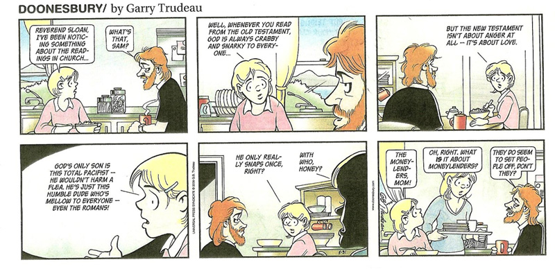
wit (in italics): To the Editor: Re "Use Their Work Free? Some Artists Say No to Google" (Business Day, June 15): If every creator of intellectual property had the moxie of the illustrators who refused Google's request to use their artwork for free in exchange for "exposure," today's Internet vampires wouldn't be able to exploit them. It's offensive that a company that reports annual profits in the billions refuses to pay independent artists for their labor. Sadly, the Web revolution has turned "information wants to be free" into a mantra. Whether it's illustrators, cartoonists or musicians, working for free ought to have gone out with slavery. Congress ought to act to make it illegal for a profitable corporation to solicit work without paying for it. Postscript: Rumor is, by the way, that the Philadelphia papers, Daily News and Enquirer, will begin charging for online content by the end of the year. **** In his new book, The Year of Living Dangerously, Ted Rall says he returns to the autobiographical graphic novel form, but only as the author: drawing the book is Pablo J. Callejo. The memoir recounts Rall’s adventures with homelessness when he was a college student in New York City in the 1980s. One hopes this new work will be somewhat less outlandishly cruel than his nefarious My War with Brian of some years ago. Parade, the Sunday magazine newspaper supplement that regularly publishes cartoons by Speed Bump’s Dave Coverly, proudly announced Coverly’s “taking top honors” in being named “Cartoonist of the Year” by the National Cartoonists Society last Memorial Day weekend. Might be the only publicity that the NCS’s Reuben gets these days: the Society itself, guarding its privacy, avoids advertising its annual meeting and the awards conferred thereat because it doesn’t want to attract attention and, with it, the clamoring mobs of autograph seekers that would descend on the Reuben Weekend and ruin it if they only knew. ... Several newspapers have lately sought to improve their bottom line by eliminating the expense of syndicate fees, dropping comic strips from their line-ups. Some of those papers—including the Florida Times-Union and the Oregonian—encountered such vociferous objection from readers that they scrapped their plans. Said Comic Riffs’ Michael Cavna, quoted in May’s Editor & Publisher: “Most daily newspapers are struggling to survive. Most syndicated cartoonists are struggling to hold on to clients. In the middle of these perilous crossed train tracks is one, if not two, badly hurting business models.” In objecting to the practice of making ends meet by dropping comics, Cavna offered an analogy: “Comics are your bedroom furniture. You can burn them for a little short-term, shortsighted heat savings—and your structure will still stand. But many people won’t want to live there much longer.” The new CEO of Archie Comics is Jon Goldwater, son of the founder John Goldwater. He purchased an ownership interest in the company and plans “aggressive efforts to expand both the company’s currently active properties and its dormant ones,” saith Icv.2. Among likely future projects are an Archie feature movie, Archie toons, a Katy Keene TV show, and a new music deal for the Archies. Jon Goldwater is the brother of Richard Goldwater, who, with Michael Silberkleit (son of another Archie founder, Louis Silberkleit), ran the company for years until his death recently. “Other properties Goldwater hopes to developing include Lil Jinx, the Red Circle characters, Sabrina, Josie & the Pussycats, Cosmo the Merry Martian, Pat the Brat, Wilbur Wilkins, Bingo Wilkins, Suzie and Ginger Snapp.” For more about John Goldwater and his fraudulent pose as the creator of Archie, visit Harv’s Hindsight in the fall of 2001. Fascinating Footnit. Much of the news retailed in the foregoing segment is culled from articles eventually indexed at rpi.edu/~bulloj/comxbib.html, the Comics Research Bibliography, maintained by Michael Rhode and John Bullough, which covers comic books, comic strips, animation, caricature, cartoons, bandes dessinees and related topics. It also provides links to numerous other sites that delve deeply into cartooning topics. Three other sites laden with cartooning news and lore are Mark Evanier’s povonline.com, Alan Gardner’s DailyCartoonist.com, and Tom Spurgeon’s comicsreporter.com. And then there’s Mike Rhode’s ComicsDC blog, comicsdc.blogspot.com For delving into the history of our beloved medium, you can’t go wrong by visiting Allan Holtz’s strippersguide.blogspot.com, where Allan regularly posts rare findings from his forays into the vast reaches of newspaper microfilm files hither and yon. DOONESBURY OFFENDS. AGAIN. BUT THIS TIME ... Amy Lago, who has assembled an impressive career as a syndicate comics editor, having edited Charles Schulz while she was at United Feature and Berkeley Breathed while at her present perch at Washington Post Writers Group, knows whereof she speaks when it comes to irate readers and what irates them. “We know that any time religion is mentioned, any religion, it’s a warning flag to readers,” she told Tom Spurgeon, who was interviewing her in September 2007 for Busted! the Comic Book Legal Defense Fund magazine. “It’s as if they become primed and ready to be offended,” she continued. Spurgeon
had been prompted to interview Lago when several newspapers who
subscribed to Breathed’s Opus strip had declined to run one or more of the Sunday strip’s
episodes in which a character, a somewhat dizzy bimbo as I recall,
adopted radical Muslim behavior and attire. Muslims—some of
them—don’t take kindly to being depicted in the comics,
and it comes as no surprise, then, that some of them were offended
when a dizzy bimbo adopts the outward accouterments of their
religion. Because comic strips are usually funny and make people
laugh, a dizzy bimbo Muslim impersonator in the funnies might easily
be interpreted as a rude attempt by the newspaper business to make
fun of Islam. No one likes their religion laughed at. And lately in
this country, as in most European countries, newspapers have
religiously avoided publishing cartoons with Muslim or Islamic
references in them because Muslims—some of them—when they
take offense have been known to start lobbing explosive devices at
the offenders. All of which raises questions about Dear Mr. Trudeau: We agree with the numerous people who are contacting us that Sunday's Doonesbury misquotes the Bible, maligns Judaism, and promotes a Christian heresy, all within eight panels. It reinforces age-old stereotypes about Judaism that have been the cause of much suffering and pain over the centuries, and which have been rejected by a variety of Christian denominations over the last decades. Jesus' concern in the Gospels is with money-changers, not money-lenders. The money-changers converted the coins of the Roman Empire into the currency accepted by the Jerusalem Temple, as money-changers today convert dollars into Euros. To speak of money-lenders harkens back the stereotype of Shylock, when Jews were forced by Christians to engage in usury. Christian teaching is clear: the God of the Old Testament is the same God as the God of the New Testament. Doonesbury's Reverend Sloan is guilty of promoting anti-Jewish stereotypes and Biblical illiteracy. He owes both Jews and Christians an apology. Those of us who sometimes weary of readers protesting hysterically whenever a favorite ox of theirs is gored in the funnies—and who applaud Amy Lago, who memorably pretended to say to such readers, “If you can’t take a joke, why are you reading the funnies?”—we can find a mote of comfort in the letter’s demanding an apology of Reverend Sloan, not of cartoonist Trudeau, a rhetorical nuance that reveals that the ADL has, in some measure, entered into the spirit of the faux life on the funnies page and is perhaps not taking all this quite as seriously as it would seem. Trudeau’s syndicate, however, took it all very seriously. Universal Press issued a statement, part of which read: "Neither Garry Trudeau nor UPS intended to revert to stereotype, and if any readers suggest to us that they approve of that connection, we will do our best to correct them." Another letter on the subject, this one from Rabbi David Sapertsein, the veteran civil rights fighter, the director of the Reform movement's Religious Action Center, who delivered the invocation when Barack Obama accepted the Democratic presidential nomination, is markedly less strident. Herewith (in italics): Dear Mr. Trudeau: On behalf of the Union for Reform Judaism, whose more than 900 congregations across North America include 1.5 million Reform Jews, and the Central Conference of American Rabbis, whose membership includes more than 1,800 Reform rabbis, I write out of concern about the Sunday, May 31st edition of your popular comic strip, Doonesbury. The strip, we hope and assume unwittingly, perpetuated centuries of anti-Semitic canards about Biblical-era moneylenders—who were almost uniformly Jewish—as the enemies of Jesus and the villains of the New Testament. As you know, similar caricatures have been used throughout the years to incite hate against the Jewish community and have cultivated and perpetuated offensive stereotypes. This is, of course, not a small matter, nor is it only of historical interest. A recently released study by the Anti-Defamation League reports that American Jews are the religious group most often targeted in hate crimes. (See +@+ below.) Whether intentional or not, public expression that smacks of anti-Semitism, even in cartoon form —and especially by someone as well-regarded as yourself —is cause for concern. To be clear, I write as a fan. Satire is an invaluable means of focusing public attention on issues facing our society. It can amuse and illuminate, as you have shown repeatedly throughout your career. I hope my reading of the cartoon is correct that the focus appears to be on the current financial crisis; in this case, however, a line was crossed that allowed a pernicious stereotype to find its way into the discourse about the current economic challenges faced by our nation and world. If you agree with me that these challenges are not the fault of any one individual, group or religion, then I hope you share my concern that your cartoon might be read as blaming Jews. In light of this incident, I hope that in the future, you will pay particular attention to ensuring careful consideration of the weight of the allusions made in your artwork and the many ways in which they may be interpreted. Sincerely, Rabbi David Saperstein Rabbi Saperstein’s epistle is a good deal more decorous than the ADL’s missive. He doesn’t demand an apology of either Reverend Sloan or cartoonist Trudeau. He makes his point, though, thoughtfully and gently but firmly: depicting Jews as money-lenders helps perpetuate a centuries-old anti-Semitic canard of Jews as stingy and grasping and concerned only with money. The ADL letter, unhappily, laces its protest with dubious, or at least debatable, assertions about historical matters, thereby giving nit-pickers like me something to quibble about, effectively undermining the impact of the letter. While it’s true that money-lenders are not the same as money-changers, in Biblical times, it was a distinction without a difference. Money-changers in the Court of the Gentiles at the Temple in Jerusalem were there to exchange Jewish coins for the currencies of other countries that pilgrims brought with them because only Jewish money was acceptable in devotions within the Temple. The money-changers charged a fee for their service, a practice that made them, for all practical purposes, indistinguishable from money-lenders, who also charged a fee for their monetary services. Incidentally, because the Court of the Gentiles was also the place that pilgrims purchased animals for sacrificial purposes—at prices probably inflated because the sellers enjoyed an exclusive right to the operation—the entire enterprise smacked unholily of unscrupulous commerce, which is what got Christ’s wattles in an uproar, prompting violent action that He justified by quoting Old Testament scripture: “My house will be called a house of prayer for all nations” (Isaiah 56:7) “but you have made it a den of thieves” (Jeremiah 7:11). The Christian heresy that ADL claims is being promoted in the strip is one in which the God of the Old Testament is deemed a different God than the God of the New Testament. Reconciling these two portraits of the Almighty was a preoccupation of Christianity for centuries; it was almost as thorny a matter as the question of Jesus’ divinity and the whole Trinity concept. What happened to monotheism when Christians started worshipping a trio—God, the Son, and the Holy Ghost? Was Jesus a man or was he God? And if God was and had been “forever,” how could Jesus be God: he began when he was born of Mary. All of these seeming inconsistencies and contradictions were eventually resolved by one kind of edict or another from the church fathers. But the seeming difference between the Old Testament God and the New God remained, stubbornly resisting reconciliation despite edicts proclaiming otherwise. The difference is caused by a simple accident of religious history: Jesus was a Jew, and Jews’ scripture was, in part, the Old Testament. Moreover, Christianity was, for a time, a Jewish sect: early Christians for a discernible period were all Jews and only Jews, gentiles not being eligible unless they were circumcised. So for early Christians, the Old Testament was scripture just as it was for Jews. Christians thus inherited the stern god of the early nomadic Hebrews. At the same time, Christianity was accumulating other documents, accounts of Jesus’ life and teachings and letters from various apostles, all of which were subsequently deemed sacred as the New Testament when the books of the Bible were finally officially ratified at the Council of Trent in 1546 at which time the Church was fine-tuning its doctrine in reaction to the Protestant Reformation. I’m oversimplifying here but only to highlight the point I wish to make—namely, that the obvious differences in God’s behavior in the Old Testament compared to the way He acts in the New is an accident of the accumulative history of the Bible, not a considered theological argument. And until some official body declared, formally, that the seeming two Gods were actually one, there was no heresy. There was merely custom, a little blurry as customs all get in onrushing history. After the church’s formal declaration, of course, anyone who thought there were two Gods was a heretic. But Trudeau’s Sam is not saying that the Old Testament God is a different God than the New Testament God. What she says may lead those of little faith to that conclusion, but she’s not going there. Not in the strip at issue. She, like generations of young (and old) Christians before her, finds that God is crankier in the Old Testament than he is in the New Testament. What caused this transformation, I’m not sure. Perhaps, to heap blasphemy upon heresy, God’s dalliance with Mary calmed sexually roiled waters and made Him more fun to be with. It’s hard to say. But as this treatise amply demonstrates, for ADL to bring up Christian heresies when all it actually wants to do is to protest the perpetuation of an insidious anti-Semitic figment is to invite endless beside-the-point debate. It’s not so easy to quarrel with Rabbi Saperstein because he introduces no extraneous matter: he lodges his protest and signs off. In the last analysis, I’m not so sure that people whose anti-Semitism would be fueled by Reverend Sloan and his money-lenders are the kinds of people who read Doonesbury. And if they do read Doonesbury, are they also intellectually and theologically adept enough to make all the necessary connections that ADL does, leaping from (1) a cranky Old Testament God (2) being Jewish rather than Christian to (3) money-lenders all being Jewish. Do such readers as I envision even remember—or acknowledge—that Jesus was a Jew? I’m not sure that ADL makes all those connections either, but somewhere in the tangle of thought represented in its letter lurk kindred notions. All of which is genuinely beside the point. Rabbi Saperstein has it right. It doesn’t matter that an accident of religious or Biblical history has created two seemingly different Gods; it doesn’t matter that money-changers are not money-lenders. What matters is that to talk of money-lenders in the context of a discussion about the Bible is likely to conjure up an ancient stereotype that has been endlessly harmful to Jews. The Anti-Defamation League is sometimes quick to jump to conclusions that prompt it to act, but ADL has been around since only 1913, and Western Civilization would undoubtedly have benefitted from its attentions for several centuries before that. Nowhere in any of the discussions about Doonesbury’s offense is there any mention of free speech issues. And a good thing, too. As Amy Lago said when talking to Spurgeon about the reluctance of newspapers in the West to satirize anything in a Muslim context: “It isn’t a ‘free speech’ story because the government wasn’t involved. This is a business story. The only thing I’m worried about is our culture’s sudden need to feel offended at everything—to assume that someone is ‘against’ you rather than ‘for’ you and view such works in that light. And then to decide to take offense rather than to take time to ask, ‘What did you mean?’” What Trudeau meant in his strip for March 31 is to cast a few well-deserved aspersions in the direction of banks, whose monetary policies—i.e., greed—have brought the world’s financial systems to the brink of collapse. It’s enough to try the patience of Christ himself. +@+ James W. Von Brunn, a depraved white supremacist and anti-Semite, took a .22 rifle with him into the Holocaust Memorial Museum in Washington, D.C. on June 10 and opened fire, shooting and killing a guard before other guards could bring him down, proving, if it needed proof, that anti-Semitism is alive and as depraved as ever. Von Brunn also authored a book entitled Kill the Best Gentiles, proving, I suppose, that hatred and derangement are not always focused on one target. He worked at Noontide Press, a California-based distributor of books on “the Jewish Question,” another bunch of wack jobs. You have to be pretty fast on your feet if you’re a comics editor for a syndicate, and Amy Lago qualifies. She told me once of a time that Charles Schulz produced a strip over which a warning flag flapped. In it, Peppermint Patty, for some reason or another, warns the African American kid, Franklin, that he needs to modify his behavior or “Your name will be mud.” Having faith in Schulz’s unerring sense of humor, Lago let the strip loose into the world of raging newspaper readers, and, sure enough, one of them was offended. To connect “mud”—i.e., “dirt”—to the color of someone’s skin is probably, in certain circles, racist. And a reader phoned Lago to protest the slur. Lago responded with confounding alacrity, summoning up an explanation of the origin of the expression “Your name is mud.” Mudd is the name of the doctor who treated a fugitive John Wilkes Booth for a broken ankle that the latter acquired while assassinating Lincoln that night in Washington’s Ford Theater; and ever after, the name Mudd has been associated with someone who manages to destroy his reputation (in Mudd’s case, quite innocently, he being ignorant of how Booth broke his ankle). The irate phone caller was somewhat comforted by this information. I’m sure, judging from her usual performance, that Lago could have calmed the caller without invoking Doctor Mudd, but when she told me the story, it seemed to me an object lesson in how useful odd bits of trivia can be—and how fast on your feet you must be, how resourceful, to be a successful comics editor in the syndicate world. As
a breed of public performer, cartoonists are probably accustomed to
being regularly assaulted by readers who get offended. It comes with
the profession. If you’re going to make jokes, you’re
going to make fun of something—ridicule something—and
you’ll surely offend someone somewhere if it’s his
favorite thing being laughed at. Since all cartoons ridicule or make
fun of something, somewhere, cartoonists risk offending the very
people they seek to entertain even as they seek to entertain them.
Even I, QUOTES AND MOTS “Management is doing things right; leadership is doing the right things.”—Peter F. Drucker, financial writer “The reason worry kills more people than work is that more people worry than work.”—Robert Frost “Any idiot can face a crisis; it is this day-to-day living that wears you out.” —A. Chekhov And speaking if idiots, here’s GeeDubya, actually making sense in a videotaped message to the troops in Iraq who are watching a taping of “The Colbert Report”: “You are men and women of great courage and endurance, and that’s gonna come in handy: I’ve sat through Stephen’s stuff before.” “Everybody wants to go to heaven, but nobody wants to die.” —Dunno Who BIG BUST-OUT AT THE BOOBY HATCH The Happy Harv’s Harangue on Hooters
Our
preoccupation, as males of the species, with the physical sexual
apparatus of the opposing gender is not, as previously supposed, a
modern or 20th century invention of the advertising industry for the purpose of
inducing us to buy more goods than we need, the evidence of magazine
and tv ads to the contrary notwithstanding. For at least 40,000
years, we’ve been ogling women’s breasts and buttocks in
feverish admiration. Moreover, for at least that long, we have made
boobs and buns into objets d’art. The proof of our artistic as
well as sexual obsession was recently unearthed in a cave in
southwestern Germany where archeologists discovered an ivory figurine
of a voluptuous woman. Measuring only 2 ½ inches tall, the
carving, “the oldest known example of three-dimensional or
figurative representation of humans,” depicts a woman with
giant breasts, prominent buttocks, open legs, and a detailed vulva. Indeed. And as students of superheroic culture in comic books, we indulge our age-old obsession more overtly than most, buying and ogling funnybooks in which women of notable embonpoint cavort openly in the skimpiest or tightest attire, making our ogling easy. We’re only human, after all, and have been for over 40,000 years. Sometimes,
however, the artisans creating these artifacts for our admiration get
carried away with the symbolism and thereby undermine the erotic.
Sometimes, that is—like their counterparts in antiquity—they
draw things that have never been and cannot be. They exaggerate for
effect, but in doing so, destroy the effect. Anatomical
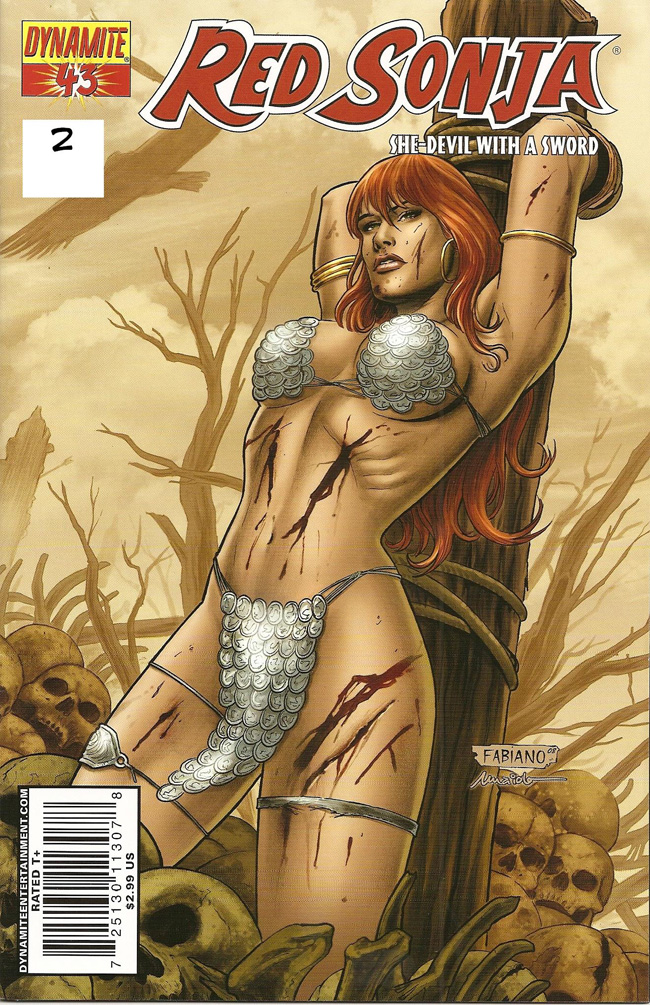
impossibilities are not erotic. Here, for instance, we have Red Sonja
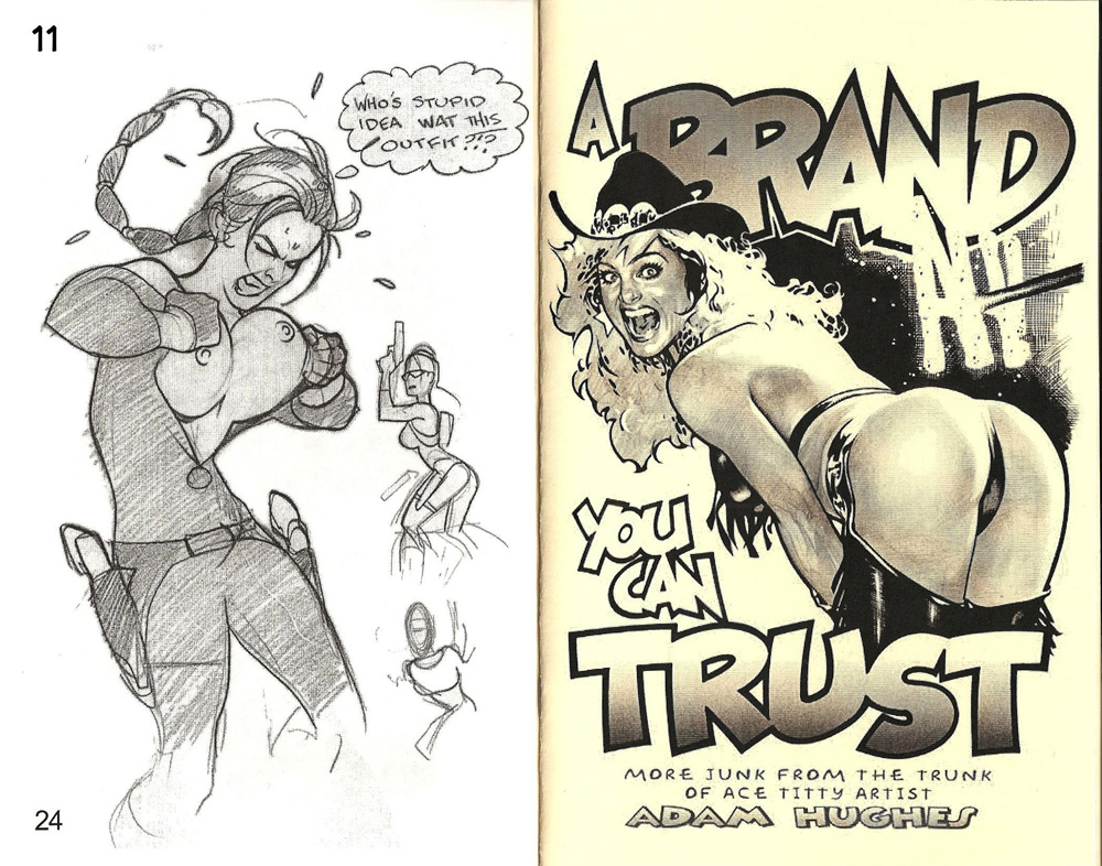
on the cover of the 43rd issue of her book. (The visual aids in this segment are numbered for
your convenience in identifying which one I’m trying to discuss
whenever I can tear my eyes away; the numbers appear in either the
upper right-hand corner or in the upper left-hand corner. Red Sonja’s
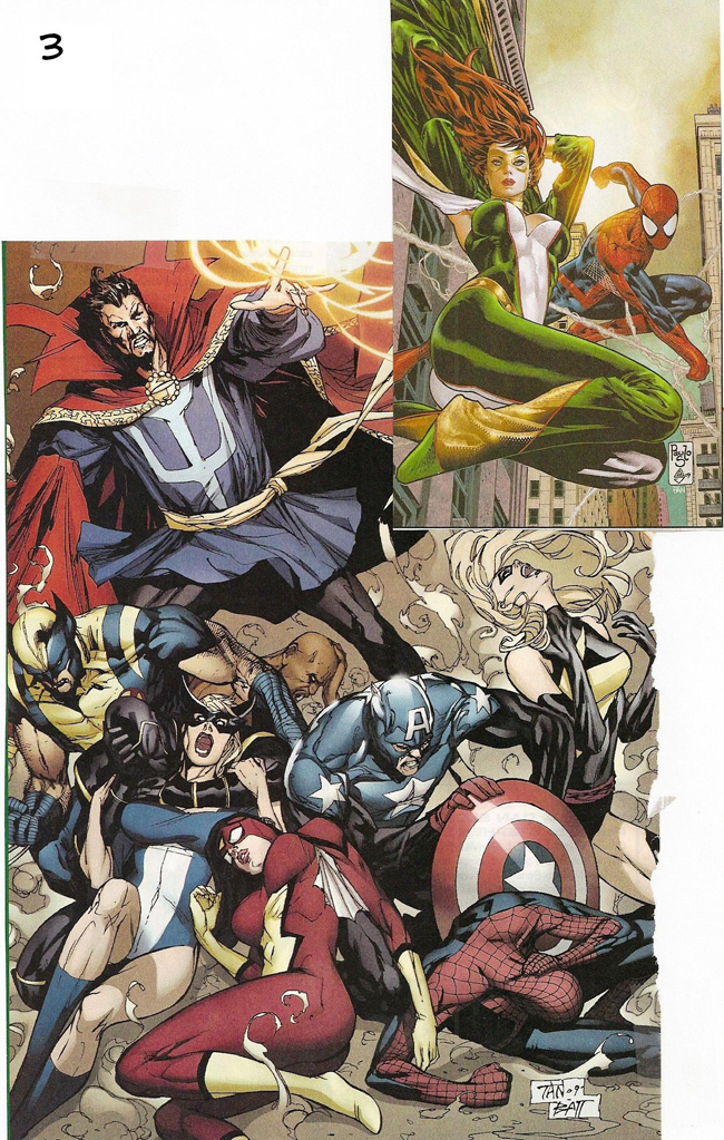
cover is No. 2, upper left-hand.) In depicting superheroines elsewhere from the same angle, other artists make similar mistakes. Boobs point upward in our next two examples (No. 3), and while the instance at the upper right is at least possible (assuming the support-bra function of the costume), Spider-Woman’s breasts, prone as she is here, would not be pointed: they’d be ovoid, and her left breast would obey the laws of gravity and sort of slide sideward to her right, the side she’s reclining on.
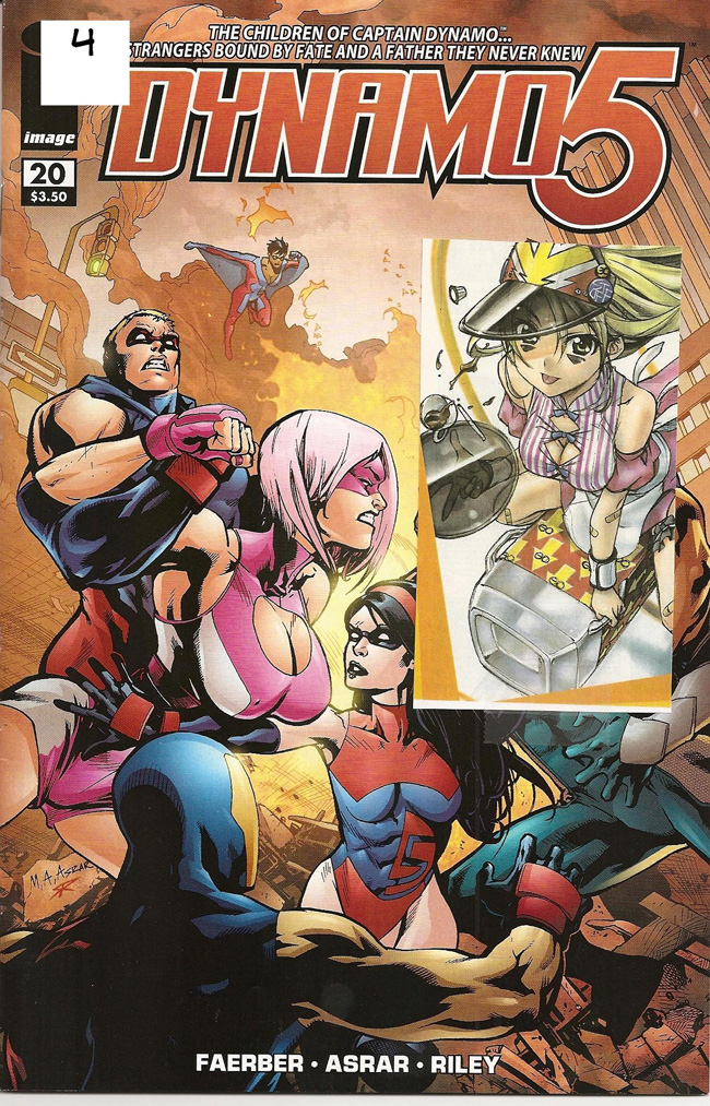
I hasten to state the obvious: I am not, in this diatribe, denigrating the size of superheroine chesticles, which, generally, I enjoy regardless of their size (or cube). I am deriding here only failed attempts at depicting healthy hooters. Failure may be achieved by attempting to draw these appendages at sizes to great for them, but not necessarily, as witness the next in our gallery of glandular grandeur. On the cover of Dynamo 5 (No. 4), we have a pendulous portrait of the superheroine comically christened War Chest, whose chest, while not particular warlike, is certainly imposing, intended, no doubt, to compete with DC’s Power Girl for headlight honors; large jugs lend themselves to pendular portraiture, as we see in the inset of a manga heroine. The boobs displayed on the next visual aid (No. 5) are all of generous dimension and all drawn with some regard for actual anatomy and laws of gravity; the rack on the central babe in the bottom picture, in particular, seems to be drooping appealingly in exactly the way we would expect if we ever actually encountered a woman of these dimensions wearing skintight spandex. The same tendency is admirably displayed in the lower of two pictures of No. 6. The top picture I’ve included because the costume of the central figure is designed to suggest hands gripping her boobs from behind or below, or both, a visual device so obviously a loving (or at least lusty) sexual caress that it’s nearly laughable. Or would be if the mammaries were not so lovingly drawn. More
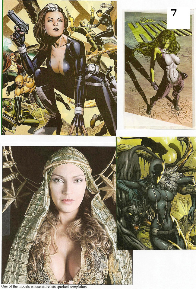
realistic drooping is depicted on our next slide, No. 7, and I
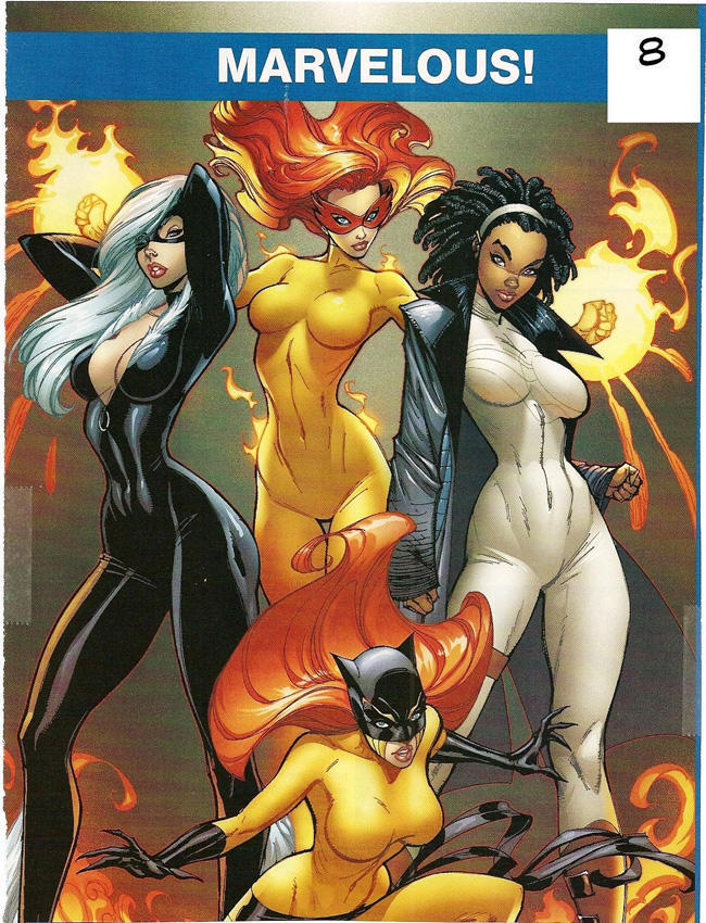
applaud all four portraits. Some artists are better at limning the curvaceous gender than others. Scott Campbell, for example, has long enjoyed a reputation in this department, as his depiction of a gaggle of divas demonstrates persuasively (No. 8).
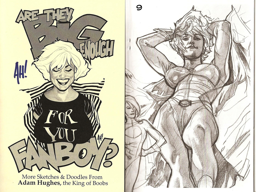
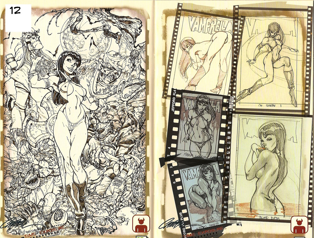
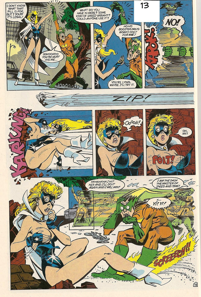
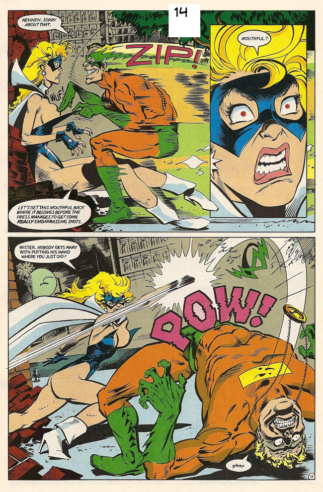
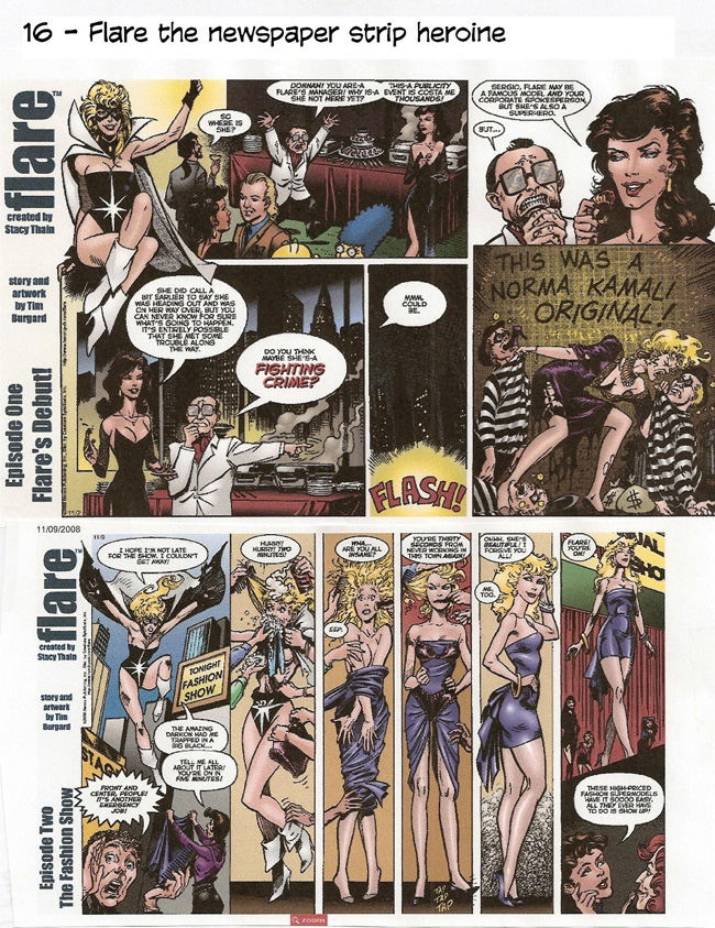
Campbell has not only mastered the feminine protuberances, but he has synthesized their portrayals with the anatomical array of the female form in full; not a line out of place here. Adam Hughes is another past master at portraying udderly delightful ladies, and in our next example (first, at the left, in this array), we have his version of the “boobs viewed from below” perspective we earlier in pictures by less able delineators. Observe that Power Girl’s breasts move in opposite directions, and they are not pointed skyward but slide sideways (or would if it were not for the restraining fabric of her garment), obeying gravity’s impulse. (This picture, by the way, is now mounted and paired with the printed cover it decorated, “a museum-quality piece,” claims DC, for $125.) In the next brace of drawings (No. 10), Hughes shows how breasts actually look when their owner wears a sweater: each boob is not depicted individually, as they appear in their unfettered naked glory, but they fill the sweater, stretching its fabric from side to side, knocker to knocker, until they appear as one continuous shelf-like projection. That’s realism, kimo sabe. Frank Cho became adept at this way of depicting his delectable women’s charms when his syndicate objected to all the “stress lines” he typically used to portray each boob as an individual jiggling aspect of their anatomy. I notice that more and more of his colleagues are following his example—Nate Bellegarde with Atom Eve, for instance. And our next witness (No. 11) continues testifying in favor of Hughes’ superiority at rendering tits and ass in convincing aspect not at all undercut by an abiding comedic flair. In No. 12, we have a couple pages of sketches by Campbell, revealing that his women are not usually spectacularly endowed: in fact, they usually seem to be of ordinary dimensions, but those dimensions Campbell arranges in a highly seductive manner. Finally, we come to one of my all-time favorite superheroines, Flare, who, in the three pages at hand (Nos. 13, 14, and 15), extracted from a December 1988 issue of her Hero Comics title (Vol. 1, No. 2, to be bibliographically compulsive), reveals, so to speak, the hazard of fighting crime while wearing a costume the upper region of which is too scanty to support much modest. You’d think she’d know better: as a professional model as well as a superheroine, she ought to understand the limitations of whatever raiment she puts on, but, thankfully, she apparently doesn’t. Not here anyhow.
Comedy and eroticism seldom go well together, but here, they seem to. The story, drawn with clean clear lines by Tim Burgard, was written by Dennis Mallonee for the character created by Stacy Thain. Unlikely as it may seem, Thain and Burgard re-united last fall to do a newspaper comic strip version of their scarcely clad superheroine. Distributed by Creators Syndicate, Flare is a Sunday only strip; it started November 2 and is still going. My barely concealed amazement derives from the outlandish idea of a newspaper comic strip about a sexy young woman wearing not much at all below her clavical: never have we seen the like in a family newspaper (except, of course, in the advertisements for women’s underwear). Here in No. 16 are the first two strips, and you can see from the second (11/09) that Flare is still experiencing difficulty keeping herself covered up enough for mixed company.
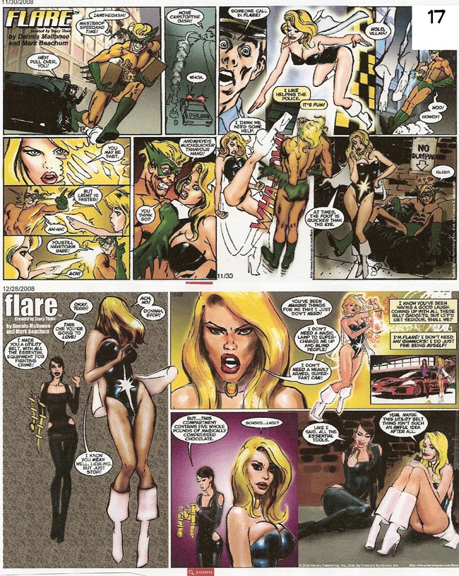
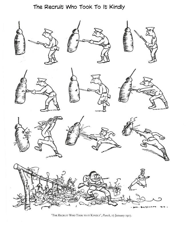
The next two samples (in No. 17, dated 11/30 and 12/28) are drawn by Mark Beachum, another alum from the Hero Comics incarnation of the character, a legendary delineator of the feminine form in those distant days of yore. His rendering, it seems to me, is a trifle more risque than Burgard’s—more, and more astounding in a newspaper comic strip. Lately, however, the brevity of Flare’s costume has been somewhat modified, and she shows a little less of her lithesome epidermis. But, oooh, while it lasted. Mark Propst has joined the crew to do pictures in recent months. THE FROTH ESTATE The Alleged News Institution Newspaper reports about James Von Brunn demonstrate, conclusively, the timidity afflicting print journalism. The anti-Semitic white supremacist “allegedly opened fire at the Holocaust Museum, killing a security guard.” Allegedly? Really? Yes, really: in newspapers, it is merely “alleged” that he killed the guard. Until tried and proven guilty, he is presumed innocent so we can only allege his guilt. Moreover, in litigious America, the only way newspapers can be certain to avoid prejudicing a potential jury is, apparently, to merely “allege” that a man, whose murderous rampage was witnessed by several persons, went on a murderous rampage and killed someone. Some of the witnesses to this heinous act, other security guards, stopped Von Brunn by shooting him in the face—not, you’ll observe, “by allegedly shooting him in the face.” Apparently no one cares about the legal innocence of the guards, who could be hauled up for man slaughter, I suppose. And, strangely, no one is saying that Von Brunn is “allegedly” an anti-Semitic white supremacist. Any newspaper that fails to use “allegedly” in this connection may be open to a libel lawsuit, alleging that the paper defamed Von Brunn’s character. In the June issue of 5280, a Denver magazine the numerical name of which reminds us that this is the Mile High City, Maximillian Potter, the magazine’s executive editor, supplies what I’m persuaded is the “real reason” that the Rocky Mountain News died a few months ago. Yes, it’s true that the paper was losing better than $1 million a month, roughly $16 million a year. But as I mentioned here before, one of the entities operated by the paper’s owner, E.W. Scripps, namely United Media Syndicate, made a profit last year that was 36% higher than the year before: United Media’s revenue for the last 2008 quarter increased 20% to $30.9 million, compared with $25.7 million in the year-ago period. There may not be enough of the $30.9 million left after operating costs to float the News outright, but, as Potter said, “Scripps is in the best financial shape of any newspaper company in America.” So while accountants wouldn’t like robbing Peter to pay for Paul, Scripps—with United Media’s help—could have carried the News until better times. If, that is, Scripps hadn’t wanted to kill the paper. Scripps wanted the News to die an ignominious death, unwanted, unsaleable. So it put the paper up for sale and allowed only a month for some interested party to come forward with an offer to buy. None did. A month isn’t, really, long enough for any interested buyer to examine the prospects and then put together an offer. But Scripps didn’t care: its plan was of another sort altogether. Turns out that if the News could be declared “worthless,” Scripps could pull the plug on it and gain a $70 million tax advantage. If the paper wouldn’t sell, it was, perforce, “worthless.” And Scripps was suddenly, effectively, $70 million to the good—money it could use in its new ventures on cable tv, Home and Garden Television and the Food Network, and its Internet enterprises, which is where Scripps has been investing for several years. It folded four of its newspapers between 2000 and 2008; now, with the News, a fifth has been dispatched. Writes Potter: “Shutting down newspapers was merely the opportunity cost of doing business.” And the business Scripps is doing these days is only marginally the newspaper business. If it didn’t make me sick, it would be tragic. READ AND RELISH A Short Compendium of Enviable Utterances Garrison Keillor, writing about the beloved of his lost youth, remembers poignantly that “her laughter was like an aviary of exotic birds.” “The purpose of art is to inform and delight.” —Horace, often quoted by Milton Glaser, the man who invented the “I [heart] NY” logo “Make no little plans, they have no magic to stir men’s blood.” —Daniel Burnham, a Chicago architect who designed the Flatiron building in New York, Union Station in Washington D.C., Orchestra Hall in Chicago “and more banks and buildings than you could count,” saith Paul Goldberger in The New Yorker for March 9, 2009 NEWSPAPER COMICS PAGE VIGIL The Bump and Grind of Daily Stripping In his Mutts, Patrick McDonnell, who has often touted animal shelters in the strip, now takes after the puppy mill industry. He may have done this before, but if he did, I’ve missed it; it may be a new crusade. In the Sunday strip for June 14, we see a cute but miserable dog, who says: “I’m a breeding dog at a puppy mill. I’ve lived in this small cage my entire life. My feet have never touched God’s earth. I’ve had eleven litters of ‘pet store pedigree puppies.’ I’m matted, filthy and drained. This is no life. I had no human contact or kindness—until Scotlund rescued me,” he concludes, now pictured cuddled in the arms of his new owner, who may be an actual person leading the campaign against puppy mills. It won’t take anything more than this strip to make a convert of me. Sexual “intimacy” (to use the current euphemism for copulation) may once again take place on the funnies page. Tom Batiuk in Funky Winkerbean moved perilously close to depicting something more than hand-holding between Les Moore and Cayla, his African American paramour: Les is in a somewhat gloomy mood on June 25, and Cayla puts her hand on his knee and says, “If you’ll let me, I can help those blackbirds fly from your shoulder.” The next day, however, Les says, “I really enjoy being with you, Cayla, but let’s not skip ahead too fast. Endings have to be earned.” And the next day, they embrace and kiss goodnight. No hanky-panky yet, I guess. Whatever transpires, I can’t imagine anything matching Brooke McEldowney’s entwining hands in 9 Chickweed Lane last fall, but it’ll be interesting to see if Batiuk eventually goes further than Doonesbury’s Garry Trudeau did in 1976, when he showed Joanie Caucus and Rick Sloan in post-coital embrace, in bed; 30 papers declined to publish that day’s strip. Another daring leap into sexual matters took place June 26 in Robb Armstrong’s Jump Start wherein a father is being urged by his friend to talk to his son about the birds and the bees. The next day, the father finds out that his son already knows: he’s been told by one of his 11 uncles. And in Rudy Park (written by Theron Heir, not his real name, and drawn by Darrin Bell, his real name), Rudy is suddenly confronted on June 24 by Darlene, who is, obviously—another comic strip first!—big with child. Or, as she puts it, “pregnant” (maybe the first time that word has occurred in the funnies). And she’s going to have 15 (count ’em) babies. Rudy is appalled: “How’d this happen?” he wants to know, “—we never even were intimate.” Says Darlene: “I went to a fertility specialist.” Since we’re big into breasts this time, it’s nice to know we’re in the best of company. Canadian cartooner Sandra Bell-Lundy, who produces Between Friends, a strip featuring several life-long women friends, did a special series of strips to coincide with Mother’s Day—strips about the necessity for women to have mammograms regularly. The three Sunday-style strips are flash-animated and voiced at thingamaboob.ca , a site sponsored by the Canadian Cancer Society. At her blog, Bell-Lundy writes: “When I was approached to help out with this campaign, I was excited for a couple of reasons. One, of course, was because I hought it was a valuable message. Secondly, I thought the fit was perfect. Between Friends is very women-focused, and I felt the targeted audience would relate very well to my characters. And lastly, because it was an opportunity to stretch a bit and do something a bit new and challenging—all within the comfort zone of my ‘area of expertise.’” She picked the oldest of her cast to star in the series because the campaign is directed at women ages 50-65. She admits that she was “a bit nervous about coming up with a little storyline for the mammogram message.” But she needn’t have worried: she pulled it off with her usual aplomb. “As it turned out,” she concludes, “it wasn’t really all that difficult because it wasn’t that much of a stretch from the way I normally work.” She attended the recording sessions that voiced-over her pictures, and she cracked up over the sound of her character objecting to “squashing my boobs between these two plastic...” —and then being astonished that it took so little time to complete the examination. And now for something completely different. Wafting across the funnies pages lately have been numerous fart jokes, a legacy, no doubt, from the regime of the Bush League, whose Deciderer was famed, far and near, for relishing the genre. In the gallery of gags now at your elbow, we begin with flatulence and then proceed through various alimentary matters, ending, as all such forays must, at the end with Bucky Katt making fun of Satchel’s behind and canine hygienic habits as compared to feline practices, a derision that cannot help but remind us that cat’s butts are clean and why.
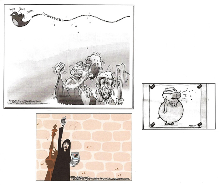
EDITOONERY Afflicting the Comfortable and Comforting the Afflicted And
while we’re inspecting fecal matters, here’s John Cole’s take on the role of Twitter
in the Iranian riots. Follow-Up to Opus 243: Roy Peterson, fired by the Vancouver Sun after 47 years “of brilliant editorial cartooning,” told Crawford Kilian at thetyee.ca that the paper said it could no longer afford him. “They gave me three months’ notice,” Peterson said. “They ran a story in the Saturday Sun ," Peterson added, “—but it didn't say I'd been fired." The Sun also declined to run his farewell cartoon. Said Kilian, a longtime Peterson fan: “Peterson plans to explore a couple of book ideas over the next year or two. The book series he did with Stanley Burke in the 1970s, including Frog Fables and Beaver Tales and The Day of the Glorious Revolution, was some of the best political satire Canada's ever seen. And Drawn and Quartered was a highly irreverent cartoon history of the Trudeau years.” READERS OUTRAGED AT SOTOMAYOR PINATA Chip Bok lately earned the ire of some Hispanics and advocates for women with a cartoon that depicts Supreme Court nominee Sonia Sotomayor as a strung-up pinata, which President Barack Obama, standing nearby and wearing a sombrero, invites a herd of Grand Old Pachyderms to whack. The cartoon is captioned: "Fiesta Time At The Confirmation Hearing." Richard Green of the Associated Press quoted Jean Warner, chair of the Oklahoma Women's Coalition, who saw nothing funny about the image. "Here's a woman wearing a judge's robes and she's about to get the crap beaten out of her because she has the audacity to think she can sit on the Supreme Court," Warner said. "But most young girls who look at the cartoon don't even understand that. They just see guys with sticks about to hit a woman." Rossana Rosado, publisher and chief executive officer of El Diario La Prensa in New York, likewise thought the cartoon was offensive. "On first view you just see her hanging by a rope and that's a very disturbing image," she said. "It's offensive mostly because it's not funny. It's supposed to be satirical and humorous and it simply isn't funny." Bok said that his point was that Republicans will look bad if they are too rough on Sotomayor. He added that editorial cartoons sometimes offend to make a point: "A cartoon is disrespectful, it is insensitive," Bok said. "That's what we do. We're not in the business of carrying out socially responsible dictates. That's somebody else's job. That's not my job. I don't mean to be gratuitously offensive. It was just a vehicle for the cartoon and I think it worked. It was funny, and in some cases they are being too sensitive about it." He said the cartoon was "an utter exaggeration of the cultural theme. She has used her Latinaness stereotypically as an asset in her effort for the nomination to go through. So I turned it around and tried to exaggerate the cultural part of it. It's part of the mockery of the cartoon, part of the joke." At the Oklahoman, which published the cartoon and thereby provoked angry response from some of its readers, editor Ed Kelley said the cartoon was reviewed before publication and found to be a good cartoon on a subject that will continue to be in the news. "Our take on the cartoon is that the president basically is daring Republicans to criticize his Supreme Court nominee and the Republicans are huddled up and semi-terrified and worried about how they are going to respond," he said. "If we would have thought for a minute that it was racist we would clearly not have used it." Bok said about 100 newspapers use his cartoons, but he's not sure how many ran it aside from the Oklahoman. He said he has not heard of any newspapers that rejected it or complained about it. CIVILIZATION’S LAST OUTPOST One of a kind beats everything. —Dennis Miller adv. One of our local alt newspapers is Westword, which published the following letter from an annoyed reader, who began by complaining about alt weeklies cutting costs by dropping all the comics and then went on as follows: “From This Modern World to Red Meat and the myriad comedic perspectives in between, the alt-comics are simply among the most important elements of the alt-weeklies. They provide a core value—a unifying, condensed, surreal connective tissue throughout the culture, a counter-punch to mainstream commentary and meme-crafting; a vital and important reduction of the mania of the other press. They are, in large part, exactly what defines the alt-newspapers as a vital pulse of reason against the mainstream press. They are also the first reason that I, as a reader, pick up the alts. ... I always grab Westword from the stands, first to check in on Red Meat, then for Tom Tomorrow’s reduction of the insanity of the lunatic fringe. The alt-comics are, simply, an important avenue that, simply put, triggered my picking up Westword. ... Please, I implore you, do not cut the entire comics scene from Westword.” And it’s signed Aaron Walker. The Westword editor adds a concluding note: “For the record, Westword has never published Red Meat.” BOOK MARQUEE Reviews of Books Lucinda Gosling’s new book, Brushes and Bayonets: Cartoons, Sketches and Paintings of World War I (200 9x12-inch landscape pages, some in color; hardback, $34.95) should have included in its title the most tell-tale term of all, “European Cartoons, etc.” Americans are not at all represented. Nothing by the redoubtable A.A. “Wally” Wallgren, about whom we posted a long appreciation in Harv’s Hindsights not long ago. Nothing about C. Leroy Baldridge, an illustrator whose drawings, like those of Wally, appeared in Stars and Stripes during the hostilities. Nope, this book is about European brushes and pens, and almost entirely British ones at that. The only likely familiar names are those of Captain Bruce Bairnsfather (1888-1959), who, after the war was over, made a career of his fame, much of which derived (and deservedly so) from the cartoon we’re posting in this vicinity; and H.M. Bateman (1887-1970), noted in most cartoon histories as the purveyor of vastly popular multi-panel (sometimes multi-page) pantomime magazine-style cartoons that were published under the heading “The Man Who ....” Invariably, these cartoons traced, step by step, the progress of some disaster or some personality quirk, as in our example, “The Recruit Who Took To It Kindly.”
In one of Bateman’s celebrated extravaganzas, he took four pages to show us “The One Note Man” arising in the morning, having breakfast, going to the concert hall, sitting with the orchestra, and, on cue, playing only one note in the symphony, collapsing in his chair momentarily now that the strain is over, then reviving to leave before the number was completed, going home, and going to bed. It took 58 pictures to tell the tale, and in our visual aid, we’ve included only the third of the four pages—the climactic moment. Another series of “The Man Who ...” were single-panel drawings that depict some social faux pas that electrifies with alarm the typically staid British witnesses to the outrage. “The Man Who Dared to Feel Sea-sick on the Queen Mary,” for instance, must endure the withering stares of his fashionable shipmates; “The Man Who Lit His Cigar before the Royal Toast,” sending all the rest of those at the table into paroxysms of shock and disbelief; and “The Soldier Who Dropped His Rifle in Ranks,” committed an offense so startling that the commanding officer’s horse rears up and throws his rider off. Said Bateman: “All I ever did was to push things to their logical conclusion. The man who dropped his rife could be confined to barracks for two months, pay would be stopped, he’d get extra pack drill. Today if a soldier dropped his rifle on parade, it wouldn’t be funny: it would be an interesting psychological happening.” Bateman enlisted in the army but arrived at a medical discharge after brief service in Europe, where he developed rheumatic fever while sleeping out in damp foxholes and other less than commodious places. That this should be a book of just European ink-slingers is entirely appropriate. After all, we got into the war late: they’d been at it longer and therefore had more to be funny about. But at first blush, the illustrators seem to outnumber the cartoonists herein. That, however, may be because cartoonists in that antique time drew illustratively rather than cartoonily, little-footedly not big-footedly. So, thumbing the pages, all the pictures look like illustrations, not cartoons. Upon closer inspection, comedy emerges. It’s an elegant book, and its big pages offer a generous display of the artistry under inspection. Dividing the volume into chapters by subject—“The Outbreak of War,” “Life in the Trenches,” “Drawing the Enemy,” “The Home Front,” and so on—Gosling supplies ample introductory text for every chapter and explanatory annotations beneath each picture. You’ll need it on your shelf if you’re hoping to have a complete reference on cartooning in WWI trenches. The other tome you’ll need for that purpose is Mark Bryant’s World War I in Cartoons (160 9x12-inch pages, some in color; hardback, $29.95), which, like his earlier World War II in Cartoons, “is intended primarily as a pictorial history of the Great War as seen through the eyes of the cartoonists and caricaturists who lived through it and chronicled the events as they occurred,” as Bryant helpfully explains in the Preface. His book is arranged by year, beginning with “Pre-War” then proceeding to “1914" then “1915" and so on. Here, although many of the cartoons, as was the custom of the time, are illustrative rather than cartoony, because there are no outright “illustrations” or paintings of battle scenes, the visual impression is, at once, that we’re holding a book of cartoons in our hands. Some pages display posters of the period, too. Moreover, the volume includes cartoons from Germany as well as Britain; ditto Russia, France, Australia, even India and South Africa and the U.S. In short, a much broader view of the war from a cartoonist’s perspective. The pictures get less display space herein—three or four to a page, not just one or two—and while there are accompanying columns of expository text, none of the annotation appears directly below the pictures being discussed, and the discussion, perhaps in consequence, is not as exhaustive. Completists will need both Gosling and Bryant; and probably Bryant’s WWII volume to complete the set. MISSING PERSONS The history of superhero comics has always, in the usual fable, seemed quite straight-forward. Jerry Siegel and his drawing partner Joe Shuster created Superman, which they finally got into print with the first issue of Action Comics, cover-dated June 1938. Nothing much happened right away until the next spring, when Bob Kane and Bill Finger concocted Batman in Detective Comics No. 27, cover-dated May 1939. Like Superman, Batman wore a costume and had a secret civilian identity, but Batman had no superpowers; his considerable physical and mental prowess he acquired through constant training. With the arrival of Batman, in the customary rehearsal of subsequent events, the floodgates opened, and a host of long underwear characters began cavorting across the four-color pages of comic book after comic book as other publishers sought financial benefits from the new recipe. As I said in my book, The Art of the Comic Book, roughly in order of appearance came Fantom of the Fair, Masked Marvel, the Flame, Green Mask, Blue Beetle, Amazing Man, Cat Man, the Sandman, Hourman, the Human Torch, Submariner, Dollman, Captain Marvel, Flash, Hawkman, the Spectre, Ultra Man, Plastic Man, Green Lantern, and on and on. Of the lot, perhaps the only distinctive creations were Quality's Plastic Man and Fawcett's Captain Marvel, about whom, more in a trice. But shorthand history can be deceiving. The aforementioned caped and spandexed crime-fighting athletes came along after Superman, that’s true. What’s typically left out of the ritual recital are numerous others of the breed who came along after mild-mannered Clark Kent donned blue tights, and a few who arrived on the scene before this watershed wardrobe change. Greg Sadowski and Fantagraphics have corrected our erroneous impression with Supermen! The First Wave of Comic Book Heroes, 1936-41 (192 7x10-inch pages, all in color; paperback, $24.99). Only one of the my list is on Sadowski’s—The Flame. He begins his muster with three heroes who debuted before the Man of Steel: Dr. Mystic, The Clock, and Dan Hastings. Dr. Mystic, “the occult detective,” was among the first Siegel and Shuster creations: before his appearance here, reprinted from Comics Magazine No. 1 (May 1936), he showed up as Dr. Occult in the final issue of New Fun (October 1935), Sadowski tells us in the copious notes section at the end of the book, and the same character would re-appear again as Dr. Occult, “the mystic detective,” in More Fun (October 1936). In the two-page story reprinted herein, Dr. Mystic looks exactly like all of Shuster’s heroes—Slam Bradley, Clark Kent—but the instructive aspect of this manifestation, which is in black-and-white, no distracting color, is how well-drawn it is: Shuster was better than I realized. The rest of Sadowski’s roll call commences after Superman’s June 1938 debut, starting with Bill Everett’s Dirk the Demon in November 1938 and proceeding through the Flame by Will Eisner and Lou Fine, Eisner’s Yarko the Great, Rex Dexter of Mars, Cosmic Carson by Jack Kirby, Stardust the Super Wizard by the incomparably wooden renderer Fletcher Hanks, the Shield, the Comet by Jack Cole, Eisner’s Flint Baker, Fero (Planet Detective), Fantomah by Hanks, Marvelo, the Face, Skyman (by Ogden Whitney, the cleanest line then in comics), the Claw and Silver Streak and Daredevil all by Cole, Spacehawk by Basil Wolverton, Everett’s Sub Zero, the Blue Bolt by Joe Simon and Jack Kirby. An impressive line-up of names that echo only faintly today. This is a valuable historical document and a superlative publishing achievement. The pages are shot directly from their first printed appearance in comic books, a practice that I’ve been touting for nearly thirty years, and DC has yet to take my advice with its Archive books, all of which are Theakstonized and re-touched and then garishly re-colored on slick paper. Shooting from the original published comic book pages preserves all the blemishes of that initial publication, but those, judging from the pages at hand, are remarkably few (and many of them have been removed when these pages were scanned), and the benefit is worth the cost: we see the artwork as it first appeared in public. And it’s better than we’ve been led to believe. Comic books have always carried the stigma of being cheaply published on newsprint, a porous pulp paper, but the quality of the printing was actually remarkably high, belying the rotten reputation. Fine lines are reproduced herein with none of the matting and blotching that so often prevails in Theakstonizing, a technique introduced several generations ago by Greg Theakston, who chemically bleached the color out of published comic book pages, leaving the black lines as “original art” that could be re-colored. Unhappily, the lines were often broken and had to be retouched; and if the printing quality of Theakston’s source comic book was not too good, retouching in the style of the original artist was nearly impossible. Sadowski did quite a bit of restoration, he told Tim O’Shea during an interview at robot6.comicbookresources.com; but, he said, “the trick is not to let them look like they were restored.” A trick Sadowski accomplished with aplomb. In Theakstonizing, after the black lines in the artwork are reconstructed, a colorist then tried to copy the original coloring of a book, using the customary bright colors, but when the result was published on slick paper, the muting effect of newsprint in the original was lost, and the result was a garish riot that assaulted the eye of the beholder and gave him a headache. Sadowski agrees: “I never liked those Archive editions where they bleach out the old colors and replace them with modern coloring methods printed on glossy paper,” he told O’Shea. “That whitewashes all the distinction out of those vintage books and transforms them into a cloyingly slick and artificial product. To me, it's mindless bureaucratic revisionism, as misguided as recoloring a poster by Toulouse-Lautrec.” Theakstonizing was good enough for its time, but digital scanning is a great improvement, as we can readily see in this volume. And Fantagraphics has the wisdom to print on matt-finish paper (or its equivalent), eliminating entirely the distracting glare that arises from coated stock and turns the colors into a circus. Jonathan Lethem’s Foreword is appropriately appreciative of the genre, but Sadowski’s notes at the end of the book are encyclopedic, a veritable capsule history of the early comic book. I also applaud his selection of material throughout. He’s included a few covers and some advertising from the interior pages of his sources, which enhances the value of the volume as history. On one such advertising page, we see covers picturing other superheroes of the day—the Black Hood, Mr. Justice, Steel Sterling, and the Shield; elsewhere, we catch glimpses of the Green Mask, Dick Cole Wonder Boy, Blue Bolt, and, on a cover by Eisner and Fine, Samson in rippling musculature. Talking to O’Shea, Sadowski said that including ad pages from the original comic books was part of his intention to “give the reader, as authentically as possible, a sense that he’s reading a comic book from that era (albeit one with better printing and accurate registration), and the house ads are part of that experience. When I was a kid reading comics in the sixties, I was always excited to see [covers of] the upcoming issues shrunk down in the ads [which typically depicted several covers on a single page]. You’d always get a little thrill later when you saw them full-size on the newsstand racks.” (I suppose I should confess that my celebrated objectivity as a reviewer may be compromised by Sadowski’s having quoted me in his notes and by his being associate editor and designer of the interior of my book, Meanwhile: A Biography of Milton Caniff. But now, having ’fessed up, I don’t feel any better, and you’re probably none the wiser however better informed you may be.) Sadowski hopes a second volume will be published, permitting him to visit superheroes he had to overlook this time. Among numerous treats in this tome is Jack Cole’s depiction of the epic 1941 battle between the villainous superpower, the Claw, and Daredevil in his definitive (albeit second) appearance (in his first, he was drawn by Jack Binder). This is the first time I’ve witnessed this historic encounter in glorious but non-garish color with perfect register. Daredevil went on to become a mainstay in the Gleason comic books, and Cole went on to invent Plastic Man, one of the few genuinely unique comic book superheroes. Doing the book left Sadowski with a greater appreciation of certain of the early comics storytellers, Jack Cole particularly, he told O’Shea: “Apart from the great graphics and breakdowns, Cole's three stories (which cover a nine-month period, from April 1940 to January 1941) pretty much encapsulate how comic book storytelling evolved in those early years: from being verbose, coarse, a bit stiff and self-conscious, to loose, exciting, splashy, fun. I think Cole had a profound influence on Will Eisner, allowing him to loosen up considerably on The Spirit.” Plastic Man wore red leotards and a black-and-yellow striped belt with a yellow diamond-shaped buckle. His superpower was elasticity. He could stretch himself at will to any desired size; he could mold himself into any shape. In hot pursuit of the bad guys, he lengthened his stride by stretching his legs. He frequently caught up with evil-doers by disguising himself; the fun was in discovering which piece of red furniture in the hoodlum's hideout had black-and-yellow stripes with a yellow diamond. Understandably, Cole didn't take any of this very seriously. He drew in a realistic if simple style but his pictures were often populated with characters rendered in a cartoony, "big foot" comedy manner. His villains were usually obsessive, their personalities wholly defined by their law-breaking objectives. So single-minded were they that they seemed quite insane. The combination of nutty crooks and cartoony drawings gave Plastic Man's adventures a zany surrealism. But Plas and the rest of the cast were entirely serious in their various pursuits, thereby grounding the seeming wackiness in realistic intention. The stories were engrossing as well as amusing, with strong overtones of parody. But it was not so much superheroics or crime fighting that was parodied as it was the criminal mind itself: the parody's moral point was that only madmen seem to seek a life of crime. (You can find a vast store of information about Jack Cole in Harv’s Hindsight for November 2003.) Another unique creation in those early years was, as I said, Fawcett’s Captain Marvel. Unlike most of his fellow superheroes, Captain Marvel made no pretense at science fiction. He was pure science fantasy. Magic, not science, guided his fate. He had super strength, he was invulnerable, and he could fly. Like Superman. But Captain Marvel acquired his gifts by incantation: when teenage newsboy Billy Batson shouted the name of an old magician, Shazam, a bolt of lightning transformed him into the adult superhero. Captain Marvel's adventures, written after the first year by Otto Binder or under his supervision, were enlivened by a whimsical wit, and the resulting tongue-in-cheek tenor of the feature was reinforced by the simple graphic technique of C. C. Beck, who styled Captain Marvel for a staff of artists. Captain Marvel was immensely popular and starred in a proliferation of comic book titles (which also featured other superpowered members of "the Marvel Family"), eventually out-selling even Superman. But Captain Marvel fell victim to the protective passions of Superman's publishers. Ignoring the obvious differences in the conception and functioning of the two characters, Superman's lawyers sued for copyright infringement; after battling in court for over a dozen years, Fawcett stopped publishing the line in the mid-1950s. (Harv’s Hindsight is loaded up with Captain Marvel lore, September 2006, should you want to pursue the subject.) In the floodtide of superheroics on the newsstands, comic books that simply reprinted newspaper comic strips, the original formulation for the medium, were soon in a minority. All at once, there was a voracious demand for stories and characters created expressly for comic books, a demand that stimulated the growth of comic art shops. Shortly after Harry Chesler set up his shop in the summer of 1936, Jerry Iger and Will Eisner had formed a shop in support of their newspaper syndicate, Universal Phoenix Features, which sold comic strips to weekly newspapers and foreign markets and also, eventually, produced entirely original comic book stories for U.S. comic book publishers. As the thirties drew to a close, Lloyd Jacquet and Jack Binder established the other two of what comics historian Jerry Bails has identified as the four major comic art shops (in his invaluable Who's Who of American Comic Books, Volume 4). As the forties wore on, about sixteen other shops formed. These were smaller operations, involving fewer artists and writers than the big four, and most of them specialized in particular titles. The shop of C.C. Beck and Pete Costanza, for instance, produced most of the Captain Marvel features for Fawcett. GOING UNDERGROUND In the watershed winter of 1967-68 in Austin, Texas, Gilbert Shelton witnessed two movies, one about the Marx Brothers and the other about the Three Stooges, playing a fated double-bill at the Vulcan Gas Company, a theater for which he drew posters. Stunned by the Marx-Stooges experience, Shelton decided that he, too, could make movies. Enlisting the help of a friend in the film department of the University of Texas, he produced a five-minute movie, “The Texas Hippies March on the Capitol.” Shelton had been, in the early sixties, editor of the Texas Ranger, the campus humor magazine at UT, wherein Shelton published, in the December 1961 issue, an early installment of Wonder Wart-Hog, a comic whose eponymous protagonist he’d been fooling around with since high school; but that’s another story for another time. This time, the winter of 1967-68, Shelton was a movie maker. And a cartoonist. As a cartoonist, Shelton decided the best way to promote his new film was to publish a flyer featuring a comic strip about three potheads. “Everyone liked the comic strip better than the film,” Shelton said, “so I abandoned my film-directing career and devoted my subsequent efforts to cartooning.” For the next few decades, he produced more comic strips about the three potheads, denominated, for all time, “the Fabulous Furry Freak Brothers,” a trio consisting of Phineas Freakears, Freewheelin’ Franklin, and Fat Freddy, who, eventually, had a cat. The Brothers made their comic book debut in Feds ’n’ Heads (wherein Wonder Wart-Hog also appears) in the spring of 1968, just about the time Robert Crumb produced Zap Comix No. 1. Underground comix were officially off and running. In order to sell some of the comic books, Shelton drove a carload of them to San Francisco, an already fabled hippie mecca; once there, he decided to stay and try to make a living drawing posters. He was soon joined by three other displaced Texans, Fred Todd, Dave Moriaty, and Jack Jackson (“Jaxon”), and they started Rip Off Press. Among their first productions was a collection of comic strips entitled The New Adventures of Jesus by Foolbert Sturgeon, aka Frank Stack, another fugitive Texan, then on the cusp of a career as a professor of art at the University of Missouri. Some of this tale is rehearsed in a book of mine, The Art of the Comic Book, which is copiously described and simultaneously offered for sale in this vicinity. Shelton tells the same story in considerably more detail in the last (but one) three pages of The Fabulous Furry Freak Brothers Omnibus, a 624-page compendium that purports to include all of the Freak Brothers oeuvre, including that very first movie flyer strip, which shows up herein on page 35. By reason of this tardy appearance, we may conclude that the Freak Brothers do not appear in the chronological order of their initial publication. Amid the 624 pages are two 112-page color sections, one of which reprints the famed three-part “Idiots Abroad” epic; the other, various posters and covers. All of the pages of this book are numbered, one number to each page, but I can’t imagine why: there’s no table of contents and the page numbers are never, otherwise, referred to. So why number them? Because, as any pothead knows, books have page numbers, and this production, kimo sabe, is a book, a fat stubby 7x10x1-inch door-stopper of a tome, which I bought (for $35 list price) so I’ll have a Freak Brothers source at hand, should I ever need one. You may want it for the same purpose or to enjoy Shelton’s wicked satire, in both pictures and words, with assistance in the former by Dave Sheridan and, later, Paul Mavrides. Alas, although the book is fat enough to include all the Freak Brothers, the page size is not kind to the artwork, which, in some instances, is reduced too small to see very well. Earlier compendia, most of which use an 8x11-inch format, are better if you hope to admire the drawing. While we’re underground, here’s a fresh look at comix from Abrams ComicArts, Underground Classics: The Transformation of Comics into Comix (9x12-inch pages, many in color; hardback, $29.95). At just 144 pages, the book is scarcely a comprehensive over-view published for its own sake; it is, rather, the catalogue for an exhibition of original underground comix art at the Chazen Museum of Art in Madison, Wisconsin, this very spring. Surprisingly perhaps, only 90 of the book’s pages are devoted to displaying the art from the show—at one piece per page, an expansive display—and the selection includes most of the major figures in comix: Crumb, Shelton, Art Spiegelman, S. Clay Wilson, Skip Williamson, Jay Lynch, Denis Kitchen, Justin Green, Jack “Jaxon” Jackson (whose nickname, conferred by Shelton at the Texas Ranger, refers obliquely to JAX beer, a favorite Lone Star State beverage), Kim Deitch, Trina Robbins, to name some; and a few peripheral but seminal figures for the underground, Harvey Kurtzman and Will Elder and Will Eisner, for instance. The remaining three dozen pages are devoted to five essays about comix. Jay Lynch, reviewing his own pioneering engagement with the movement, waxes nicely nostalgic, dwelling on the early history of the genre with a view from inside (but slipping momentarily to misstate the date of Zap Comix No. 1, citing 1967 instead of 1968). Trina Robbins does a similar inside job but with an emphasis on the struggle of women cartoonists to impinge upon what was then (and to a large extent still is) a male-dominated art form in which women, when depicted, are degraded and abused. Denis Kitchen teams with journalism professor James Danky, his co-editor for the book, reflecting on the license ug cartoonists enjoyed, expressing themselves and their unconventional attitudes in their art, as they developed a business acumen while the burgeoning comix phenomenon exploded around them. Patrick Rozenkranz, who has spent 40 years admiring underground comix and writing about them while earning his living in sundry film appreciation endeavors, is more analytical: he attempts to credit the iconoclastic impulses of underground comix for subsequent societal changes, but by telescoping history to create direct cause-and-effect links, he leaves out many contributing factors. In his essay, the longest in the book, Paul Buhle, a senior lecturer in history at Brown University with thirty books on his vitae, argues that comix are art and belong in art history. Their “dissident themes alone would have placed the undergrounds within the key rebellious artistic traditions of the American twentieth century. Underground comix deftly united the most vernacular of all arts, the comic book, with political rebellion and a reflective critique of American culture.” And in trying often to realize a psychedelic LSD vision, comix contributed innovative visuals to match their revolutionary content. Buhle’s ringing conclusion is only slightly marred by his mistaken belief in the worn-out tradition that Mad adopted a magazine format in order to escape censorship. In the last analysis, Buhle concludes roundly, comix “were the artistic outpourings of a lost generation, able to achieve only a portion of what the comix revolution of 1969 had promised and would have delivered, in other circumstances, on talent alone. There were so many large losses in those years—the receding waves of social transformation, the transfer of ‘sexual freedom’ into license, the vogue of LSD into cocaine, the reconsolidation of corporate prestige in Ronald Reagan and the restart of the Cold War—that a tragedy in the vernacular art world (or any art world) cannot be taken too seriously.” But for those who pored over these artifacts “with enthusiasm and an adult awareness that the vernacular was reaching up toward a reconciliation of the artists’ hand and the intellectuals’ vision,” the loss “was a blow not to be underestimated.” But there’s hope: “Just now—beyond midlife, thirty years on, with the Web at full cruising speed and the promise of a new graphic novel art on the horizon—we may be recovering.” Underground Classics offers but a taste of the genre, whetting the appetite. In Rebel Visions: The Underground Comix Revolution 1963-1975, Patrick Rosenkranz’s 2002 tome from Fantagraphics (292 9x12-inch pages, some in color; hardcover, $39.95), we have something approaching a smorgasbord, a generous sampling of comix art accompanied by a text that traces the growth and development of the genre chronologically, chapters tagged with years as well as themes—“1967: Good Vibes,” “1971: Revolution,” and so on. As X-Tra’s Brian Tucker observed online in 2004 (Vol. 6, Issue 2), because the book relies heavily on its author’s interviews with 50 ug cartoonists, it is “more oral history than critical analysis.” In its voluminousness, Rebel Visions is a trove of information about comix—almost, as Tucker says, “an indispensable sourcebook for anyone interested in the underground comix milieu.” While the testimony of the witnesses makes history live, Rosenkranz usually retails this information uncritically—that is, accepting the information his interviewees offer without question or comment. He does much the same in his essay in Underground Classics when he quotes Robert Williams, who says in the early 1970s, he and his cohorts feared that a government “clamp down” was coming: “We know for a fact that they were reconditioning internment camps in eastern and southern California. Our phones were being tapped, and the cops were watching down the street. It was just continual surveillance. Either we were going to get forced into the army or we’d get thrown into an internment camp.” GeeDubya and Darth Cheney have very nearly made a paranoid conspiracy theorist out of me, but even in the enhanced anxiety of my present mental state, it seems to me that Williams has gone overboard here. Rosenkranz offers not the slightest demurer, however, piling up Williams’ testimony as evidence of governmental agencies “pawing through your e-mail.” That governmental agencies somewhere are pawing through my e-mail I no longer doubt, but I do doubt that they were doing that sort of eavesdropping in the early 1970s when the technology for it was much less sophisticated. Oral history, which is essentially eye witness accounts of what transpired earlier in the witness’s life, requires scrupulous editing to correct, or at least acknowledge, dubious assertions and suspect claims made in the testimony. As nearly as I can tell without having read every word of Rebel Visions, Rosenkranz doesn’t perform this vital function; instead of editing the text or advising his readers, he acts as cheerleader, urging his witnesses on and wholeheartedly embracing their every utterance as unvarnished truth. The catastrophe fostered by this benign neglect is that every witness’s version of reality, however fictional, becomes fact. And the actual facts, history itself, recedes into the foggy past, lost forever. Rosenkranz’s noncommittal, even permissive, editorial posture may be deliberate and canny: it can’t help but encourage his interviewees to talk, to reveal all. And “all,” indeed, is what we get here, from fifty different points of view. And as a documentary record of the thoughts and beliefs of ug cartoonists, whether they’re accurate or not, the book fulfils an otherwise empty niche in the history of comics. But the volume of the material that Rosenkranz has assembled coupled to his apparently lackadaisical and unquestioning acceptance of it all can breed a nonchalance that can lead to awkward moments if not outright drastic fubars. (That last term is a buzz word derived from the military expression Fucked Up Beyond All Recognition.) Rosenkranz retails Bill Griffith’s story about how he sold his first cartoon: Griffith took the drawing in to the art director of Screw magazine who bought it without reading it because its dimensions happened to fit exactly a hole he had in a page layout. Griffith told me this story, too, but it wasn’t Screw magazine that bought the cartoon unread: it was the East Village Other. So which story is correct? On the page after the one on which Rosenkranz tells the story is a Zippy strip from 1992 (well into its present syndicated run) in which Griffy is re-living his past, including the cartoon-sale episode, which, in this telling, happens at the East Village Other. So Rosenkranz has published a piece of Griffith’s own testimony that contradicts the story he tells (and attributes to Griffith) on the immediately preceding page. Either Griffith has slipped in telling the story, or Rosenkranz has misremembered. But a careful author would have caught the contradiction and investigated to discern which was the publication to which Griffith sold his first underground cartoon. Rosenkranz, as the “editor” of the interview transcripts he’s using, might have caught this boo-boo if he hadn’t already adopted a somewhat laissez faire attitude about his witnesses’ testimony. Anyone who writes about underground comix is likely to find himself stirring a stew of contradictory allegations about what actually transpired and when. Everyone who was participating in the events of those storied years has his own version of what happened, and each version is a little different. And for much of that history, none of the source documents—that is, the comix themselves—carry dates of publication, so corroboration is impossible to realize. Based upon the interviews he conducted, Rosenkranz says Frank Stack’s The Adventures of Jesus, ostensibly, in hindsight, the “first” underground comic book (albeit just sheets of paper stapled together), was “published” in 1964, the same year Jaxon’s God Nose was published. In my book The Art of the Comic Book, after interviewing Stack twice a couple years apart, I date The Adventures of Jesus as 1962, a date that conforms to Stack’s printed recollections in the Fantagraphics 2006 compilation of the strips, The New Adventures of Jesus: Second Coming (160 8x10-inch pages, b/w; paperback, $19.95). I’ve since revised my guess a little, opting for 1963—probably winter or early spring— as the actual “publication” date. Rosenkranz says Shelton was editor of the Texas Ranger humor magazine in 1962-63, but Stack told me Shelton’s tenure on the magazine was 1961, saying that in the December 1961 issue, editor Shelton published a Wonder Wart-Hog story. Rosenkranz says the first and second Wonder Wart-Hog stories were published in Bacchanal in March 1962. Shelton remembers going to New York City in September 1961, “a few months after he graduated,” but Stack, who was in the army then, stationed on Governor’s Island, recalls Shelton’s visit as taking place in the summer of 1962. Shelton may have trekked to New York both times, which would explain the seeming discrepancy. I suspect very little of this confusion can ever be sorted out although Stack’s stint in the army can be definitely dated, and from that, we could extrapolate other key moments. I was pretty sure I was doing that the second time I talked to him about all this: I knew the confusion existed and wanted to erase it. But Stack is scarcely infallible. He says the “booklet” of Jesus cartoons was entitled The Adventures of J, but it wasn’t: Rosenkranz includes a copy of the booklet’s cover, and the title is clearly The Adventures of Jesus. “The Adventures of J,” judging from the evidence in Rosenkranz’s book, was the title of one of the one-page cartoons or comic strips that Stack was producing sporadically while in graduate school at the University of Wyoming in the summer and fall of 1962. Stack said the photocopies of his pages of Jesus cartoons, which he was mailing to Shelton, were made by Bill Helmer, another of the Texas Ranger’s editor alums (he succeed Stack after Stack graduated in 1959); but when I talked to Helmer, he said he wasn’t in Austin in 1962, the year I alleged that the booklet was published. Helmer told me it was indeed he who made the photocopies, but he made them after he’d returned to Austin sometime in 1963. Attempting to reconcile Helmer’s timetable with Stack’s, I make the “publication” date mid-winter or early spring 1963; but that’s mere guesswork. According to Rosenkranz, the photocopies were made by a friend of Shelton’s, Brooks Alexander, who worked in the law school library and had access to a photocopying machine. But that’s questionable. When Helmer told me that he made the copies on an office machine at the offices of True West magazine where he worked, he also said he earned a look askance from his boss, Joe Small, who was a fairly religious fellow. If Helmer didn’t make the copies, why would he have such a clear memory of Small’s reaction? Confusion, as you see, reigns. Not an unfamiliar situation in the underground. The facts, insofar as we can ever ascertain them, remain uncertain. If Rosenkranz’s book is read with this notion uppermost in the reader’s mind, what still emerges is an invaluable insight into the milieu that produced the comix—that, and a palpable sense of being there then. Despite contradictions and clouded memories on display in the book, the decades Rosenkranz spent interviewing comix pioneers are not at all wasted: this book makes a vital contribution to the history of the genre. Mark James Estren’s 1974 watershed tome, The History of Underground Comics, is richer in visual content, but Rosenkranz’s book is a fitting companion volume, providing a suitable text for the pictures, perhaps the only text with any pretensions, however sometimes shaky, to being authoritative. Footnit: In the vain hope of scattering at least some of the confusion, here’s
a brief timeline that traces some of the formative events in the
history of comix (which I flesh out considerably with my own sterling
incisive history as rehearsed at Harv’s
Hindsight for July 2007.) But for a more
detailed, book-by-book list of publication dates, I’ve found
nothing better than Robert K. Wiener’s 1979 Illustrated
Checklist to Underground Comix: Preliminary Edition; to the best of my knowledge, the “preliminary” was never
followed by a “final” or “definitive”
version. As I wandered through the pages of Underground Classics and Rebel Visions, I was smitten with a vaguely nagging nostalgia: how many of these watershed comix did I actually own, I wondered. So I betook myself into the lower depths of the Rabbit Manse—into the Book Grotto itself—and dug up my stash. Alas, I don’t have many of the early issues of the more nefarious titles. But I have a few. I thumbed through some of them and ran across names that have disappeared, talent cartooners with distinctive styles. Whatever became of Fred Schrier? The antic George Erling? Evert Geradts, Joe Beck, Greg Irons, J. Michael Leonard, John Pound, Rob Landeros, Michael J.? Yes, I know: I can Google each name and find out. But for the moment, I’m enjoying the fond wondering. PERSIFLAGE AND BADINAGE Robert Crumb, saith Celia Farber in Stopsmilingonline.com, is baffled by fame. He toiled in anonymity until Terry Zwigoff’s film lin 1995; then , all of a sudden, he was famous. “All those people in the art world thought I must be somebody important,” Crumb, now 65, recalled. “It’s always been sort of bewildering, how and why they embraced me. ... All their ideas were just completely out there in some ivory-tower world, some twilight zone. I don’t understand art-speak. When I read those magazines, I think, ‘What the f— are they talking about?’ I feel like a freak in that world. When I’ve had these gallery shows and I’m asked to speak, I’ll get right up and say I don’t understand what this is all about. And everybody goes ha ha ha. But I don’t get sucked in. Because next week, one of these guys will write the most scathing put-down of your work. And if you buy into it, you’re going to be hurt.” FUNNYBOOK FAN FARE Four-color Frolics An admirable first issue must, above all else, contain such matter as will compel a reader to buy the second issue. At the same time, while provoking curiosity through mysteriousness, a good first issue must avoid being so mysterious as to be cryptic or incomprehensible. And, thirdly, it should introduce the title’s principals, preferably in a way that makes us care about them. Fourth, a first issue should include a complete “episode”—that is, something should happen, a crisis of some kind, which is resolved by the end of the issue, without, at the same time, detracting from the cliffhanger aspect of the effort that will compel us to buy the next issue. Galveston seemed promising—a comic book series about the unlikely friendship, or, at least, partnership of sorts, between frontiersman Jim Bowie and the pirate Jean Lafitte and the adventures they have in or around the Texas island port city of Galveston, a primitive but bustling metropolis that Lafitte describes as “my town.” Which, Wikipedia tells us, it is. Although founded in about 1816 by another pirate, Louis-Michel Aury, it was soon taken over by Lafitte, who had been evicted from his previous haven in Barataria Bay off the coast of New Orleans. “Lafitte organized Galveston into a pirate ‘kingdom’ he called ‘Campeachy’ (or ‘Campeche’), anointing himself the island's ‘head of government.’ Lafitte remained in Galveston until 1821 when he and his raiders were given an ultimatum by the United States Navy: leave or be destroyed. Lafitte burned his settlement to the ground and sailed under cover of night for parts unknown. There are still rumors that Lafitte's treasure is buried somewhere between Galveston Island, Bolivar Peninsula and High Island.” We meet Bowie and Lafitte at sea in mid-mutiny: the latter’s crew has decided it wants all the gold he has apparently locked in a chest in his cabin. Bowie takes out half the crew with his knife, and in recognition of his skill, he and Lafitte are dumped into a boat and turned loose on the bounding main. After drifting around for a bit, they arrive at Galveston. Lafitte’s crew, meanwhile, has opened the chest in his cabin to find it full of iron bars. No gold. The issue ends on a suspenseful enough note with Lafitte saying he’ll show Bowie a good time in “my town”; otherwise, the entire issue is the completed episode we hope for in an introductory issue. The relationship between Lafitte and Bowie is defined by witty repartee, the personality of Lafitte partaking generously of the Pirates of the Carribean’s Johnny Depp —enough to make them likeable so we’ll want to see more of them. Promising as all this may seem in the abstract of this description, in execution, it falls short of its promise. The book has one of the largest creative teams I’ve run into: judging from the credits, it was conceived by Johanna Stokes and Ross Richie, who needed help in devising a plot so they recruited Tom Peyer and Mark Rahner, and then Stokes wrote it out and got Greg Scott to draw it, but he gave it up after doing 8 pages and Todd Herman took over. It’s a wonder that a single literary entity survives. The dialogue betrays some nice pacing and a certain flair for comedic irony, but at least two gaping holes in this vessel nearly sink the story. Lafitte and Bowie go from a fight scene on deck to the boat they’re marooned in too abruptly, leaving unspecified exactly how they went from Bowie’s seeming victory with his knife to the sort of defeat that is implied by their being thrown overboard; and when they wade ashore at Galveston island, we see a ship in the background—whose? They’ve been drifting around in a boat for hours; where’d that ship come from? And Scott and Herman aren’t up to their assignment. The linework is simple but botched with solid black splotches where shadows and modeling should be. Backgrounds, for all practical purposes, do not exist: although the action takes place on board a ship, we see mostly distant horizon and grimly gray sky over the shoulders of the actors. And the coloring is terribly dark: all the action seems to be taking place in the dead of night. This defect, as I’ve explained before, is created by computer coloring. Jay Lynch first pointed this out to me, uttering the cryptic phrase, “lit from behind.” When coloring pictures on a computer, the pictures and the colors are illuminated as if “from behind”; with the light coming from behind the pictures, the colors seem bright and sparkling. The colorist then, happy with the glowing scene before him/her, turns off his/her computer and relays the digital artwork over to a printer. When printed on paper, however, the colors don’t appear as bright as they did on the computer screen: they aren’t lighted from behind, so they lose that incandescent glow. Without that light, they’re dull and dark. And the pictures they supposedly “color” disappear in the dimness. Sad but too true, particularly with heavily shadowed scenes: dark colors obscure every pictorial detail. Somewhat the same thing happens in Spider-Man Noir, which is apparently colored by the artist, who also seems to have inked his drawings—Carmine Di Giandomenico. But he’s stopped a little short of obliterating his artwork with the dark browns and sepias that create a nice period atmosphere, so I can see his drawings—for which I am grateful: it’s his languorous line and compositions that are the great appeal in this 4-issue series, now available in a single volume. The story, by David Hine with Fabrice Sapolsky, makes the hodge-podge of traditional characters re-mixed in a Depression era setting that we now expect of Marvel’s noir titles. Peter Parker’s Aunt May is an energetic rabble-rousing speaker and social activist, whose husband, Ben, was brutally murdered at the behest of Norman Osborn, the Goblin, an underworld kingpin who controls everything in the city—including newspaperman Ben Urich, who narrates the early parts of the story until he’s killed. But Urich has befriended young Peter, teaching him the arts of news photography, and Peter inherits Urich’s files on the Goblin and, bitten by a flock of mysterious spiders which enhance his abilities, he stalks the Goblin’s operations until, finally, in the midst of a confrontation, the crook is destroyed by one of his own henchmen, who sneaks into the tableau, oozing gore. Other familiar Spider-Man cast members show up: in the opening pages of the story, J. Jonah Jameson, editor of the Bugle, is found dead at his desk, bleeding from bullet wounds apparently inflicted by the man crouching over the body, Spider-Man. And Felicia Hardy is Urich’s would-be love interest if she hadn’t given up on him when his drug habit took over. A tantalizing hodge-podge, echoing the traditional Spider-Man epic but standing alone, separate: this isn’t a “prequel” about the same characters that live in the Spider-Man books these days. But it’s Di Giandomenico’s drawings that make it all work for me. He makes his pictures with a line that seems never to vary in thickness—faces, bodies, wrinkles n clothing, backgrounds—all done with the same relaxed strokes. Very little feathering. Clean, clear strokes. Wherever necessary, he fills panels with locale-defining background details, imparting to the story the atmosphere that gives any story a place in the physical world. And I like Spider-Man’s costume—leather helmet and goggles, plus a long coat like the duster of yore. SHORTER SHRIFT, a quick look at one more title. But before that, we’ll take a short detour into the etymological swamp. “Shrift” puzzled me so I looked it up. It is the archaic noun form of “shrive,” a verb meaning to confess or to give absolution to a penitent. A “short shrift,” then, is a confession that is quick. The expression has its origins in Shakespeare, “Richard III,” Act IV, Scene 4, in which Lord Hastings has been condemned to death but is permitted, in the custom of the day, to make his confession to a priest but is told he must “make a short shrift”—hurry up with your confession—because the Duke of Gloucester, who has ordered his death, “longs to see your head.” Now, if I can only find some explanation for “going to hell in a handbasket”; what the hell is a handbasket? Are there other kinds of baskets? I suppose. C.P. Smith has drenched the second issue of Wolverine Noir in more solid black than the first, but there’s a five-page sequence about the character’s youth and the concluding 5-page fight with the bad guy that are clearly enough illuminated to tell a portion of the Depression Era “Elseworlds” story Stuart Moore seems determined to foist off on us. Wolverine’s characteristic berzerker rage surfaces in the first of these 5-page sequences; and in the second, he gets pounded into unconsciousness, an unaccustomed comeuppance for him. The rest of the issue consists of pages of close-ups of noses and eyes during which “Jim Logan” is toyed with by a couple of Asian females, one of whom suckers him into the fight at the end of the book and then appears to have been pretty well pounded herself. On the last page, they both lie unconscious in an alley. CHAYKIN’S BACK, BRIMMING, AS ALWAYS, WITH PITHY PRONOUNCEMENTS Howard Chaykin’s American Flagg! comic book started coming out in monthly installments in 1983 from First Comics, and now, it’s being re-issued by Dynamite Entertainment in a single 376-page tome, a worthy 25th anniversary monument to Chaykin’s iconoclastic talent. Chaykin left comic books for a few years in the late seventies to do "visual novels" for Byron Preiss. For Empire (1978) and The Stars My Destination (1979), he produced fully painted illustrations—several to a page in the fashion of comic book panels—that shared the narrative with the original author's adjacent text. When he returned to comic books with Flagg, Chaykin brought with him a heightened sense of design, and the pages of Flagg are laid out like posters, panels alternating with full-figure renderings or lobby-card close-ups against a plain white ground. Typography also plays a dramatic role in the page designs and in the narrative itself, different type faces evoking a variety of emotional responses. The pronounced design quality of his pages gives sheer imagery a narrative role; there is little continuity of action in the usual manner of comics. The reader absorbs the story as a series of impressions, and Chaykin enhanced the sense that the narrative progressed by imagistic fits and starts with a storyline that is extremely elliptical, jumping from one incident to the next and landing his readers, often, in the midst of the action with little or no preamble. And he employed the cinematic maneuver of the voice-over: in the last panel of a sequence, the speech balloons of the next sequence frequently appear, making the bridge between scenes. When more elaborate connective tissue was needed, Chaykin used television as his narrator: tv commentators supply explanatory background with their reports and analyses of the "news." All of these devices, novel and innovative in the early 1980s, are now almost standard fare in comics. In subject, Chaykin's story is gritty and vulgar: it plunges through street gang violence in a futuristic multiplex with Reuben Flagg's sexual dalliances as a leitmotif. In treatment, American Flagg! is sophisticated and intellectually intriguing, often in the manner of puzzle-solving. Emotionally, however, the tales are seldom engaging; none of Chaykin's characters are sympathetic enough to make us like them. Writing in the February 2009 Comics Buyer’s Guide, Thomas Kintner adds that “Flagg is a story of politics, patriotism, heroes with feet of clay, and a future adorned with garters and high heels. Its main character is a video star turned corporate-sponsored police officer” who is accompanied by “a varied cast of conniving, self-interested, and highly amusing characters who live in a shopping mall among what is left of society.” In short, Flagg, which Kintner dubs “Chaykin's signature work,” is for adults: it is mature in theme and in manner of presentation. Interviewed by Kintner, Chaykin said he was happy to see the re-issue of the series, adding: “I think it’s appalling that so much of my back catalog is not in print because I do have a resonance in the context of the profession. ... The Flagg material was fun to write and draw when I was in my early 30s,” he went on. “The world I was writing about and drawing in those days has functionally come true. Flagg was also very broad and satiric and it ticked off a lot of people. It wasn’t an easy book to love. It didn’t pander, it didn’t patronize. It didn’t tell the audience that everything was okay. By the same token it was not grim and dark and filled with gravity nor did it try to be more serious than it was. Flagg was a book with a strong, angry political point of view that had some lubricious material in it.” Chaykin spent a number of years dabbling in film and tv projects and would be interested in seeing Flagg as a film although he has no ambition to be either a writer or director on such a project. For the present, he remains a creature of the comics. He is working on a 10-issue “prequel” to his 1988 “adult” series, Black Kiss. “I’ve never been a particularly popular artist,” he told Kintner. “I’m an artist’s artist, and I recognize that as a necessary adjunct of my cult status in the comic book business. My stuff is too weird for the mainstream and too mainstream for the weird.” FIFTEEN-YEAR-OLD SCREED Mallard Filmore, the conservative screed masquerading as a comic strip in which a duck masquerades as a tv news reporter, passed its 15th anniversary on June 1, recorded E&P. In celebration of this unlikely event, cartoonist Bruce Tinsley concocted a special series of strips that ran through June 10. In each of them, one “of the very Washington liberal elite” appears in caricature to offer congratulations. “President Obama congratulates Mallard on celebrating his 15th anniversary, sniping that even though he’s only been featured in the strip for a couple of years, ‘it seems like longer’; Joe Biden unfortunately can’t tell Mallard what he really thinks of him, ‘until the President says I’m allowed to talk to the public again’; and to help celebrate the anniversary, Nancy Pelosi invites Mallard to her ‘posh Congressional office ... for a free waterboarding.’” Tinsley did not, to my knowledge, say or do anything as a gesture of gratitude to Garry Trudeau, whose Doonesbury flung open doors to newspaper publication hitherto closed to the likes of Tinsley: without Doonesbury, newspapers have no liberal-leaning comic strip that they must counter by running Mallard Filmore for political balance. According to King Features, which distributes Tinsley’s strip, more than 400 newspapers feel the need to achieve that kind of balance. Before achieving success as a perverse reflection of Trudeau, Tinsley suffered for his beliefs. His wife Doris, writing in Cartoonist PROfiles to celebrate the launch of the strip in 1984, said: “When the rumor gets out that Mallard Fillmore is a conservative journalist, his colleagues can’t believe their ears. ‘Isn’t that sort of like being an ethical lawyer?’ asks the anchorman at WFDR-TV where Mallard works. Of course Mallard, a ‘reporter of the duck persuasion’ [or, as he is dubbed with satirical bile later in his career, ‘an Amphibious American’], and his creator have heard it all before.” Recalling his career in journalism, Tinsley elaborated: “When the reporters and editors met me, their reactions were always the same: ‘I didn’t know conservatives could write! I didn’t know conservatives were funny! I didn’t know conservatives wore trousers and walked upright!’” Tinsley’s suffering began while he was a mere teenager but it was divorced from any political tinges whatsoever. In his native Louisville, Kentucky, he worked at local fairs and similar gatherings doing caricatures for a pittance. It was not a happy career choice, he explained: “Things would be going along pretty well, and then she would walk up to my booth. My worst nightmare: a woman with a daughter who was about ten or twelve years old and really ugly, like most of us are when we’re ten or twelve years old. She didn’t really want a caricature of her daughter: she wanted a drawing of Elizabeth Taylor in ‘National Velvet’ with her daughter’s name under it. And she could get really nasty if you didn’t draw her that way.” Politics, however, soon reared up. When a senior in high school, young Bruce entered an editorial cartoon contest sponsored by a local suburban weekly paper that wanted to see who could draw the best cartoon about forced busing of public school students, which had just been instituted. Bruce won the contest and a part-time job as editoonist for the paper. “Busing was, for me,” Tinsley recalled, “one of my first lessons in how the government can come along and force people to do things.” What really irked him was “when I read that the grandchildren of the Sixth Circuit Court judge who ordered the busing all went to private schools.” The editor of the paper was liberal, but he and Tinsley worked out an arrangement: Tinsley didn’t have to draw anything he disagreed with, and the editor didn’t have to publish anything the cartoonist drew. Tinsley graduated from Bellarmine University with a degree in political science and also studied journalism at the University of Missouri–Columbia. Tinsley realized he could not make a cartooning career in Louisville because, as a conservative, he knew he had no chance at a job on either of the city’s newspapers, both liberal. Eventually, after his various college forays, he traveled east in 1987 into the darkest heart of raving liberalism. Ironically, he was hired by the somewhat liberal Daily Progress in Charlottesville, Virginia. It was there that he concocted Mallard Fillmore. He was asked to create a mascot for the paper’s entertainment section, and he offered three possibilities: a big blue hippopotamus, a big disembodied nose in a tuxedo, and a duck. The hippo wasn’t used because the editors were afraid of offending overweight people, Tinsley said. And the nose was axed because it would “offend people of Jewish and Mediterranean descent, not to mention Arabs and anyone else with a big nose.” Tinsley thought at first that his editors were kidding; but they weren’t. They risked everything on the wild supposition that no ducks would be offended by Mallard. Tinsley’s approach was to tailor his new creation for the “conservative underdog—the average person out there, the forgotten American taxpayer who’s sick of the liberal media and cultural establishments that act like he or she doesn’t exist.” Soon after Mallard got into full waddle, however, the paper fell into the clutches of an even more liberal publisher and editor, who wanted Tinsley to tone down the conservative bias in the strip. Tinsley refused. “The last straw,” reported Harry Stein in the City Journal four years ago, “was a strip that had Mallard musing about what might have happened if Michelangelo had applied for a National Endowment for the Arts grant. While the NEA would surely like all the naked people, the duck concluded, they’d also object to the depiction of God as male, worrying about its disheartening influence over little girls. The publisher, it turned out, was on NEA’s board.” Tinsley was fired. But all was not lost. In fact, it was just about to be found. Tinsley had been freelancing cartoons to the conservative Washington Times, and now, with more time, he increased his submissions and sent cartoons around to other newspapers. Among his submissions to the Times were Mallard Fillmore offerings. After about a year or so, he was asked to produce Mallard as a regular feature in the newspaper, and when Editor & Publisher printed a piece about Mallard, the strip came to the attention of Jay Kennedy, the enterprising comics editor at King Features, who asked Tinsley if he wanted to get syndicated. Said Tinsley: “I was impressed by the fact that Kennedy, a devout liberal who cherishes the memory of meeting Eleanor Roosevelt when he was a small child, nevertheless saw the need for a comic strip that came from ‘the other side.’” Kennedy was canny that way. Several years ago, he helped convert a funny animal strip to a strip with mildly religious themes because he figured with all the born again Evangelicals abroad in the land, there’d be a happy audience for a strip that spoke their language. When Mallard Fillmore was launched on Monday, May 30, 1994, it appeared in 50 newspapers. Tinsley believed at the time that the average newspaper reader wanted entertainment of the kind his strip provided, but editors weren’t ready. “Letters to the editor at newspapers were full of complaints about the papers being too liberal, too one-sided,” Tinsley said. “But editors just didn’t get it.” At first. “Now,” Tinsley went on, “with the popularity of people like Rush Limbaugh, I think editors are starting to think, ‘Hey, even if I hate this strip, it can help me sell a lot of newspapers.’ The marketplace wins again,” Tinsley concluded. Tinsley’s philosophical—or political—objective is straight-forward: “What I want to accomplish with Mallard more than anything is to skewer the sacred cows and smash the icons of conventional wisdom. I want to give readers information—in a funny way—that they can use and that they are not getting from many other places, particularly in the mainstream media and at their colleges and universities and in their pop culture.” During the 2004 presidential campaign, for instance, Tinsley pointed out that the much bemoaned difference in pay between male and female workers is exaggerated by skewing the statistics. “When men and women work the exact same jobs at the same number of hours, women in many cases actually make more than men,” the cartoonist averred. The reason for the statistical difference in pay is that “there are a whole lot of dangerous jobs, and lonely jobs, like commercial fishermen, that women don’t want to take. So it’s not discrimination.” He’s relying on a book by Warren Farrell, Why Men Earn More, and I suppose Farrell does a better job presenting his case than Tinsley does invoking Farrell’s statistics. Tinsely’s heroes include William F. Buckley; Edmund Burke and Al Capp, who, Tinsely said, “had an epiphany and changed from being liberal to being conservative about two thirds through his career.” He’s buying into a nasty myth about Capp. Capp was never a liberal: he was a basher of bullies, and when Li’l Abner started in the mid-1930s, the bullies were The Establishment; so Capp bashed The Establishment, which was, like most Establishments, essentially conservative. But in the 1960s, the bullies were on college campuses, students protesting the Vietnam War: a standard gambit of the day was to storm the Bastille of the university president’s office, take possession of it, and then trash it. And Capp continued his lifelong practice: he bashed the bullies, who were, by most measures, left-wingers. But Capp didn’t suffer an epiphany: he stayed the same, a basher of bullies. Tinsley’s strip is not offensive to me entirely because of its simple-minded conservatism: all strips are fundamentally simple-minded because complexity is not handily explained in a few comic strip panels, so I forgive him his over-simplification. But I can’t forgive him for failing to draw a comic strip. Mallard Fillmore deploys none of the resources of the medium. It typically appears these days as a single panel with Mallard spewing some conservative dogma or attacking by rote various liberal policies. A good comic strip blends word and picture to achieve a purpose neither words not pictures achieve alone without the other. Tinsley uses pictures to identify the speakers in the strip: they’re either Mallard or some political satrap, conservative or liberal. But talking pictures are just that—talking pictures. Neither the talk nor the pictures in Mallard Fillmore aim beyond being talk or pictures. They do not blend for some additional meaning. Moreover, without more than a single panel, the strip lacks timing. And all of the characters in the strip are cardboard cut-outs of stereotypical political positions. In contrast, consider Doonesbury in which a large cast represents a wide range of political and social views, making their points often by interacting. Nothing of the sort ever happens in Mallard Fillmore. No blend, no timing, no personalities. What remains of a so-called “comic strip”? Just ink on paper. And that’s not enough. Still, Tinsley has lasted 15 years. His trip is now in about 400 newspapers. We can’t, or shouldn’t, ignore the accomplishment—even though all of those 15 years were years with conservatives in the ascendency. Newt Gingerich, GeeDubya, Rushbeau, Hannity, Beck. O’Reilly. When Mallard Fillmore loses his cheering section as the ranks of conservatives thin, how much longer will he last? Sorry. My bile is showing. Mallard Fillmore will probably last as long as Tinsley is capable of detecting inconsistency and hypocrisy in liberals wherever they lurk. Unfortunately for those of us with tender sensibilities, “inconsistency” and “hypocrisy” are synonyms for “American political philosophy.” This strip is likely to go on forever.
WE’RE ALL BROTHERS, AND WE’RE ONLY PASSIN’ THROUGH Sometimes happy, sometimes blue, But I’m so glad I ran into you--- We’re all brothers, and we’re only passin’ through. Bill Bates, 1930-2009 Cartoonist, raconteur, and world traveler Bill Bates died May 21 in the Community Hospital of Monterey Peninsula where he had been battling a staph infection contracted while in the hospital recovering from a heart attack. Revered locally for the thousands of cartoons he drew that depicted Carmel village life with wit and affection, he came to Carmel from San Francisco, where he’d cartooned for the Examiner. For the next 36 years, he drew gag cartoons for the Carmel Pine Cone, and the last few years, he also did political cartoons for the Monterey Herald. In his youth, Bates saw the world from the decks of cruise ships on which he served as dance host and artist. On every cruise, he’d sketch passengers and destinations, then he’d publish a booklet and give every passenger a copy. His cartoons about life in Carmel-by-the-Sea were affixed to the wall of the village post office, and when, in 2006, postal officials removed the gallery of his work, people protested so vociferously that the cartoons were promptly returned to the walls. It was this display of visual acumen that attracted the attention of the editor of the Monterey Herald, who invited Bates to contribute political cartoons. Being a dedicated Bush Whacker, Bates leaped into the fray, producing cartoons of such vituperative contumely that conservative residents objected. Even his editor at the Pine Cone wrote a letter about one cartoon. Bates published a collection of these Bush bashings last year; it’s reviewed at Opus 218, where we posted a small sample of his most vigorous assaults. I urge you to revisit that posting: Bates’ dislike for GeeDubya is unrivaled, and even when, at his editor’s insistence, he’d “tone down” his attack, the editor refused to publish some of the emasculations. The Monterey Peninsula once had a higher per capita contingent of cartoonists than any other city of comparable size: Hank Ketcham, Eldon Dedini, Gus Arriola, Dennis Renault, Jimmy Hatlo, Al Johns, and others. Once a week, some of them met for coffee—on Tuesdays, which they called “Toonsday.” And that’s where I met Bates, who was a boisterous, even raucous, and sometimes bawdy, teller of stories and inventor of outrageous witticisms. Arriola customarily introduced him as “the father of our country,” and Bates always explained: “He calls me that because I have so many children.” His wife, Lei Lei Bates and eight children, mostly from previous marriages, survive him. A group called Friends of Bill Bates was formed to encourage the cartoonist through his illness and help his wife with mounting medical costs. They conducted an auction on June 27 to help raise money for Bates’ youngest daughter who is still in school. ONWARD, THE SPREADING PUNDITRY The Thing of It Is ... The day before Barack Obama was inaugurated, Leonard Pitts, Jr., my favorite syndicated columnist (he brims with common sense and writes with a lyricist’s ear), wrote: “On Tuesday, Barack Obama will stand on the steps of the U.S. Capitol and take an oath making him the nation's first president of African heritage. The statue of Abraham Lincoln, which sits facing the Capitol in a temple two miles away, will not give two thumbs up. Neither will it weep, commune with the spirit of Martin Luther King Jr. or dance a Macarena of joy. The point is obvious, yes, but also necessary given that when Obama was elected in November, every third political cartoonist seemed to use an image of a celebrating Lincoln to comment upon the milestone that had occurred. Lincoln, they told us, would have been overjoyed. Actually, Lincoln likely would have been appalled. How could he not? He was a 19th century white man who famously said in 1858 that ‘there is a physical difference between the white and black races, which ... will forever forbid the two races living together upon terms of social and political equality.’ How do you reconcile that with all those cartoons of Lincoln congratulating Obama? You don't. You simply recognize it for what it is: yet another illustration of how shallow our comprehension of history is, yet another instance where myth supersedes reality. ... None of which is to deny or diminish the greatness of the 16th president. His greatness stands unquestioned, unquestionable. We would be a very different nation, a lesser nation, without his political genius, his dogged faith in the unsundered Union, his refusal to accept less than Union, even when haunted by reversals and setbacks that would have broken anyone else. No, the argument is not about Lincoln's greatness. Rather, it is about our tendency to cherish untextured myths that affirm our preferred narratives. ... Abraham Lincoln did not believe in the equality of black people. He did, however — and this was no minor distinction in his era — believe in their humanity. He also abhorred slavery. But he was willing to countenance it if doing so would have vindicated his primary goal: to save the Union. For him, nothing mattered more. Lincoln held with an indefatigable fervor to the belief that there was something unique, something necessary to preserve, in the union of American states, this government of, by and for the people. He held to this even when common sense, casualty reports and political reality demanded otherwise. So, remarkable as it is that America has elected a black man its 44th president, Lincoln might find it more remarkable simply that the country has elected a 44th president at all. That was not always a certainty. He would be glad to know that, 144 years after his death, America continues to surprise itself. The Union endures.” Faux News (motto: We Report, You Decry!) is a syndicated feature offering a “Headline News Section” that “aspires to the high standards set by cable tv news.” Here’s a quick sampling of some recent headlines (culled from Humor Times): Miss California Vows to Use Her Naked Breasts for Good (with a photo of naked Carrie Prejean, take from the back): Fight Against Gay Marriage Will Be ‘Tireless, Topless’; followed by a newsstory, Onion-style Cheney to Travel Around Country in Sound Truck: Hopes to Bring Pro-Torture Message to Every State White House Replaces ‘War on Terror’ with Symbol: Acquires Cryptic Icon from Funk Rocker Prince (followed by the cryptic symbol itself) GM’s New Focus: Wind Hybrids Cheney to Pen Bush’s Memoir: First Vice-President in History to Write President’s Book Captain Sullenberger Ditches Second Plane in Hudson on a Dare Madoff to Help U.S. Sell Bad Assets There’s more—each headline and subhead is followed by an Onion-like newsstory—but you get the idea, surely, without my going into tedious detail and copying all that stuff. ***** THE ANSWER. The cartoon was published as the cover to the booklet, but the Rabbit’s remark was excised. Censored. Well, not exactly “censored”: as Amy Lago observed, technically speaking, censorship involves governmental action, and here it was merely officials of the university alumni association, who feared, no doubt, that someone whose spouse had recently died would be jolted into a paroxysm of fresh grief so profound that he or she might not donate any money to the university henceforth. In vain did I and another alum participating in designing the program point out that all the people attending the reunion were at least 70 years old, and for a 70-year-old, death is an everyday presence—your spouse, your relatives, your best friends. And when you meet a friend from the bygone days of your youth, the first thing that runs through your mind is amazement that the person is still alive. “I thought you were dead” is what you think, even if you don’t say it. The comedy here, such as it is, arises from the unspoken thought being spoken. But officialdumb prevailed, as it almost always does, and the Rabbit went to press mute. The essential humor of the cartoon—how people change so much in 50 years that they are no longer recognizable to their onetime best friends—wasn’t spoiled by removing the Rabbit’s remark. In fact, when I used the Rabbit as a signature in my undergraduate days, he never spoke. He doesn’t speak in the published version of my reunion cartoon, but he looks into the mirror still, obtusely mocking the actions of the people who tower over him: they, too, are looking in a kind of mirror, the mirror of Time and Aging that a friend’s no longer familiar face provides. So the cartoon still worked; it just lacked what to me was the funniest aspect of reunions. As a cartoonist, you get used to this kind of so-called censorship. If your business is humor, you risk offending someone every time you put pen to paper. And you know it. You expect it. And you also expect timid editors to want to avoid offending anyone by changing your cartoon or refusing to publish it. If you want to survive as a cartoonist, you know you can’t dash to the barricades to defend a cartoon every time an editor takes a blue pencil to your work. You learn to pick your battles. Some things are worth fighting for, but not everything. I once quit drawing cartoons for a publication whose editor was afraid, as most editors are, of annoying some valued reader. His favorite ploy was to change the caption from a statement to a question; that blunted the edge of the cartoon’s thrust, reducing the risk of giving offense to sensitive souls, but it didn’t change the meaning of the cartoon, so I usually went along. I quit, finally, when he wanted to change the target of the cartoon from something actual to something that didn’t exist. The
publication in question was the newsletter of an association of
teachers of English, and the editor was the executive director of the
organization. Here’s the cartoon he wanted to alter out of
existence, plus another that never saw print. The other cartoon, the rough sketch at the bottom of the page, didn’t run either Like many membership organizations, mine pursued political correctness with a passion. Political correctness (if not political power) seems to require that we change the labels frequently: it’s a way of demonstrating the power of the oppressed. I sometimes get weary of this exercise, even today, and back when I did this cartoon, I was even more worn out with it. I knew, though, when I did this rough for the cartoon that the editor wouldn’t tolerate its publication, but I did it anyhow. I still think it makes a good point: “American” is the word that, historically, embraces the teeming variety of humanity, all races, ethnicities, and sexes—without regard to place of origin or religious belief. I drew the student pondering these matters in silhouette because I didn’t want his race or ethnicity to be apparent; if it were, it could be interpreted as influencing his choice of a word for a “diverse society.” The Rabbit is silhouetted, too; no reason—just the consistency of little minds. None of my misadventures with so-called censorship, or editorial dictatorship, compare to the alarm that Trudeau’s Doonesbury often excites or to the dilemma Chip Bok encountered with his comment on Republican rapaciousness when facing a presumably liberal nominee for the Supreme Court. But however trifling my exploits have been, they are different only in degree, not in kind. And as a cartoonist—any cartoonist— I had to decide which battle to fight. I made a strategic withdrawal from the English teachers’ newspaper: I knew I could never win that one. And the class reunion cartoon wasn’t worth going to the barricades for. The Rabbit being mute didn’t change the basic joke. The frosting on the cake was peeled away, but the cake remained. Let ’em eat cake, I said to myself, and let the alteration stand without further objection.
To find out about Harv's books, click here. |
||||||||||||||||||||||||||
send e-mail to R.C. Harvey Art of the Comic Book - Art of the Funnies - Accidental Ambassador Gordo - reviews - order form - Harv's Hindsights - main page |