 |
||||||||||||||||||||||||||||||||||||||
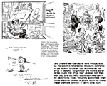
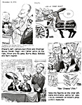
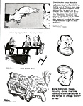
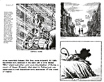
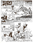
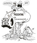
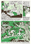
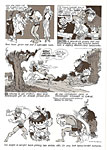
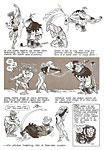
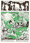
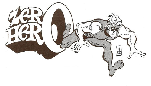
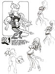
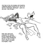
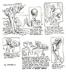
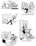
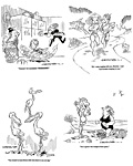
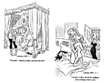
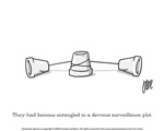
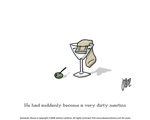
Opus 242 (May 27, 2009). In the aforementioned orgy of decadence, we celebrate a decade of Rancid Raves with 10 pages of our famous but entirely obscure comic book creation, the would-be superhero Zero Hero, 10 gag cartoons from my aborted magazine cartooning career, and 10 cartoons by our webmaster, Jeremy “Webby” Lambros, a cartooner of no mean achievement, who has been R&R’s silent partner for the entire ten years of our short but spectacular history. We also review at length Art Spiegelman’s Breakdowns, another anniversary of sorts that re-visits his inventions of more than 30 years ago, and we complain about the Reubens nominees of the National Cartoonists Society but acknowledge the winners regardless, and say a fond farewell to a friend and champion of editorial cartooning, Draper Hill. Here’s what’s here, in order, by department: NOUS R US: Comics declining sales, Archie nuptials, Mad’s 500th, fewer cartoons in Playboy NO MORE OLD MASTERS: NCS Division Awards and the Cartoonist of the Year Reuben Swine Strike Back at Stephan Pastis No More Cartoon Appreciation Week? EDITOONERY: New hope for the fired The Froth Estate Misses the News NEWSPAPER COMICS PAGE VIGIL Rip Haywire, A New Strip Playing an Old Tune in a New Way BREAKING DOWN AND LAYING OUT: Spiegelman’s New Old Stuff BOOK MARQUEE: Bad biographies of Spiegelman and Eisner PASSIN’ THROUGH: Draper Hill, 1935-2009 ANNIVERSARY CELEBRATION: Zero Hero, HarvToons, Webby’s Cartoonery Onward, the Spreading Punditry: GOP shenanigans And our customary reminder: don’t forget to activate the “Bathroom Button” by clicking on the “print friendly version” so you can print off a copy of just this installment for reading later, at your leisure while enthroned. Without further adieu, then, here we go— NOUS R US All the News That Gives Us Fits For the first time in its history, saith the Associated Press, the Cannes Film Festival opened with an animated film, “Up,” which also marked the first—and, so far, the only—time a 3-D movie has opened the famed fest. ... Next spring, according to Walter Scott in Parade, a musical derived from Charles Addams’ famously macabre New Yorker cartoon family will open. ... Credited at DailyCartoonist.com, Rob Tornoe reports that Jon Stewart said that his news comedy program, “The Daily Show,” is the equivalent of a 22-minute editorial cartoon. In the latest issue of the Comics Buyer’s Guide (No. 1655), Chuck Rozanski, owner of Mile High Comics, the “world’s largest online retail comic book store,” once again tries to assess the impact of the Great Recession on the comics biz. Invoking his experience at a couple recent comic-cons where he talked with other retailers and determined that sales were down by 20%, he goes on to say, “oddly enough,” that “the over-all market for comics is simply outperforming most other businesses during this malaise. ... Fans are still buying a huge number of comics.” And funnybooks as investment are still a good bet: “We may not have taken the ‘safe’ investment strategy of investing in stocks and bonds,” Rozanski said, “but our collectibles inventories have actually held their values far better!” But sales were still down 20%—except for retailers who drastically reduced prices, like Rozanski. Alan Gardner at his blog, DailyCartoonist.com, alerts us to the fact that Jeff Kinney, the creator of The Diary of a Wimpy Kid, has been named as one of the World’s Most Influential People by Time magazine, coming in 52nd. “Kinney’s upbringing and off-beat humor” helped inspire his series of Wimpy Kid children’s books, which chronicle the life of Greg Heffley, “a middle school student on the brink of adolescence who finds himself in precarious situations. Since publishing the first book in 2006, the series has sold close to 16 million copies worldwide and earned Kinney a spot on Time’s 2009 list.” Quoted by Gardner, Kinney said: “I don’t even think I’m the most influential person in my own house— I thought [hearing the news of making the list] was a joke,” said Kinney, 38, who now lives in Massachusetts. I don’t mind Kinney getting to 52nd place with his stick-figure illustrated diaries, but if they call him a “cartoonist,” I’ll be mad enough to crush a grape. I can’t remember where I picked this up, probably from Gardner: During a comic festival in Brussels, a scaled up reproduction of a Tintin adventure was created on the Brussels Grand Place. It measures 672 square meters (7,233 square feet). The article doesn’t mention if the feat was to be submitted to the Guinness Book of World records. The current record holder is a team in Germany who created a comic strip 782 ft wide—well below this Brussel’s effort. You might remember that Lucky Cow creator Mark Pett also attempted the record back in 2003 with a Lucky Cow strip measuring 135 ft wide. ***** Wedding Ballistic. You can’t, by now—given the topic’s recent worldwide ballyhoo on all sides, front and center included—be ignorant of the impending nuptials of Archie Andrews. “The eternal love triangle” that has been “the cornerstone of Archie comic books for over 65 years will, apparently—if we are to believe the publisher’s press releases (always a dubious proposition)—be dissolved sometime this summer. The management has waited for one of those Significant Numbers that all of fandom dotes on: issue No. 600, shipping August 12, will, it seems, carry a story the title of which is “Archie Gets Married, Part 1: The Proposal.” The press release fairly bubbles with seductive come-ons: “Could it be true? Has Archie finally decided to take the plunge and propose to one of comics' favorite girls? It sure looks that way!” Well, maybe. But I think there’s a subversive twist embedded in the plot. The story, drawn by Archie veteran Stan Goldberg, was written by Michael Uslan, who took a break from his usual obsession, Batman (and all other costumed heroes of yore), to pursue his other favorite subject, Archie Comics’ defining essence, the Archie/Betty/Veronica relationship. In promoting the “Archie Story of the Century,” the press release reminds us of another story, published earlier this year, in which “readers got a chance to relive ‘Freshman Year’ with the famous teens of Riverdale High. Now,” the release goes on breathlessly, “make way for this special story that takes a look at Archie and his friends after they graduate college! [My emphases.] What careers will they seek? Will the friends stay in Riverdale or disperse? What would lead Archie to have marriage on his mind? And who would he choose, Veronica or Betty? How will Betty react? How will Veronica react? Can Archie shake off his klutzy past and hold down a steady job for more than a month?” A “special story.” Yup, it’s one of those “imaginary” stories, an “elseworld” yarn: what happens in it will have absolutely no effect on future issues of Archie titles or the fates of the Riverdale gang. Moreover, the press release is coyly silent about whether there will be a Part 2: “The Wedding.” Probably not. But it won’t matter: whatever happens in Elseworld, stays in Elseworld. In all once and future issues of Archie comics, the eternal triangle will continue, prolonged, presumably, forever, frozen in time and aspic. But isn’t it fun to think about Archie choosing one or the other of his paramours? And it is exactly that provocation the publisher has in mind in condoning the sacrilege: our overwhelming curiosity will drag us, wild with anticipation, to the newsstand to buy No. 600 and whatever other issues cling to the marriage proposition. ***** In yet another earth-shattering development, Topps Confectionary is changing its corporate name to Bazooka Candy Brands, according to the company’s new owner, Michael Eisner, quoted at brandfreak.com. The maneuver will shine a spotlight on the perpetrator of the worst jokes ever inflicted on humankind, Bazooka Joe, the kid in a baseball cap and eyepatch, who has dwelled in the bubblegum wrappers since 1953. “The company plans to bring Bazooka Joe to life ‘in a variety of mediums and promotional activities,’” it sez here. “Considering that some of his classic jokes include ‘The early bird gets the worm. Some reward!’ and ‘Your homework is like a juicy steak: rarely done!,’ hopefully those activities will not include a stand-up comedy routine.” ***** Sadly
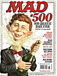
Madly. Here’s the cover of the 500th issue of Mad, the last monthly issue after 57 continuous years of
monthly publication. Mad shifted its sense of humor in the last decade or so, approaching a vulgarity never dreamed of during its birth pangs. “People's taste in humor always changes and we hope Mad has reflected that," says John Ficarra, 53, who has been editor-in-chief since 1984 (he was co-editor with Nick Meglin for much of that time). "We have a lot more political humor, the language has been ramped up," he said. "We always mirror society. There's been a coarsening of society, and things that wouldn't have been printed years ago are in there now." What's really changed, he told Linn, is how people get their humor today: "It's now on the Web, where people are creating humor, 'The Daily Show,' Letterman's Top 10. There's an immediacy in humor that wasn't there when Mad first started." And the Madmaniacs are joining the webworks, working on a new website to update their acerbic satire 24/7. ***** Oddly,
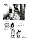
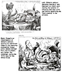
two cartoons by editoonist Mike Luckovich, who leans left most
of the time, are reprinted in the May 11 issue of American Free
Press, a frothing-at-the-mouth rightwingnut “pretend”
newspaper; here they are, displaying how critical commentary from a
liberally tilting observer can seem pertinent to conservative
knee-jerkers. At the website for Talkers Magazine, a publication devoted to talk radio, the top 100 talk show blatherers are listed—“the heavy hundred.” Rush Limbaugh is Number One; Hannity, second. Of the top 10, all are conservative except Lou Dobbs, who is unaccountably described as “independent” (when a more accurate label might be “panderer”) and Tom Hartman, “progressive.” I’ve not convinced that laws against “hate speech” are a good idea, but I’m not sure they’re altogether bad either. “Hate speech” fosters a very human tendency, the tendency to seek approval, and in that tendency resides a capacity to harm as well as to help. We join in volunteer charitable programs partly because we want the approval of like-minded neighbors, and their approval, in turn, encourages us in our charitable endeavors. History is littered with instances of people doing harm to others because they believe their behavior is approved by those who think the same way. Muslim extremists provide a current example: the support of jihad by those who interpret their scripture in a particular way effectively approves of the killing of innocent persons, who are, by reason of their contrary religious beliefs, infidels and therefore guilty of blasphemy and deserving of death. On the airways in the U.S., the chorus of conservative shouting, our domestic brand of jihad, drowns out opposing ideas, liberal ones mostly, and in so doing creates a club of group-thinkers. If we share their ideas, we come to believe, sometimes almost subconsciously, that in espousing those views we earn the approval of the group. I can’t help but think that, with an liberal African American in the White House, hysterical anti-liberal talk of the Hannity-Beck sort is nurturing racial hatred in some obscure corner of Timothy McVeigh’s shadow world. Those with racist tendencies might well feel they’d earn the approval of other fanatic anti-liberal, America-firsters if they could arrange to rid the country of the current target of the anti-liberal political ranting on radio and cable tv. Assassins are often a-social loaners who don’t give a toot for the approval of their fellow beings, but not all of them are so disposed: John Hinckley Jr., who tried to rid the world of Ronald Reagan, did so to earn the approval of Jodie Foster. Fascinating Footnit. Much of the news retailed in the foregoing segment and in some of what follows is culled from articles eventually indexed at rpi.edu/~bulloj/comxbib.html, the Comics Research Bibliography, maintained by Michael Rhode and John Bullough, which covers comic books, comic strips, animation, caricature, cartoons, bandes dessinees and related topics. It also provides links to numerous other sites that delve deeply into cartooning topics. Three other sites laden with cartooning news and lore are Mark Evanier’s povonline.com, Alan Gardner’s DailyCartoonist.com, and Tom Spurgeon’s comicsreporter.com. And then there’s Mike Rhode’s ComicsDC blog, comicsdc.blogspot.com For delving into the history of our beloved medium, you can’t go wrong by visiting Allan Holtz’s strippersguide.blogspot.com, where Allan regularly posts rare findings from his forays into the vast reaches of newspaper microfilm files hither and yon. HEF, THE INCREDIBLE SHRINKING PLAYBOY Hugh Hefner, we learn in March 27's Entertainment Weekly, is selling the mansion next door to the Playboy mansion, about which EW scribe Scott Brown quips: “It’s expected to be purchased immediately by an international consortium of 14-year-old boys.” The National Cartoonists Society held its annual awards dinner in Hollywood over Memorial Day weekend. I had hoped that the Society would be able to arrange again, as it once did for a previous Reubens celebration in Lala Land, a soiree at the Playboy Mansion. I hoped in vain: some wag said NCS has fallen Hefner’s esteem. Hef, a lifetime frustrated cartoonist, apparently misses the “old” NCS, the one that’s members included such giants as Milton Caniff, Rube Goldberg, Chester Gould, Chic Young, and so on. Hef is also poorer now than he’s been for a while: Playboy apparently feels the crunching economy too—declining circulation and advertising; all this time, I thought sex and barenekkidwimmin never went out of style no matter what economists say. In any case, Hef probably doesn’t think he can afford new girlfriends and a evening of heavily imbibing cartoonists. Well, if you had to choose, what would you pick? And there are other signs of quiet desperation at the rabbit hutch. The last three issues of Playboy, beginning with April’s, have run 122, 116 and 126 pages, compared to the monster issues of yore when 180-240 pages was the norm. The number of cartoons in each issue is also diminishing: respectively, 5, 6, and 4 full-page color cartoons in the last three issues; 7, 6, and 8 smaller cartoons in the back of the book, plus, usually Bobby London’s Dirty Duck and that full-page stylish triumph of a strip by Juan Alvarez and Jorge G.—both of which were missing from the May issue. On average, that’s one full-page cartoon for every 24 pages in the April issue; 1:19 in May, and 1:32 in June, which means, as a purely mathematical proposition, you’d go 32 pages in June before seeing a full-page cartoon; then another 32 before encountering another. In the bygone glory days of the 1990s, the ratio was 1:23-26; last year, it was about the same, due to the diminishing total number of pages. In short, while the ratio of full-page color cartoons to the page count remains more-or-less constant, the total number of cartoons is dropping, keeping cadence with the decrease in the number of pages in each issue. But I was right about barenekkidwimmin: Playboy’s page count may be dropping, but the number of pages devoted to the unadorned curvaceous epidermis remains about the same. Sadly, however, the magazine’s layout, once unique and distinctive, is indiscernible from any of the laddie mags on the stands. They all look alike inside. NO MORE DISTINGUISHED OLD MASTERS OF THE MEDIIUM This Year’s Nominees and Winners of the Reuben and the NCS Divisions Awards I’m writing this, the ensuing screed, both before and after the National Cartoonists Society “Reubens Weekend,” the annual convening of ’tooners at which the Society confers honors on the Cartoonist of the Year (who gets the Reuben trophy) and on winners in the numerous divisions in the cartooning vineyard (who get handsome wall plaques). For the record and because being nominated is an honor in itself, here, below, are the nominees this year, beginning with the Division awards and culminating, amid fanfare and silent cheers, with the Reuben candidates. The listing (and its attendant carping by yrs trly) was composed before the winners were known; but now I know, and I’ve marked the winners by preceding their names with an asterisk (*) and congratulations, herewith. The complaints remain, intact, unasterisked. Newspaper Comic Strips—Stephan Pastis, Pearls Before Swine; *Mark Tatulli, Lio; and Richard Thompson, Cul de Sac. I sympathize with Hef: these guys are all new to the craft, having produced daily comic strips for a decade or less, each. All produce funny strips, but there are other quality endeavors that have been overlooked despite having been around for similar duration and sometimes longer—Darrin Bell with Candorville; Jef Mallett with Frazz; not to mention Tom Batiuk’s two strips, Crankshaft and Funky Winkerbean, which have been looking better and better in recent years and have also ventured into human interest venues most other strips haven’t yet entered. To name a few. And there are other worthy enterprises, too—Arlo and Janis by Jimmy Johnson and the comfy Betty by Gerry Rasmussen and Gary Delainey, for instance. And Pastis has won in this category before; why again when other worthies are overlooked? Newspaper Panel Cartoons—Vic Lee, Pardon My Planet; *Mark Parisi, Off the Mark; and Jeff Stahler, Moderately Confused. Again, relative newcomers except Stahler, who has been cartooning in newspapers for decades, albeit as an editorial cartoonist, in which capacity he still persists. What about Cornered by Mike Baldwin? Good, solid and off-beat. Part of the predicament here is that “entries” in the division competition are submitted by the candidates themselves; the process admits of nomination of works by persons who didn’t submit their own stuff, but it apparently doesn’t work that way often. It’s a little cumbersome: the submitter is advised to get the permission of the submittee, and that’s an extraneous ocean of undertaking that cartoonists, notoriously non-organizational personages, aren’t likely to spend time navigating. Editorial Cartoons—Mike Luckovich (who won the Reuben a couple years ago, the same year he won the Pulitzer), *Michael Ramirez (who has won in this category before, and last year, took home the Pulitzer), and Jeff Parker (who, besides editorial cartoons, does Mother Goose and Grimm on alternate weeks for Mike Peters). At least Parker is new to the competition; the others have been around and been honored before, as noted. Again, there are other worthy candidates who are overlooked: David Horsey, two-time Pulitzer winner; Ann Telnaes, one-time Pulitzer winner; and several who’ve never won big awards—Steve Sack (a metaphor-making genius), Kirk Anderson, Tony Auth, Jeff Danziger, Steve Benson, and on and on. But NCS, betraying its essential provincialism and syndicated strip-bound myopia, never seems to come up with guys like these. Magazine Gag Cartoons—Pat Byrnes, *Mort Gerberg (both mostly New Yorker cartoonists), and Werner Wejp-Olsen. No Playboy ’tooners here? None from the other admittedly scarce number of magazines that run the occasional cartoon? Television Animation—Bryan Arnett, Character Design, “The Mighty B!”; Ben Balistreri, Character Design, “Foster’s Home for Imaginary Friends”; and *Sandra Equihua and Jorge Gutierrez, Creators, “El Tigre: The Adventures of Manny Rivera.” Feature Animation—James Baxter, 2D Character Animator, “Kung Fu Panda”; Clay Katis, Supervising Animator, “Bolt”; *Nicolas Marlet, Character Designer, “Kung Fu Panda.” Newspaper Illustration—Lars Leetaru, *Mark Marturello, and Sean Kelly. Greeting Cards—Kevin Ahern, *Jem Sullivan, and Debbie Tomassi. Magazine Feature/Magazine Illustration—Daryll Collins, Bob Staake (noted here for his New Yorker cover the week Obama won), and *Sam Viviano. Book Illustration—Jim Benton, Stacy Curtis (otherwise, an editorial cartoonist), and *Mike Lester (ditto). Advertising Illustration—Roy Doty (amazing! —one of the Grand Old Men of cartooning!), *Craig McKay, and Jack Pittman. And, finally, “Comic Books” (which is where NCS gives awards for graphic novels while overlooking such masterfully done comic books as, say, Loveless or Casanova or Army @ Love or 100 Bullets)—Chris Blain, Gus & His Gang, Matthew Forsythe, Ojingogo, and *Cyril Pedrosa, Three Shadows. The problem here is ignorance: NCS is still, as it always has been, chiefly the redoubt of syndicated cartoonists, and the organization has harbored a deep-seated prejudice against comic books, which, when NCS started giving out awards, were (and still are) produced by teams rather than single creative consciousnesses. NCS wants to award single cartoonists, not teams. Or it did, at the beginning; and the custom has persisted even as animation categories often recognize groups of creators. The titles I just listed are well and inventively drawn, regardless of how written; and one of them, Army @ Love, is both written and drawn by that creative colossus, Rick Veitch. NCS, however, remains stunningly oblivious of such achievements—which means, by the way (although not at all incidentally), that the club is blind to the cartooning arena in which the most innovative work is being done these days. And then we have the candidates for the Reuben: *Dave Coverly, Speed Bump; Dan Piraro, Bizarro (both panel cartoonists) and Stephan Pastis, who thumbs his nose at his readers and his fellow practitioners with a comic strip called Pearls Before Swine. Samples of their efforts appear in this vicinity.
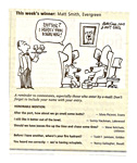
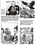
Incidentally, in one of those accidental fateful confluences that sometimes occur on the comics page (and always delight me when they do), on the same day that Coverly’s Speed Bump offered a gag about dogs and their habit of greeting each other by smelling butts, so did Mike Peters’ Mother Goose and Grim offer a similar (you should pardon the expression) gag, which I’ve added to the bottom of the page. One of my favorite gags in this line was perpetrated in a cartoon drawn by the Denver Post’s editorial cartoonist, Mike Keefe, as one of a series of weekly cartoon captioning contests. As you can see in our second visual aid, the wordplay in a winning caption from Matt Smith is stunning: the words make no sense, no comedy, without the pictures. As usual, all the Reuben nominees are syndicated newspaper cartoonists—no animators, no magazine gag cartoonists, no editorial cartoonists, no comic book cartoonists (although Piraro produced a graphic novel masquerading as a children’s book that ridiculed the so-called thinking of the Bush League; but the short form, while qualifying as mischievous satire, scarcely deployed the sequential capacities of the medium). As far as NCS is concerned with picking a Cartoonist of the Year, none of these other categories of cartooning exist, an oddly hypocritical posture, considering all the division awards it also confers. I thought Piraro should have got the nod this year: thrice emcee at the Reubens banquet, he’s been active in NCS and has been nominated at least twice before. And he’s been producing his hilarious feature since January 1985, longer than the other two nominees put together: Speed Bump began in 1994; Pearls in January 2002. When Sergio Aragones got the Reuben in 1996, he told me he was surprised because he thought it was “too soon”—and he’d been cartooning brilliantly for over 30 years by then. But Coverly has also been active in the club, serving on its executive board. And he does funny stuff, as you can see. As for Pastis, I thought this might be his year. He’s featured in a long interview in Hogan’s Alley, the cartooning annual, and he’ll be a guest at the San Diego Comic-Con this summer. His nasty-minded sense of humor infects his strip and, apparently, its readers: the strip’s popularity has resulted in a steadily increasing number of subscribing newspapers despite Pastis’s regrettable attitude. As I’ve said before, anyone who calls his readers swine has dubious motives, and since Pastis can draw better than the stick figures he customarily sprinkles through his panels, I’ve thought that he is secretly thumbing his nose at his colleagues, saying, in effect, you guys can kill yourselves, spending hours every day drawing your characters with some measure of anatomical accuracy, but I’m getting away with stick figures—ha, ha, the joke’s on you, you slaves.
The Swine Strike Back Pastis is actually a very nice fellow, suitably humble and oozing humility when in the company of his betters. And he’s very witty. Interviewed with Cul de Sac’s Richard Thompson in the winter issue of San Diego’s Comic-Con Magazine, Pastis demonstrated a wit not only funny but quick. Asked to describe his strip in six words, Pastis said: “Arrogant rat, humble pig, gallows humor.” Thompson did almost as well, but, as the second to rise to the challenge, he had longer to think about his response: “These little kids that never shut up.” To say that Pearls Before Swine is about a pig, a rat, some zebras, a few hungry alligators, and a goat scarcely does justice to description. It is, rather, about comedy, the non-traditional sort that takes you where you least expect to go. A few years ago, the syndicate brochure thought the strip was about “commentary on humanity’s quest for the unattainable.” That’s hard to square with our subsequent experience of the strip, which, even at its commencement, I thought was about humor. Much of the humor is generated by the pig and the rat who personify, respectively, stupidity and causticity. The pig notices a pig doll that the rat has bought “to remind me of you when you’re not around.” “How sweet,” says the pig. “That really makes my day. I’ll leave now and you can see if it works.” “Okay,” says the rat. “See ya.” By the next panel, the pig has gone, and the rat turns to a swami-like character standing next to him and says: “Okay, now—show me again where to stick the pins.” Nothing in the setup for this gag predicts where we’ll wind up. And much of Pastis’ humor is of this breed of hilarity. Yes, there are humans as well as animals in the strip. And the humans are better drawn than the animals. The animals barely rise above stick figures. Their bodies and heads are blobs, and their arms and legs are sticks. It’s an approach to drawing that gives Cathybert a good name. It’s the sort of rendering that can be found on the Internet. And that, in fact, is where Pastis’ strip originated. There, he attracted the attention of that guru of fine art, Scott Adams (famous in some circles for not drawing Dilbert). “I’m a big fan of Stephan’s comic,” Adams said. “It’s one of the few that make me laugh out loud. I’m sure he’ll get a lot of criticism about the simple line art but it’s the simplicity that makes it work. When people figure that out, he’ll be huge, and then everyone will want to draw like that.” With the steel-trap mind of the satirist, Adams is, of course, commenting upon the inspirational function of his own work on people like Pastis. Regrettably, Adams is probably right: more so-called cartoonists are bound to come along, drawing stick figures. We aren’t far from Vera Alldid, a cartoonist character years ago in Chester Gould’s Dick Tracy: Alldid’s comic strip was called Sawdust, and the drawing consisted of specks representing sawdust. Still, although it hurts me to admit it, Pearls before Swine is hilarious. But the strip and its apparent success raises questions about the American newspaper reader. What kind of people are they who are laughing at the death and dismemberment and rampant rudeness and wholesale disrespect that often prevails in Pearls? What does the popularity of this quirky, grim comedy say about society at large? And when speaking of a profession poised to honor its practitioners for excellence at their craft, what does it say about the National Cartoonists Society when it nominates Pastis for “Cartoonist of the Year”? Not only does he draw badly on purpose (thereby, as I’ve indicated, insulting his colleagues), but his announced opinion about how he goes about manufacturing his macabre comedy suggests, again, that he scorns the craft at which he makes his living. The idea, he says, is not to try. Or to try less harder. Writing at wordpress.com, Pastis begins with “one small caveat: I'm sort of an idiot. (Of course, I have managed to get out of a job as a lawyer and now sit around in my monkey underwear, so I must be doing something right.)” He plunges on: “My first piece of advice is on writing jokes, and I'll use yesterday and today to illustrate this point. Yesterday, I spent four hours writing strips. They all sucked. They sucked because I was trying too hard to be funny. Today I wrote for a few hours and got 9 strips out of it. The difference: Today I didn't try so hard.” Another caveat, he continues: “Sometimes the stuff that flows from you will be crap. And that voice inside your head will lie and tell you it's good. That's a risk you must bear. “So,
the lesson today,” Pastis concludes, “is this: Don't put
effort into your work. It There you have it. Advice from the fraudulent cartoonist: don’t try to concoct jokes, and don’t draw as well as you can. And this is the guy NCS thinks could be Cartoonist of the Year? ***** Footnit. And while we’re lambasting NCS for its self-absorbed provincialisms, whatever happened to Cartoonist Day? And Cartoon Appreciation Week? Cartoonist Day, May 5, was celebrated this year only (as far as I know) by Wiley Miller, who mentioned it in his Non Sequitur. Every year, we are supposed to encounter Cartoon Appreciation Week right about this time. The dates shift a little from year to year, but that doesn’t make cartoonists any more shifty than the rest of us. Cartoon Appreciation Week, as initially fomented by NCS, is whatever Monday-through-Sunday includes May 5. So this year, it’s May 4-10. They picked May 5 because it was on that date in 1895 that the New York World published a cartoon called Hogan’s Alley by Richard Outcault, a freelance technical draftsman, who, when not diagraming electrical equipment, drew comical pictures and peddled them to weekly humor magazines. Hogan’s Alley, like others Outcault had sold to magazines, featured the juvenile antics of a swarm of slum urchins, and among the otherwise raggedy and bedraggled mob, Outcault drew one distinctive little kid: he was bald (his head having been shaved as a cure for lice), and he had big jug ears and a gap-tooth grin, and wore a nightshirt that reached to his ankles. His name was Mickey Dugan, but when, on subsequent appearances, his nightshirt was colored yellow, he became known as the Yellow Kid. The Yellow Kid turned out to be a genuine crowd-pleaser: people bought the newspaper just to follow his shenanigans every week. The character was so popular that William Randolph Hearst hired Outcault away from the World to draw the cartoon for his New York Journal. But Joseph Pulitzer at the World hired another artist to draw the Yellow Kid, and for quite some time, the circulation battle between the two press lords had the Yellow Kid in the front lines as the most conspicuous combatant: delivery wagons taking newspapers around the city had posters on their flanks bearing the grinning visage of the Yellow Kid. The Yellow Kid is often called the first newspaper comic strip (even though he wasn’t first, and he didn’t appear in a “strip” but in a single, large drawing) because he demonstrated the commercial appeal of cartoons. After his noisy debut, newspaper publishers knew they could attract readers if they published cartoons. And for that historic reason, Cartoon Appreciation Week always convenes around May 5, which is, itself, called Cartoonists Day. The enthusiasm went out of this ersatz holiday as an NCS enterprise when Steve McGarry, a fugitive Brit, became president of NCS. He announced at his inaugural business meeting that since too few of the members were positioned to recognize Cartoon Appreciation Week or Cartoonist Day—animators couldn’t; ditto comic book makers and gag cartoonists—the whole thing would be dropped. Besides, he said, May 5 is a Latino holiday, Cinco de Mayo, so people would be confused. Or Latinos might object to cartoonists appropriating their holiday, thinking it was being turned into a joke. Or something. More like, Cartoonist Day would be overwhelmed. But neither of these purported “reasons” seemed to me terribly persuasive. Why not go on? Persistence might’ve paid off with greater recognition of the societal and fiscal worth of comics. NCS never formally abandoned the Week or the Day, but it hasn’t pushed it by reminding members to commemorate it either. It withers. Incidentally, Wiley Miller recognized the Reuben, too. On Saturday, May 23, the day the Reuben winner would be announced, he drew in Non Sequitur a gang of barflies celebrating in a sports bar, with the tv announcing: “We interrupt the ballgame to bring you live coverage of the 63rd Annual Reuben Awards ... in the cartoonists’ alternate universe, where society has its priorities straight ...” The Reuben was originally conceived as a way of getting cartoonists some publicity, but in recent years, NCS has arranged to avoid publicity by forbidding any “non-members” from attending the events of the Reubens Weekend and by cautioning members not to mention the affair for fear it will attract fans (who might show up and ask for autographs; how annoying). EDITOONERY Afflicting the Comfortable and Comforting the Afflicted Editorial cartoonist Robert Ariail, who recently took a buyout from The State in Columbia, S.C., will continue to be syndicated by United Feature Syndicate's Newspaper Enterprise Association, saith Editor & Publisher, and he has launched a website, robertariail.com, where he’ll be posting new cartoons as well as an archive of his 25-plus years with The State. Steve Greenberg, recently involuntarily departed from the Ventura County Star, looked around Los Angeles and couldn’t see any local topic editoons. Both the Daily News and the Times have eliminated editorial cartoonist staff positions, and the L.A. Weekly eliminated its cartoon content earlier in the year. With nobody doing local-issue editoons in the nation’s second-largest city and metro, Greenberg saw an opportunity and jumped in, doing local cartoons for LA Observed, a blog website devoted to the city’s news and politics conducted by career journalists. So far, his is a venture with no money, he explained, but he hopes to attract buyers and expand from his other local gigs, Ventura County Reporter and Jewish Journal of Los Angeles. “Ironically,” said he, “my career began with locally-oriented cartoons for the Daily News three decades ago. I felt there would be an audience for local cartooning commentary in a huge market that's ripe for lampooning—and there was no place left to go in print—and that it could lead to useful exposure or other opportunities.” He reports that he’s already had some response—possible freelance assignment and the like. QUOTES AND MOTS “It seemed like an ordinary day until I had coffee with Jesus at the Café du Monde.” On the wall there. “Many a man owes his success to his first wife and his second wife to his success.”—Jim Backus, actor “Never miss a good chance to shut up.” —Will Rogers “I didn’t really say everything I said.” —Yogi Berra THE FROTH ESTATE Our Alleged News Institution The governor of Texas, a state with pretensions, was huffing and puffing during all those “tea” parties a month ago (“tea” standing for “Taxed Enough Already”), saying that the Lone Star State might withdraw from the Union if the rest of America doesn’t shape up and quit taxing. His fulmination misses two essential points. First, O’Bama’s tax hike, which doesn’t go into effect until 2011, will affect only those persons with an annual income in excess of a quarter-of-a-million dollars. As Hendrik Hertzberg calculated at The New Yorker, “that means that a fellow making, for example, three hundred grand could see his tax bill go up $34.62 a week.” The rest of us, the 97% of the population who don’t make $250,000 a year, will get a tax reduction, not an increase. It’s difficult to see what those attending the “tea” parties have to complain about, but whilst we ponder that imponderable, we can dispense with Governor Rick Perry’s other contention handily. He claimed that when Texas joined the Union in 1845, “one of the issues was that we would be able to leave if we decided to do that.” Not exactly. And while the rest of the nation’s so-called newspapers promulgated Perry’s outrageous statement without demurer, Hertzberg and the legendary fact-checking minions at The New Yorker researched the matter and discovered that “the actual deal was that Texas, with Congress’s permission, could theoretically divide itself into five [smaller] states.” Not quite the same as the Get-Out-of-Jail-Free card Perry thought he had. The sad thing is that it apparently took a weekly magazine not particularly dedicated to the promulgation of “news” to publicize Perry’s prevarication. ***** And why isn’t some enterprising newspaper exposing the rules by which Congress operates, rules that destroy any pretext at “democracy in action”? Take, for instance, the practice in the Senate of putting “holds” on pending business—nominations for judges, say, or legislation generally. A “hold,” we are informed, is “an informal practice by which a Senator informs his or her floor leader that he or she does not wish a particular bill or other measure to reach the floor for consideration. The Majority Leader need not follow the Senator's wishes, but is on notice that the opposing Senator may filibuster any motion to proceed to consider the measure.” So a “hold” usually works: it has the effect of stalling indefinitely—perhaps forever—an otherwise legitimate legislative action. With a “hold,” one Senator—a single citizen—can block action by the most revered deliberative body on earth. Where’s the democracy? Where’s majority rule? Shouldn’t we know more about such autocratic customs in Congress? Who will tell us? There are scores of them, an infestation looking for purgation. NEWSPAPER COMICS PAGE VIGIL The Bump and Grind of Daily Stripping In Tom Batiuk’s Funky Winkerbean, Les is now dating
an African American woman with the approval of the ghost of his wife,
Lisa, who died a year or so ago of cancer. I don’t know the
name of Les’ love interest; in fact, I have difficulty knowing
who any of the strip’s characters are these days. After Lisa’s
death, Batiuk jumped the strip forward in time several years; all the
characters were suddenly, one Monday morning, fifteen-or-so years
older. And none of them were immediately recognizable. Les lost some
hair and grew a beard; he’s more attractive now than he used to
be. Funky (I think it’s Funky but I can’t be sure) gained
several dozen pounds and lost what remained of his hair. Batiuk is
handling the Les love affair with his customary delicacy and sense of
dramatic comedy, all nicely done, but I wish he’d pause for a
week or so and re-introduce his cast so I’d know who is who
these days. At
the bottom of the accompanying visual aid is an installment of Rudy
Park, drawn by Darrin Bell over scripts by Theron Heir (not his real name), in which Clyde the Thug from Bell’s other
strip, Candorville, shows up again. Bell is a conspirator in
other cross-pollinating efforts these days. In fact, I suspect him in Candorville lately of colluding with Stephen Pastis in Pearls Before Swine as they both try by satiric means to make
a case for the value of comics in newspapers, attacking the bailout
industry at the same time. If they’re not colluding (in a nice
way, of course), how else can we explain the appearance of Dennis the
Menace in both strips on the same date, each strip offering an aspect
of the same gag? Bell’s criticism of newspapers’ treatment of comics was more direct earlier in the series with a strip I haven’t reprinted here. In it, Doctor Manhattan from The Watchmen murmurs observations about newspapers and comics as he moves through time. In February 1895, he is watching Joseph Pulitzer adding to his paper “the very first comic strip [in order] to tempt young readers to buy his newspaper.” In April 2009, he watches himself “explain to a congressional committee why the newspaper industry is dying.” In March 2009, he watches “an editor who just dropped a full page of comics wonder why young people won’t buy his paper.” Rip
Haywire, the sometimes-square-jawed hero of the strip named after
him, commits deeds of derring-do in the manner of Olde Timey
adventure strip heroes but at the rate of one adventure a week
instead of one lasting six months in the mode of yore, and in
mid-April he confronted a band of rogue Amish in order to rescue a
scientific wunderkind. A couple weeks later, Keith Knight in a Sunday release of his Knight Life strip also toyed with the Amish. Keef encounters his friend Gunther, who has grown a beard because, he says, he’s “gone Amish.” He explains: “In order to survive this depression, I’ve give up all modern luxuries. I’m going to live off the land.” But he admits he doesn’t like washing dishes by hand or drinking water out of a well, and slaughtering his own food is out of the question. Says Keef: “Sounds like your more squeamish than Amish.” To which Gunther responds: “I’m thinking of starting my own off-shoot.” Again, as far as I’ve been able to tell, no protest from the actual Amish. ***** Rip
Haywire, to return to the other subject at hand, is one of the
strips picked up by United Media through the offices of its (now
former) acquisitions editor, Ted Rall, who sought to
revitalize newspaper comic strips by injecting off-beat comedy from
cartoonists who normally ply the waters of the alternative press or
waft about on the Web. Concocted by Dan Thompson and launched
January 5 this year, strip rehearses the adventures of the eponymous
Rip (great name), a soldier of fortune (an unabashed mercenary, it
develops) in the classic mold, “who lives for danger,”
accompanied on his travails by his cowardly dog, TNT, and his
“venomous ex-girlfriend Cobra,” who, like her former
beau, is rendered in geometric visual shorthand—simple lines,
simple shapes. And so was I when I read a brief description of the strip as a silly send-up of the adventure strip genre. In one of my other lives, I’d conjured up a similar offering, a comedic adventure strip about an ineffectual soldier of fortune named Fiddlefoot, so I was hoping for the best when I heard about Rip Haywire. Alas, when it materialized, it proved not to be the best after all; it was pretty good, but not entirely successful. I was put off somewhat at first by the confused story lines. Each daily installment blurted out a fragment of a story but seemed to abandon plot whenever a joke demanded it. The strip often devolved into three panels so episodic as to be entirely disconnected. The fourth strip in the series on display up the scroll a bit is a good example: in the second panel, we must assume, with no other evidence to guide us, that Rip has set up a bunch of bombs shaped like cows, just as we must assume in the third panel that the cows have exploded and the horse-drawn vehicle is carrying Rip and the wunderkind doc. But the comedy of the punchline—“Get thee! Get thee!”—evades me. Is Thompson just making fun of the way the Amish are supposed to talk? Apparently. But it’s not very funny. And what’s that triangular black shape in the first panel? A printing error? The strip at the bottom of the page is another conglomeration of panels that seem nearly independent of one another. Well, okay—Rip lands on a rooftop in the first panel and heads into the building below by going down stairs from the roof in the second panel. But what happens next? Something happened between the second and third panels—did the “polecat” take a shot at Rip? Did he miss? Evidently—if we are to judge from what the old timer says in the third panel. And where did he come from? Oh, I see: that tiny silhouette at the top of the stairs in the second panel—that’s him. I discern the cowboy hat. This strip is fairly typical of Thompson’s effort about half the time. I can accept the fragmented and therefore nonexistent plot, but where’s the joke that’s the justification for all this dissonance? Rip’s “giddy”? What’s so funny about that? Eventually, I figured out Thompson’s contrivance. Plot and continuity are of no concern to him: his objective is to arrive at a punchline that ribs adventure strips and action heroes, and “story” in this context serves merely as a kind of motif, the atmosphere in which such jokes might be made. “Atmosphere” requires nothing resembling a story. Atmosphere is the trappings, the accouterments of action and adventure. To this end, Thompson gives us a couple of panels to establish appropriately exciting atmospherics, and then he springs the joke. But too often, the jokes aren’t funny, and too many of them depend upon TNT and his addiction to kibbles and bits. But dogs aren’t Thompson’s satiric target—are they? BREAKING DOWN AND LAYING OUT A Review of Spiegelman’s New Old Stuff The Irish novelist James Joyce, whose medium was words, once, in a flight of linguistic fancy, wrote: Nobirdy avair soar anywing to eagle it. If not high praise, at least acknowledgment of extraordinary achievement. And we may say the same about Art Spiegelman’s Breakdowns: Portrait of the Artist as a Young @&%*! (76 10x14-inch pages, many in color; hardcover, Pantheon, $27.50). My invocation of Joyce is neither facetious nor arbitrary: Joyce, the inventor of stream of consciousness writing, was a formalist, unabashed and unrepentent; ditto, with a vengeance, Spiegelman, but with pictures, not words. And Breakdowns is the par excellence exemplar of his preoccupation. This dubious relationship between formalists has scarcely evaded Spiegelman’s attention: the subtitle of his book echoes that of Joyce’s semi-autobiographical novel. Breakdowns is part reincarnation: one part reprints the original 1978 48-page book of that title that was almost accidentally—and certainly perversely—published by Belier Press, otherwise a specialist in fetish fantasies, which became the publisher-of-record by paying the printer who had printed the book that Nostalgia Press could no longer afford to pay for; the other part bookends the original publication with two Spiegelman specialties, a prefatory 20-page autobiographical comic strip and a postscriptive 8-page autobiographical essay. It’s not impossible to imagine how this edition of Breakdowns came into being. Spiegelman is a notoriously slow worker: it took him two years to complete his last book, In the Shadow of No Towers, which he undertook to express his alarm and anger in reaction to the terrorist attack on the twin towers of the World Trade Center in lower Manhattan, just a few blocks from his studio and near the school one of his children was attending. “Reaction” implies something nearly immediate, but Spiegelman’s treatment soon evolved into a pousse café of the agonies the cartoonist endured in the immediate and ensuing aftermath of 9/11, in which he layered in allusion after allusion in his original comics construct and then laminated the whole thing with reprints of vintage newspaper comic strips. In his compulsive tinkering and jiggering with the visual elements of his work, Spiegelman is again like Joyce, who, asked by his biographer how his Work In Progress was progressing, said that it was going as well as could be expected: he had decided on the words to use in a particular sentence and was now trying to determine their order. (Some of the first Tower pages were published pretty soon after 9/11 in the Jewish weekly, Forward, but Spiegelman’s modus operandi soon slowed production, and the publication of the subsequent pages took place at too distant a remove to be a “reaction,” strictly speaking.) Pantheon, the publisher of Spiegelman’s Pulitzer-winning Maus in two volumes (1986 and 1991, but the five-year interval doesn’t reflect the preceding eight years that Spiegelman labored on it), was probably growing impatient, waiting for the meticulously dilatory cartoonist to produce another book that would earn both shekels and laurels. Weary of being nagged about it, Spiegelman doubtless looked around his SoHo studio to see what he could use to silence Pantheon’s plaints and landed on Breakdowns, which, in its initial publication, had sunk like a rock as soon as it was launched and was therefore virtually unknown, as close to being a “new” book as it was possible to be without actually being freshly minted. This vintage effort from his youth Spiegelman offered Pantheon, and Pantheon seized upon it eagerly. But
Spiegelman, a canny promoter as well as a painstaking craftsman,
realized that simply recycling work from his salad days would inspire
a certain quantity of scoffing among his critics and sour gripes
among his fans, and so he offered to put the comic strips of the
original Breakdowns in the context of his creative life by
prefacing them with an autobiographical comic strip. This pleased
Pantheon, which had long recognized that autobiographical comic
strips were Spiegelman’s metier. Spiegelman worried, he explains, about the sexually explicit pictures in one of the strips (repeated pictures of fellatio predominate as the image of sexual relations, which makes one wonder ...), but Pantheon wasn’t worried at all. Times, since Breakdowns’ inaugural publication thirty years ago, have changed. Spiegelman was comforted at the realization: “I know that America has changed dramatically,” he opined, “... and I know its moral center is located somewhere between Janet Jackson’s nipple and Paris Hilton’s clit—it’s just that I can’t figure out exactly where.” See what I mean about his verbal dexterity? And his final flourish is just as packed: “I’m glad to see Breakdowns get a new spin around the block, now that comics are thriving while the rest of America turns to shit. The discoveries I made while working on the strips in that book have somehow been absorbed by those interested in stretching the boundaries of comics over the past thirty years, even if only second or third hand. As a result, some may look at Breakdowns as a mere artifact of its time. But for me, it’s a manifesto, a diary, a crumpled suicide note and a still-relevant love letter to a medium I adore.” Adroitly, Spiegelman, after claiming to be the medium’s trail-blazing innovator (“the discoveries I made”), manages to slip into self-deprecation (“a crumpled suicide note”) and soft, warm navel lint (a “love letter”), thereby earning our sympathetic regard for being so fondly dedicated to his art rather than being just egotistically self-aggrandizing. Watching Spiegelman’s footwork as he dances through a paragraph is often as much fun as studying the pictures he laces with alternative implications. Spiegelman’s oft-professed love for comics as an artistic medium probably accounts partially for his overriding interest in its “forms.” As he told Dave Welch last fall at Powells.com, the strips in Breakdowns came “from an interest primarily in How pages are made. What is the stuff of comics that makes up its comics-ness?” The book’s title refers to the essential cartooning act of breaking a narrative down into discrete pictorial “moments.” (The title also refers, much more obliquely, to the mental breakdown Spiegelman suffered in the late 1960s, although, reading his description of how he got himself sent to a mental institution, I suspect his behavior wasn’t so much insane as it was bizarrely comedic, even satiric, and none of those around him could recognize it for an attempt at humor and therefore thought him crazy. Not an unusual failing on the part of the multitudes.) At the center of Spiegelman’s formalistic interest, however, is a profound artistic deficiency: he loves to draw comics but has no story to tell. And so he pursues his love affair by fooling around with “how” comics work. The
briefest as well as best demonstration of the validity of this
assessment is found in the very first of his experiments, the
one-page 1972 “Zip-a-Tunes and Moire Melodies,” in which
Spiegelman is unapologetically merely playing with the visual
impressions that can be created with Zipatone, a dot-patterned
self-adhesive cellophane-like overlay that can be stuck onto line
drawings to give them gray tones. I
don’t mean to imply that Breakdowns is somehow inferior.
It decidedly isn’t. As a demonstration of the capabilities of
the comics artform, the book is usually superior. And the
demonstrations are not the stuff of dry classroom lectures: they are
entertaining. One-to-three pages long, they’re short and
quippy, a little like blackout playlets but often without punchlines.
In “The Malpractice Suite,” Spiegelman appropriates a few
panels from Rex Morgan, M.D. and constructs around each panel
as originally published a faux “background”; so we see in
the original, a close-up of nurse June Gale talking to Dr. Morgan who
appears at mid-range, nearly full figure, but Spiegelman has extended
the picture in the panel by drawing the rest of June Gale’s
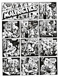
body, which, we see, is completely naked from the neck down. Spiegelman’s examination of how a joke works supposedly inspired Scott McCloud to propound his masterpiece, Understanding Comics. A couple of the one-pagers herein have been published as stand-alone strips in The New Yorker, at which his wife, Francoise Mouly is art director; I hasten to add that she is not cartoon editor, which effectively dissipates the aura of nepotism as a credential for publication in the nation’s foremost cartoon outlet. In at least two of the longer pieces in the book, the introductory autobiographical comic strip and a lust story called “Little Signs of Passion,” Spiegelman is toying with a filmmaker’s storytelling tricks. He was hanging around some experimental filmmakers, whose methods he envied: they could shoot “footage” willy nilly, and then go back to their labs and edit the images, re-arranging them to make a story. Spiegelman was intrigued. As he explained last fall to Tom Gatti at the London Times, employing one of his most extravagantly archane metaphors: “Comics are a narrative medium, but a narrative is a story, which comes from the Latin historia, referring to the horizontal rows [floors] of a building—and that comes from those early painted-glass comics that were used in churches to tell the superhero story of that guy who could walk on water. I was ultimately obsessed by comic structure”—that is, to pursue the metaphor, the “architecture” of comics. The bricks in the building are the panels of a comic strip. Throwing caution to the wind, Spiegelman decided to make a comic strip with the filmmaker’s devices: for “Little Signs of Passion,” he “shot” footage by drawing his pictures in equal-sized panels, then, like a film editor, he re-arranged the panels for publication. The object of this exercise was to “rupture” the “illusion of time that is created by juxtaposing images [panels of pictures] on a page.” He does somewhat the same sort of thing in the autobiographical comic strip. But these exercises, like most of Breakdowns, are what a cartoonist does when he can’t think of a story or a joke to tell. He doodles. He plays with his food, his tools. And much of the alleged “content” of Breakdowns is elaborate doodling. Except for Spiegelman’s autobiographical forays. In those he finds his real subject: himself. He says he was introduced to the concept of autobiographical comics by Justin Green, “whose Binky Brown Meets the Holy Virgin Mary opened his eyes to the possibility that confessional autobiography could be subject matter for comics.” In the events and adventures of his own life, Spiegelman found “stories” that he could tell in his beloved medium. Spiegelman’s first purely autobiographical exercise appeared in the 1978 Breakdowns: drawn like a woodcut in the manner of German expressionism, “Prisoner on Hell Planet” is a recollection of the suicide of the cartoonist’s mother in 1968, just after he was released from that mental hospital. Not unexpectedly, the narrative focuses on Spiegeman’s grief and angst: it concludes with him metaphorically in prison, saying: “Well, Mom, if you’re listening— congratulations! You’ve committed the perfect crime ... you put me here ... shorted all my circuits ... cut my nerve endings ... and crossed my wires! ... you murdered me, Mommy, and you left me here to take the rap!!” While the egocentricity of the piece is understandable, given the provocation, it is, in hindsight, a little strange that Spiegelman spends no effort at all speculating about why his mother killed herself. Strange, that is, until we realize that the cartoonist himself is his authentic subject, the focus of his concern and art. Even Maus, his most celebrated achievement, is more about him than it is about its ostensible subject, his parents’ experience of the holocaust. Chronologically, Maus succeeds Breakdowns in Spiegelman’s oeuvre, but the earliest manifestation of Maus appeared as a three-page strip in the 1978 Breakdowns. From this, he would develop his 300-page magnum opus. Although the two-volume tome is subtitled “A Survivor’s Tale,” implying that it is about “Mauschwitz” and his parents’ survival of World War II’s most horrendous event, the narrative device turns on Spiegelman’s interviewing his father, Vladek. Tellingly, when he learns that his father has destroyed the diaries his mother kept during their incarceration, he calls his father a “murderer”: his mother’s diaries would have supplied unimagined insights into the concentration camp experience. Throughout the book, the storyteller’s preoccupation, gathering material for the story and then devising a way to tell it—the Jews are mice; the Nazis, cats—the ostensible subtext of the book is actually the author’s chief subject. The focus of the work is on the cartoonist making a book—on his concerns, not his father’s. While denying that making comics is therapy, Spiegelman admits that he does his best work when he’s unhappy—“It’s the way a pearl gets made in an oyster,” he told Weich. And his best work is always autobiographical. Maus is fundamentally autobiographical; and his next major work, In the Shadow of No Towers, is also autobiographical, beginning with the horror and panic of the cartoonist’s realization on that fatal September day in 2001 that the school of one of his children was “in the shadow” of the burning, collapsing World Trade Center towers. And his autobiographical comic strip in the reincarnated Breakdowns is another of his better accomplishments. It’s as if Spiegelman has nothing to say, no story to tell, until some disorienting event in his life frees his inner demons to do their worst, which, in typical Spiegelman manner, is their best, and his. To indulge, for the nonce, in a bit of Spiegelmania: for a man whose professional obsession has been to establish that the art he practices is “Art” indeed, it’s doubtless a delirious coincidence that his name, too, is Art, again with a capital “A.” Perhaps for this reason, Art (the cartoonist, not the product of an artist’s labors) is often the focus of his endeavors: whenever Art starts talking about “Art,” he winds up talking about Art. (He was named Abraham when he was born in Sweden in 1948, and we’re perhaps lucky that he changed his name when his parents brought him to this country at the age of three, otherwise we’d be hearing him talking about being the father of comics.) Spiegelman realizes this propensity of his for self-absorption and, in interviews, often apologizes for his inevitably arrogant-sounding sermonizing. Nicely rhetorical, but he needn’t have bothered: he’s usually answering his interrogator’s queries, after all, which invariably are pointed at his, Art’s, “Art,” thereby forcing his hand. When one is regarded as the pope of comics, it’s difficult not to pontificate about oneself. “Everything I know I learned from comic books,” he says in Breakdowns’ opening autobiographical strip. And, recalling his father’s advice about packing a suitcase—“You have to use what little space you have to pack inside everything what you can”—Spiegelman realizes that “was the best advice I’ve ever gotten as a cartoonist.” He’s been packing meanings into panels ever since. Because of his deep engagement in the medium, Spiegelman’s comics are complex, even obtuse. Much of the meaning he infuses them with is lost to all but the most informed observers of the history of comics. A moment of realization in the Breakdowns autobiographical strip is depicted not with a light-bulb going off overhead but with a brick hitting the narrator, Spiegelman, in the head, accompanied by “Zip” and “Pow,” all evoking fond memories of the lyrical Krazy Kat and the brick Ignatz hurls at the Kat’s head in the final panel of so many strips. Why this allusion should be significant in the autobiography we are left alone to ponder. Homage to a master of the medium? Perhaps. Probably. Under other circumstances—in a lecture hall, say—Spiegelman would himself supply an explanation. He is his own best explicator. And many of his comics are improved by his expert eludications. One
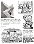
page in the second book of Maus, for instance, achieves a kind
of profundity through a visual maneuver so obscure as to be nearly
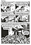
invisible—until Spiegelman explains it. One aspect of the meaning of the page derives from the eclat (“critical and commercial success”) that the first book of Maus has brought its author: as he works on Volume II, Spiegelman, like Cervantes writing the second part of Don Quixote, is conscious of the reputation both he and Volume I of his work enjoy. But the fame, he realizes sardonically, is not an unalloyed pleasantry: it has been achieved by using the holocaust as narrative. His renown has been built on the deaths of millions: our realization of this unhappy fact dawns upon us slowly as we read the page, wondering, at first, why the flies hover at Spiegelman’s elbow. (The heading of the page, “Time flies,” now acquires another shade of meaning, the noun becoming, perhaps, an adjective. More typical Spiegelman legerdemain.) The last panel explains the flies with the rotting corpses, giving Spiegelman’s fame a bad odor—on the page and, doubtless, in the cartoonist’s mind, as he revealed when he referred to Maus in an interview with Mark Athitakis at washingtoncitypaper.com as having been done “on the piles of the dead.” So saying, Spiegelman displays a nuance of guilt that sidles up to self-loathing, and the Nazi emblem completes the picture. Is the swastika in the background of this page simply a subtle reminder of what built the heap of death at the cartoonist’s feet? Or does Spiegelman, who, in the imagery of this page, acknowledges the unsavory fact of a fame built upon the massive misfortune of others, see himself as a kind of Nazi, using the holocaust for selfish purposes of his own. Is he, by some bizarre stretch, himself a Nazi, an architect of the holocaust? Oh, come now—surely that interpretation is not just a little overwrought. Well, why not? Spiegelman packs a lot into every image, so why can’t we? In the page we’ve just been contemplating, Spiegelman has tied a mouse mask on his face, impersonating his impersonation in Maus. Spiegelman, knowing the value of publicity, often draws himself as a mouse; he uses a mouse as a self-caricature in autographing copies of his books. In the autobiographical comic strip at the beginning of Breakdowns, he bemoans his perpetual association with a mouse and Maus: he draws a huge statue of a mouse with himself in the shadow the statue casts. “No matter how much I run,” his self-caricatured character says, “I can’t seem to get out of that mouse’s shadow.” And yet he persists in giving himself the head and face of the Maus mouse in most of his self-caricatures, contriving thereby yet another fillip of publicity for the book—and for all subsequent Spiegelman works. The
cover of Breakdowns offers another image as fraught with vague
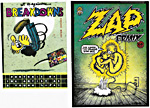
meanings and connections as the nearly imperceptible swastika. The “first issue” of Zap Comix has “No. 0" on the cover because Zap Comix No. 1 had already been published, using up the “No. 1" designation. The artwork that was subsequently published in No. 0 had been produced first (in October 1967), before the artwork for No. 1 (done in November 1967), but had become lost. (The presumptive publisher, Philadelphia’s Brian Zahn, proprietor of Yellowstalks, an early underground newspaper, had absconded with the art, and we’ve never seen whatever he did with it.) With the publication of No. 1 in February 1968, demand succeeded popularity voraciously. No. 2 was published in June and No. 3 in December—and, to supply the unsatiable demand, Crumb dug up photocopies of the lost art for the “first issue” and it was published in “No. 0" at about the same time as No. 3. All of which is beside the point. The point is that for many of us, Spiegelman included, the first several issues of Crumb’s Zap Comix launched the underground genre. These were the outrageous bellwethers of the iconoclastic future. By invoking Crumb’s “first issue” of Zap Comix on the cover of this reincarnation of Breakdowns, Spiegelman asserts his own place in the history of the medium as a formalist who redesigned the form, producing another “comic that plugs you in.” Spiegelman may not be as arrogantly self-absorbed as he sometimes seems, but he does not hesitate to proclaim what he sees as his role in the evolution of the medium. Which brings us, not at all incidentally, to— BOOK MARQUEE Short & Quick Reviews of New Books THE LIBRARY OF GRAPHIC ARTISTS —a series of books about cartoonists from Rosen Publishing Group in New York. I’ve seen only two of six books purported to be in the series, and I do not recommend them. One focuses on Spiegelman. Written by a man with an unlikely name for a biographer, Tom Forget, it’s a book I read only the early pages of before deciding that I shouldn’t be wasting my time. Forget asserts in an Introduction that tries to provide an overview of the comic book industry that the early issues of Disney Comics were drawn by Walt Disney, “entirely by himself.” With that as a sample of Forget’s knowledge of the field, I strenuously suspected he couldn’t be very reliable on Spiegelman. And a few pages on, my suspicions were confirmed. Forget says Spiegelman was strongly influenced by Mad magazine, but, judging from the autobiographical strip in Breakdowns, it was Mad the comic book that had such a great impact upon Spiegelman— specifically, a paperback reprinting of some of the Mad comic book stories. Most of Forget’s Spiegelman book seems merely a recitation of the “story” of Maus, the graphic novel not its conception; just glancing through the book, admittedly, I could see no evidence that Forget had ever interviewed his subject. Don’t get this one. The other Rosen book I bothered with was the one devoted to Will Eisner by Robert Greenberg, then a “senior editor” at DC Comics. Like the Spiegelman book, it is an attractive looking, modestly illustrated, 112 6x9-inch page hardcover, which does not announce its price on either cover or inside. Greenberg reveals an unfamiliarity with newspaper comic strip history, giving incorrect dates and names, and he messes up punchlines in anecdotes, puts Tudor City in the Bronx instead of on 42nd Street in Manhattan, doesn’t seem to know what an Eisner splash page is, and doesn’t say much about Eisner’s military career. Don’t get this one either. At least Greenberg gives us a date for Eisner’s birth (March 6, 1917), something Bob Andelman somehow seems to have overlooked in rushing out his biography of the comics pioneer, Will Eisner: A Spirited Life (276 6x9-inch pages paperback; $14.95), in 2005, within just months of Eisner’s untimely death on January 3 of that year. I’ve scoured the book three times, page by page, looking for Eisner’s birth date; no luck. But Andelman, a journalist with several published books to his credit, at least interviewed his subject frequently, often at great length. His great discovery in talking with Eisner was that A Contract With God, the book the popularity of which (due, partly, to Eisner’s reputation; then, the skill of his storytelling) paved the way for the graphic novel genre, grew out of the cartoonist’s anger and disillusionment when his daughter Alice died of leukemia at the age of merely sixteen. I had long suspected there must be something personal that inspired Eisner’s attack on religion, but I never would have guessed how deeply personal. Andelman devised the book as a series of episodes, flashing back and forth across the spectrum of Eisner’s life; it makes for a bumpy ride sometimes, but it’s jammed with details—facts, mostly, not insights or analyses of Eisner’s work. The weakest part of the volume comes towards the end, when Andelman quotes at length the testimonies of many of Eisner’s students at the School of Visual Arts; after that, the narrative current of the book dissipates into several tributaries, each testifying to some aspect of the cartoonist’s life and achievement, albeit, again, without any analysis or appreciation of Eisner’s mastery of his medium, how and why he set the pace for many of those who’ve followed him into funnybook fame and fortune. This is a book you should get; and when you do, jot the date of Eisner’s birth on the front page, and plunge happily in. ***** In his new book, out in the fall, Ted Rall will return to the autobiographical mode. Badinage and Bagatelles “I've put in so many enigmas and puzzles that it will keep the professors busy for centuries arguing over what I meant, and that's the only way of insuring one's immortality.”—James Joyce again, this time commenting on his 1939 novel Finnegans Wake, the sales of which to American college professors for their literature classes, Joyce figured would support him the rest of his life. And he was almost right about that: he just didn’t live long enough to enjoy it as long as it lasted; it is, in fact, still going on, and Joyce died in 1941, just two years after his allusive masterpiece was published. WE’RE ALL BROTHERS, AND WE’RE ONLY PASSIN’ THROUGH Sometimes happy, sometimes blue, But I’m so glad I ran into you--- We’re all brothers, and we’re only passin’ through. Old Folk Ballad Lustily Sung By Walt Conley in His Trademark Husky Rasp of a Voice at the Last Resort in Denver, Lo These Many Years Ago Draper Hill, 1935-2009 Peeping Tom at the Palace Keyhole Draper
Hill was unique. A historian and scholar of the arts of editorial
cartooning as well as an adroit practitioner in the arena of the
day’s news—professionally as well as personally, he was
like no other. Dead at 73, he leaves a hole in the world of editorial
cartooning—a keyhole unattended. Born July 1, 1935 in Boston, he grew up in Wellesley Hills, Massachusetts but spoke without a trace of the regional accent. He attended Harvard and drew cartoons for the college’s famed humor magazine, the Harvard Lampoon, where, during Hill’s freshman year, a fellow cartoonist was John Updike, then a senior, who also wrote for the publication and was its president (Lampoonese for “editor”). After he graduated in 1954, no one ever heard again of Updike the cartoonist, but Hill persisted: he became art editor of the Lampoon his senior year and then staff editorial cartoonist at a succession of daily newspapers. But first, upon graduating magna cum laude in 1957, he rewarded himself with a summer tour of Europe, during which he initiated a friendship with England’s legendary political cartoonist, David Low. Back in the U.S. in the fall, he was hired by the Patriot Ledger in Quincy, Massachusetts, as reporter and odd-job illustrator (which included the occasional editorial cartoon). In 1960, he left on a Fullbright scholarship to continue his artistic and scholarly pursuits in London at the Slade School of Fine Arts. When he returned to the States in 1964, he became editorial cartoonist for the Worchester (Massachusetts) Telegram until 1971 when he went to Memphis and the Commercial Appeal, where he stayed until joining the Detroit News in 1976 for the next 23 years. But this abrupt recitation of dates and places of enterprise and accomplishment scarcely describes Draper Hill. “Initiating a friendship” with David Low, for instance, doesn’t do justice to how Draper achieved this historic acquaintance. I don’t know how he managed it, but I like to think he did it with a skillful combination of admiring audacity and artistic appreciation that doubtless distinguished his meeting Norman Rockwell. When still an undergraduate at Harvard, Draper invited himself, unannounced, to visit Rockwell in his studio. Rockwell was sufficiently impressed by his surprise visitor that he gave Draper a pair of his sketches. Each of us is unique in our own way, but Draper was without peer in his passion for cartooning, its practice and its history. In his devotion, hand and mind, to his profession, Draper successfully ignored the ordinary distractions of everyday life. He was not, for example, attentive to his attire: he looked, usually, as if he’d just thrown something on and missed, somewhat—his tie notoriously askew, sometimes half over his dress shirt collar, half under; shirt-tail untucked and extending below the bottom edge of his jacket; hair combed in front but not in back, where a night’s tossing and turning had produced a proudly flourishing rooster-tail. “Sloppy” is too strong a word for Draper, and “mussed” implies a conscious effort; but “disheveled” is about right. On my first, and only, visit to Draper at the Detroit News building, I missed seeing the “museum of cartooning” that his office had evolved into over the years. To John Silverstein (writing the Introduction to Political Asylum, the catalogue for a 1985 exhibition of Draper’s cartoons), the cartoonist’s office, a long narrow room, the walls lined with desks used only to stack paper on, was “a shrine to cartoon greats of the past and present, and a living, heaving archive of the kind of obscure, but essential ephemera—picture files, stacks of mysterious papers, reference books—that feed cartoonists’ souls. Original drawings and prints lined the walls, stacked two-, three-, and sometimes four-high, including Gillray’s ‘The Plumb-pudding in Danger,’ two Nast drawings, one a late self-portrait, a Rollin Kirby drawing of Old Man Prohibition, and a profusion of original cartoons and strips by the likes of Herblock, Bill Mauldin, Leslie Illingsworth, Garry Trudeau and Al Capp, to note only a few.” When I visited, this ornately garnished atelier wasn’t around anymore. The paper’s offices were being remodeled, and Draper had been dispossessed and was then working on his drawing board set up in make-shift cubicle that was little more than a wide space in the hallway. Our destination, however, was his home in Grosse Pointe where we were going to meet his wife Sarah and then go to dinner together. The most memorable—and revealing—moment of our evening took place in the Detroit News parking garage, not in the office, his home, or the restaurant. Backing his car out of its space, Draper cut the wheels too sharply and scraped up against an encroaching stanchion. In what I came to regard as his typical nonchalance about the strictures of daily life, Draper straightened the wheels slightly, scraped on by the stanchion, backed the rest of the way out of the parking slot, and then shifted out of reverse and headed for the exit. He didn’t get out to look at whatever damage might have been inflicted on his car, which, probably, wouldn’t have been noticeable anyhow amid other evidences of previous encounters he and the car had perpetrated on their immediate surroundings. These represented preoccupations beyond the interest of Draper Hill, cartoonist and cartooning historian, artist and scholar. We roomed together several times at the annual convention of the Association of American Editorial Cartoonists. Draper had a way of taking possession of the room. He did it through the simple act of unpacking. In his later years, he was accompanied on his travels by a phalanx of bottles containing a number of different pills, all of which he was obliged to take at various intervals. Draper had little patience with bottles (or with any sort of container, as we’ve already seen): while opening pill bottles, he usually, accidentally, decanted the bottles, spreading their contents on whatever horizontal surface was handy—dressers, tv cabinets, the lip of the sink in the bathroom. And the floor. The latter made a disconcerting crunch whenever one of us had to make his way to the toilet in the middle of the night—which, at our ages, roughly equivalent, we did with some regularity. He invariably brought with him a bottle of good whiskey, which he was eager to pour into your glass as well as his own. The first thing he asked of anyone who wandered into the premises was if they wanted a drink. Draper’s imbibing was not the compulsion of the habitual inebriate (which he wasn’t) but the indulgence of a gregarious and social soul; he drank with company, not in solitude. Shopping for vintage books in musty second-hand book stores was an obsession with both of us, and we always devoted the convention’s free afternoon to forays into the hinterlands of the host city, looking for used-book stores and treasure. On a couple occasions, Draper and I went together, and you’d think we’d be scrabbling over some rare tome on cartooning that we’d discovered jointly and both wanted. Not so. Draper usually had them all already. “Here’s something you need,” he’d say, pointing, in this case, to John Leech’s Pictures of Life and Character (1887) in two volumes, reprinting Leech’s cartoons from Punch, 1842-64. “They’re in great shape,” he added; “you really ought to have them.” I was convinced: no, I didn’t need them then—and haven’t looked into them yet—but they’re there, on the shelf, whenever I need to know something more about John Leech. Draper also convinced me to buy a copy of E.H. Gombrich’s Art and Illusion for the psychology of art it revealed and examined. Haven’t read it yet either. But someday, I will. Going book browsing with Draper was like reading the syllabus for a course in the history of cartooning. His customary untidiness was liberating: it enabled him to devote his mind and energies to things he was avid about, the history and practice of his profession. Like many people who are negligent in their physique and fashion—who may be, shall we say, “messy”—Draper had an extraordinarily orderly mind. His home provided ample evidence of both mess and order. Many of the walls (but not those of the livingroom, which was exclusively Sarah’s) were festooned with neatly framed and carefully hung original art by contemporary cartoonists and historic giants like England’s James Gillray and many Americans, Jay N. Darling of Des Moines, for example, or Rollin Kirby of New York. In contrast, his upstairs study seemed at first glance a little unkempt, but the papers strewn about the spacious floor were piled by categories, perfect reflections of the orderliness of his mind, which was, for as long as I knew him, deeply engaged in researching the life and work of Thomas Nast. Draper’s appetite for scholarly endeavors had been thoroughly whetted during his incarceration at Harvard, where he produced a lengthy paper entitled Image of America in English (viz. Punch) Cartoons and an undergraduate thesis on Joseph Keppler, the artist-founder of Puck humor magazine, What Fools These Mortals Be!, which he amended after visiting Vienna during his summer abroad in 1957 with The Early Life of Joseph Keppler and His Family, making his Keppler oeuvre the most authoritative text on the artist until Richard Samuel West produced Satire in Stone in 1988. While studying at the Slade School in London, Draper began the research on Gillray, one of the editorial profession’s earliest (and most notorious) architects, that would eventually yield three books: a biography, Mr. Gillray, the Caricaturist (Phaidon, London, 1965), Fashionable Contrasts: Caricatures by James Gillray (Phaidon, 1966), and The Satirical Etchings of James Gillray (Dover, 1976). And, his interest in cartooning luminaries of the past aroused, he next resolved on Nast, the progenitor of all American editorial cartoonists. The task was prodigious, and Draper tackled it with dogged persistence over many years. He visited over twenty libraries and museums where Nast works were archived, and he acquired many unique Nast prints and publications, including contemporary publications on topics Nast drew about. To aid him in these endeavors, he received a Guggenheim Fellowship in 1983-84. According to John Adler, who commissioned Draper to produce a series of articles about Nast for HarpWeek and its website, “Draper probably has forgotten more about Thomas Nast than anyone else in the world knows.” But Draper’s definitive opus on Nast was never finished. The nearest thing we have to such a monumental work is Adler’s Doomed by Cartoon: How Cartoonist Thomas Nast and The New York Times Brought Down Boss Tweed and His Ring of Thieves, about 60 percent of which, Adler said, came from Draper’s commissioned writings. (We reviewed the book last year, Opus 233.) Judging from Draper’s meticulous treatment of Gillray, we are poorer by several light years for his failure to finish a comprehensive volume on Nast. Here, by way of testifying to what we are missing, is the opening paragraph of Draper’s Introduction to The Satirical Etchings of James Gillray: “St. James Street slopes gently down from Piccadilly through the heart of ‘clubbable’ London, past White’s, Boodle’s and Brooks’s, to the squat clocktower portal of St. James’s Palace. In the early 1800s, the King’s immediate neighbors included poet-banker Samuel Rogers; the distinguished printer William Bulmer; Francis Kelsey, dealer in sugar plumbs; the younger Pitt, betwixt terms as Prime Minister (1801-04); and a ‘thin, dry bespectacled man’ described by a contemporary German journalist as ‘the foremost living artist in the whole of Europe.’ The recipient of this considerable homage, James Gillray, lived and worked (and occasionally waited on customers) at the shop of his publisher-printseller Hannah Humphrey, halfway down the east side of the street. Her establishment, Number 2, was some 190 yards from George III’s doorstep, directly opposite William Pitt’s lodgings in Park Place.” What toothsome tidbits are here in this leisurely narrative so liberally laced with details that could have been discovered only by the most painstaking and diligent researches. Apart from the testimony of the details in the paragraph itself, we have the footnotes for the Introduction: three pages of them, 121 footnotes, for a mere 21-page article. Copious as well as classy. And Draper’s orderly mind is on flamboyant display here, conjuring up as needed from memory telling details to illuminate and decorate: he’s seasoned the basic brew of his narrative with minuscule scraps of intelligence culled from who-knows-where—a “squat” clocktower, a German journalist, the geography of the neighborhood. It makes one weep to think of what we might have had on Nast if Draper’s health had been more robust and his life longer. Draper’s health began a slow deterioration, it seemed to me, in the mid-1990s when he fell while installing (or removing) storm windows on his house. A leg was badly injured, requiring hospitalization and a long convalescence; he walked with a distinct limp thereafter. But the more serious assault on his well-being was being fired by the Detroit News in 1999. He claimed the paper’s officials never told him, explicitly, the reasons for their actions—I suspect they simply wanted a younger and perhaps less scholarly visual commentator, and, judging from the man hired to replace Draper, a more conservative point of view. For a time, Draper was without medical benefits as well as employment, a circumstance that, after 23 years on the payroll and with the debilities of age and illness looming, was sad to the point of tragic, tragic to the point of criminal. His colleagues were alarmed and angry. Said Joel Pett, at the time president of AAEC: “It’s a shame Draper was treated with such a lack of dignity. He’s a really dedicated practitioner of the craft and just about the kindest and most generous gentleman it has been my pleasure to know in the business.” But after a while, Draper was able to work out a satisfactory arrangement with the paper that left him somewhat less than destitute; by the terms of the deal, he couldn’t tell me what, exactly, it was, but in response to my expressed concern and agitation, he was able to reassure me that he would be all right. And so it seemed. He went to London at least once to oversee the auctioning off of portions of his massive Gillray collection; and he kept plugging away at the Nast tome. And he attended AAEC’s annual convention as often as he was able: his last was in 2006, when AAEC met in Sacramento, California. As before several times, we roomed together. Lately, he took up residence at a retirement center, where he suffered a massive stroke on Friday or Saturday, May 8 or 9, and died on the 13th without regaining consciousness. Encomiums flowed. From Steve Benson at the Arizona Republic: “Draper, despite his debilitating health issues and occasional reliance on a cane, nonetheless had an irrepressible spirit. He loved and respected his profession and made us all feel proud to be editorial cartoonists in the true spirit of the historical role of our craft. He was a gentle and genteel man, with the heart of a lion. How sad that he is gone.” For years, Draper wrote articles on the history of editorial cartooning for the AAEC magazine, The Notebook. “He was a repository of history,” said Cullum Rogers, himself no slouch in the repository of cartooning history department. “Among working cartoonists in the U.S.,” Rogers added, “he probably knew more about the field than any other.” Said the Pittsburgh Tribune-Review’s Randy Bish: “You would be hard-pressed to find any man who held even half as much of the compassion that Draper held for his craft. He was indeed a man whose love of editorial cartooning was a blessing to the profession.” Draper was known and revered for his personal qualities as well as his scholarly achievements. “I will miss him terribly,” said Kate Salley Palmer (Greenville News, retired). “He made every one of us cartoonists feel special and gave us each a sense that we were doing important work and that we were part of a unique tradition. He knew more about political cartooning than anyone else ever will. I fear that with his passing we’ll lose much of our institutional memory. His intelligence was astounding —matched only by his compassion and sense of humor. He was AAEC president at my first convention, and I will never forget his welcoming kindness that year. He was a very special one-of-a-kind lovely man.” In his relations with and treatment of women, Draper personified an Old World courtliness, standing until they were seated, stepping aside to let any of their number precede him through a doorway or into an elevator. In today’s social milieux, his demeanor seems an exaggerated courtesy, but even when a woman pooh-poohed his ministrations, Draper persisted, undeterred. Said Steve Artley, freelancing for an Alexandria paper in Virginia: “Draper was a man of wit and charm, as well as dignity and grace. He was the aristocrat of editorial cartooning.” Said Ed Hall of Artizans Syndicate: “My last memory of him is sitting in a hotel hallway pouring drinks out of bottle he had brought with him, and talking about—what else?— cartooning. I couldn't even believe he knew who I was. What a great, generous guy. He'll be missed.” Freelancer Steve Greenberg elaborated: “Draper was droll, funny, erudite, the scholar of and among editorial cartoonists, and a very nice guy who will be missed by all his colleagues. His ‘History Corner’ was a staple of AAEC Notebooks for many years, and he did a lot to keep our convention business meetings focused and covering things that needed to be addressed. But let's not forget he was also a fine editorial cartoonist, with a lively style that used some of the boldest brushwork in the business while still being fun to look at, and intelligent and pointed commentary that had impact on his community. We'll miss you, Draper.” Draper was in Memphis at the Commercial Appeal for only four years before a local art gallery mounted an exhibit of his work. His editor (I assume: his affiliation is not specified), Guy Northrop, wrote in the show’s brochure: “An artist such as Draper Hill hates to waste a day commending good works. It’s not that he can’t be nice if he tries. He’s delightful company. But hunched over a drawing board, his left hand executing those black brush strokes, his skepticism drools all over political heroes and brasshats. If there’s an ounce of pomposity, charlatanism or deceit in a person, he wants to expose it.” Draper gets his ideas from whatever is happening, Northrop noted. “He has commonplace experiences like our own. His fears and anxieties approximate our own. So it is easy for us to identify with his symbolic figures for Mr. and Mrs. Public—who, in most cases, look like Draper and his wife, Sarah.” In the fourth cartoon Draper did after arriving at the Commercial Appeal, he depicted himself and Sarah at a local restaurant with their jewelry and silverware beside them at the table: “It happened,” Northrop explained, “that the neighborhood into which the newcomers had just moved was at that time the main work area of a band of arch burglars.” (The cartoon is among those in our Draper Hill Gallery below.) Northrop continued: “Indeed, that quizzical little guy with the big glasses and the tousled hair who frequently shows up at curbside in a crowd scene is our old friend, Draper.” Draper was often in his cartoons because he saw himself playing the role of Everyman. His explanation is pure Draper: “Mine is the most readily available mug on which I can suggest all the emotions I need,” he said, “—stupidity, incompetence, complete bewilderment.” Another of Draper’s editors, Jeffrey Hadden, deputy editorial page editor at the Detroit News, said: "His cartoons were usually a gentle form of humor, but he could draw blood when he felt it was warranted. As an editorial writer, I sometimes envied his ability to more strongly convey a point with a few well-placed pen strokes." Draper’s
successor at the Detroit News, Henry Payne, called him
"one of the deans of American cartooning," adding that he
was an "encyclopedia of cartoon knowledge" as well "He wanted to increase the awareness of people and get them more engaged with what's around them," said his son, Jon. "He wanted to challenge them to get more involved and interested in the political landscape. He wanted to push the envelope." David Vincent, a former colleague at the Commercial Appeal, agreed: “He was an intellectual cartoonist, quick to use literary and historical allusions. He was a stickler for detail and nuance.” His
drawings were often "extremely sophisticated and had deeper
meaning, so you would have to study it," said Ben Burns, former Detroit News executive editor and now director of the Wayne
State University journalism program. "He was capable of taking a
famous piece of art and converting that into a cartoon about
something going on locally. He stimulated people to think." Duncan Macpherson, Canada’s revered political cartoonist, put his appreciation of Draper’s work succinctly: “In the guerilla warfare of the political cartoon, Draper Hill aims at the brain. The message is the missile.” In Detroit, Draper created his most celebrated cartoon character in his caricature of five-term mayor Coleman Young, the city’s first African American mayor. Young was a canny and picturesque politician, a tireless advocate for the city, obtaining federal funding to build such urban projects as the Renaissance Center, the Joe Louis Arena, Cobo Hall expansion, and the People Mover, a monorail that looped the downtown. He created a formidable political machine, and was, to Detroit’s African American community, a heroic figure. His 20-year administration was controversial, dogged by rumors and accusations of corruption and incompetence, but he was re-elected four times by substantial majorities. His style was confrontational: he was always blunt and frequently profane. Some of his more pyrotechnical utterances include: “I’m smilin’ all the time. That doesn’t mean a goddamn thing except I think people who go around solemn-faced and quoting the Bible are full of shit.” And: “We don’t need no goddamn Greenpeace!” Philosophical, too: “I’ve learned over a period of years there are setbacks when you come up against the immovable object; sometimes the object doesn’t move.” Without Draper, Young was a cartoon character; with Draper to mock or applaud, Young achieved an apotheosis of political personality. And Young was mayor of Detroit for almost the entire time of Draper’s tenure on the Detroit News: they were a symbiotic pair. As former Detroit News editorial page editor Tom Bray noted, the cartoonist expertly portrayed both the comedy and the cunning of the late mayor in his cartoons. His caricature of Young as a "grinning Cheshire cat was apt without being mean." Draper delighted in every opportunity to put the mayor in a cartoon. And Hizzoner enjoyed the antic attention. In 1990, a year into Young’s last term, Draper journeyed to Landau, Germany, where he received the Thomas Nast Prize for editorial cartooning excellence. Draper thought of himself as a caricaturist, and his caricatures were deft: no one did a better one of Gerald Ford, who, with his bland face and bald pate, was difficult to do. In an editorial that was published the day after Draper died, the Detroit News added human dimension to the official portrait of Draper that it was otherwise limning: “For all of his learning, he was an impish figure around the office, possessed of a dry and subtle sense of humor that was frequently represented in his cartoons.” Indeed. His impishness was often evident in his choice of images (Coleman Young as a the condemned sinner from Michelangelo’s Sistine Chapel mural of the Last Judgement; see the Gallery) and always in his sly manner of springing some witticism on an unsuspecting listener. His humorous remarks were often steeped in erudition, obscure history or cartooning lore, and he might, momentarily, adopt the pose of pedagogical profundity, but the twinkle in his eye betrayed him, and his grin soon revealed his strategy as well as his pleasure at provoking a laugh. The Detroit News editorial acknowledged that Draper “was also a well-known figure in Metro Detroit, deeply involved in its cultural institutions. ... He cared about Detroit. He defended it from its detractors while chastening it through his cartoons." Mike Thompson, editorial cartoonist at the News’ rival (but JOA-joined) paper, the Detroit Free Press, recognized in his blog Draper’s place in Detroit as well as in editooning: “In the world of editorial cartooning, Draper Hill was a giant. The former Detroit News cartoonist was a veritable walking textbook on the history of the craft and was one of the people you could describe as a gentleman and a scholar without being cliche. He was always willing to pass along advice to budding cartoonists hoping to break into the business. I still have his written response to a letter I wrote him almost three decades ago as a young cartoonist. Although Hill left the News in 1999, he was still a fixture in Detroit and in the profession of editorial cartooning. So the ‘Catching Up’ statue by sculptor J. Seward Johnson Jr. in the Grand Circus Park People Mover stop [in downtown Detroit] is most appropriate. The bronze newspaper that the statue is reading is open to a page graced by a Draper Hill cartoon.” Draper was president of AAEC in 1975-76, but his heart was with the Association forever, as another past-president, Kevin “Kal” Kallaugher (The Economist) remembered in his affectionate salute to Draper: “Draper was wonderfully brilliant, eccentric, witty, professorial, warm, engaging ... and oh, did I say brilliant? One of my best memories from the AAEC took place at a business meeting some years ago. Draper had been a fixture at our conventions for decades. One of his unofficial duties was to prompt the dim-witted officers on stage (including me) from his perch in the front row on official protocol and parliamentary procedure. (A role now happily occupied by the esteemed Cullum Rogers). Due to illness, Draper was, at the time I’m recalling, missing his first ever AAEC convention. The silence from his empty seat was deafening. Late in the meeting, Ben Sargant stood to recognize our absent colleague. He made a motion asking the AAEC to officially declare Draper Hill as ‘Present’ at that convention. The motion passed unanimously. Draper's streak remained unbroken. I will miss Draper. The wonderfully brilliant warm and witty Draper. To me he will always be ‘present’ at the AAEC conventions.” We all will miss him. By way of showing how much, here’s what Draper once wrote about his beloved profession—graceful, witty, steeped in history and scholarship, occasionally impish, and, at last, modest and unassuming with a twinkle in his eye: “In 1831, a perceptive but not particularly sympathetic critic of the art observed that ‘In caricatures, as in candles, there are wicks which will soon consume them.’ The caricaturist himself was likened to ‘a caterpillar on the green leaf of reputation; a man who closes his heart against the sensibilities of human nature, who holds an inquest on whatever seems weak or blameable in others for the purpose of holding them up to public derision, who insults inferiority of mind and exposes defects of body, and who aggravates what is already hideous and blackens what was before sufficiently dark ... and though he is generally regarded as a nuisance, who for his audacious pictures deserves the pillory, he is permitted to walk at large by the courtesy of government and our love of fun and freedom.’ “In 1866, The Nation addressed a long censorious editorial to ‘The Limits of Caricature,’ reminding readers that ‘there may be power in the talent so exercised, but it is the same power which resides in the pistol of the house-breaker or the bludgeon of the highwayman. A good man is not likely to possess it, and will certainly be incapable of using it.’ “In the century or so which has poured over the dam since this last stricture was laid down, cartoonists have had to learn a good deal about the counterproductive effects of malice and overkill. We are still the peeping toms at the palace keyhole; still expected every now and again to hit (responsibly, of course) just a wee bit below the belt. There is a basic paradox in the union of institutional balance and licensed mischief, one that provides a continuing tension which I suspect helps to explain the potential impact and appeal of the editorial page cartoon. It is a volatile and essentially unstable compound; a denial of rules and formulas. There can be no tidy all-encompassing definition. The best cartoon is not necessarily that with the fewest lines or the shortest caption. Nor is it sure to be the funniest, or the most earnest or even the most correct. There is no guarantee that it will be the one destined to make the strongest impression on posterity. (If totally grounded in the enthusiasms of the moment, the chances are it won’t even make sense to ‘posterity.’) Perhaps it is only safe to suggest that the most perfect cartoon is apt to be that which achieves the best bond between the idea, the execution and the intended audience with the smallest (apparent) expenditure of effort. Having said all of this with the unruffled self-assurance of a would-be art-historian, I should add that it’s a whole lot easier to talk about than it is to do. But, on day at a time, I keep on trying.” And mostly succeeding, I’d say. Here’s testimony to that, a Gallery of Draper Hill cartoons. Among them is the drawing he did on the first page, a blank one, in the Political Asylum catalogue he gave me when we first met. In was in 1995 in Columbus, Ohio, where we were touring the Cartoon Research Library. At the end of a day, Draper invited me up to his room for a drink (typical Draper), and after he poured us each a glass, we talked, as we always would, of cartooning, and something prompted Draper to remember the catalogue, a handsome publication, I should add, the cartoons printed on ivory rectangles to distinguish them from the surrounding white of the book’s paper stock. “Would you like a copy?” he asked, adding, “—I have one left.” Yes, I said. And he then commenced to embellish the opening page with a self-caricature and sundry inscriptions. When he’d finished drawing himself with a pen transfixing his skull, he suddenly licked his finger and, to my alarm, applied the wet digit to his drawing, smearing it! But it produced not a blemish but an enhancement: smearing the felt-tip pen ink produced a gray wash that added another dimension to the drawing. The gray smudge has, alas, faded in the years since; but when you get to the picture, you’ll get the idea—just another instance of Draper’s cartooning genius. The other evidences, as you’ll see, lie in his persuasive caricatures and in his deployment of visual metaphors, sometimes with allusions to history, art, and literature, and sometimes just blunt imagery and sometimes nuanced with great feeling for the human dilemma. Some of the notations accompanying these cartoons are Draper’s, culled from the books in which the cartoons were eventually published. Those are the comments in typography; the comments in what looks like comics lettering are mine.
CIVILIZATION’S LAST OUTPOST One of a kind beats everything. —Dennis Miller adv. Roger Ebert, reviewing the documentary “America the Beautiful” about our obsession with feminine beauty, youth, and skinny bodies, discovered in the film the reason that designers prefer thin models, “the thinner the better, because—are you ready for this?—they save money on the expensive fabrics they use.” Anniversary Issues CELEBRATING DECADENCE Ten Years of Rants & Raves Herewith, we recognize 10 years of Rancid Raves with an appropriately absurdist brand of tithing in which we promulgate not a tenth of anything but tens of things—namely, 10 pages of my obscure comic book feature, Zero Hero, 10 gag cartoons from my aborted career as a freelance magazine cartooner, and 10 cartoons from our faithful webmaster, Jeremy “Webby” Lambros. Before we get to the actual celebration, however, we pause to remember what we talked about in This Colyum when it first appeared in May 1999. You can re-visit Opus One for yourself, of course, but without the insights the passing years have conferred upon those pronouncements. We reviewed the first issues of four comic book titles in that inaugural posting: The Victorian, which we didn’t like and said wouldn’t make it to the end of its promised 5-issue run (but it got as far as 6 issues before concluding); Virtex, we said, wasn’t much better than The Victorian, but it reached its projected conclusion with No. 3; Scene of the Crime we said was much better, and it finished its 4-issue arc; Vext, however—which seemed to initiate a continuing series—stopped at the sixth issue. So much for my prognosticating skills. We also produced our first essay on “ugly art,” defined, roughly, as raw amateurism, but we didn’t stop with that. And my opinions expressed then still prevail; you might want to revisit the posting. Since then, I’ve elaborated on the subject by developing a sub-category of “ugly art” that is, simply, “bad.” Dilbert and Pearls are ugly; Cathy is bad. Dilbert and Pearls are ugly because they are visually uninteresting; they are, in short, dull. Cathy is bad because it betrays an inability to draw. And now, to go from something to nothing, here is the “cover art” for Zero Hero and the first six pages of our tithing.
In the perhaps strained supposition that some among us might be interested in the conception and gestation of a comic character—even when that comic character is an entirely non-professional enterprise, produced by one of the nation’s most permanent amateurs (scarcely a recommendation for anyone’s interest)—I pause here on the cusp of the tenth anniversary of Rancid Raves to rehearse— THE STORY OF ZERO Or: How the Weekend
Warrior Came to Naught The genesis of Zero Hero was my simple desire to draw a muscle-bound costumed hero in those long ago days of yesteryear in approximately 1973-74. I’m not an illustrator of realistic comic strip adventures, so it was a foregone conclusion that my muscled hero would be essentially comic, something of a spoof of superheroes. The basic gimmick was that he should be both mentally defective and physically ineffective. The idea of teaming my hero with a sexy lady partner came almost at the beginning: she would be the means by which my ineffectual hero would be come effectual. (This notion is fraught with hidden meanings about the nature of the human condition, about the ying of yang, about the population explosion, and about the other things I like to draw besides muscled heroes. As soon as the team idea occurred to me, I thought it was worth exploiting for all the significances I could find in it. But you’ll have to discover those yourself.) Initially, I called my character “The Weekend Warrior.” His heroic adventures were to be entirely dreams—the dreams of a normally underdeveloped young dolt, who dreamt only on weekend. His “secret identity” would be his muscular self in his dreams. Despite all his muscles, he would be as ineffective as he was in real life—saved only by the “princess of dreamland,” who would either vanquish his foes with dream-dust or nudge my hero awake at the critical moment. I eventually abandoned the dream idea because, simply, I’m lazy: I didn’t want to spend all that time and energy drawing the “frame story”—the young dolt falling asleep, waking up, yawning, etc. Besides, dreams aren’t real enough for good adventures—even comedic adventures. The waking-up-from-a-dream bit is too tired a cliche, too much a cop-out conclusion. The princess of dreamland idea stayed on, though—in the form of Starbright, princess of Nod (the land of sleep and dreams), who saves Zero by tossing stardust into his opponents’ eyes, thereby putting them to sleep more effectively that all his pummeling can. Starbright was always named Starbright, by the way—at least in my mind. But on the first one-page Zero Hero strip (above), she’s called “Stardust” erroneously: when I was lettering that first panel, I was thinking ahead to the third panel where she tosses stardust at the dragon. Rather than undertake the onerous task of whiting-out the incorrect letters (I said I was lazy), I let the wrong name stand. The name Starbright comes from the old kids’ jingle: “Starlight, starbright / Grand me the wish I wish tonight” (or something like that). And she’s obviously wish fulfillment in the form of a paper doll. Having abandoned the “weekend warrior” notion, I needed another name. And “Zero Hero” came to me through sheer rhyme and euphony. His real name, Heavy Dootie, is simple contemporary slang, but I didn’t put the two words together until I did the green-tinted four-pager. At first, as you saw in the first adventure, Zero Hero was merely Captain Heavy. I gave up the military moniker pretty soon, too. I didn’t develop a satisfactory logo until after I’d done the four-page story. I wanted something that emphasized the “zero,” and by the time I drew Zero and Starbright in that tree (above), I’d arrived at an arrangement that got that notion across. Starbright could function outside the dream-world concept, I thought, but not in any of the real worlds we know. I needed some kind of magic kingdom, a locale that was only vaguely real. In those days of Conan the Barbarian and his ilk, such dilemmas are quickly resolved: along came the kingdom of Nyghwold (“near world”), a sword and sorcery setting neither here nor there. The name suggested all sorts of punning and nonsensical linguistic possibilities. By the time I did the four-page adventure, the narrative lingo was under the influence of James Joyce, Alfred Jarry, and George Carlson. Between the drawing of the first, short one-page episode and the drawing of the later green-tinged four-pager, several things happened to my creation. First, I changed Zero’s costume a little, abandoning the collar and the laced-up front (too complicated to draw on a regular basis), and I gave him the requisite insignia on the chest of his uniform (where, now that the laces had disappeared, there was ample display space for it). (Starbright’s costume I didn’t dare tamper with.) More importantly, I decided that I couldn’t draw muscled heroes very well, so I bought a handful of “muscle men” magazines and Burne Hogarth’s Dynamic Figure Drawing and started sketching. The drawings in the four-pager were done and re-done several times before I felt I had every muscle anatomically right (and I’m still not sure). Two of the minor characters grew out of old favorites that I’ve kept in my inkwell for years. Pere Hobo is based on a caricature of W.C. Fields, with a moustache added. His personality derives (for those interested in obscure factoids) from Alfred Jarry’s Ubu Roi. And Harridan Hemistich is really Margaret Rutherford. That, surely, is enough inner workings. The rest I leave for you to find for yourself.
The Short Happy Life of a Gag Cartooner About 30 years ago, I ventured, briefly, onto the freelance magazine cartooning stage. Using jokes I solicited from gag writers, I made rough sketches at my desk in the office where I worked—about one rough a day—while chewing my way through a Spam sandwich. When I had twenty roughs, I did the finished art: laying a piece of tracing paper over the rough sketch, I traced the drawing with a soft-lead pencil, “scrubbing” the lines as I went to produce a ragged-edge line, which I thought would make the art more suitable for magazine publication than the thick-thin line I used in Zero Hero and elsewhere. Then I “inked” the artwork by photocopying the tracings. This maneuver was an insurance policy: I’d heard that sometimes cartoon editors “lost” cartoons, and if that were to happen to any of mine, I’d still have the “original” (the penciled drawing on tracing paper) to re-issue cartoons with. (Turned out to be a paranoid precaution: only once in the 3-4 years I freelanced did any of my cartoons get “lost.”) Traditionally, gag cartoonists submit cartoons in rough form and finish only those that cartoon editors say they want to buy. But since I was a newcomer whose style and drawing ability was not known to cartoon editors, I sent in the finished art. I sent in batches of 20 cartoons. At first, I alternated between general markets (like National Enquirer, Woman’s Home Companion, Saturday Evening Post) and “girlie” markets (men’s magazines, all Playboy imitators, of which, in the late 1970s, there was a plethora). Right away, I noticed that I sold more cartoons in the girlie market than in the general market. Naturally, being a good capitalist who supplies demand, I began concentrating on the girlies, and by the time I retired from this endeavor, I wasn’t doing any generals at all. The girlie cartoons sold pretty well, statistically speaking: I think I sold 13-14 out of every batch of 20. Only a few went to high-paying markets (never sold to Playboy or Penthouse, but I sold to one of the Hustler titles once and regularly to DuGent publications, which paid in the mid-ranges). Here are 10 from my misspent youth—six generals and four girlies. (Now, aren’t you glad you’re an $ubscriber/Associate?)
And now a few words and some pictures from my cohort in this enterprise, “Webby” Lambros. Pay some attention to the man behind the curtain! My name is Jeremy Lambros. I have been working on RCHarvey.com, inside all those pointy brackets, since the beginning. Actually, it was my eloquent "Do ya gotta website?", at a convention in Chicago that started this whole ball rolling. It is hard to believe that was 10 years ago. When not web-readying the latest Rants & Raves, I also do some cartooning. My single-panel cartoon, Domestic Abuse appears on GoComics.com by Uclick as well as on AbuseCartoons.com. Here are a few examples:
Before its untimely demise I also drew an original strip for Disney Adventures magazine called "Level Up". The main characters were four videogame-obsessed kids. You can read some strips below and also on the website LevelUpKids.com
Thanks for allowing me a short bit of self-promotion. Also thanks to R.C. Harvey for every Opus and Hindsight for the past ten years. And especially thanks to you, the subscribers, for supporting this unique enterprise for a decade. I look forward to making it happen for the next ten years. </close curtain> ONWARD, THE SPREADING PUNDITRY The Thing of It Is ... Barako Bama, our prez, has lately be criticized by the Grand Old Pachyderm for doing too many things too fast. The worn-out Republicans, alas, fail to realize O’Bama’s strategy: doing so much so fast doesn’t give his GOP critics enough time to mount a cogent criticism of any one of the projects. And, you see, the strategy is working: the only criticism we’ve heard until lately has been that he’s doing too much too fast. Lately, however, the insurgents across the aisle have found something to carp about, thereby unifying their frayed and wavering party. Now they lambast Obama for his torture policy (we don’t, not anymore), making Nancy Pelosi their favorite surrogate target for failing to realize that the CIA was telling her about waterboarding—or not. Into the midst of this fray lurches Darth Cheney, a man who, in the eight years he was president of vice, managed to convince us that he didn’t know what he was talking about. Why we should listen to him now escapes me. Probably so we’ll have something to scoff at. And cable tv “news” will have something to fill some of the 24/7 airtime they need to fill. Cheney’s argument, if that’s what it is, seems to go like this: we did not, during the Bushie years, torture enemy combatants, and if we did, we were justified in what we did because valuable, life-saving information was acquired. Surely, the absence of logic and candor here cannot escape our attention: the two propositions are mutually exclusive. One is true, or the other; but not both, not at the same time. In Doonesbury recently, Garry Trudeau makes an equally telling observation when he has his CIA character say: “Our interrogation program was mostly borrowed from the Commies, who used torture to extract false confessions from captured U.S. airman. In other words, to get the truth from terrorists, our geniuses chose techniques specifically designed to make people lie!” To be scrupulously fair to Cheney and his passion for torturing prisoners who are helpless, we should recall that in the immediate aftermath of 9/11, we thought we were about to experience a massive anthrax attack. And Cheney was well aware that we had absolutely no defense against it. Still don’t. Not even after 8 years of Bush League leadership. For shame. (But Cheney never mentions anthrax, does he? With good reason.) Needless to say, Cheney and his minions panicked at the thought of this wholly unstoppable manner of attacking the “homeland,” so they desperately wanted to find out if it was, in fact, imminent. Torturing helpless prisoners, however vicious they might be on the loose, is the act of desperate people. And let’s not forget just how vicious some of these bad actors are: among the training exercises they passed through in the craggy canyons between Afghanistan and Pakistan was the one in which they learned to tear the throats out of dogs with their teeth. And we’ve probably forgotten that the first American casualty in the Afghanistan Invasion was a CIA operative who was attacked by a prisoner of war, who tore his throat out with his teeth. But torture is wrong. It’s immoral. Whatever the provocation, we should never resort to torture, and it is to our everlasting shame that we even debate the matter in the hallowed halls of government. Our vigilant so-called “news” media don’t remind us about anthrax or the first casualty in the Afghanistan incursion. Instead, they vaporize about whether Pelosi knew and when, and Darth Cheney’s snarl, and O’Bama’s gift of gab. Meanwhile, no one talks much about the horrifying fact that Israel’s new prime minister is threatening to drop atomic bombs on Iran’s nuclear facilities. Now there’s a subject we ought to be discussing. Instead, we talk about where to house the terrorists too dangerous to let loose once Guantanamo is shut down. All of our so-called leaders—i.e., members of Congress—busy themselves with fulminating about how they won’t tolerate putting any of these thugs behind bars in their states, nosiree. So where will they go then? C’mon: it’s been readily apparent for years that if Guantanamo is shut down, some of its former inhabitants must be imprisoned in the U.S. In the face of this obvious factoid, instead of leaders whose task, when faced with an obvious factoid, ought to be to persuade their constituents of the obviousness as well as the imperative necessity of taking the obvious action, we have faux leaders who, “when in danger, when in doubt, run in circles, and scream and shout” about how it will be, living among terrorists who have, because they’re terrorists, escaped the local lockup and now roam the streets, looking for American children to eat. Colorado, my current home state, has one of the “Supermax” prisons being touted as a home for the terrorists. Two of our senators, both freshmen—both, we assume from their utterances, more concerned about earning the future votes of their constituents instead of guiding those constituents to adult behavior—oppose moving GITMO detainees to the Supermax facility in Florence, Colorado. But one courageous Colorado soul, another freshman—this time in the House—is Jared Polis, who said: “Coloradans, like every American, want to keep these people from causing harm. We went to keep them locked up with no chance of escape. We want to put them in the best facility for that purpose. If the Supermax in Florence is the best facility for that purpose, then that’s where we should lock them up.” Bravo. One voice of reason amid the cacophony of cowardice and groveling self-interest. The other voices of reason are in Florence. One of them, the county commissioner, said: “If suspected terrorists are adjudicated and convicted then, yeah, I think the Supermax here is an appropriate place. That facility was built to handle these kinds of individuals.” According to Florence’s town manaager, once details are worked out, Florence residents probably would be supportive of housing them in the local lockup. After all, as Denver Post reporter Bruce Finley observed: “They took the initiative on establishing Supermax in the first place, scraping together money to buy land and then donating it to the government for the complex. ... They remain glad for the jobs it provides. ‘It’s a recession-proof industry,’ the town manager said.” And Florence’s mayor is similarly sanguine about having terrorists under lock and key in the neighborhood. He noted that in rural Colorado, people are pretty self-reliant. “Most of us own guns,” he said. You read about it here, not in any nationally circulated newspaper, I ween—nor on any cable or network tv broadcast. It seems only the politicians in Congress, most of them but not all, are timid about imprisoning terrorists in prisons built for the purpose. But most of the politicians have to worry, excessively, about being re-elected; most citizens don’t. ONE MORE FOOTNIT Before we depart, hurtling headlong into our 11th year, a couple of last lingering looks at the toothsome Starbright—a handful of pin-ups, some of which are masquerading as a comic book page in the way only a comic book page can be manipulated. Enjoy.
To find out about Harv's books, click here. |
||||||||||||||||||||||||||||||||||||||
send e-mail to R.C. Harvey Art of the Comic Book - Art of the Funnies - Accidental Ambassador Gordo - reviews - order form - Harv's Hindsights - main page |
